A few months ago, a friend’s swatches of the Sweet Shoppe collection convinced me to give BH Cosmetics a try. The last time I tried BH Cosmetics, I was just beginning my love affair with eyeshadow and I had been seduced by 88 tiny pans of mattes (though many had some sheen). In the decade since, BH Cosmetics has grown a lot. And I’m not just talking about the size of their pans. Word on the street is their eyeshadow formulas are superb–not just, but especially, for a drugstore/affordable brand.
So I had to see for myself if the rumors were true. If popularity is any indication, they certainly are. These palettes sold out pretty quickly and, although BH Cosmetics initially said they would not return, are back for another round.
This post covers all of the palettes in the collection and has some handy features (like the Table of Contents below) to help you all navigate through this content-heavy post. I’ve been holding onto these photos for months (what else is new), but I am so excited to share them with y’all. This collection has definitely been a highlight of the year for me.
Contents
Sweet Shoppe Collection: Overview
The Sweet Shoppe collection consists of six ice-cream-themed monochromatic palettes of reds, oranges, greens, blues, purples and pinks, and browns. The shadows are all embossed with a waffle cone imprint and surrounded by sprinkles. Okay, maybe the imprint is of a sugar cone–but we *all* know waffle cones are superior. When stacked, the palettes combine to form a delicious, colorful ice cream cone–a design feature that I love. It’s clear a lot of thought went into the packaging, the names, and the color stories.
We’ve seen a lot of monochromatic palettes in the past few years–first with Huda Beauty and then with Colourpop (who took the spotlight away from Huda in this colorful arena, in my opinion). Just when I was getting bored with the inherently limiting ways of monochromatic color schemes, BH Cosmetics swooped in with these treats. The shadows in each palette vary in undertone and depth, making them (again, in my opinion) a bit less limiting than your run-of-the-mill monochromatic palette in terms of the number of looks you can create.
Cherry on Top
Cherry on Top
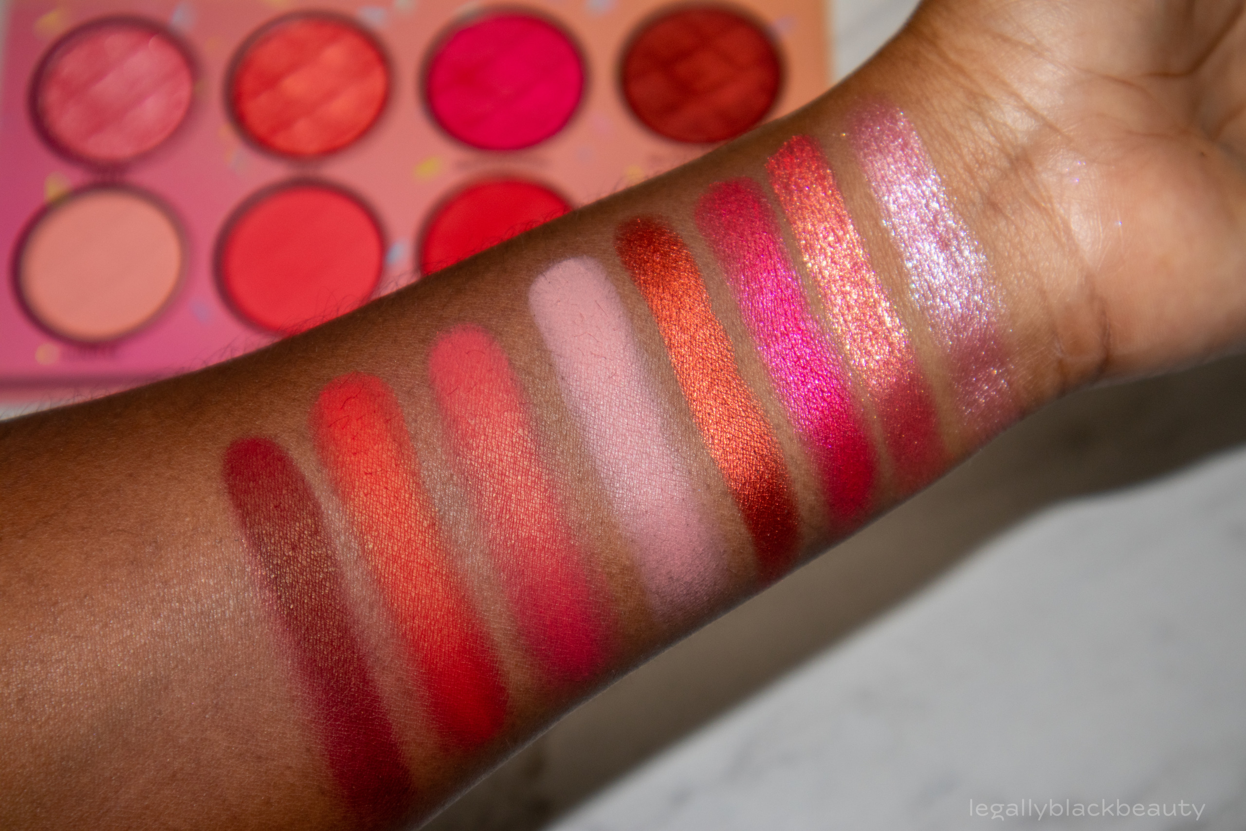
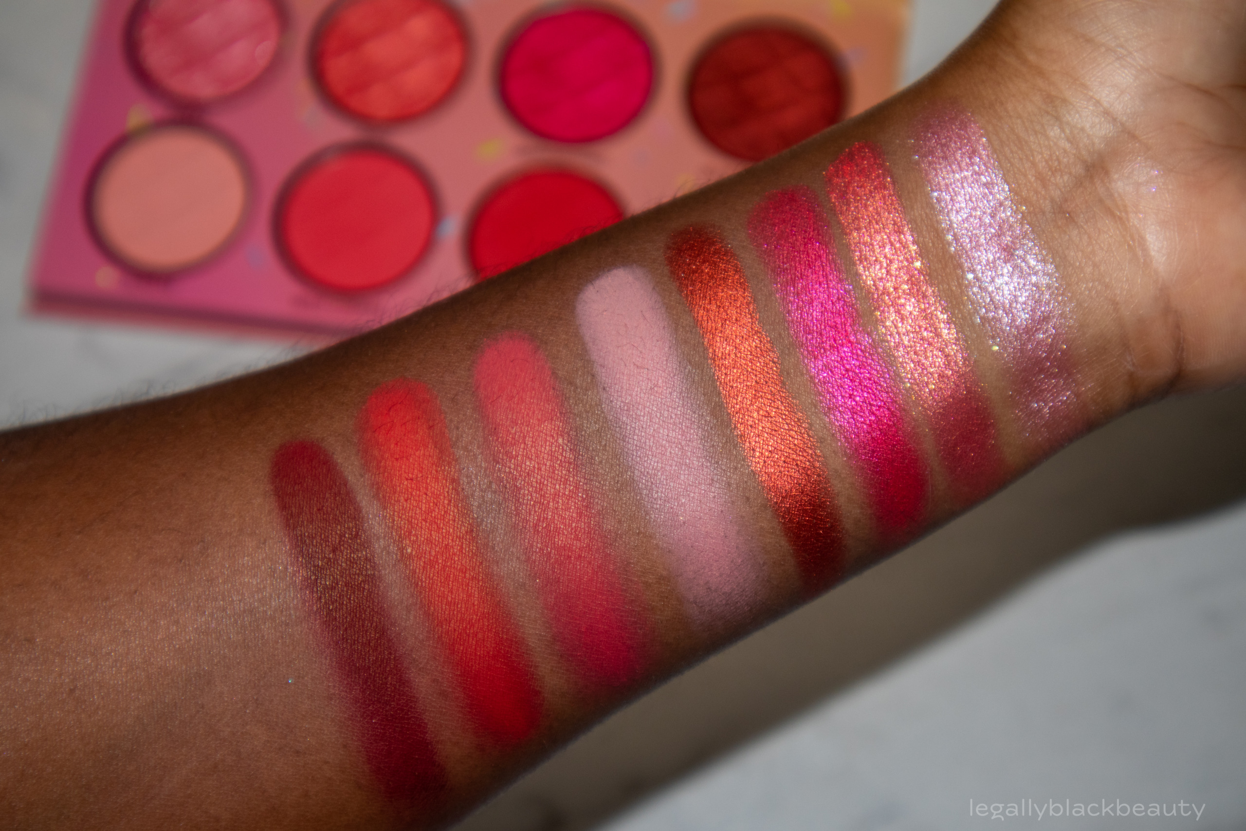
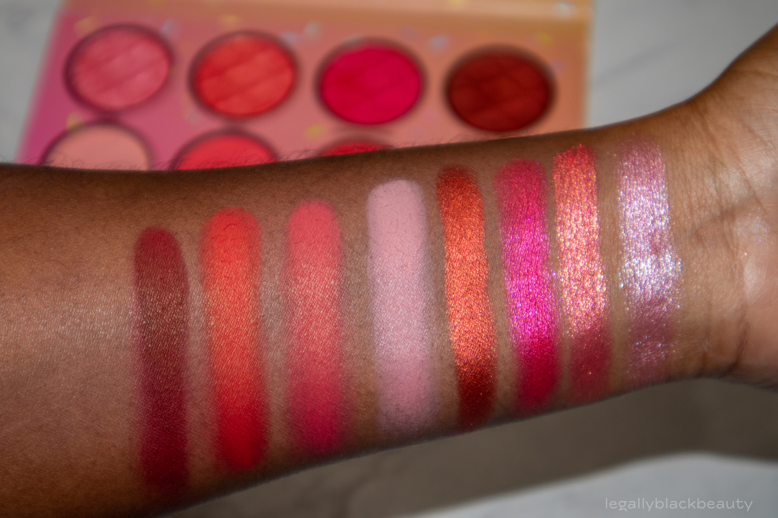
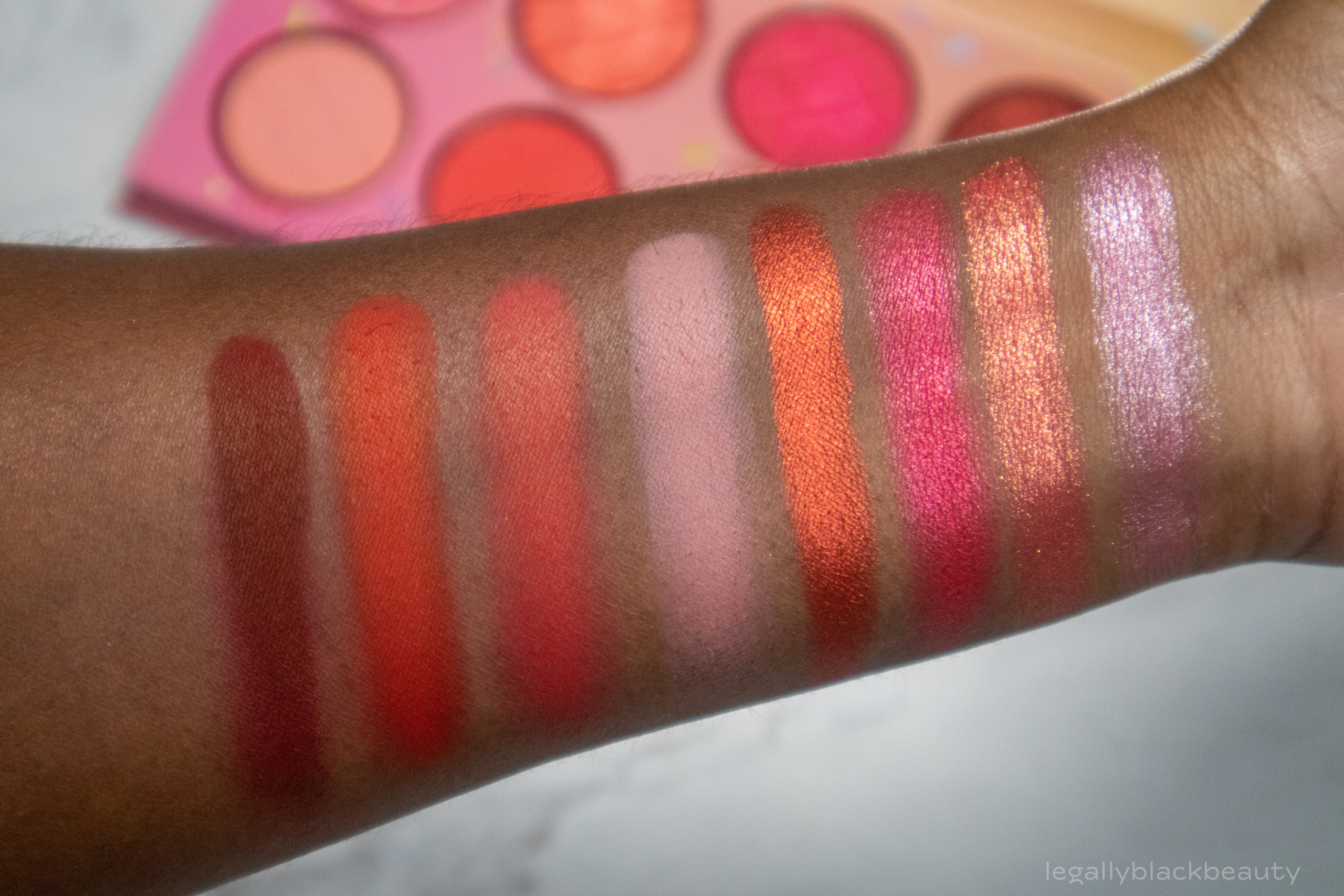
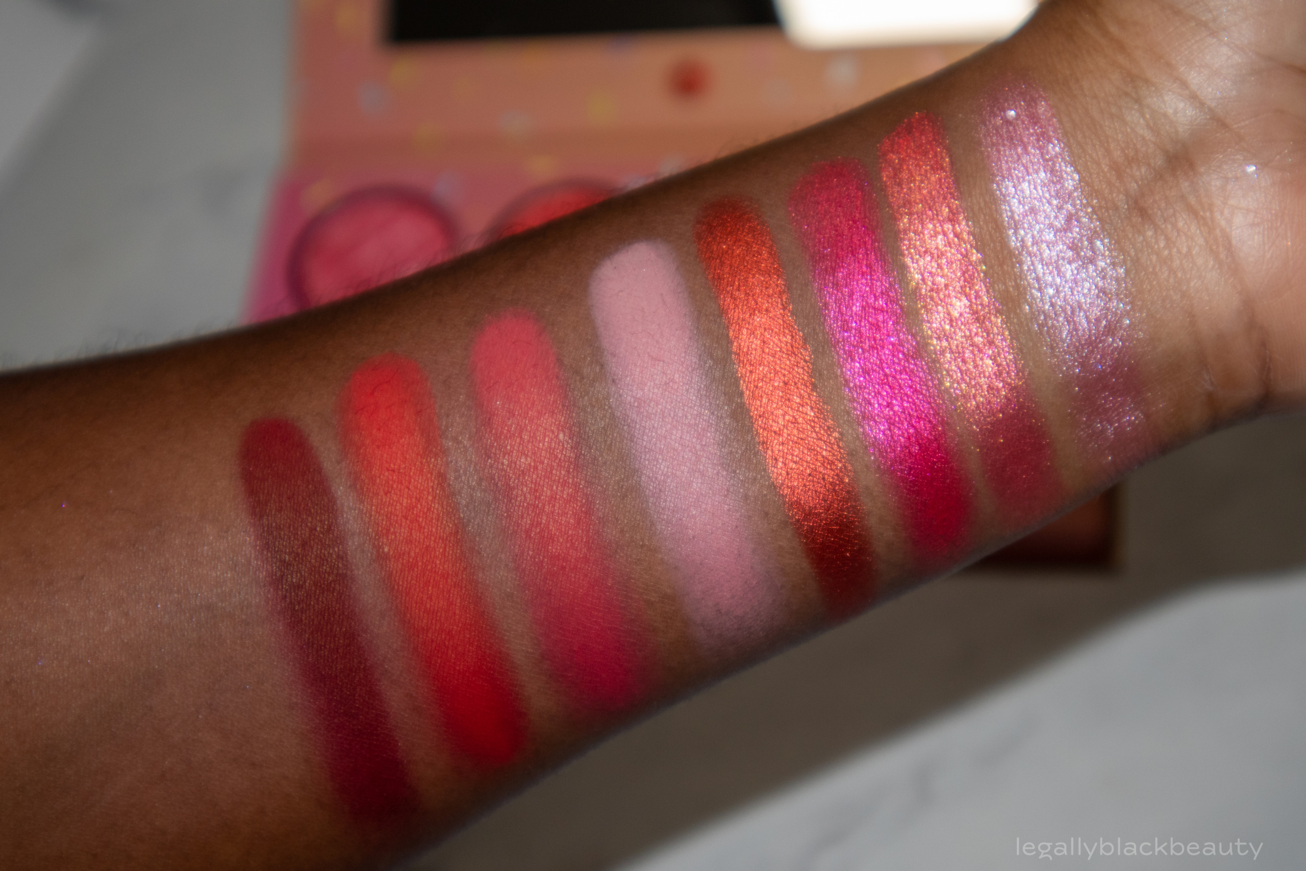
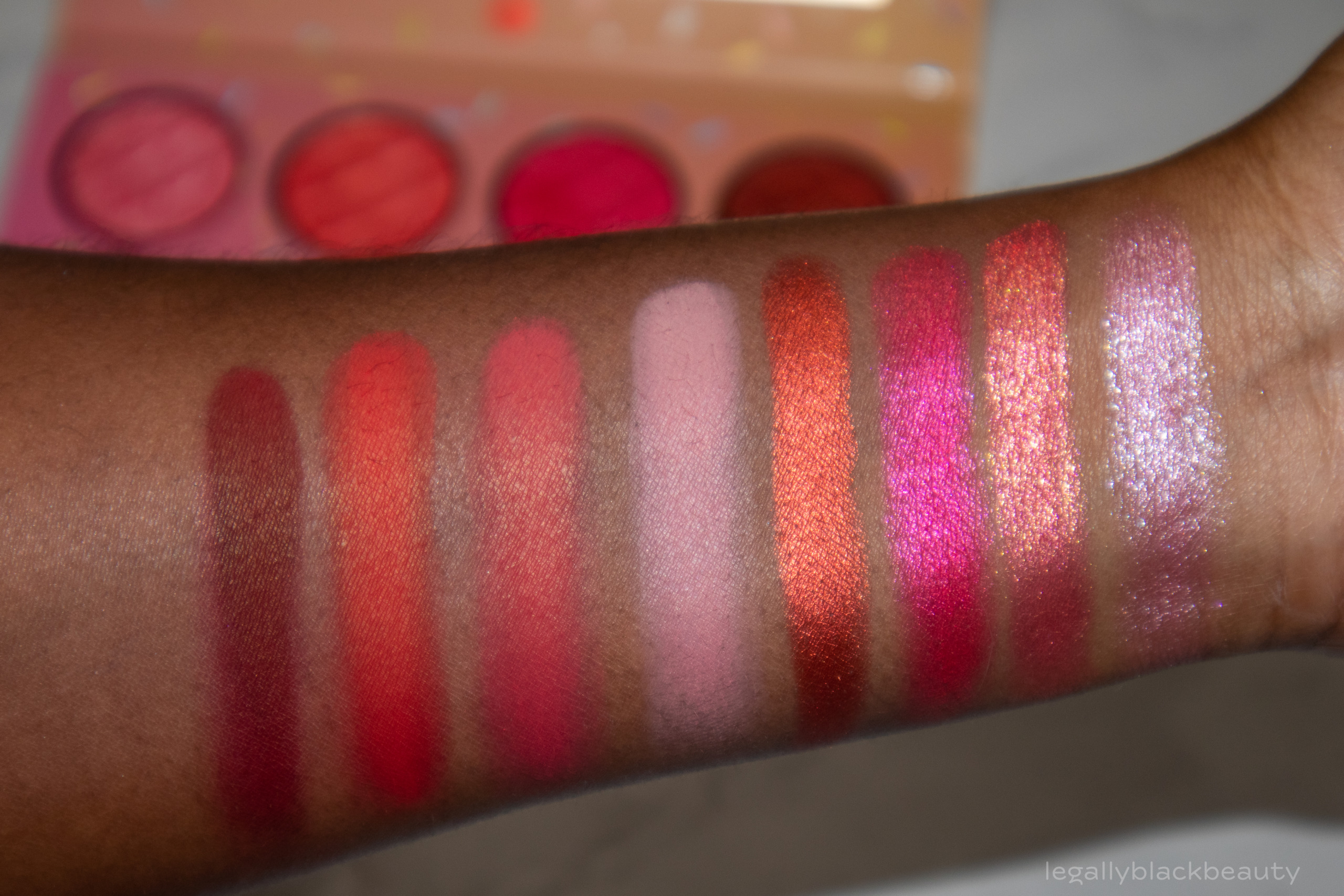
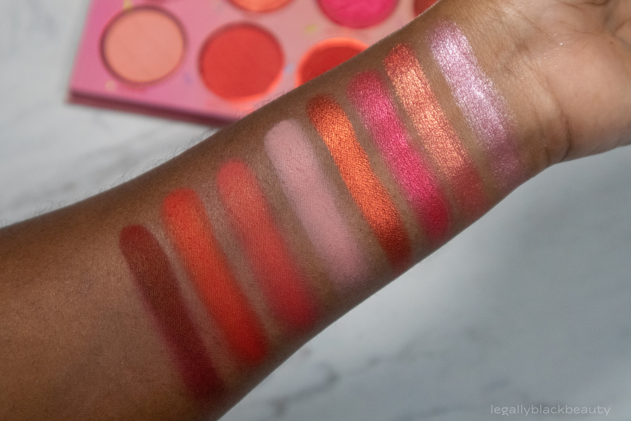
Cherry on Top consists of four shimmers and four mattes in pink and red tones. The shadows are mostly rich and pigmented.
The two lightest colors, Sweet and Sundae, stand out to me among the remaining rich and warmer shades. Each shimmer has a corresponding matte, although the match of Maraschino and Tart isn’t quite as on point as the rest (Maraschino is a pink that leans red, but Tart is more red with orange undertones). I think the variety of undertones (including cool versus warm undertones) and depth here make this an interesting palette full of lots of potential color combinations.
- Sweet: Cool, light pink shimmer
- Juicy: Coral shimmer
- Maraschino: Bright, red-leaning pink shimmer
- Black Cherry: Orange red shimmer
- Sundae: Cool, pale pink matte
- Wild Cherry: Coral matte
- Tart: Orange red matte
- Sprinkles: Burgundy matte

Orange Sorbet
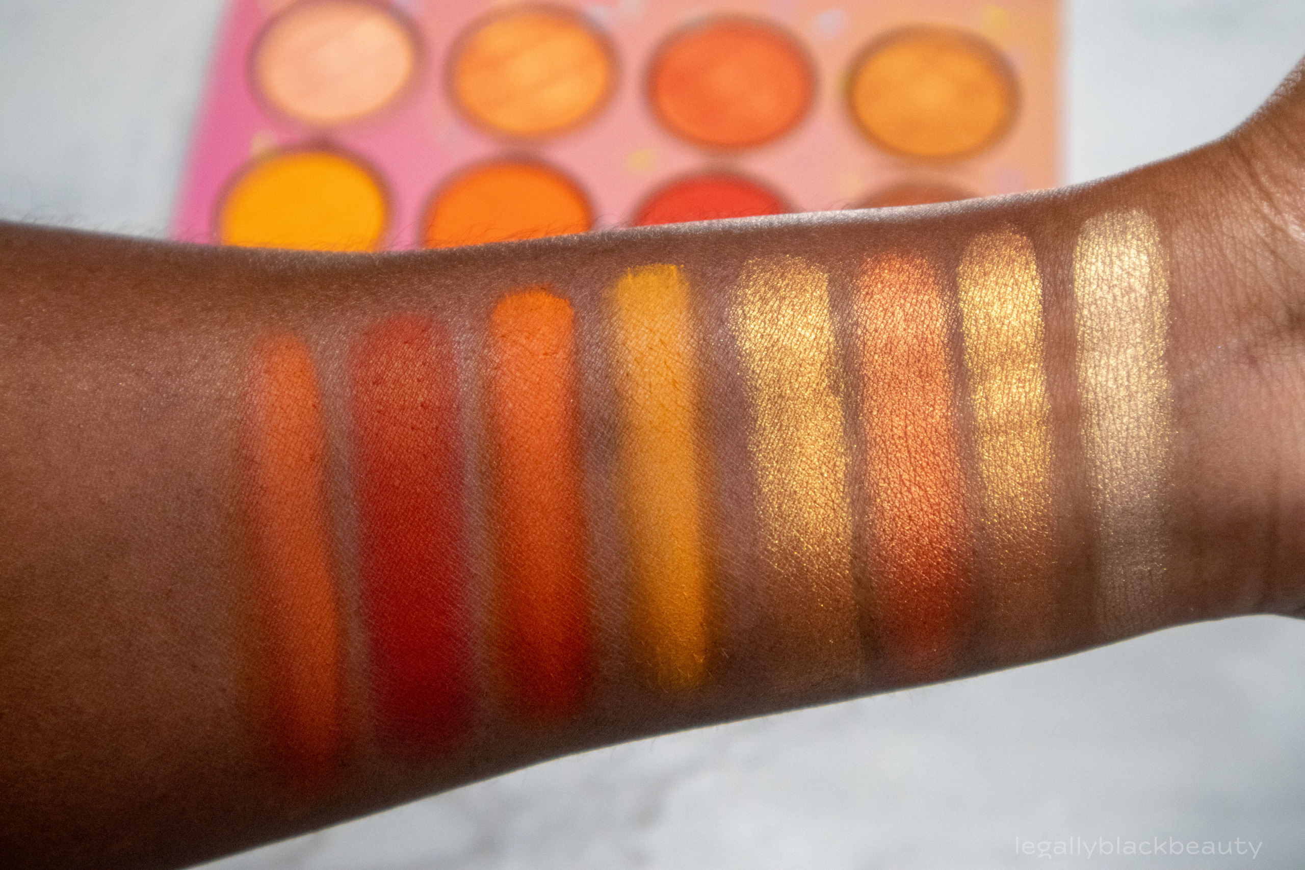
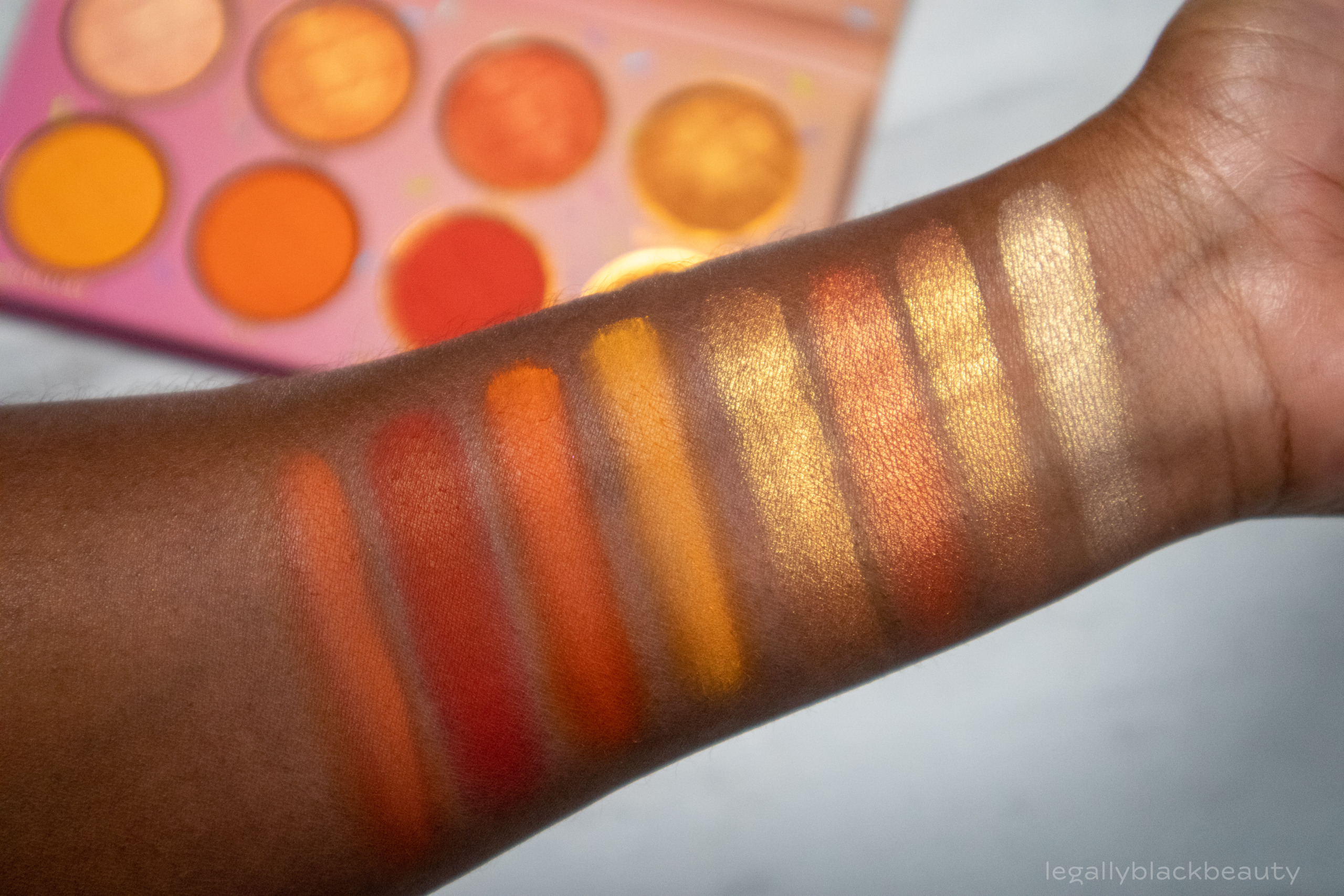
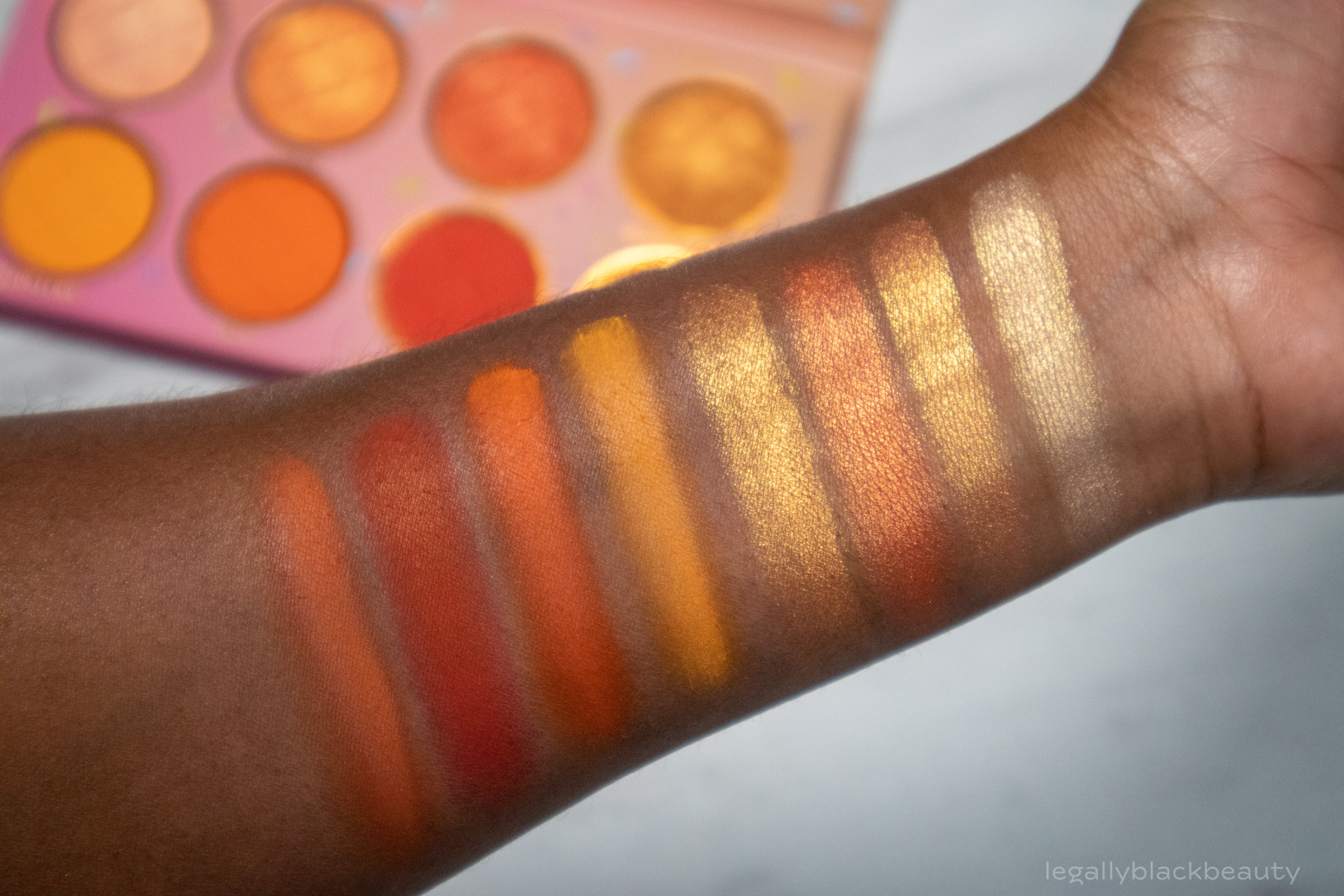
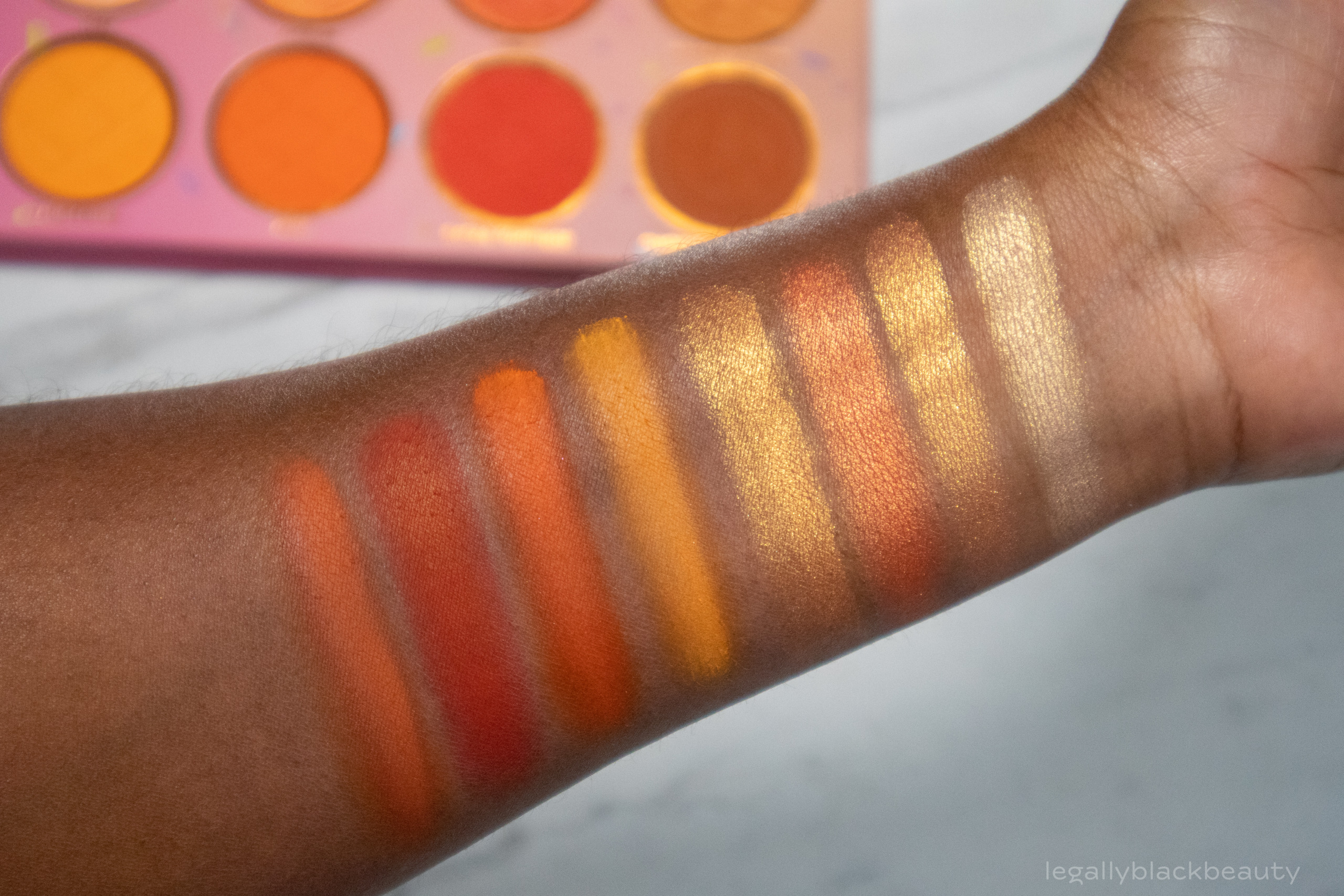
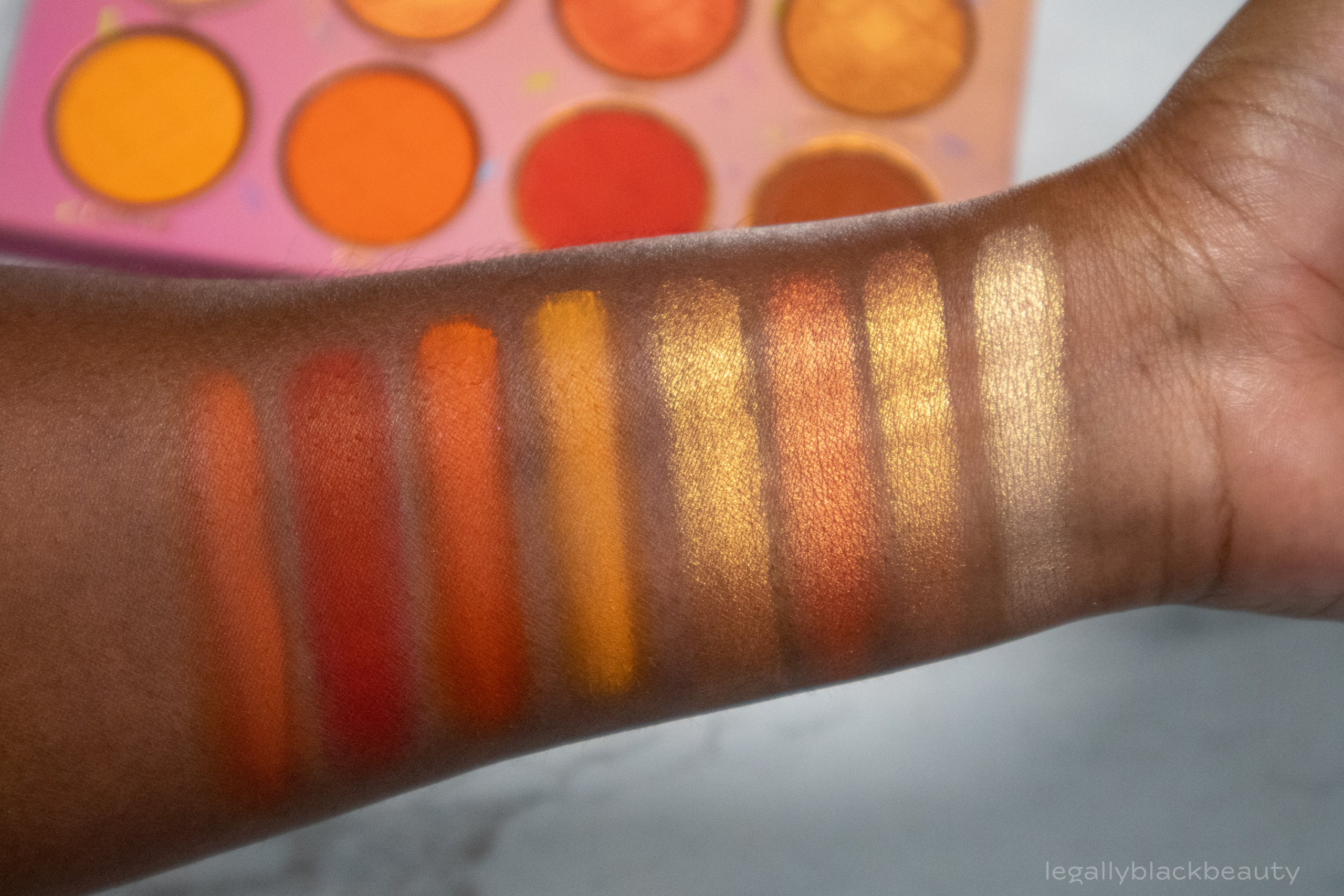
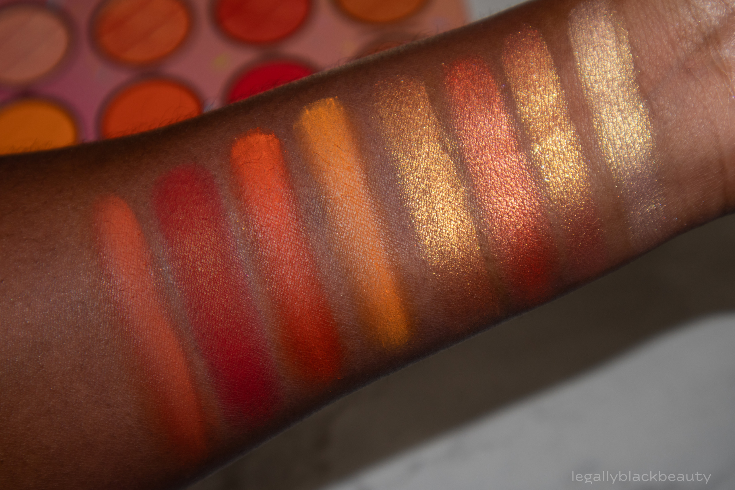
Orange Sorbet consists of four light to medium peach and gold shimmers and four orange mattes. The shadows are soft and pigmented.
I have seen the shimmers appear more duochromatic on light skin. On my skin, the duochrome effect isn’t very noticeable–most likely because the bases of the shadows blend into my brown skin. In person, Citron has the most noticeable duochrome. Chocolate Drizzle is a beautiful orange matte. With its name and how it looks in the pan, I expected it to be more brown though.
- Yum: Light peach and gold shimmer
- Citron: Peach shimmer with gold sparkles
- Tangy: Peach shimmer
- Double Scoop: Medium gold and peach shimmer
- Tangerine: Yellow orange matte
- Zest: Bright orange matte
- Extra Toppings: Red orange matte
- Chocolate Drizzle: Medium orange mate
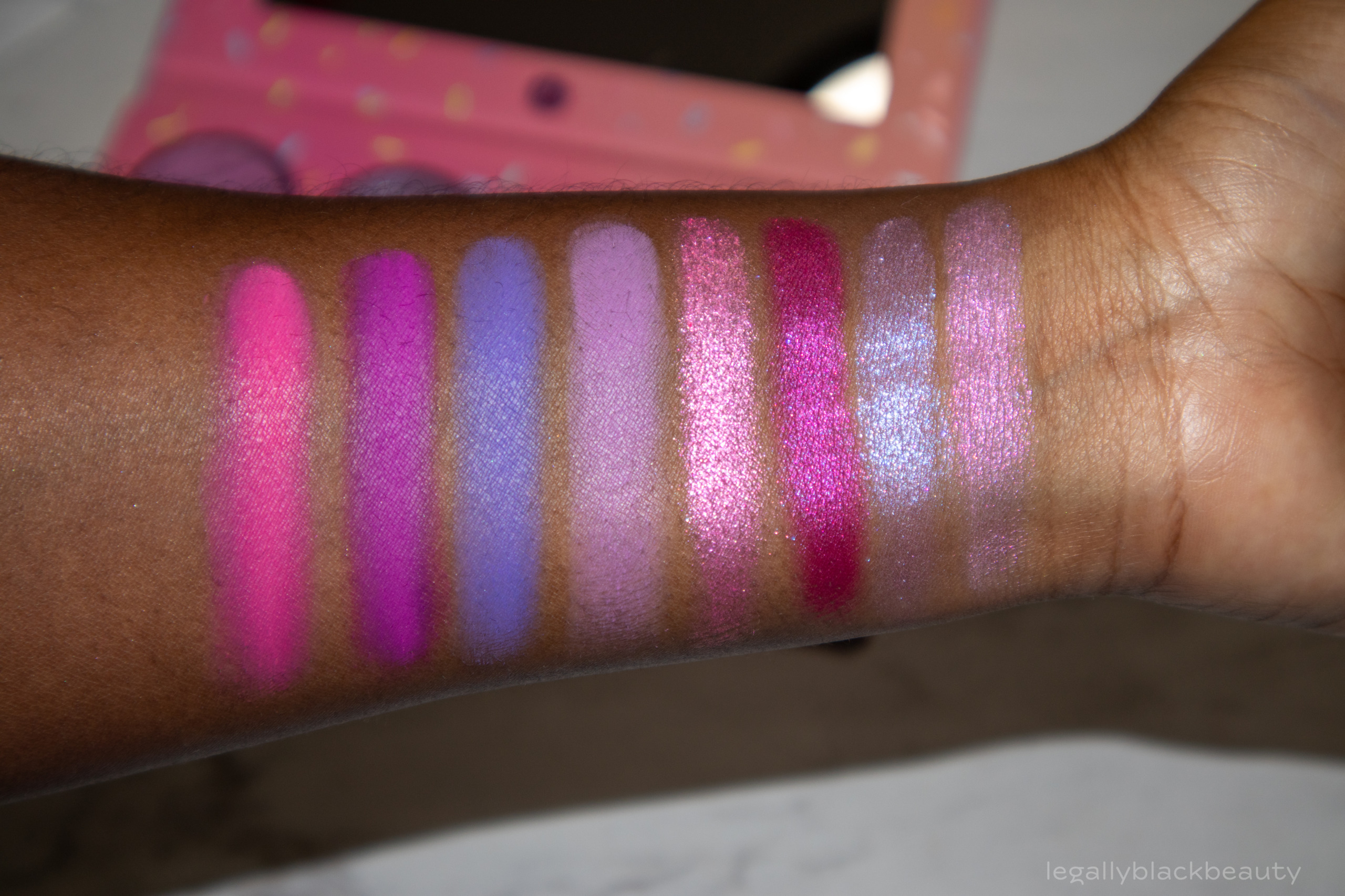
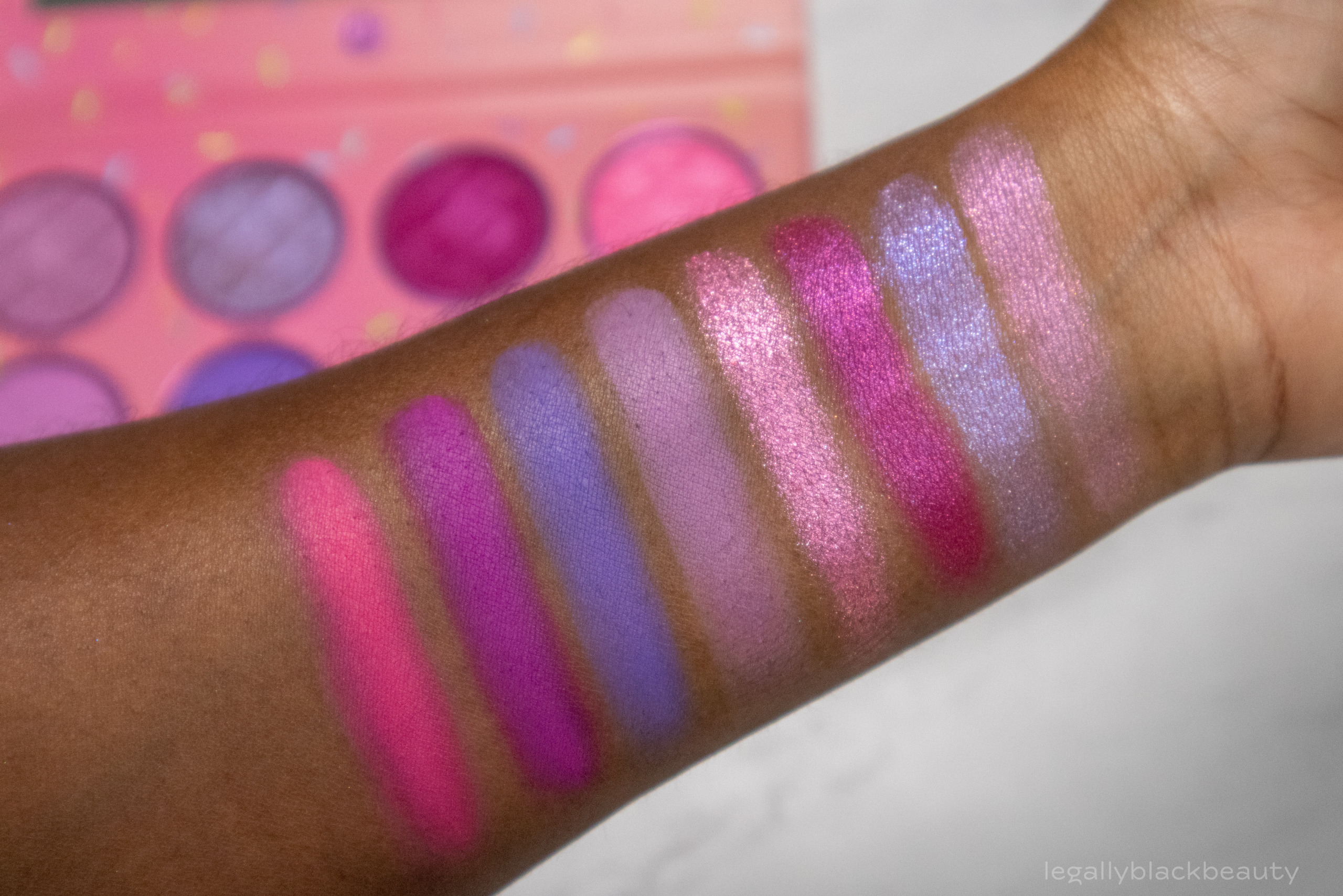
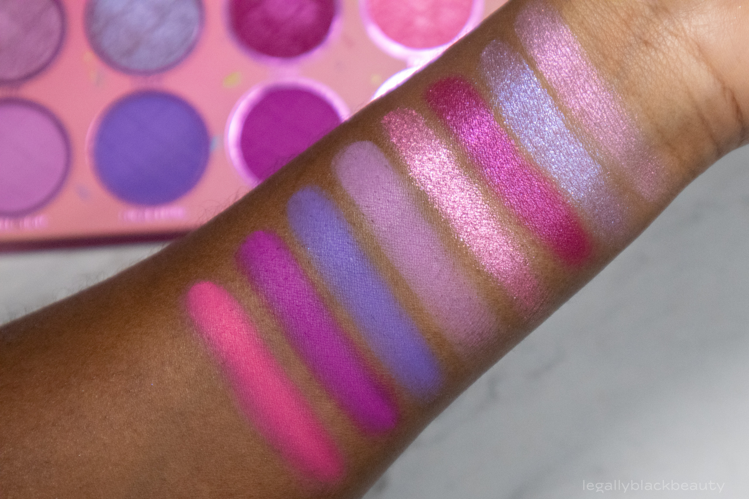
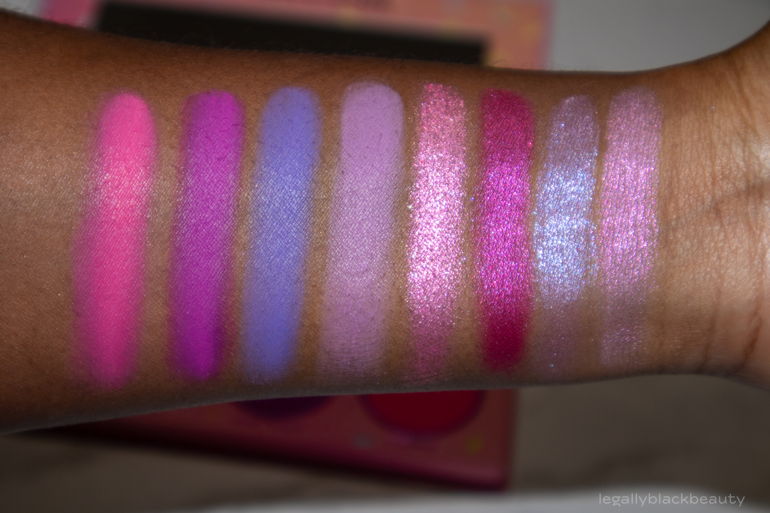
Cotton Candy
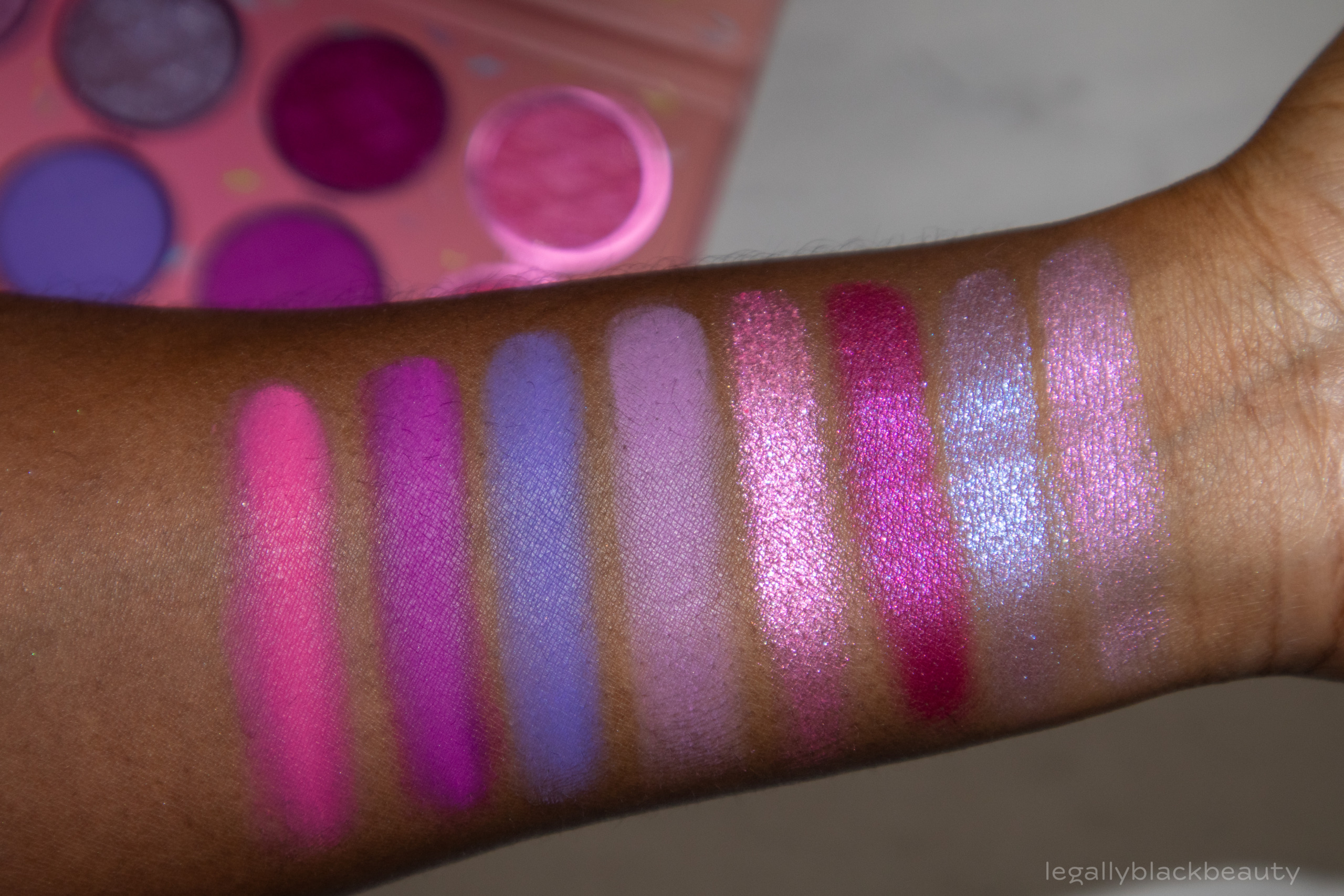
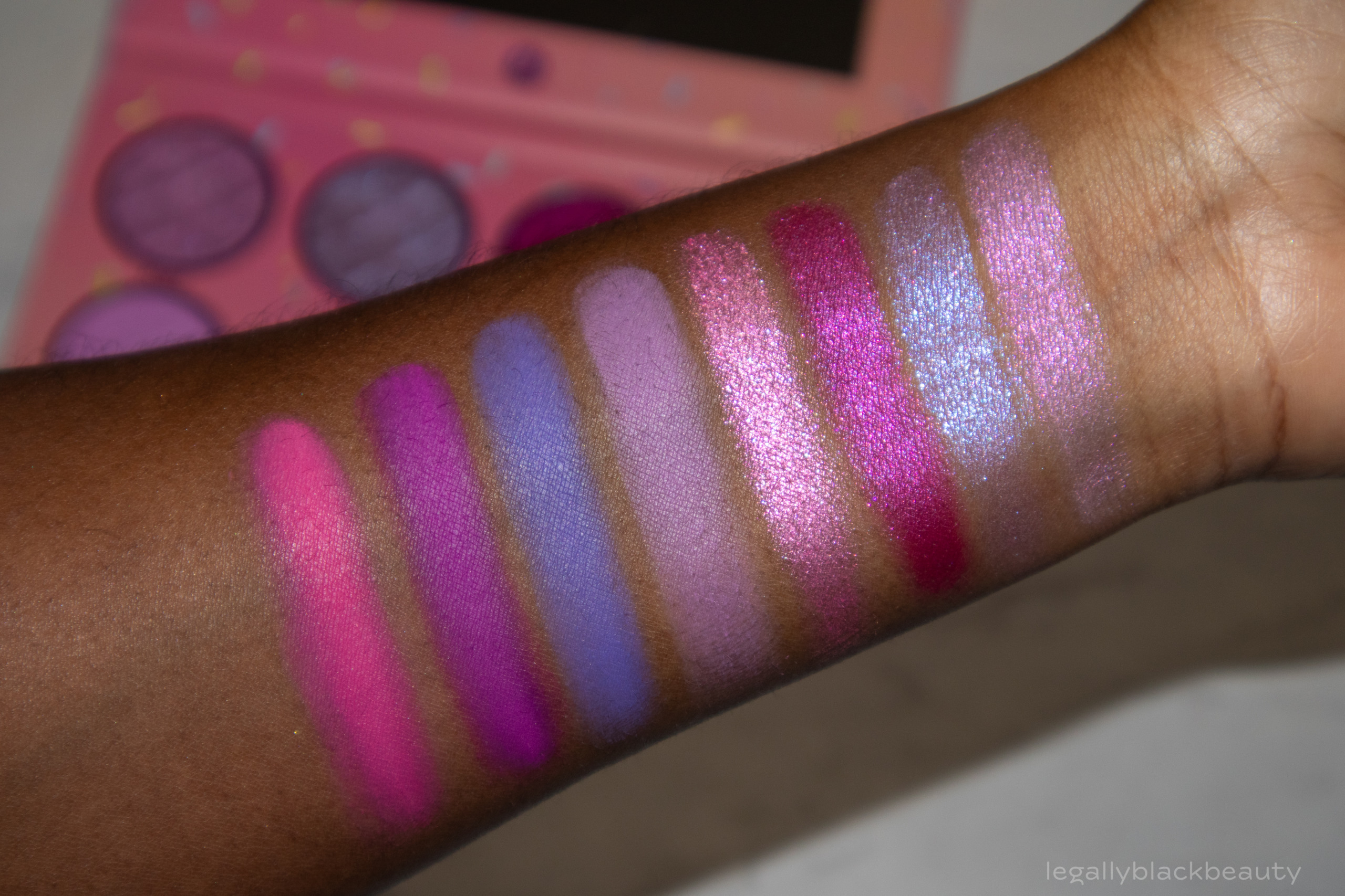
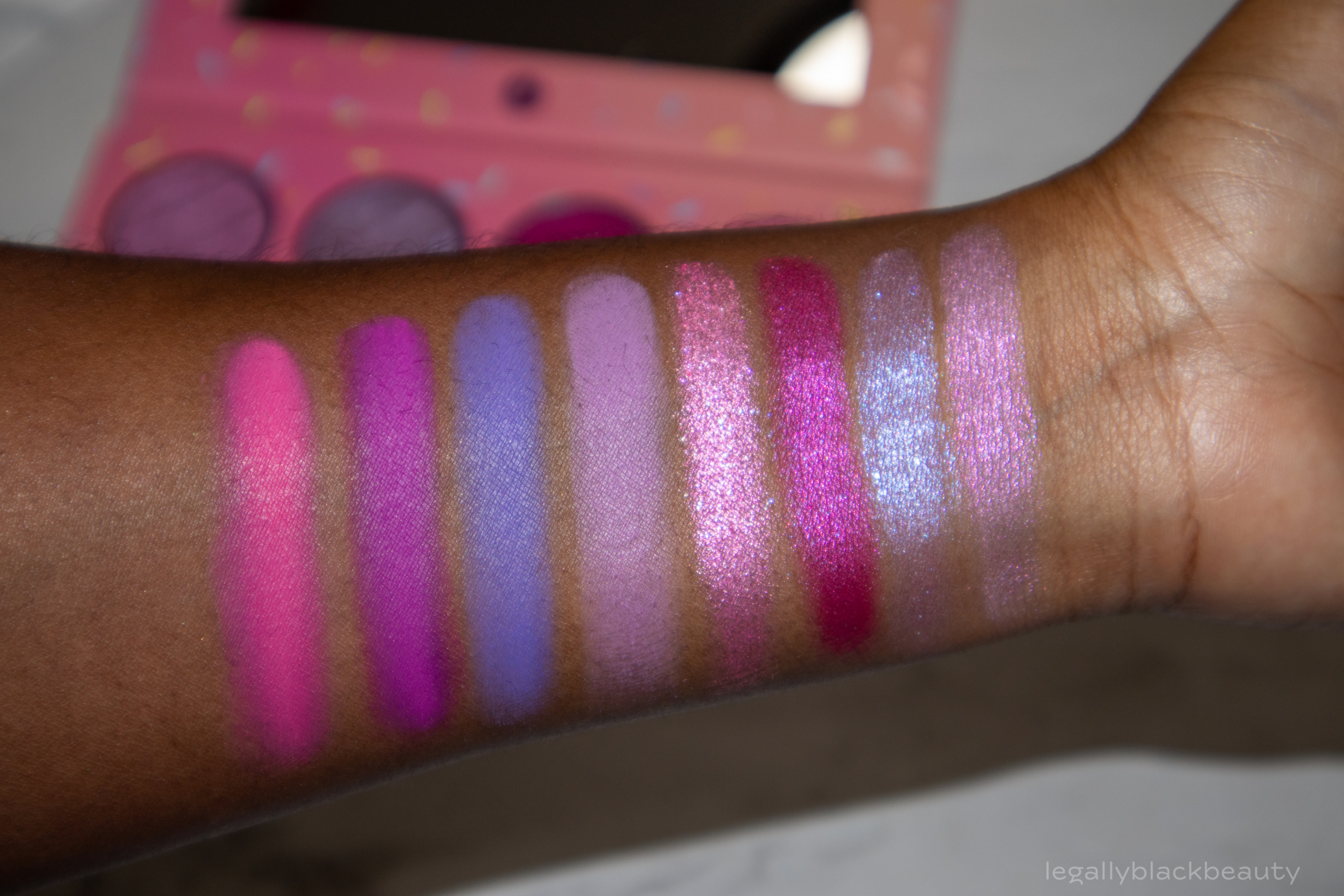
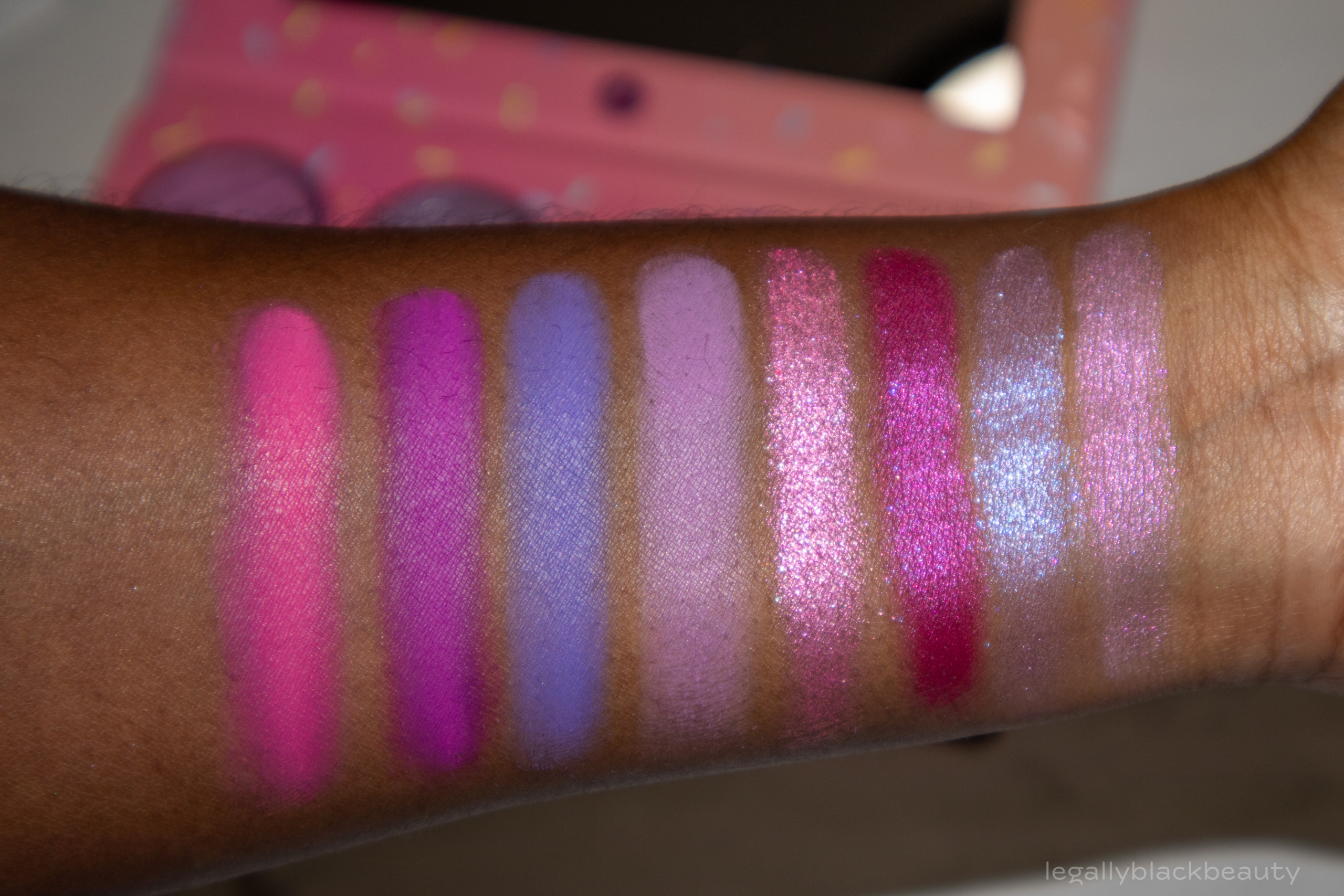
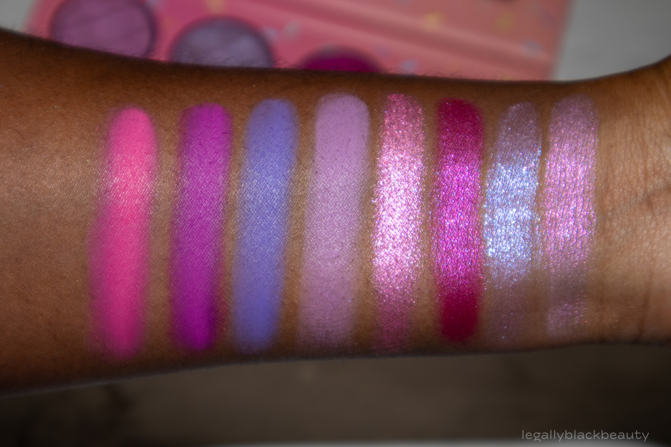
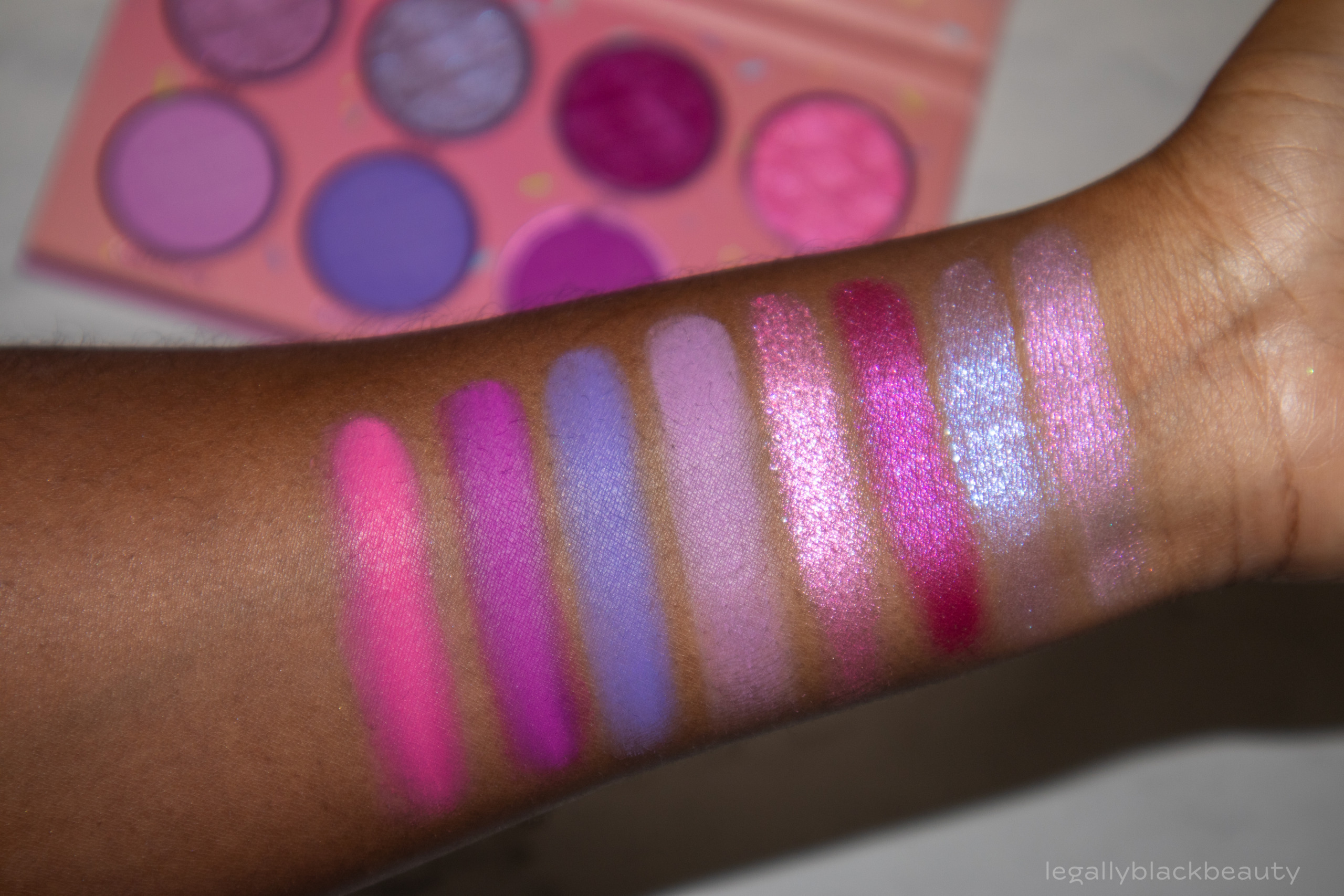
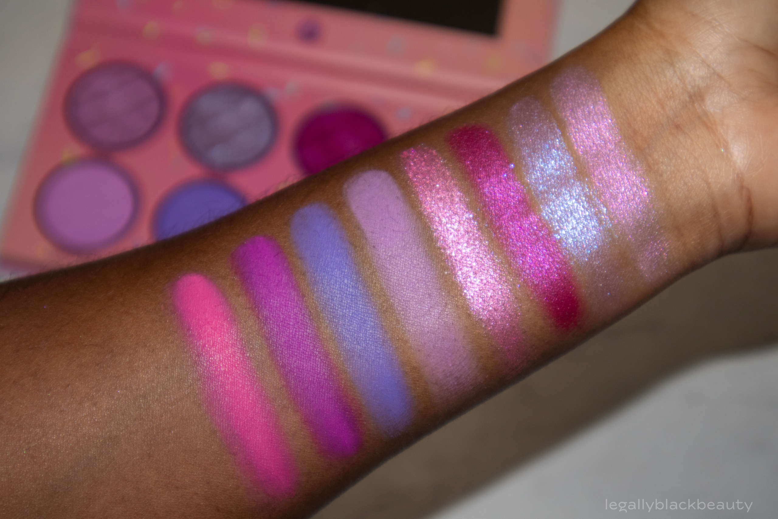
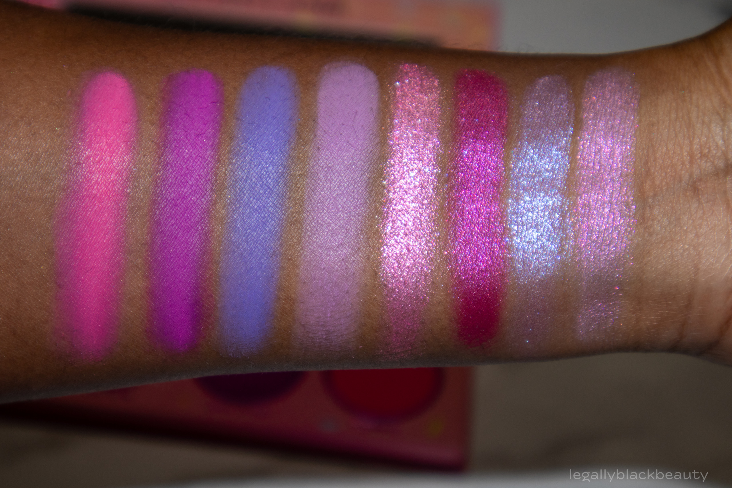
Cotton Candy consists of four shimmers and four mattes, including shades of fuchsia, lavender, and grape. Fluff and Sugar might qualify as duochromes, but the primary color of each (lavender and blue, respectively) are strong.
This palette is one of my favorites of the collection and the one I find the most interesting. The palettes is evenly split in terms of undertone, with the coolest shadows on the left side and the warmer (but still rather cool-toned) purples and pinks on the right side. I think there are tons of cool (hehe) looks to be made with this palette.
- Fluff: Cool lavender shimmer with hints of blue
- Sugar: Light blue and purple shimmer
- Swirl: Fuchsia shimmer
- Twirl: Medium pink shimmer
- Confection: Lavender matte
- Sugar Plum: Cool, purple-leaning blue matte
- Light ‘N Airy: Grape matte
- Carnival: Medium pink matte

Bubble Gum
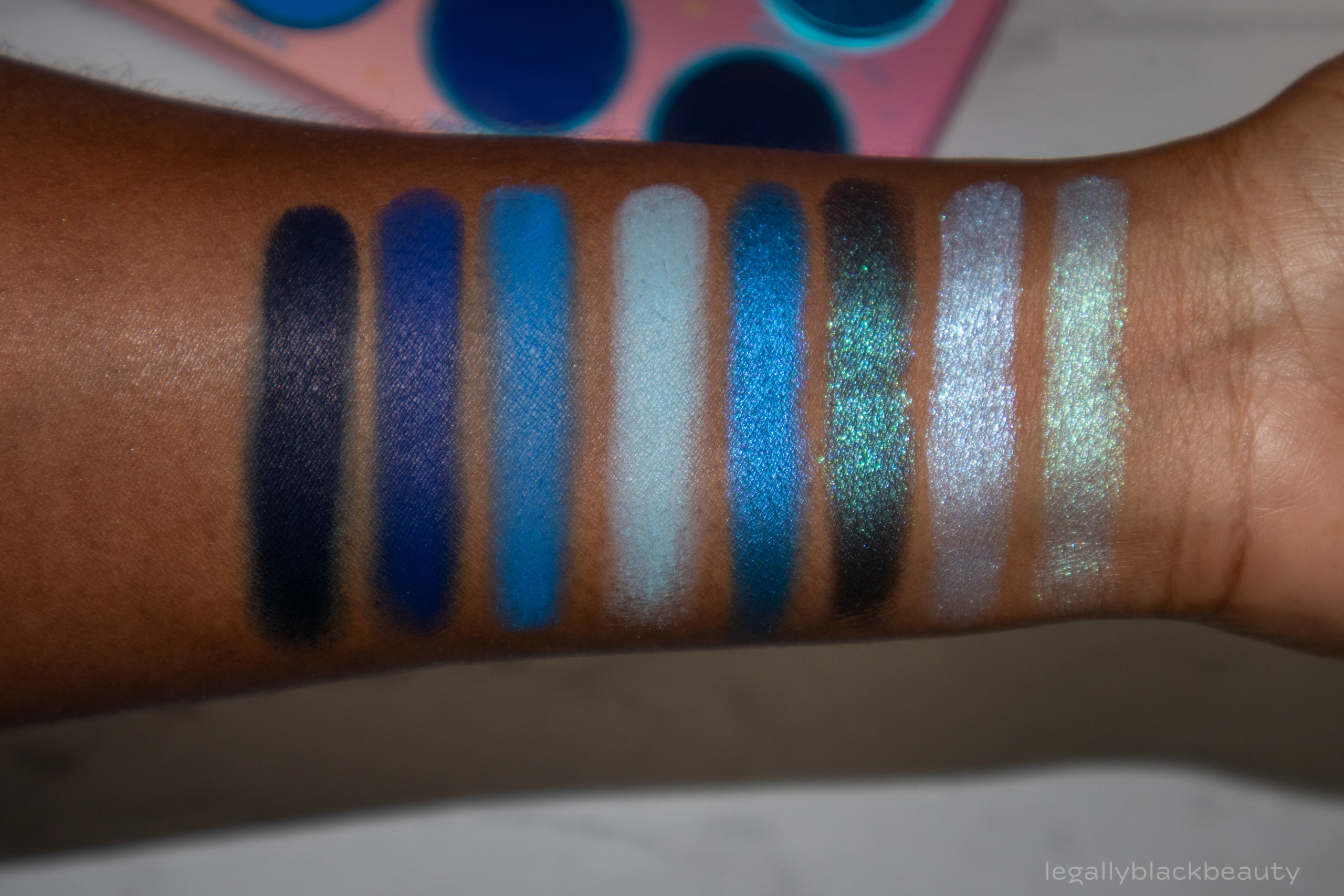
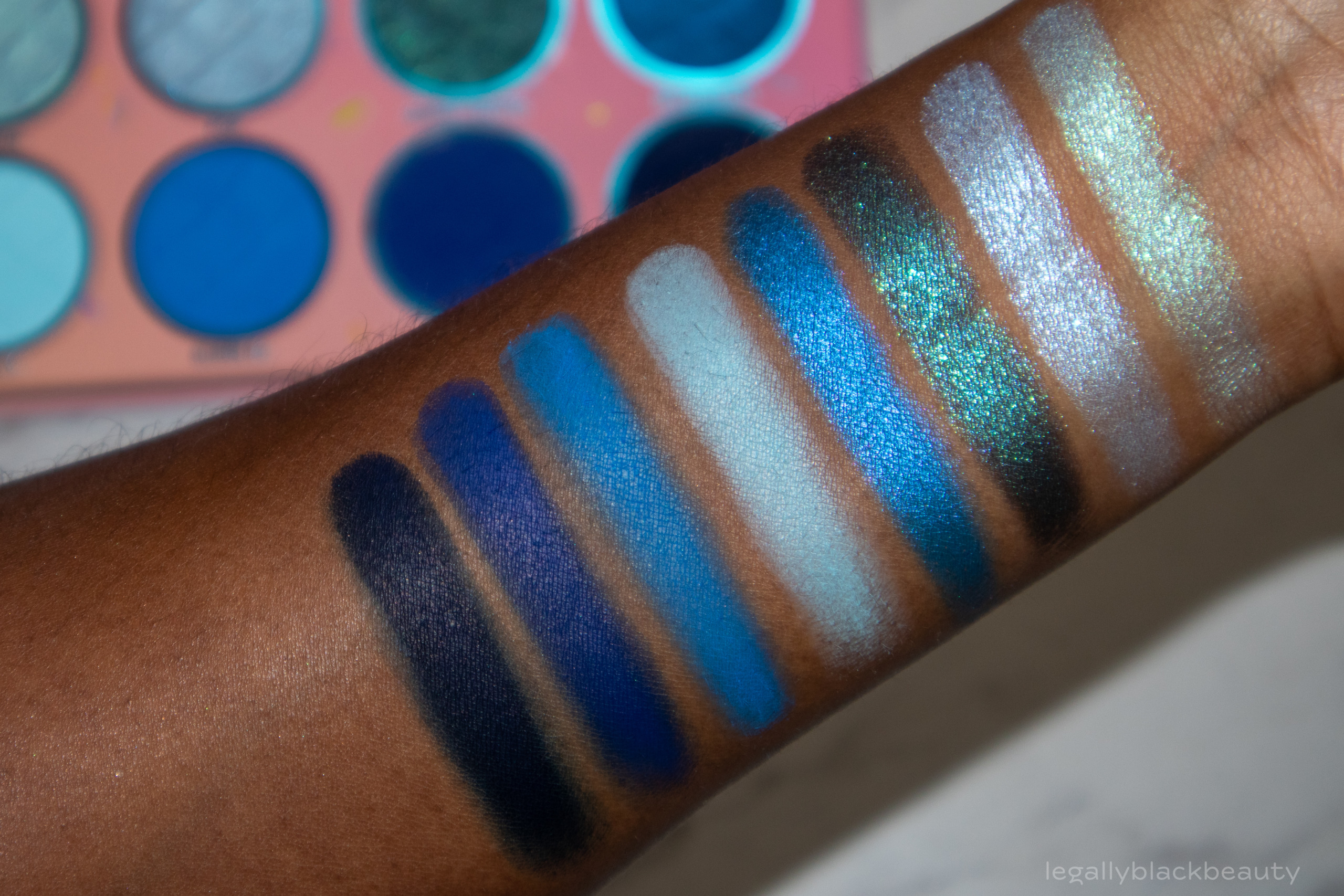
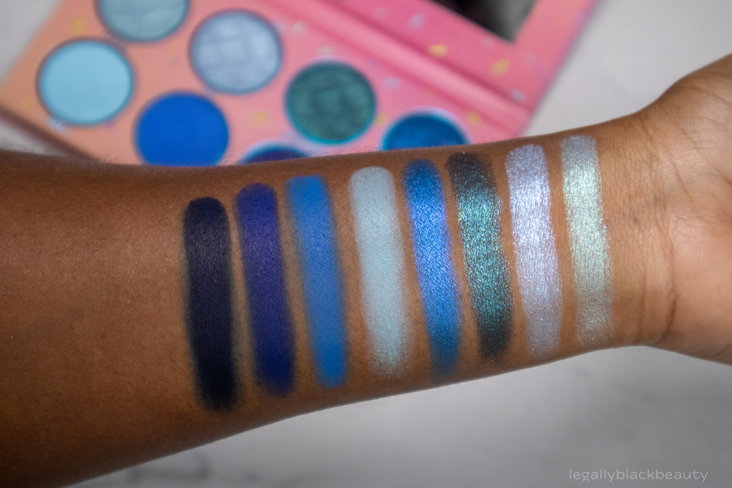
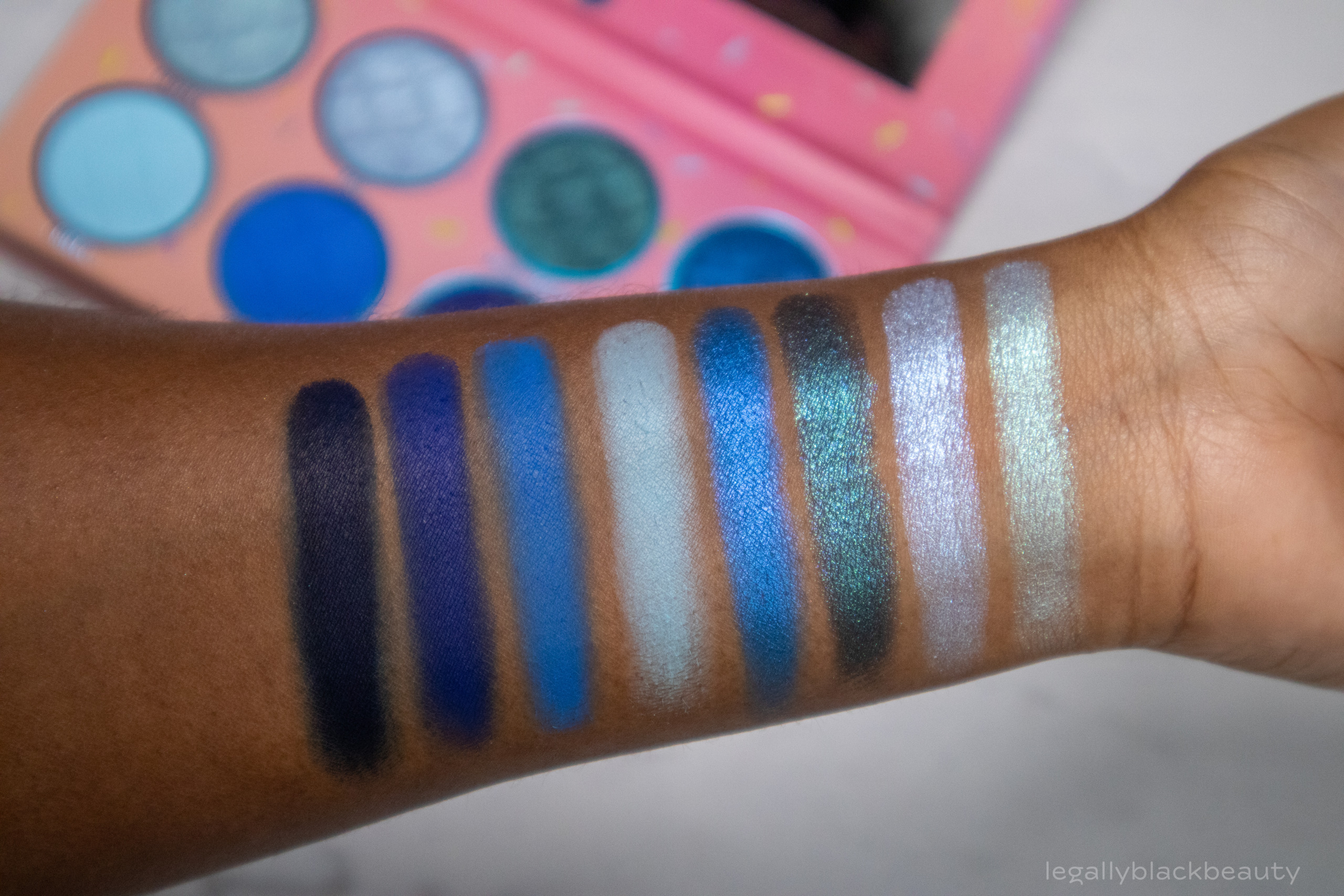
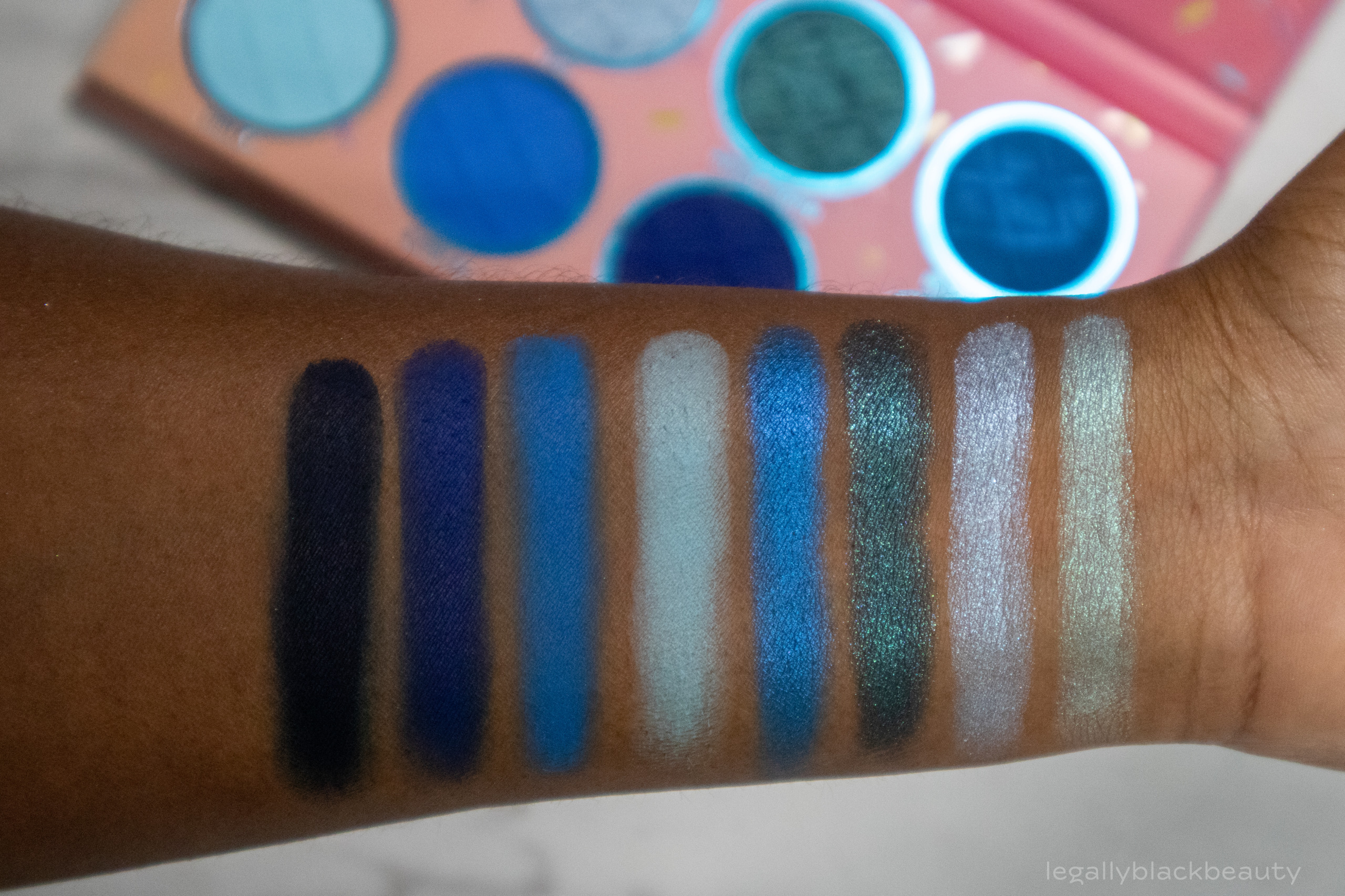
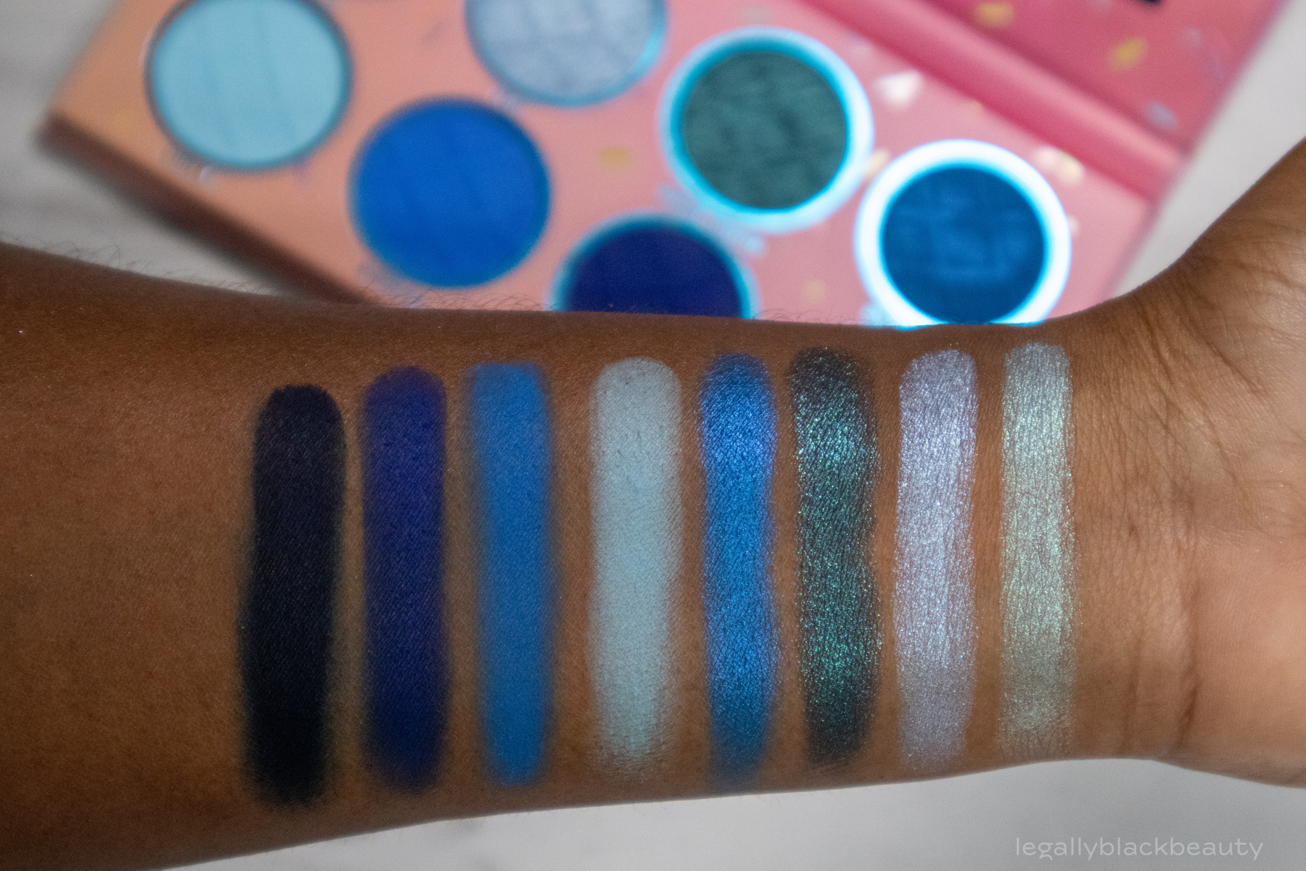
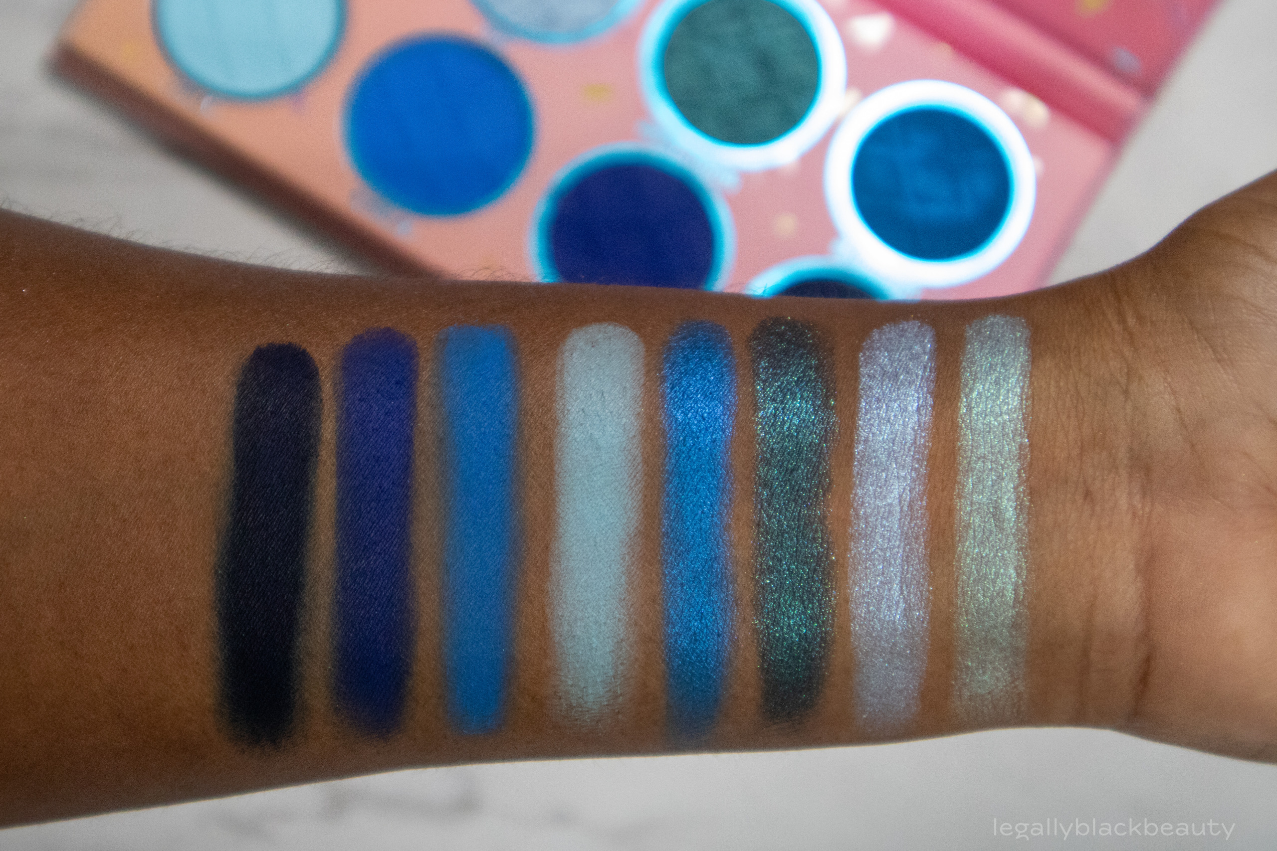
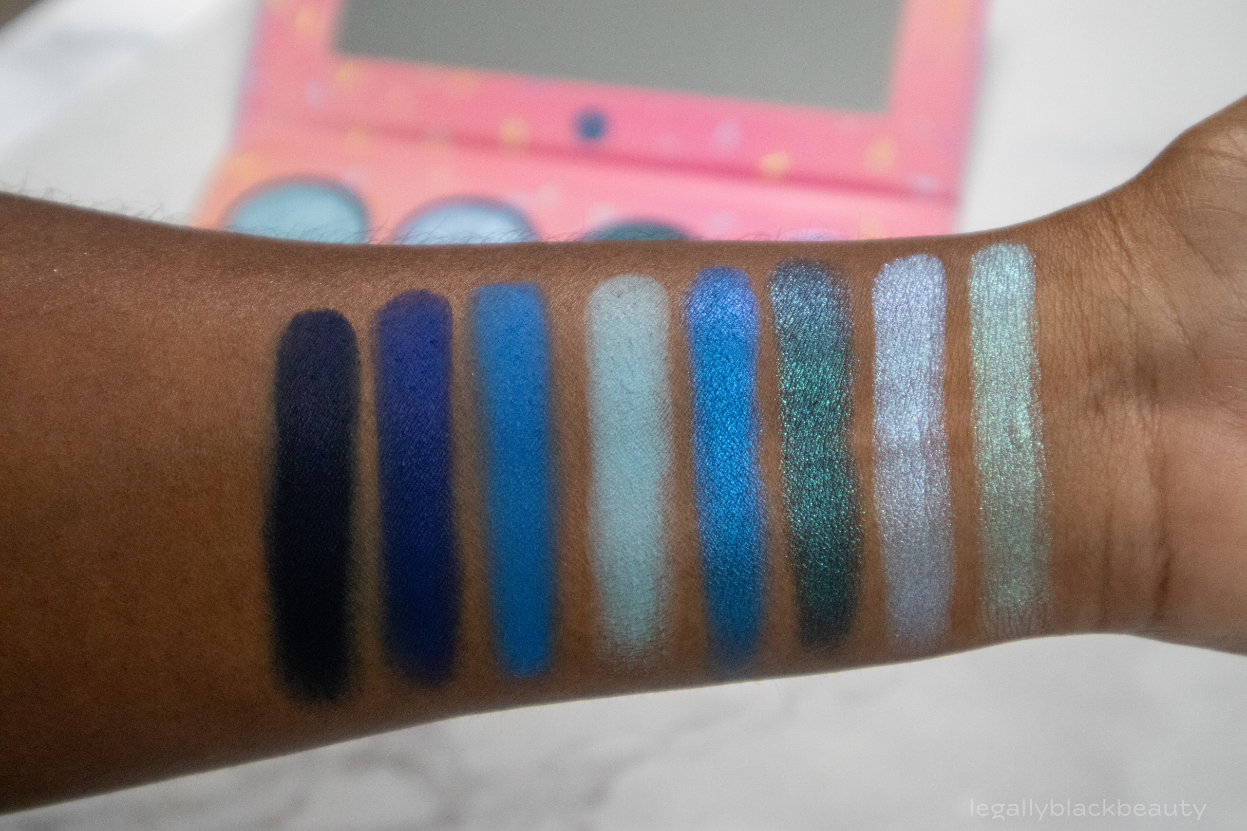
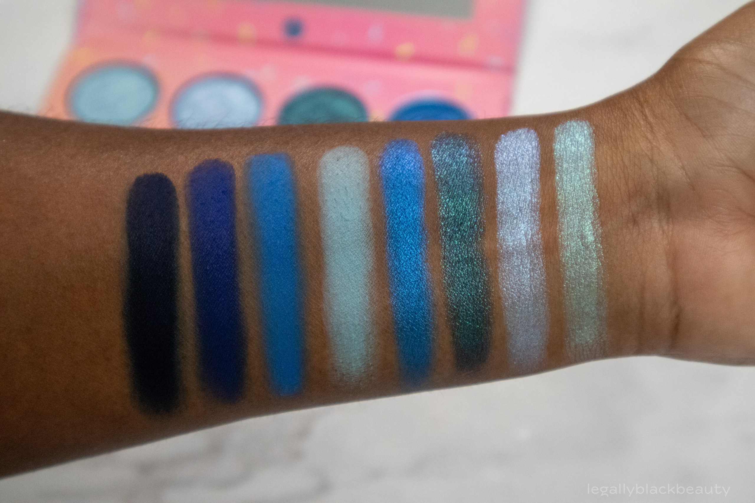
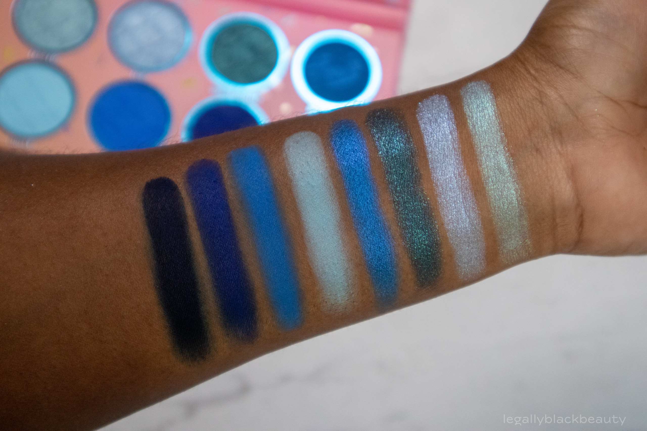
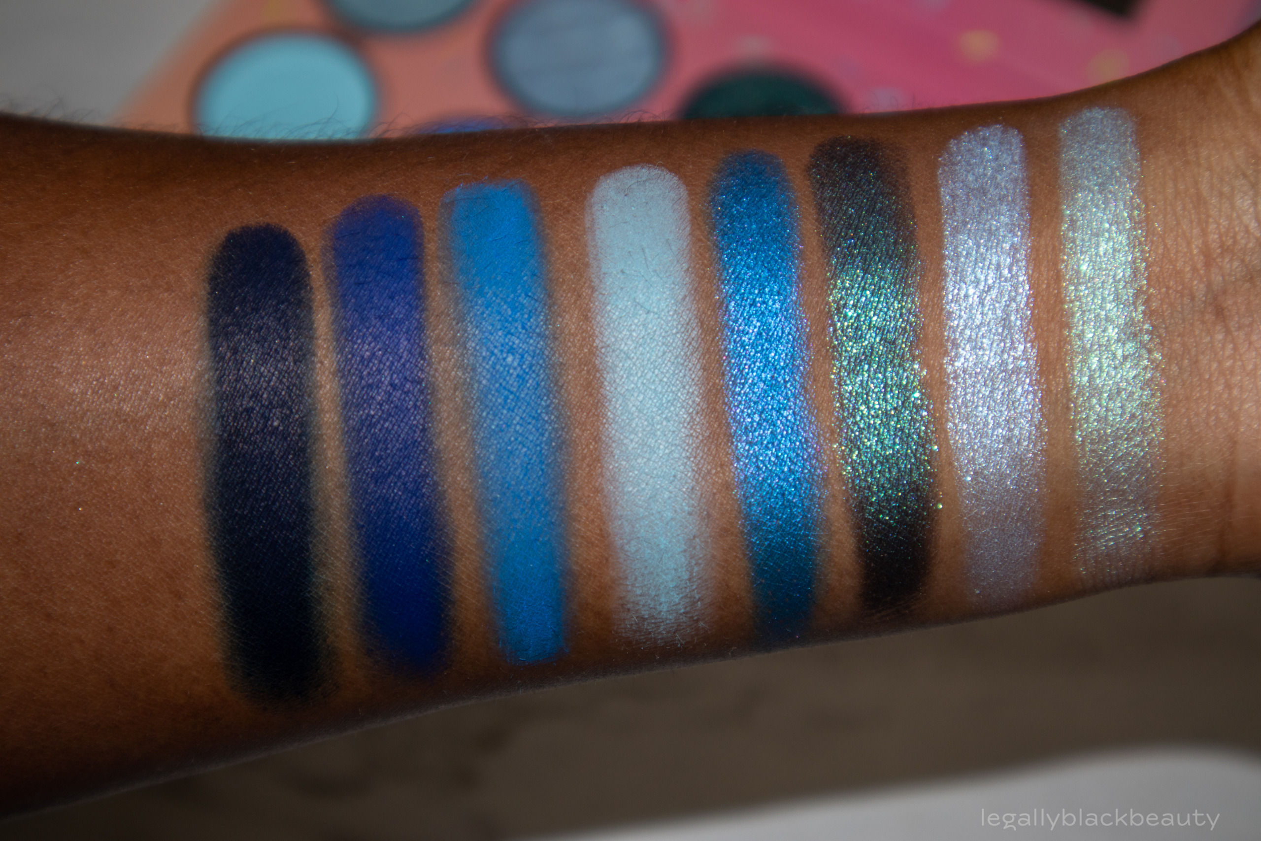
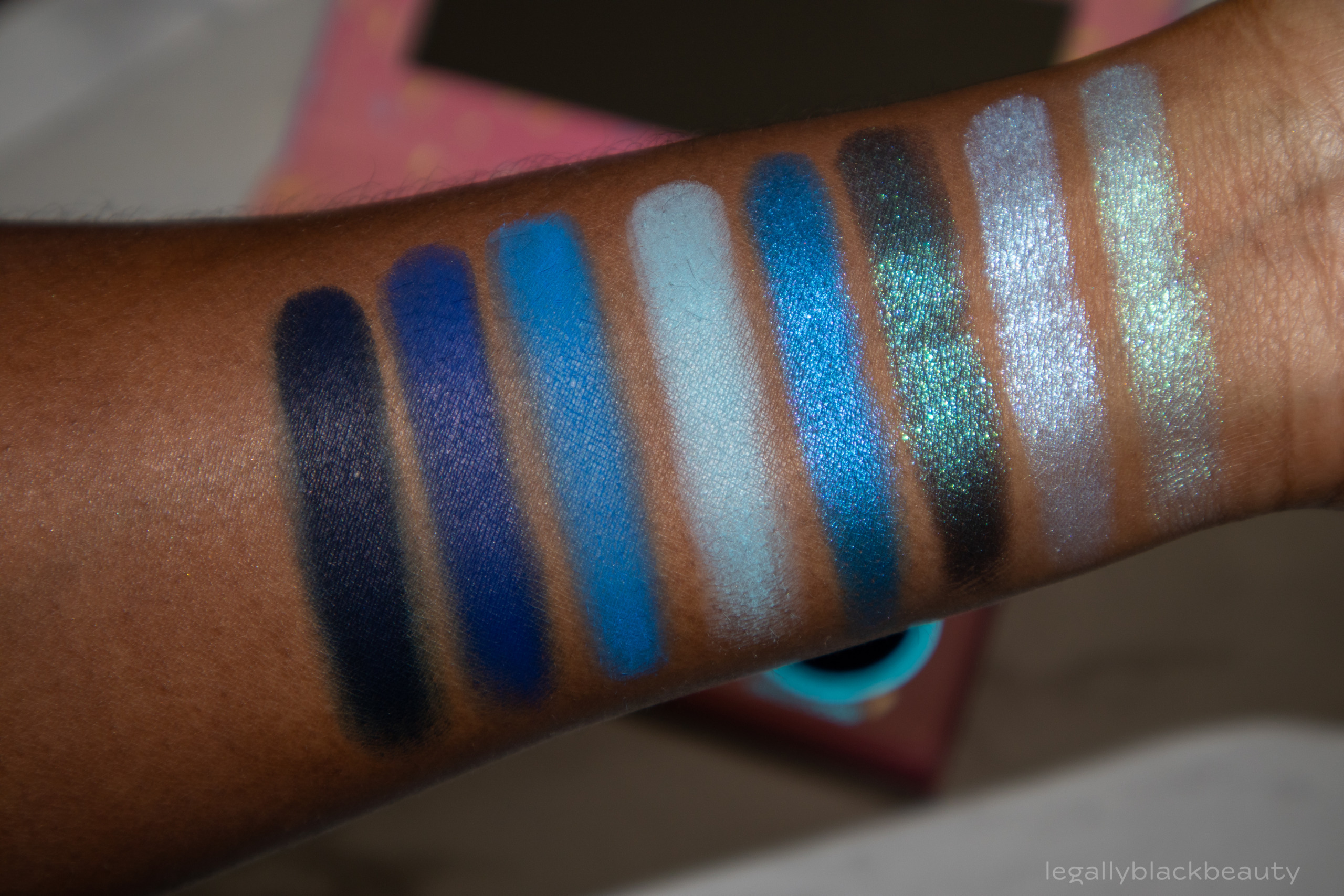
Bubble Gum consists of four blue shimmers and four blue mattes, ranging from light to extremely dark and rich.
All I can say about this palette is “Wow!” This is one of the best monochromatic blue palettes I’ve seen in a while. The mattes gradually deepen as you move along the bottom row of the palette, but the shimmers add a lot of versatility since they all differ in undertone and hue. I appreciate how deep BH Cosmetics went with Sweet Tooth and Single Scoop. This is not a palette for those wary of depth!
- Frozen: Cool teal and blue shimmer
- Pop: Icy blue shimmer
- Sweet Tooth: Deep blue and turquoise shimmer
- Blueberry: Azure blue shimmer
- Chilly: Pale azure blue
- Bubbles: Azure blue matte
- Sweetened: Cobalt blue matte
- Single Scoop: Blackened navy blue

Pistachio
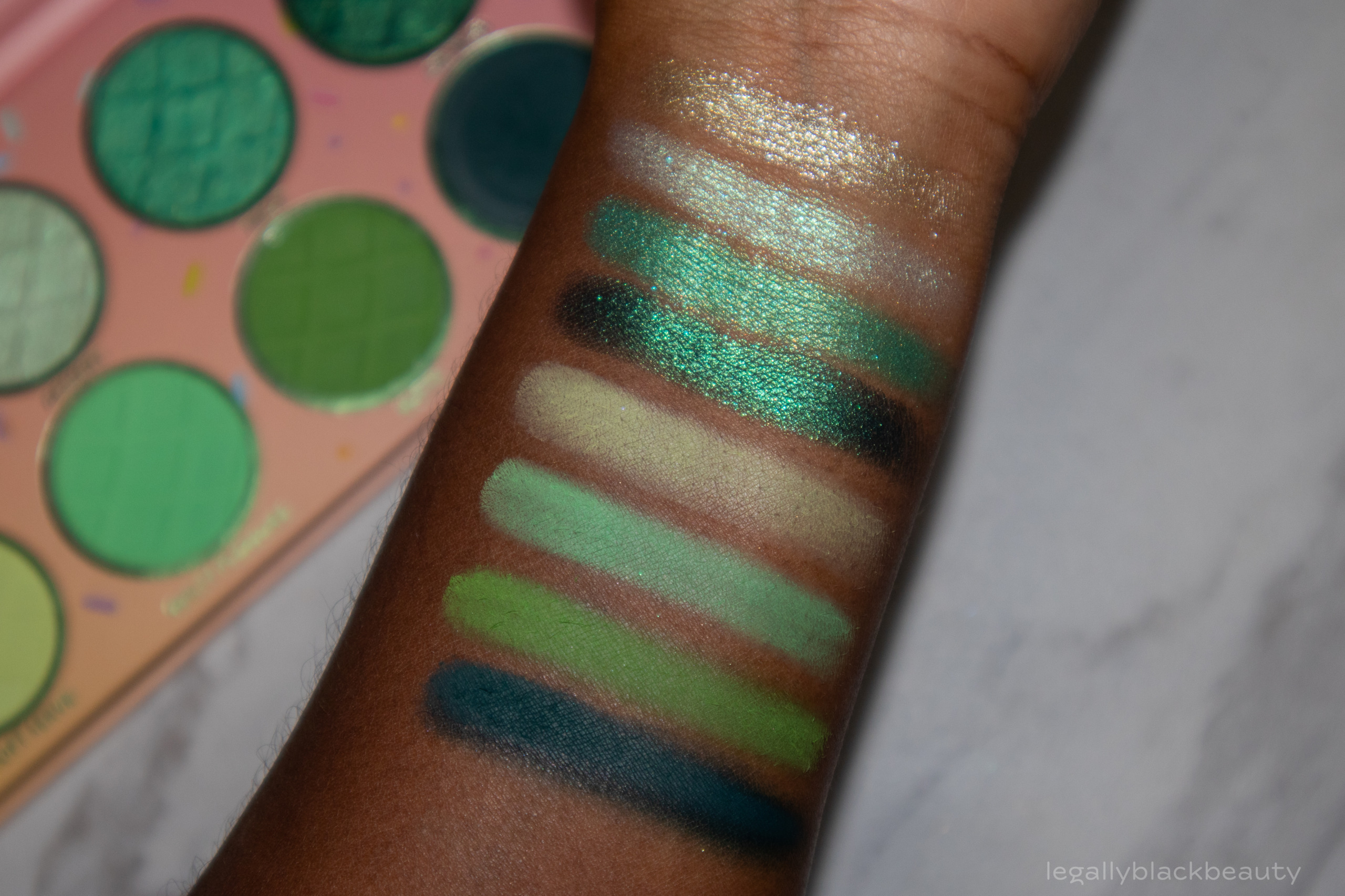
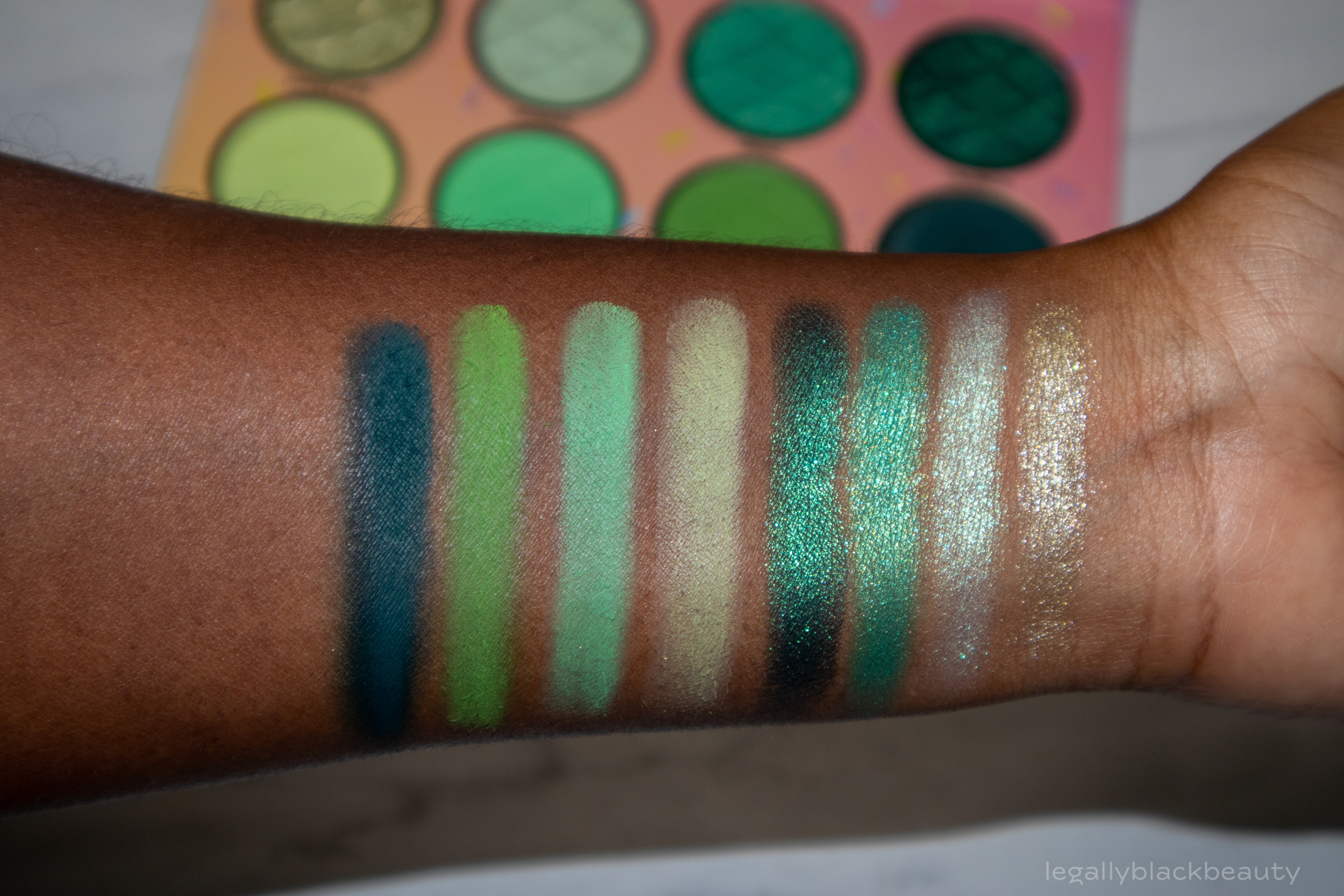
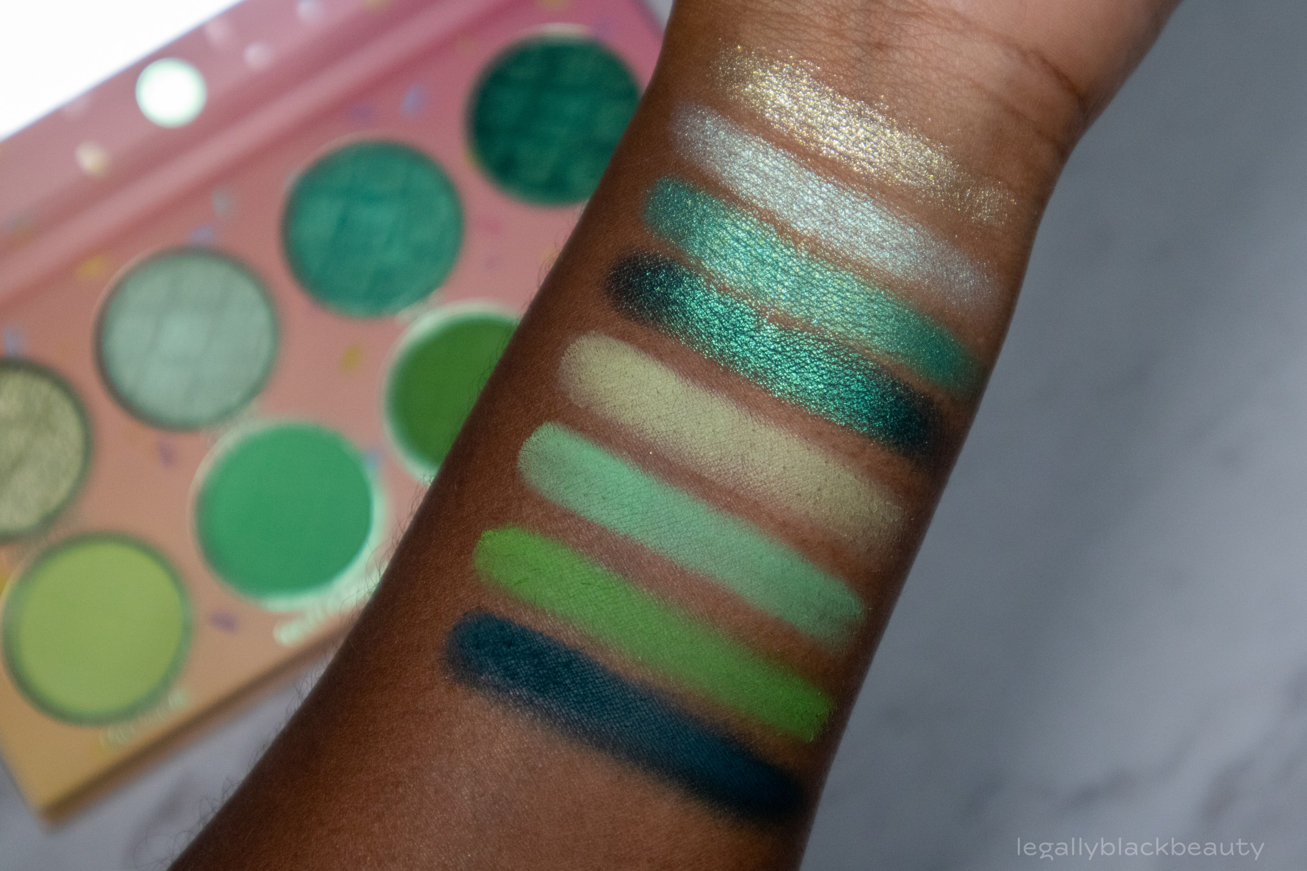
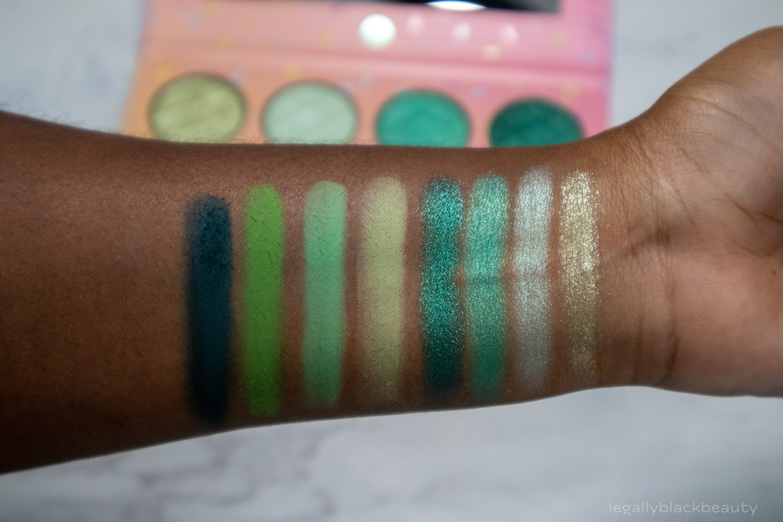
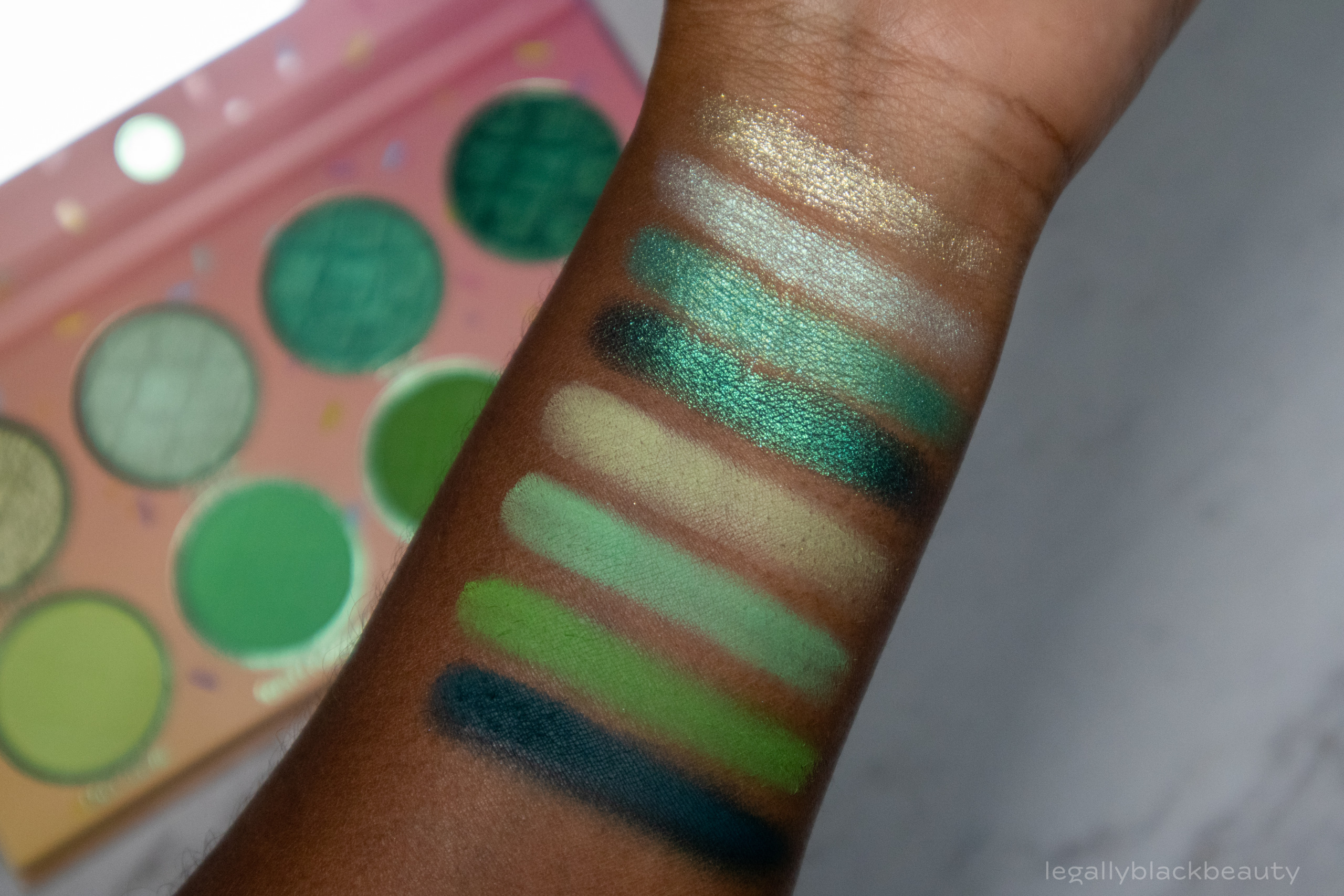
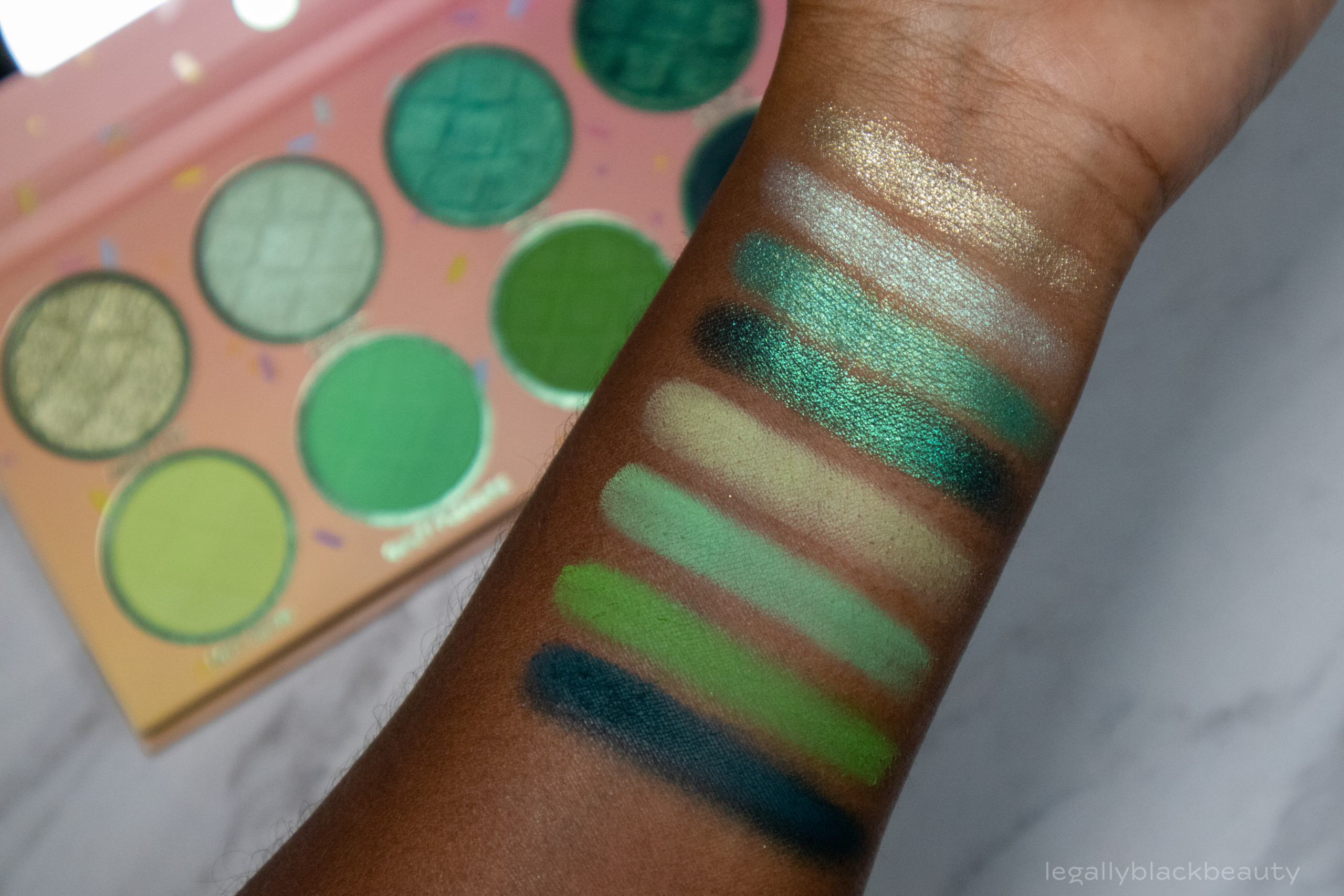
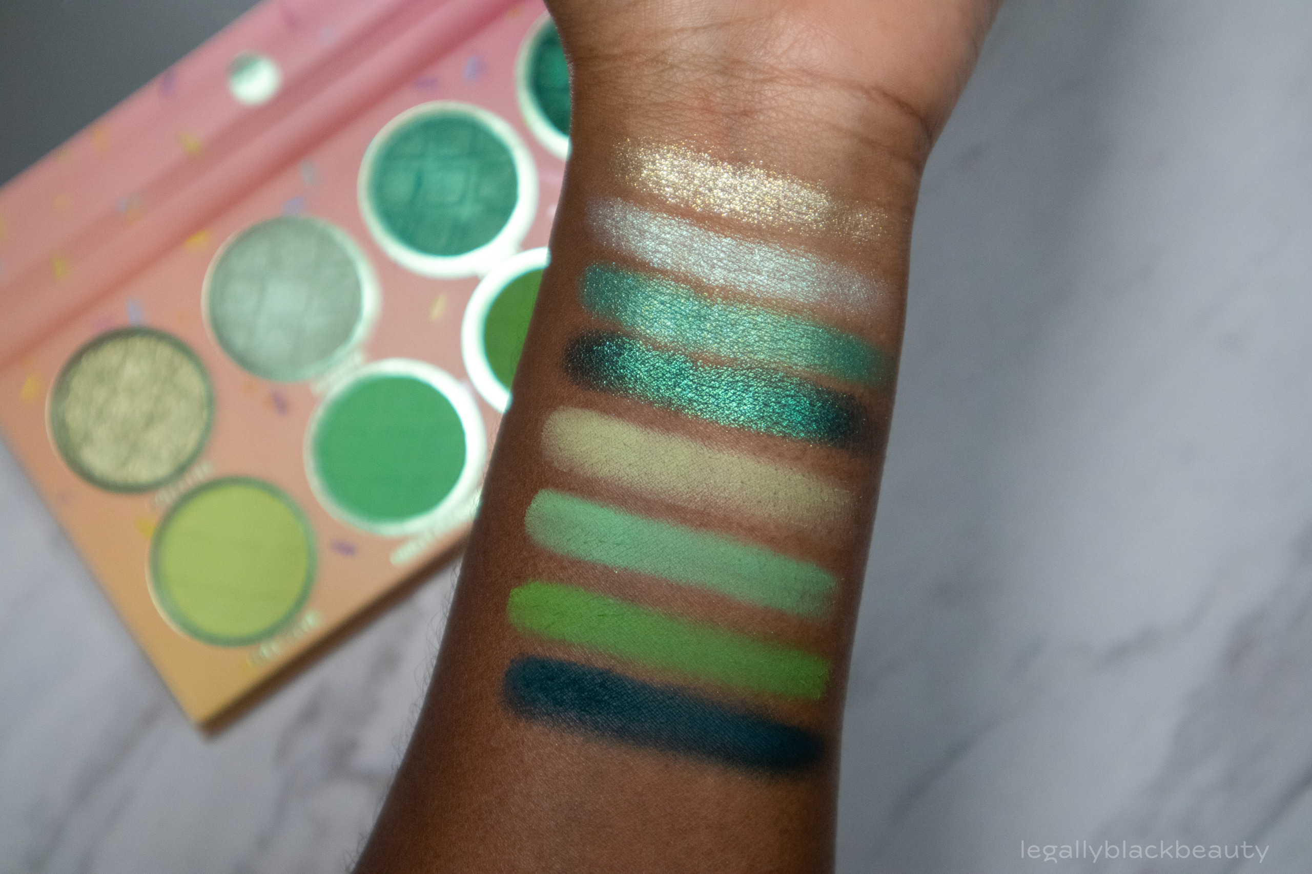
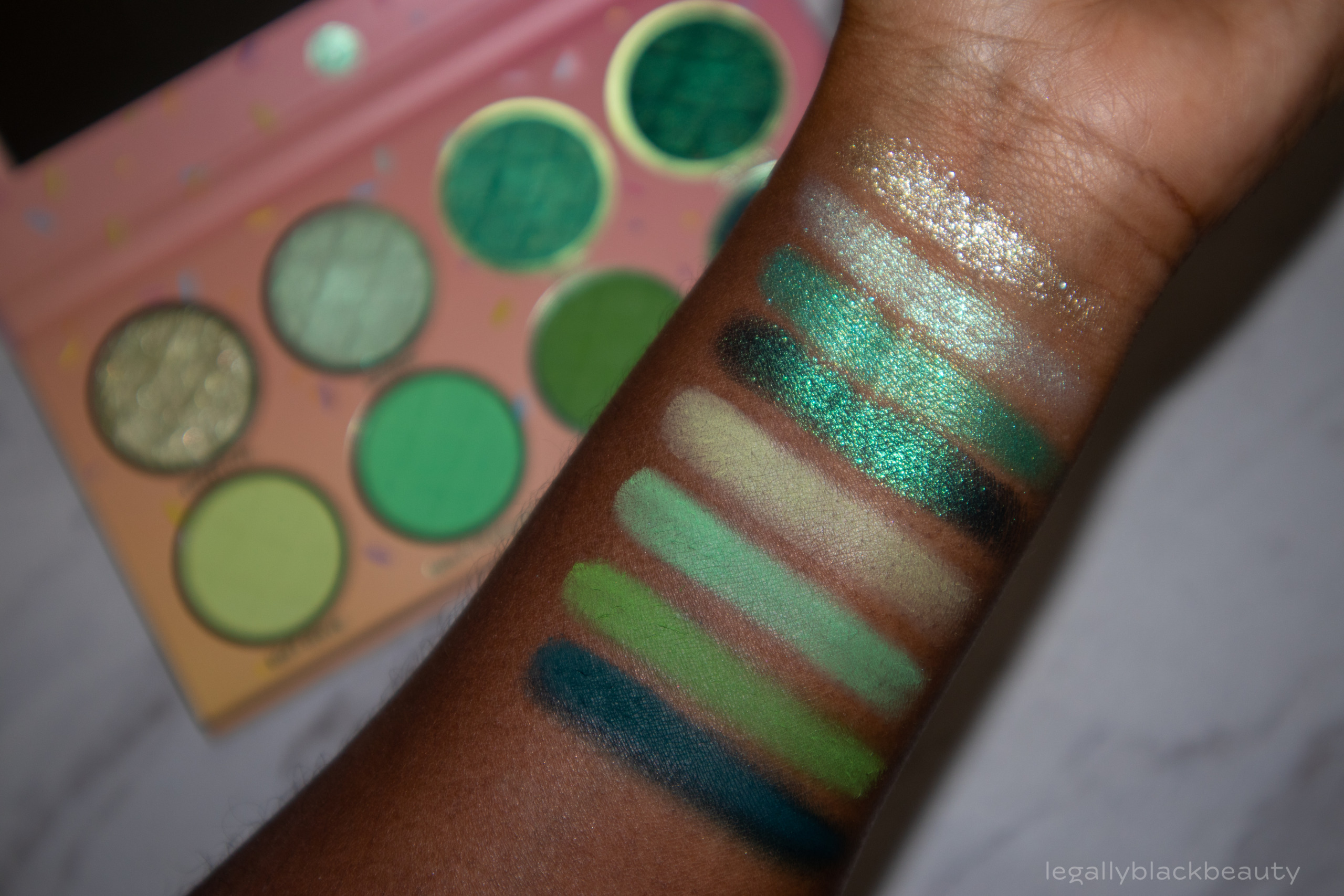
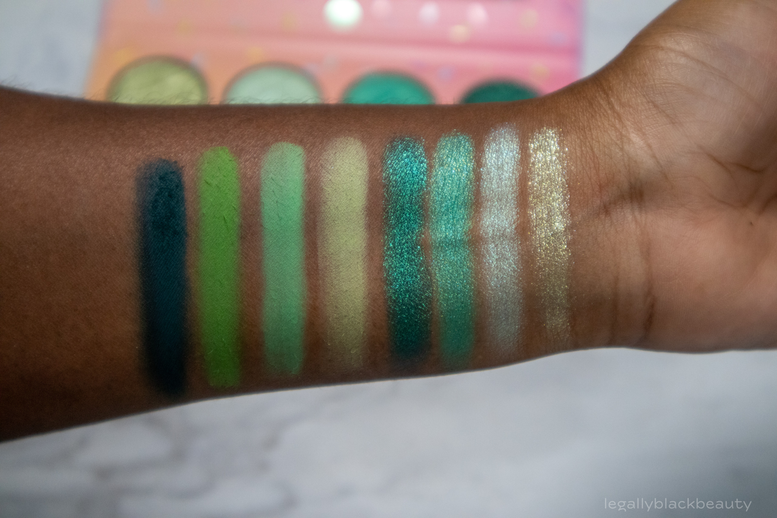
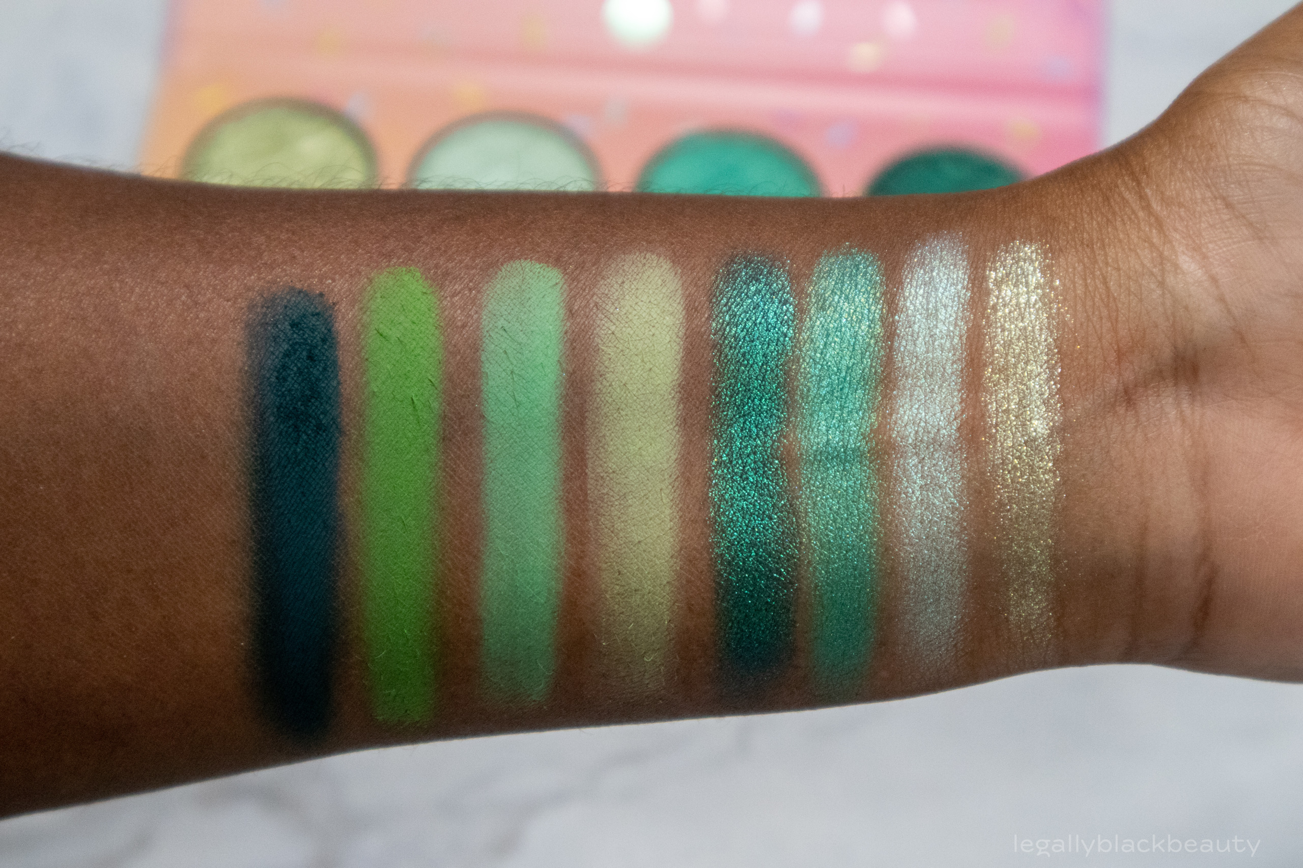
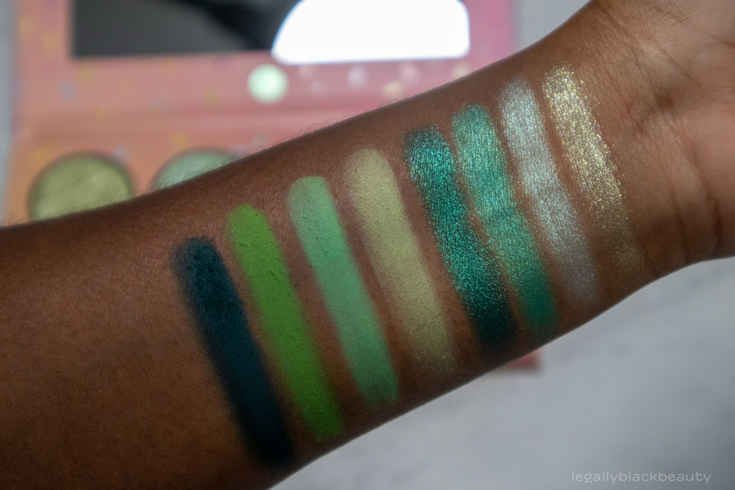
Pistachio consists of four green shimmers and four green mattes. The mattes are smooth and have impressive payoff. The shimmers are also smooth and soft.
I like the color story of this palette, but there is a lot of variation in undertone which may require some thought to make flattering color combinations across each row. Combining colors across columns requires much less thought. Each shimmer has a matte pair below it, although Treat and Nutty don’t go together as perfectly as the other column-pairs in the palette (Treat is cooler, Nutty is warmer). Of course, you can definitely use warm and cool colors together–and I would say BH Cosmetics even encourages doing so given the variety in undertones present in each palette in this collection.
- Sweet Life: Cool green shimmer with hints of pale gold
- Dessert: Cool mint shimmer
- Treat: Grassy green shimmer
- Crunch: Deep emerald green shimmer
- Soft Serve: Pale yellow green matte
- Guilty Pleasure: Mint matte
- Nutty: Medium green matte
- Cone or Cup: Deep forest green
Sugar Cone
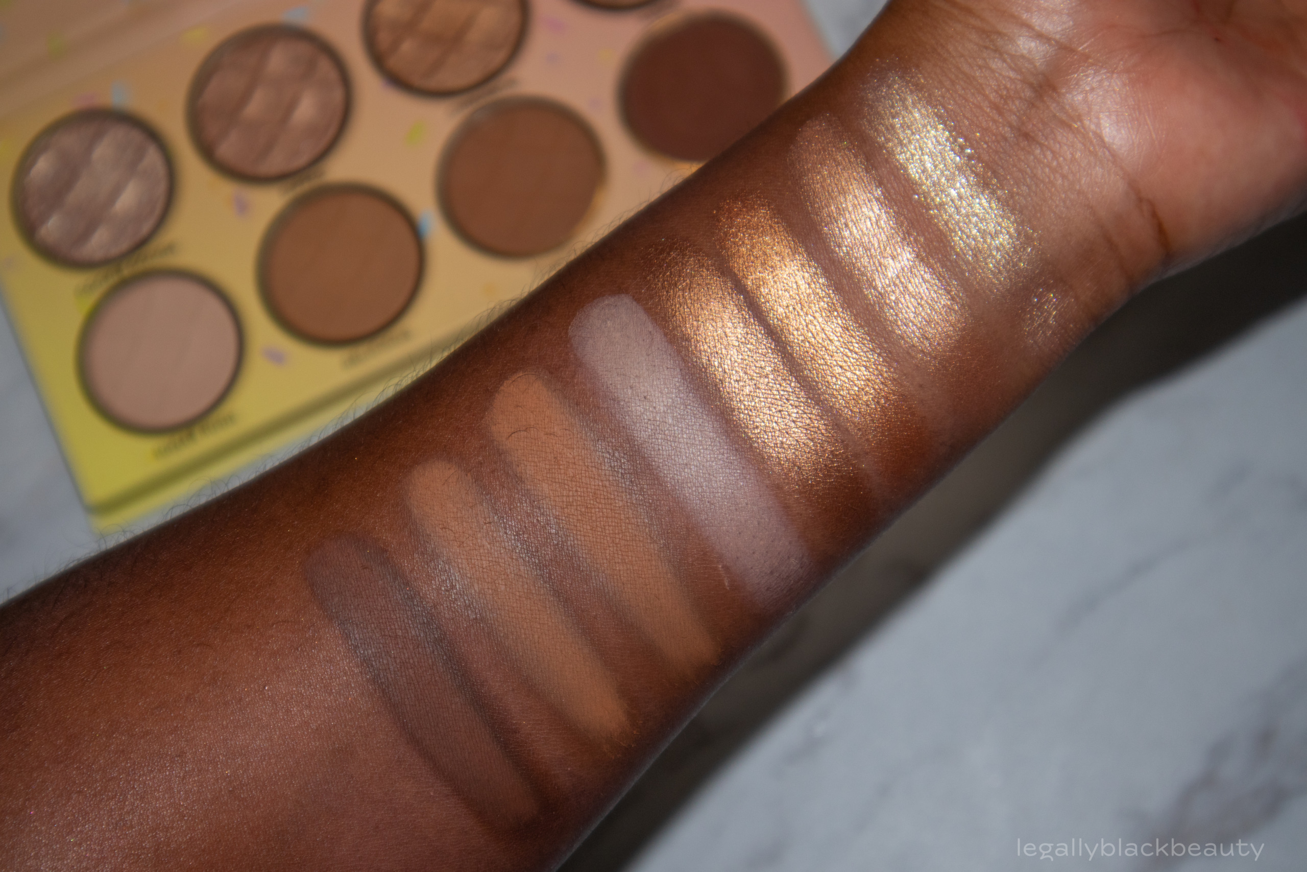
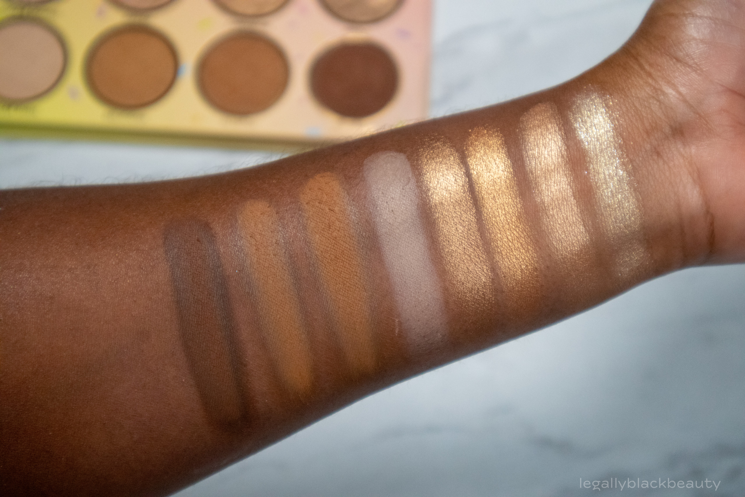
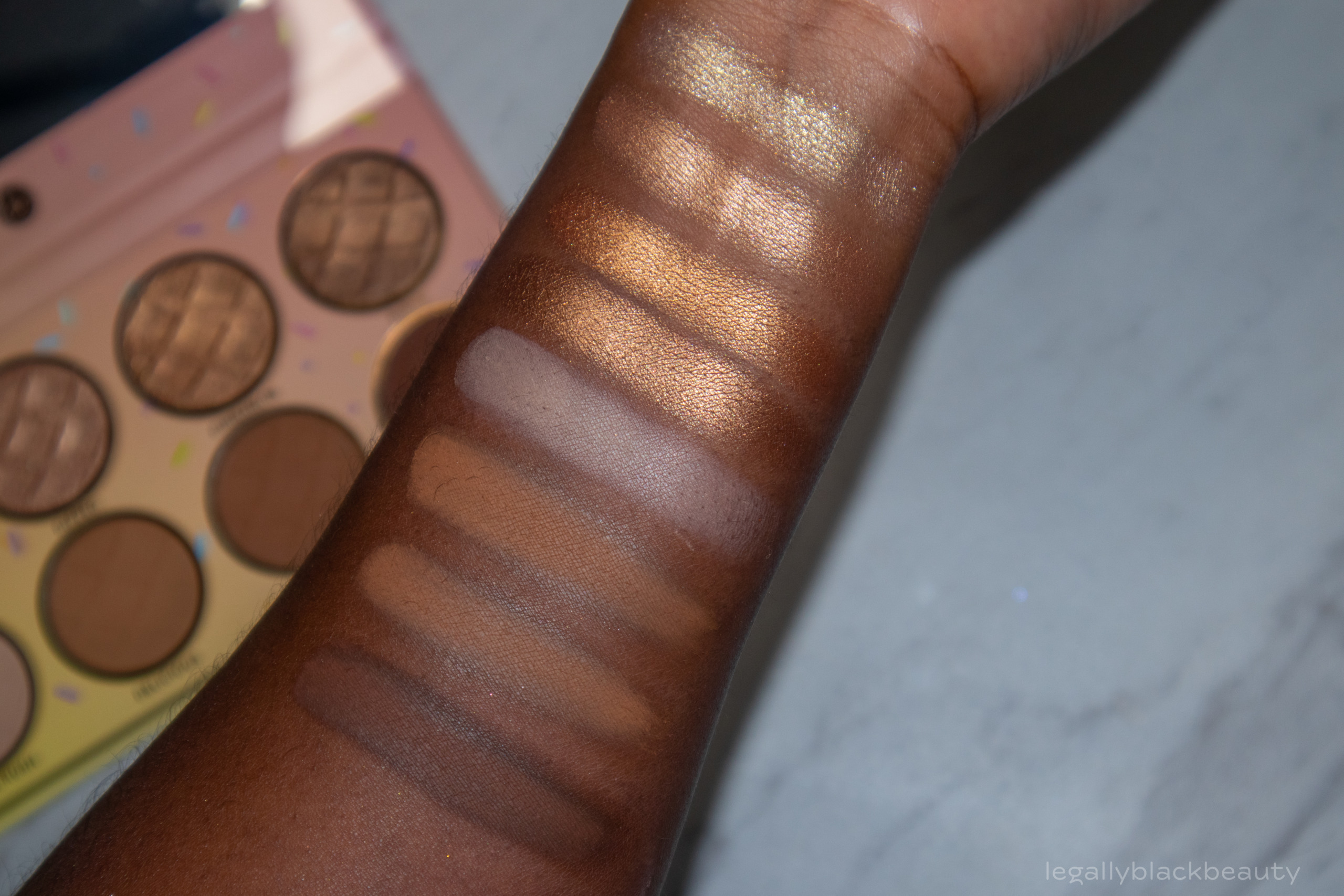
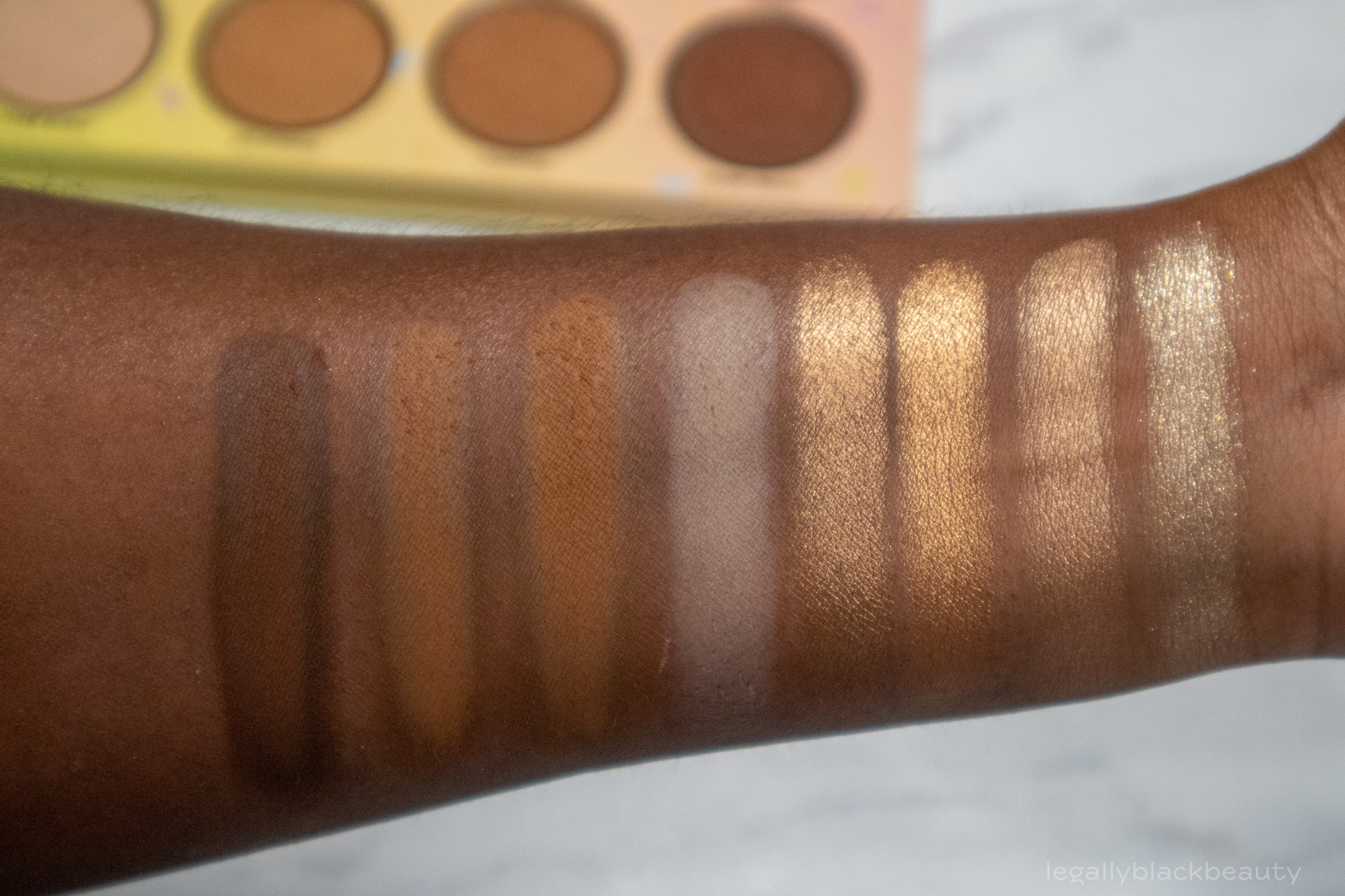
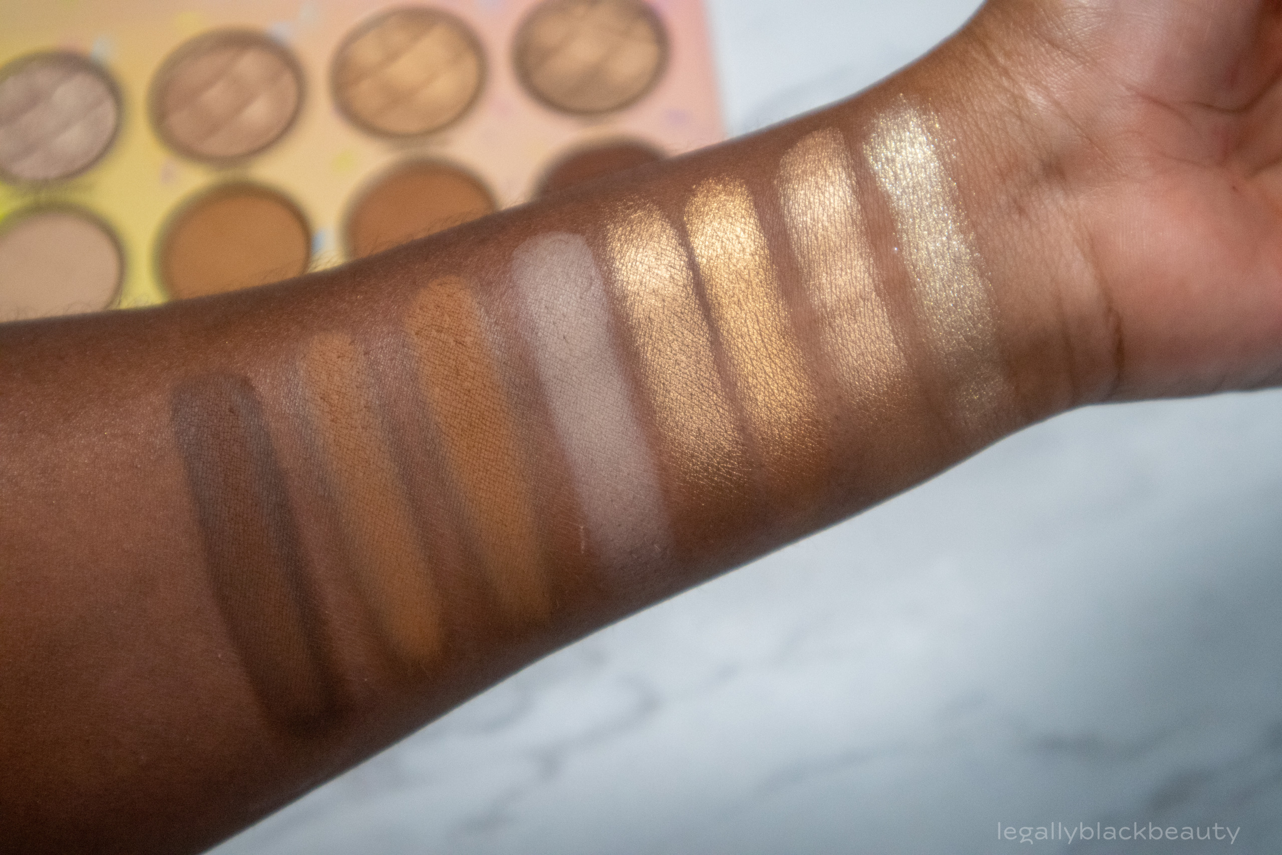
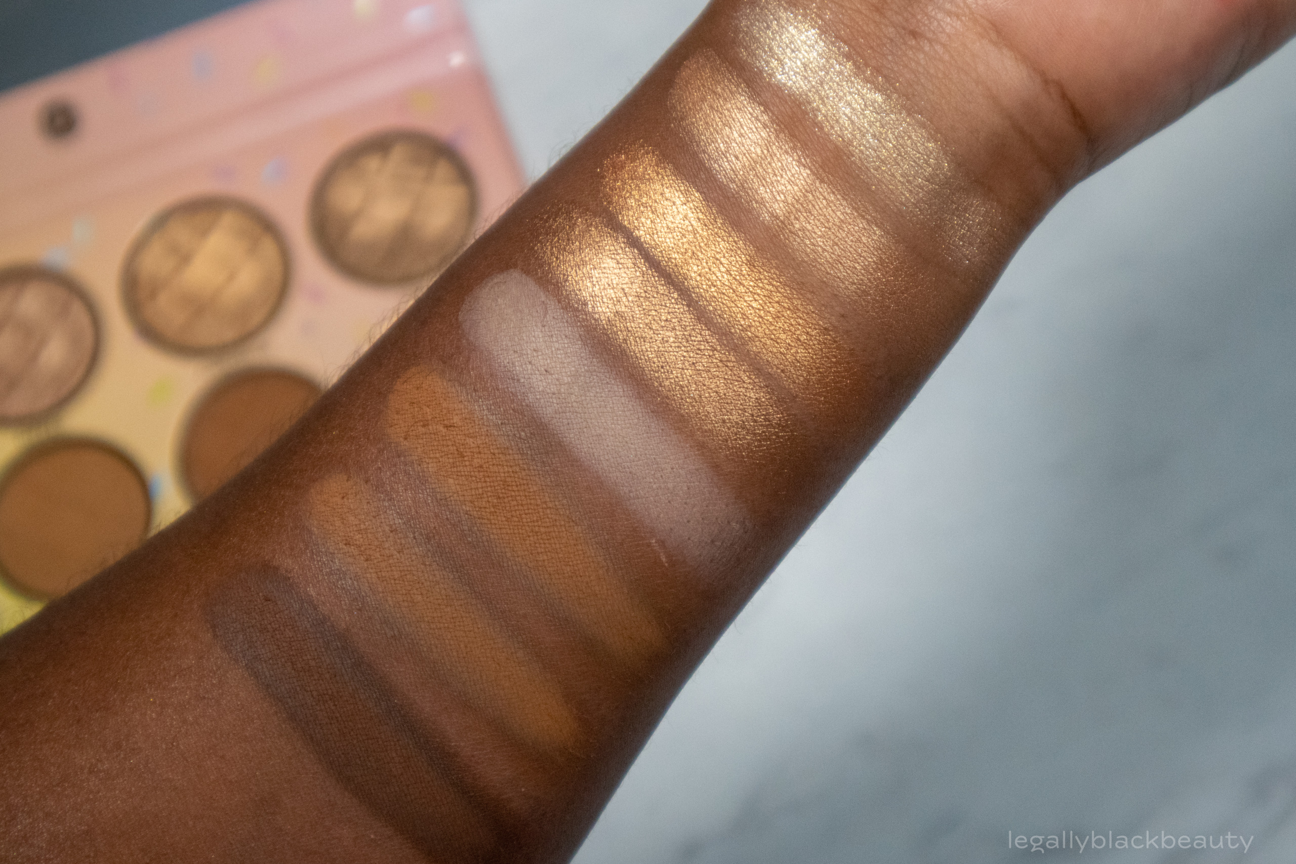
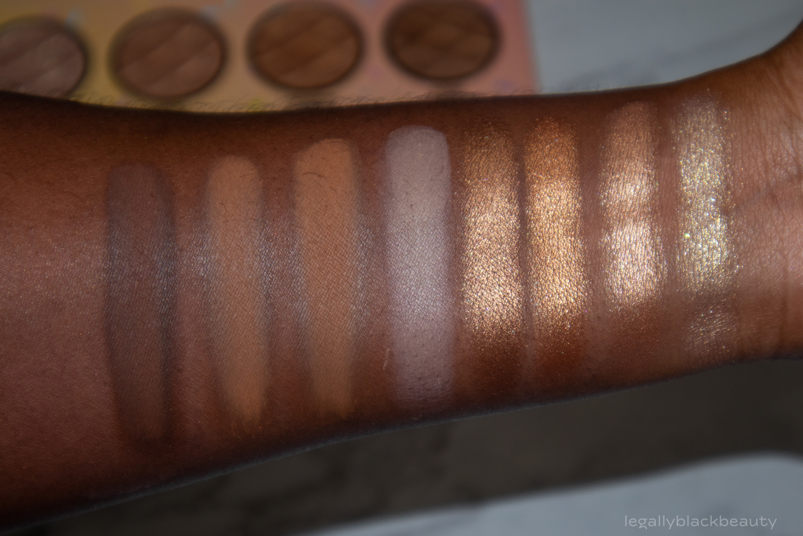
Sugar Cone consists of four shimmers and four mattes, all in shades of brown and gold.
This is my least favorite palette of the collection. Sugar Rush is useless for me and somehow manages to be more unflattering on my skin than most other beiges that have been thrown into neutral palettes. The shimmers don’t appear to be dupes for each other, but I still find myself wishing for more variety à la the Natasha Denona Gold palette. Delicious and Toasted are also too similar on my skin, in my opinion.
For what it’s worth, I don’t think the deep halo around Homemade says anything about the quality. A lot of deep mattes and brown mattes have a halo effect when swatched. I think this is because of the way I build the mattes on my skin. Homemade is definitely a color that will deepen as you blend and manipulate it. Packed on, it will resemble the interior color more.
- Cookie Dough: Pale gold shimmer
- Dipped: Light golden beige shimmer
- Cinnamon: Medium old shimmer
- Fudge: Medium golden beige shimmer
- Sugar Rush: Pale, cool beige matte
- Delicious: Medium brown matte
- Toasted: Medium golden brown matte
- Homemade: Deep brown matte



Overall Thoughts
Consider me impressed. The Sweet Shoppe collection was a fun way to be reintroduced to BH Cosmetics. The palettes perform well and, surprisingly, offer sufficient versatility when it comes to possible eye looks. I was surprised at how rich and pigmented some of the mattes were.
The standouts for me are Cotton Candy and Bubble Gum. I find the color stories some of the best that I’ve seen in monochromatic palettes. I’ve never seen bubble gum as deep as some of the mattes in BH’s palette, but I won’t complain because those shadows are amazing. Pistachio is also one of my favorites, mostly because of the beautiful, emerald color of Crunch.
While I find it amusing that BH made sure to acknowledge one of the best parts of any ice cream treat, the Sugar Cone palette is my least favorite. I love a good neutral palette, but the Sugar Cone palette left much to be desired with such small differences existing between many of the shadows.
Have you all been able to grab one of these palettes? Which is your favorite?
