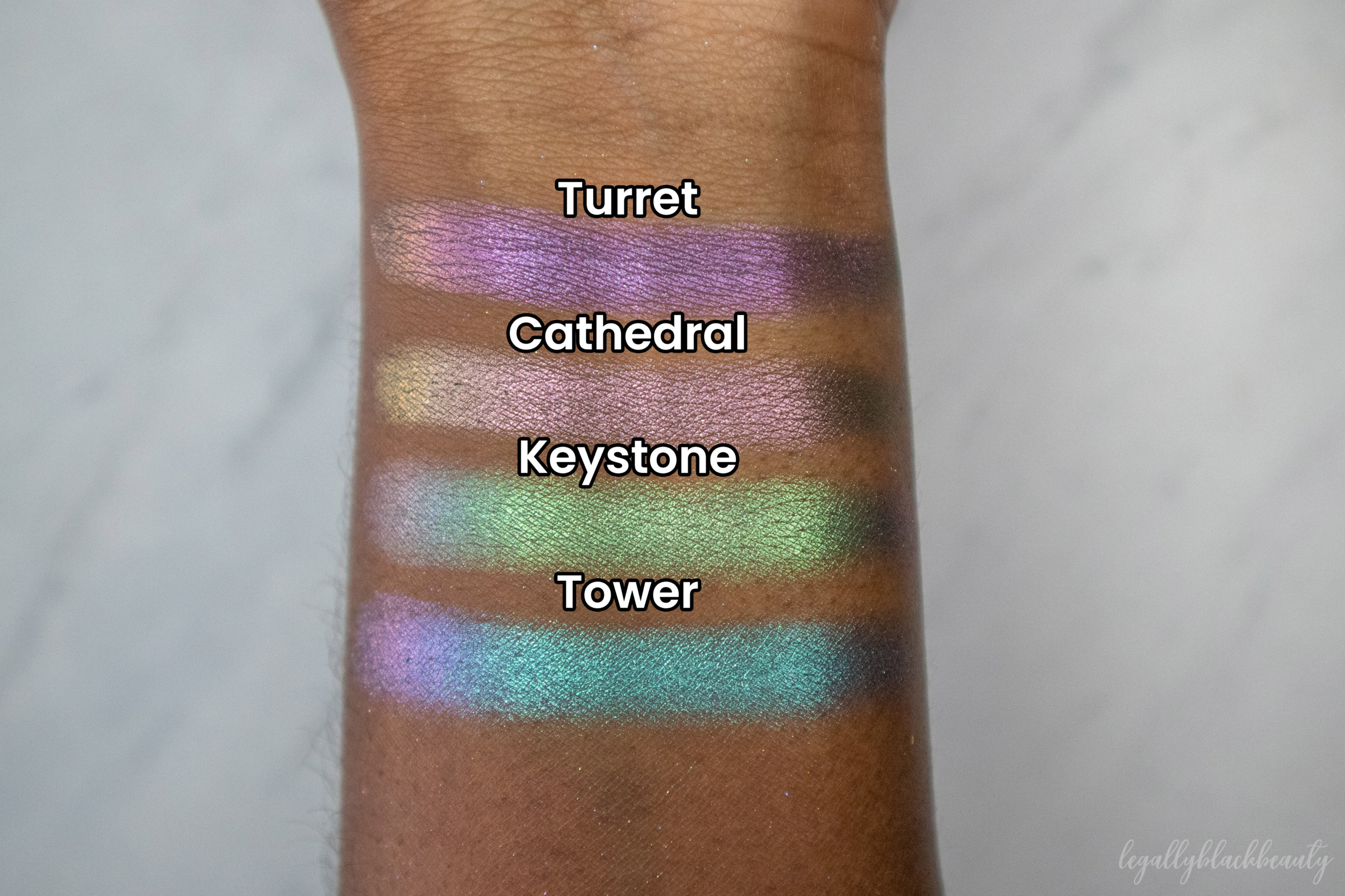
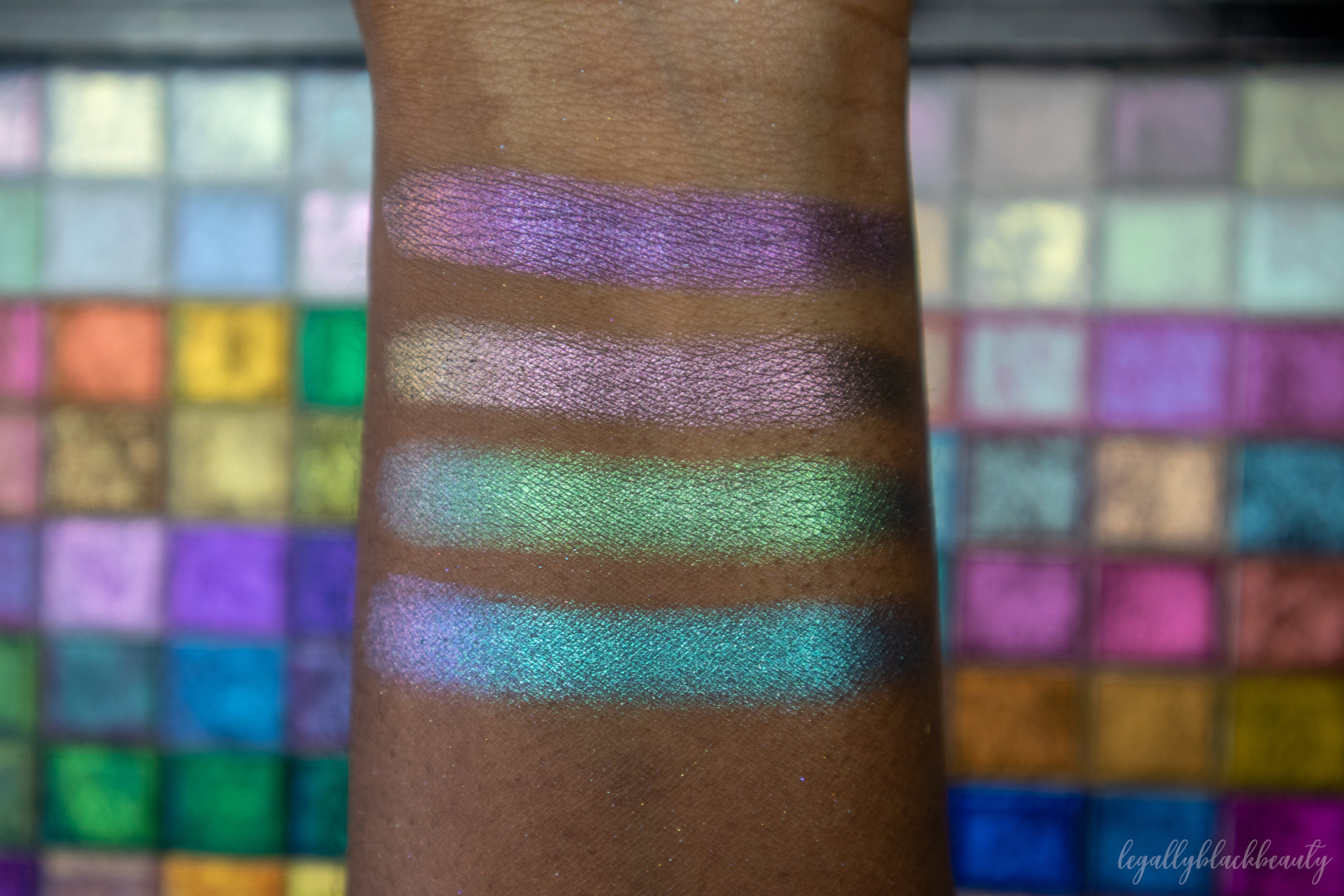
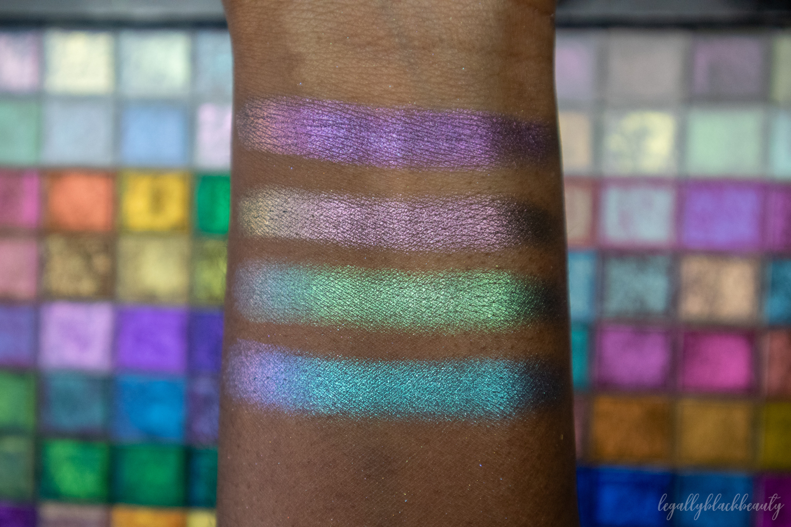
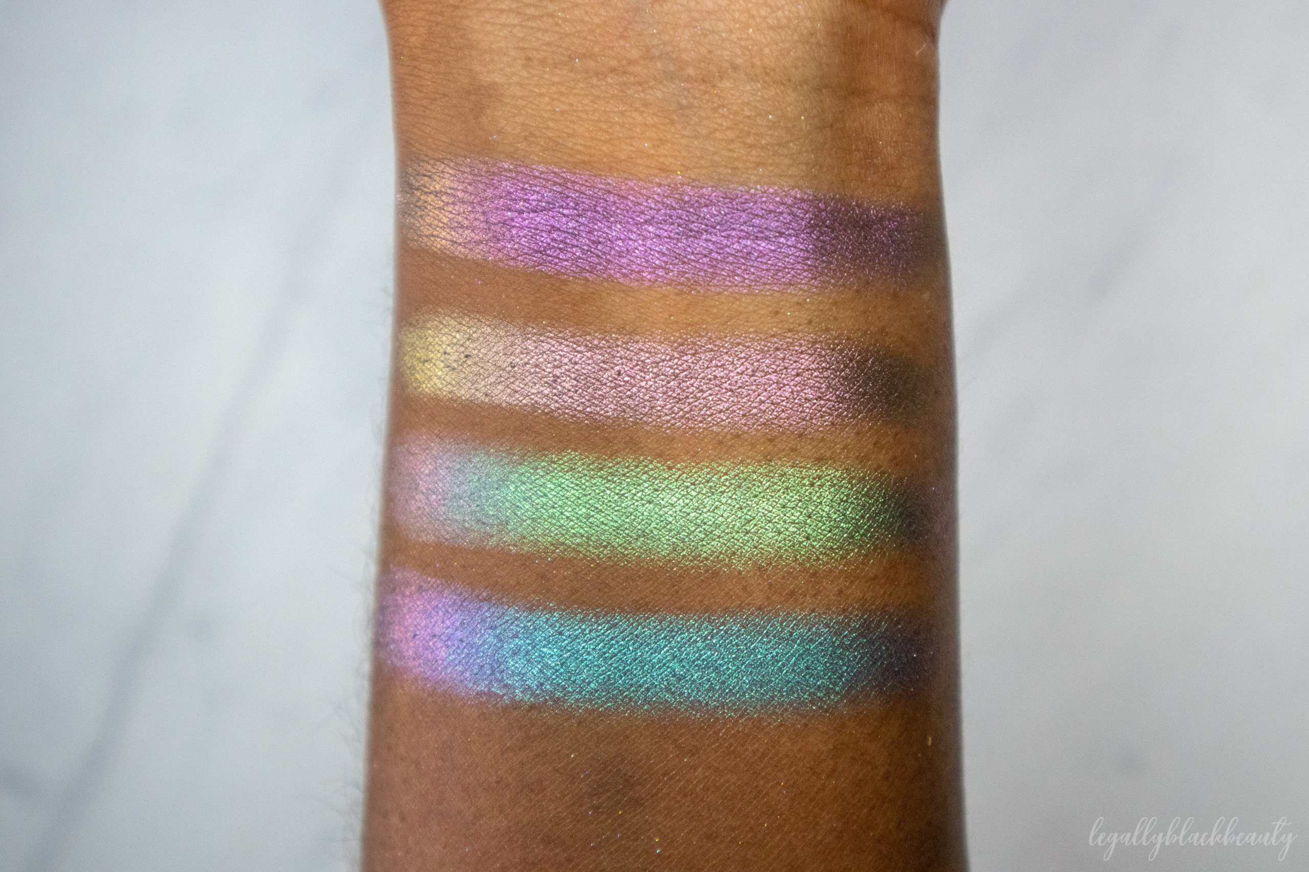
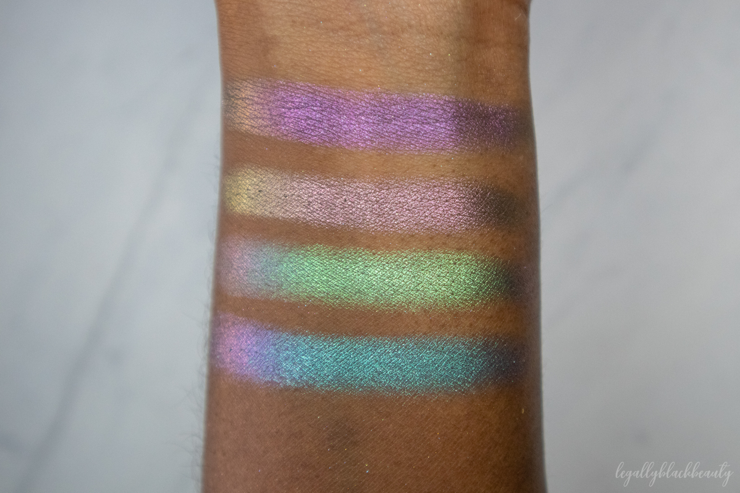
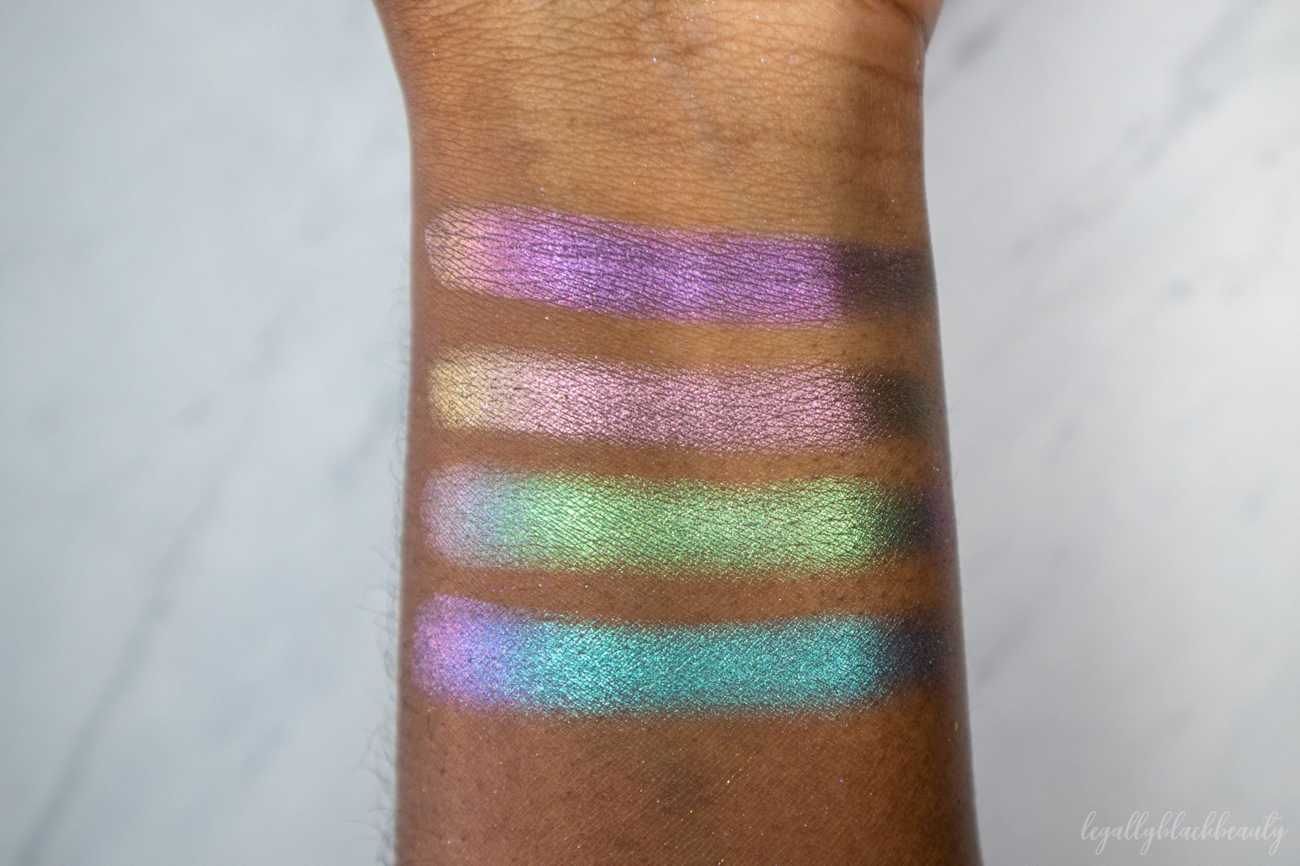
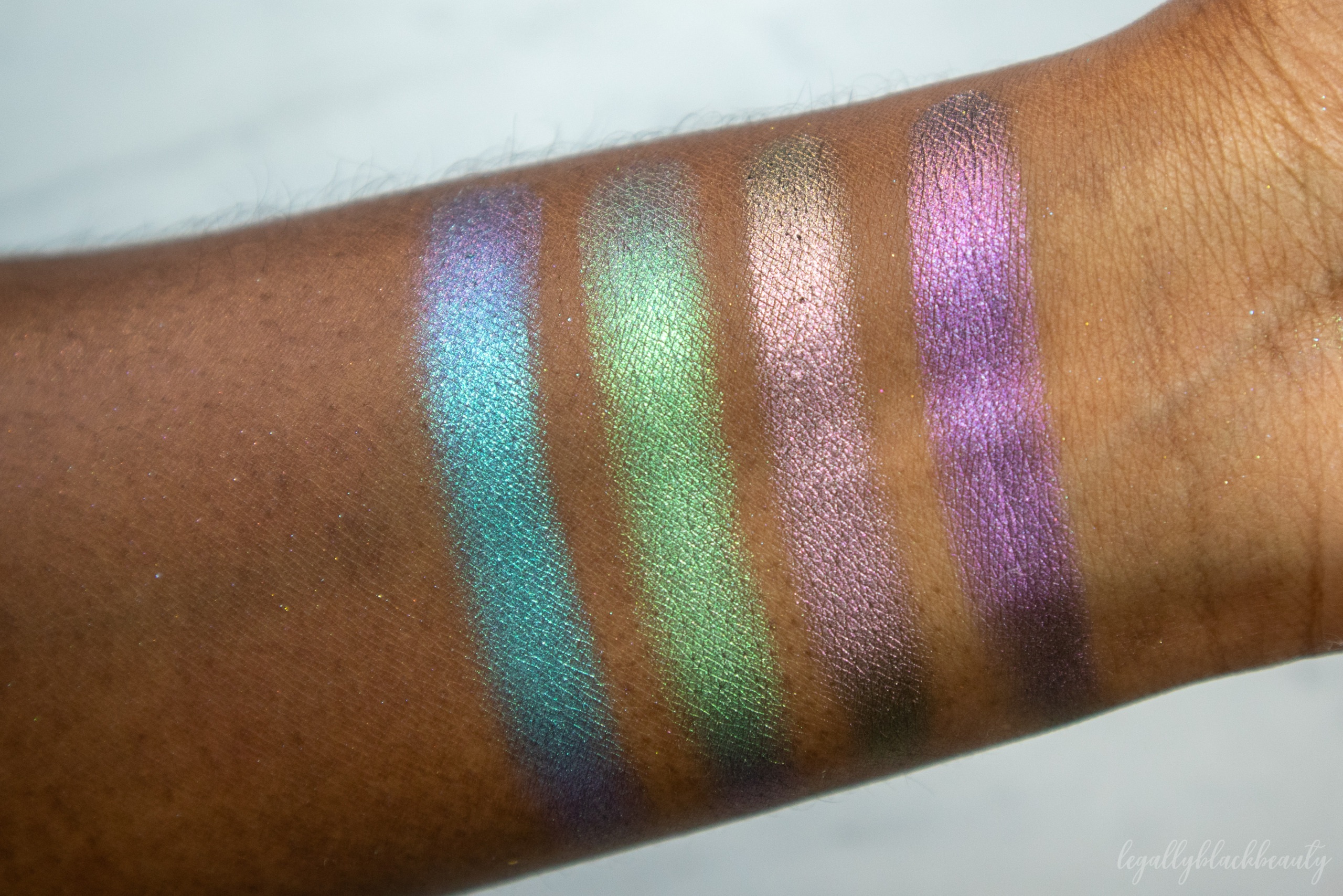
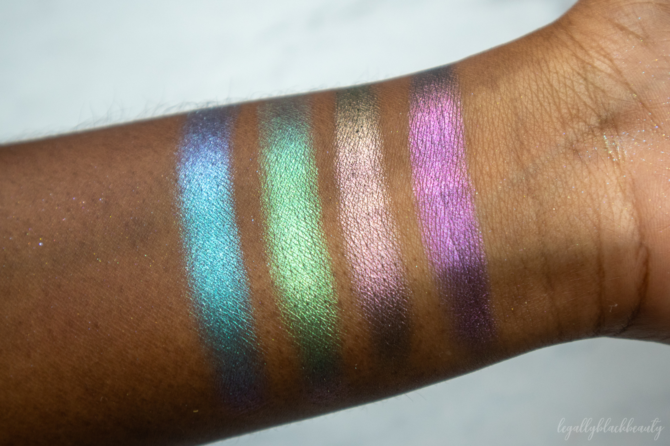
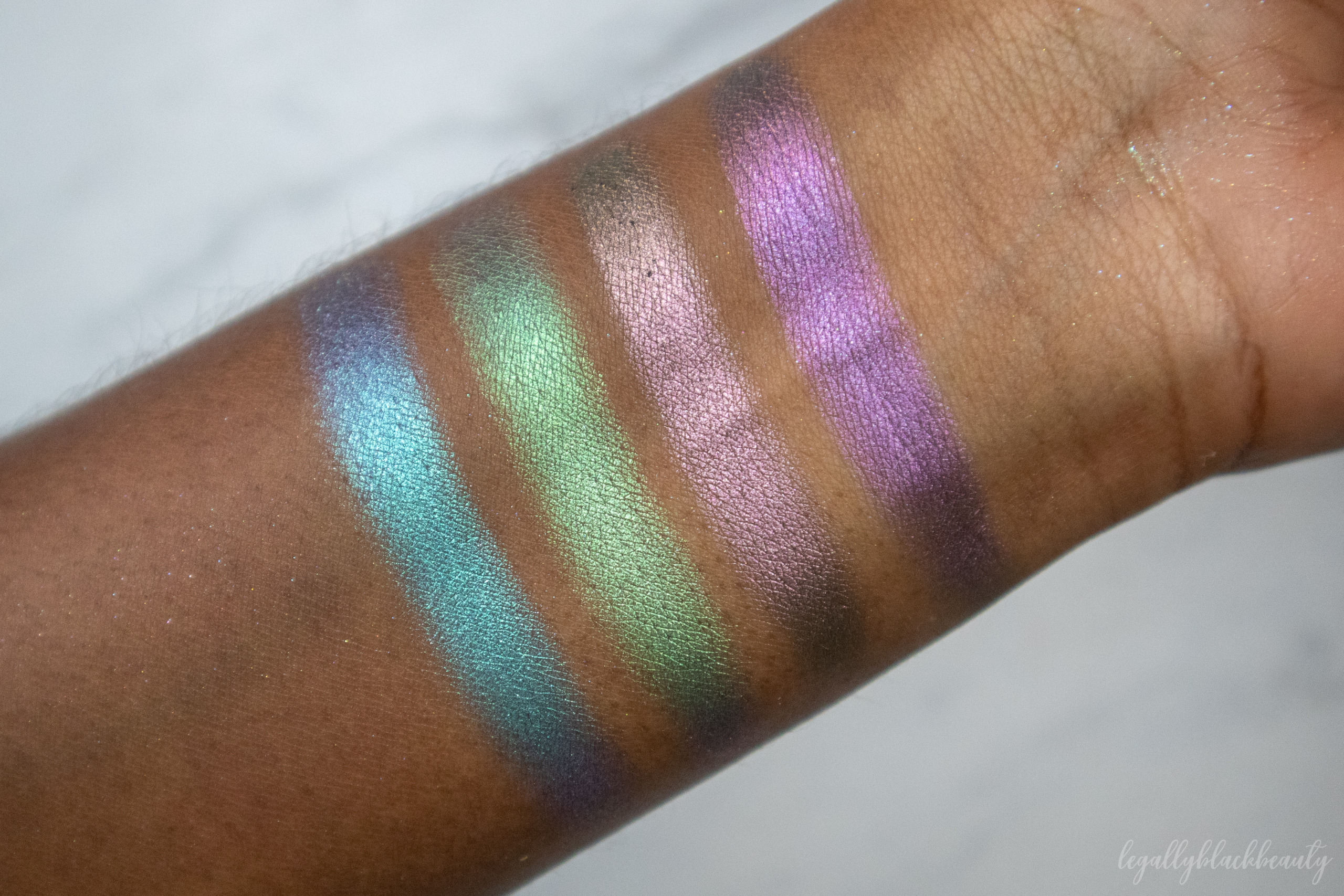
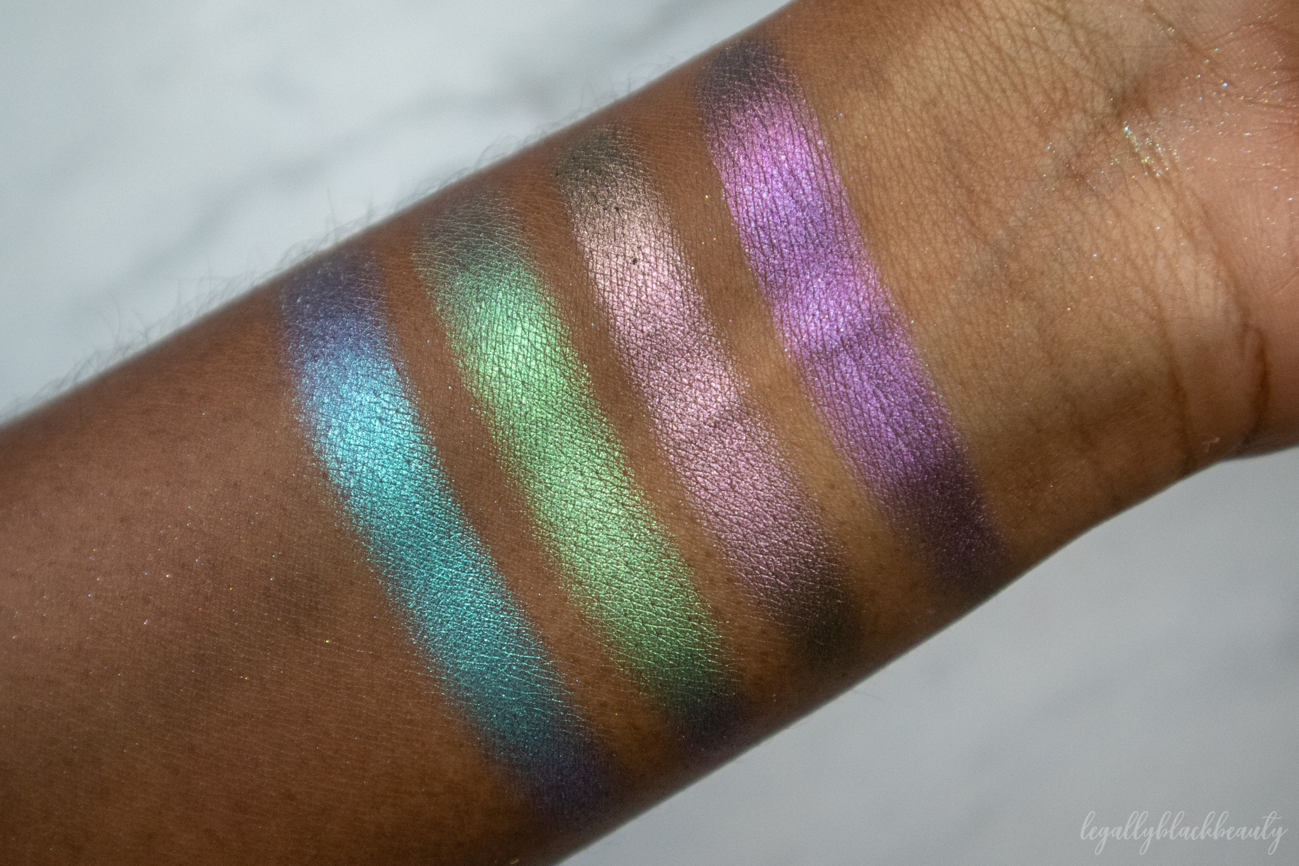
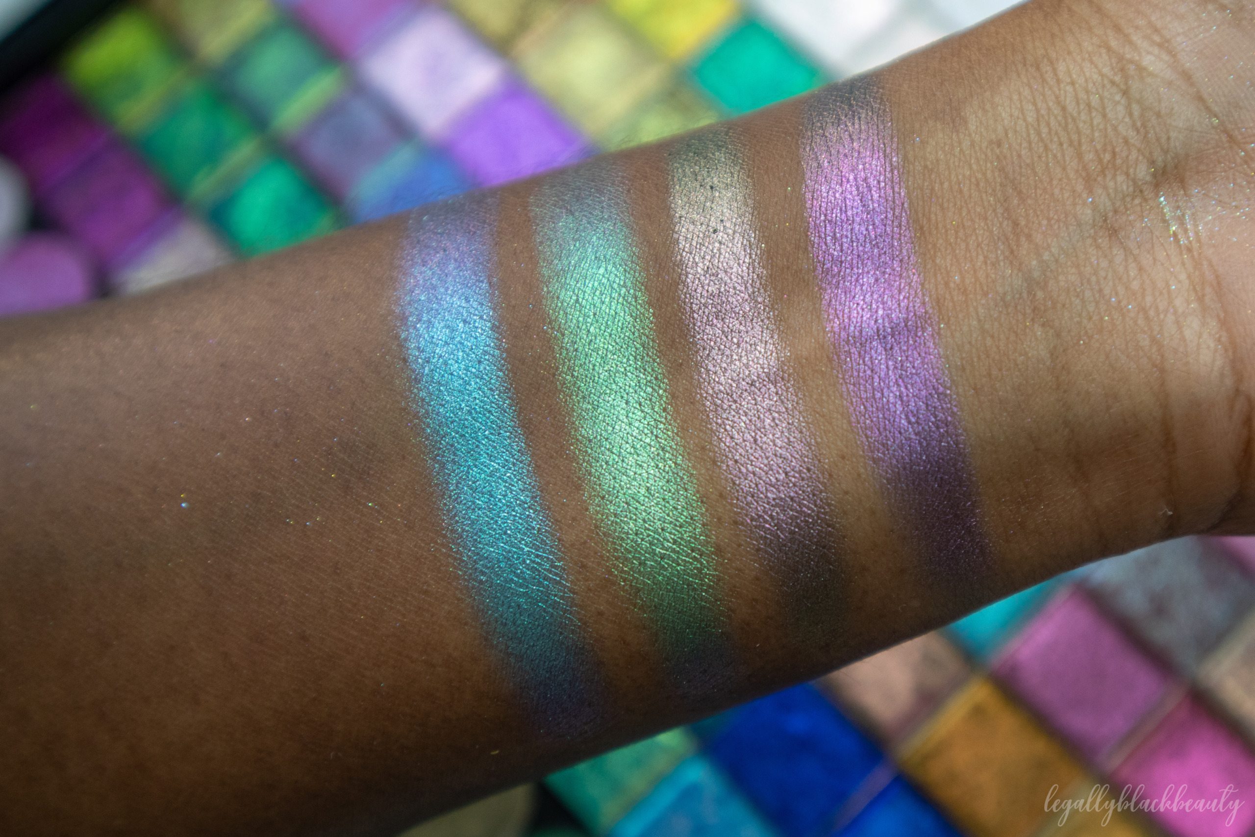
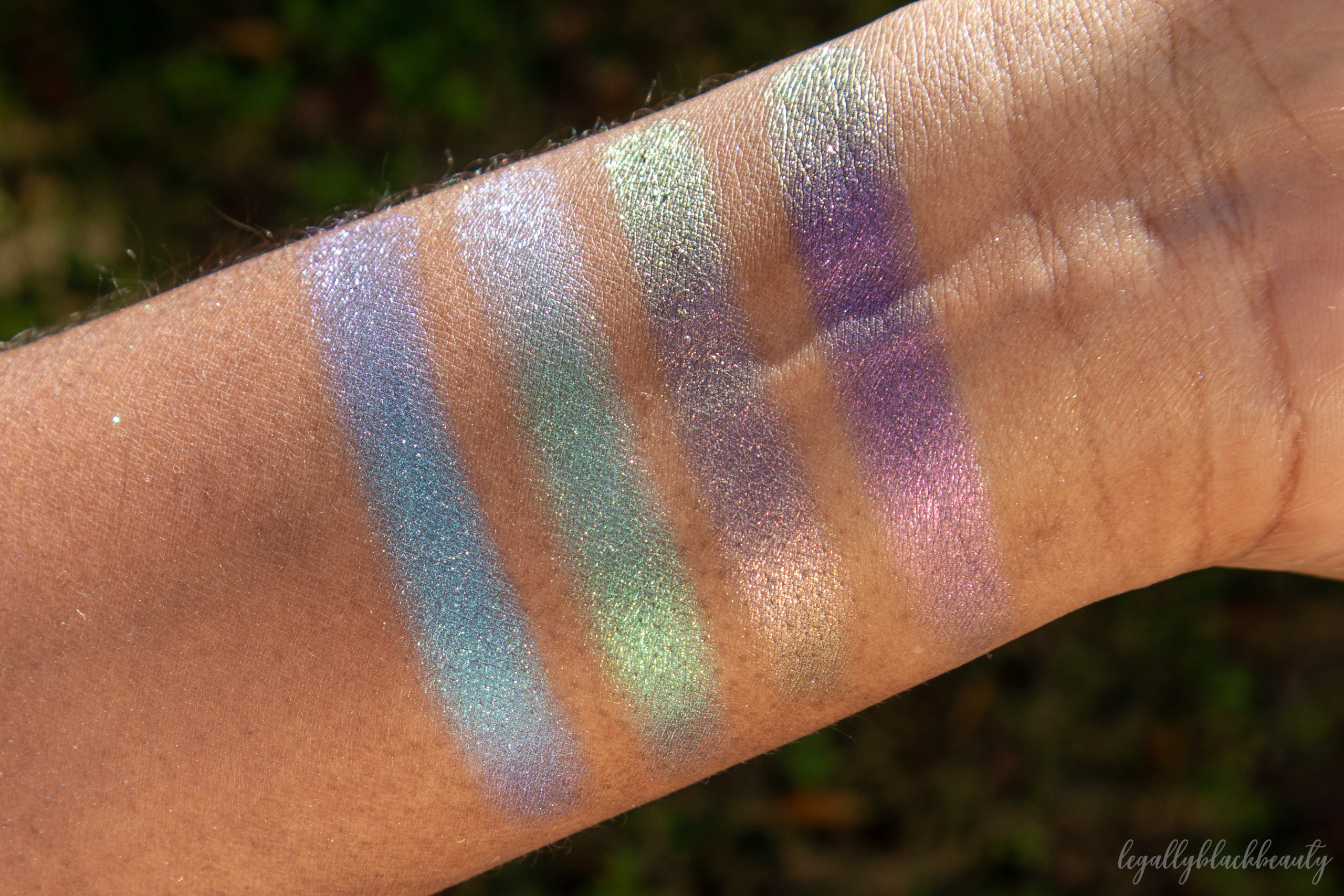
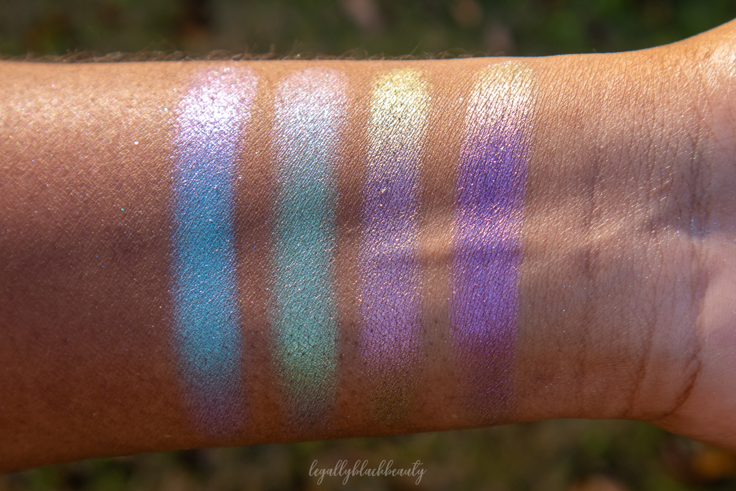
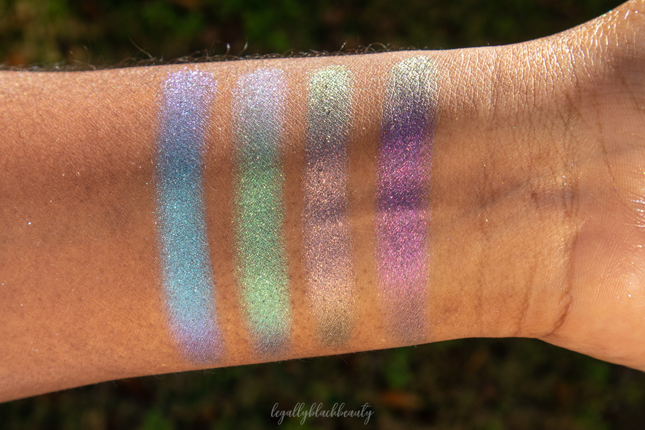
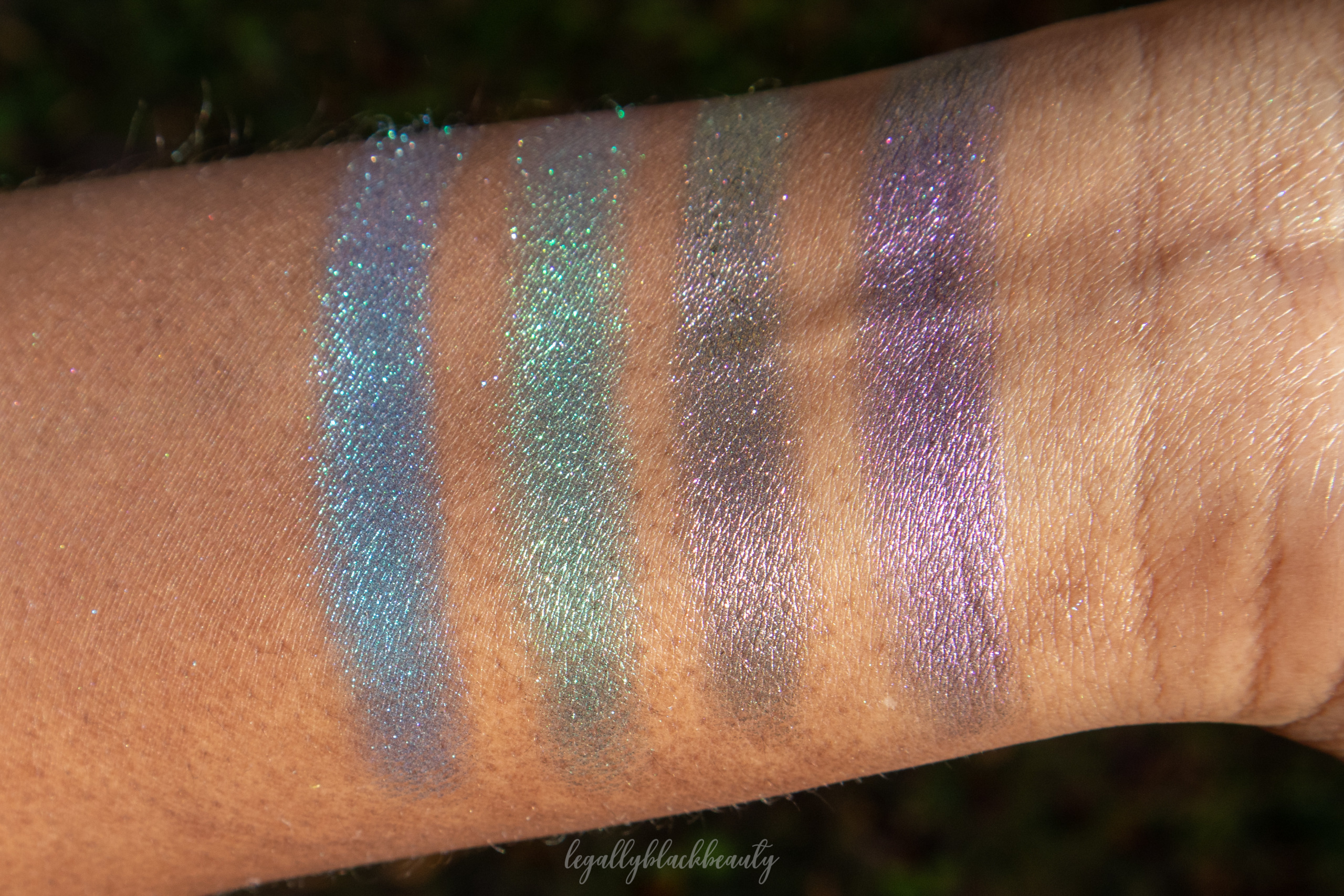
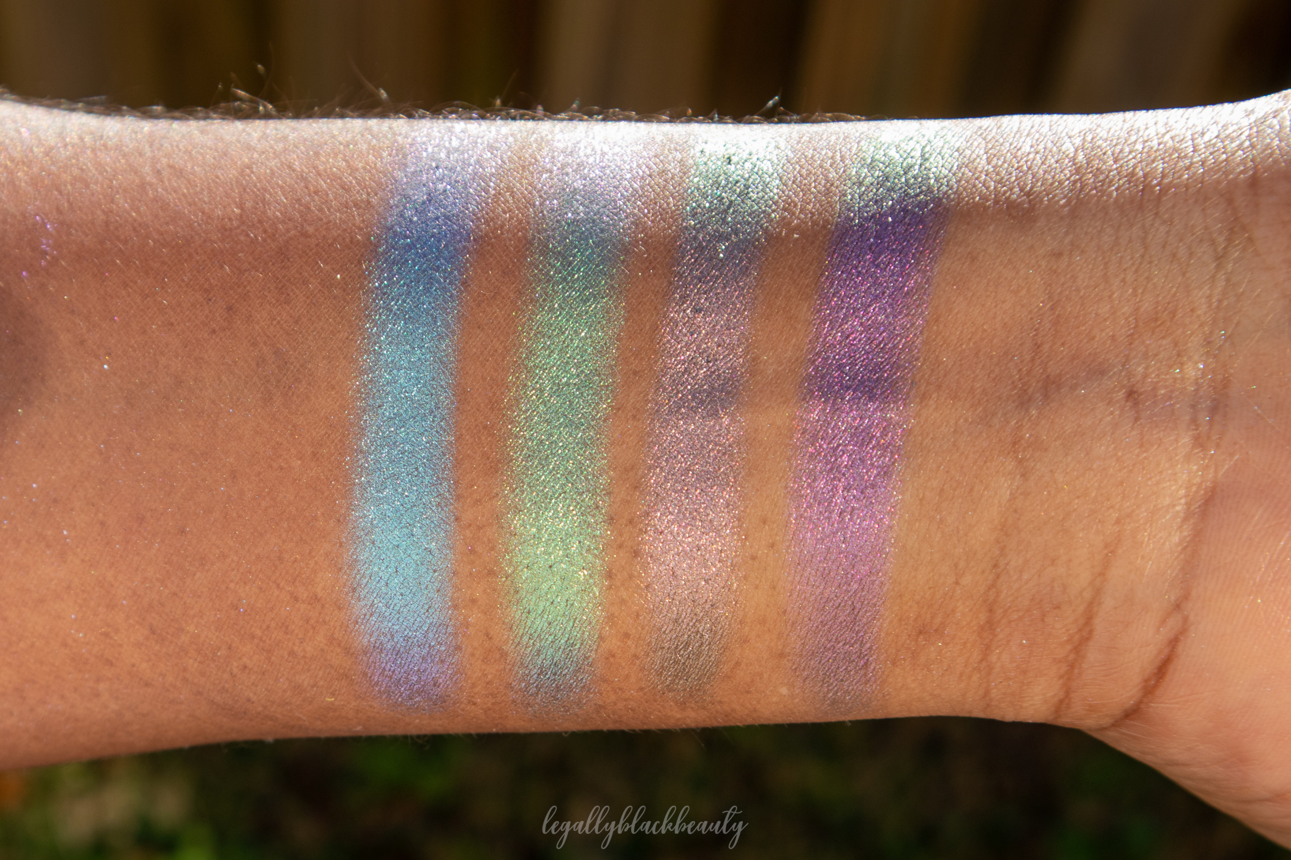
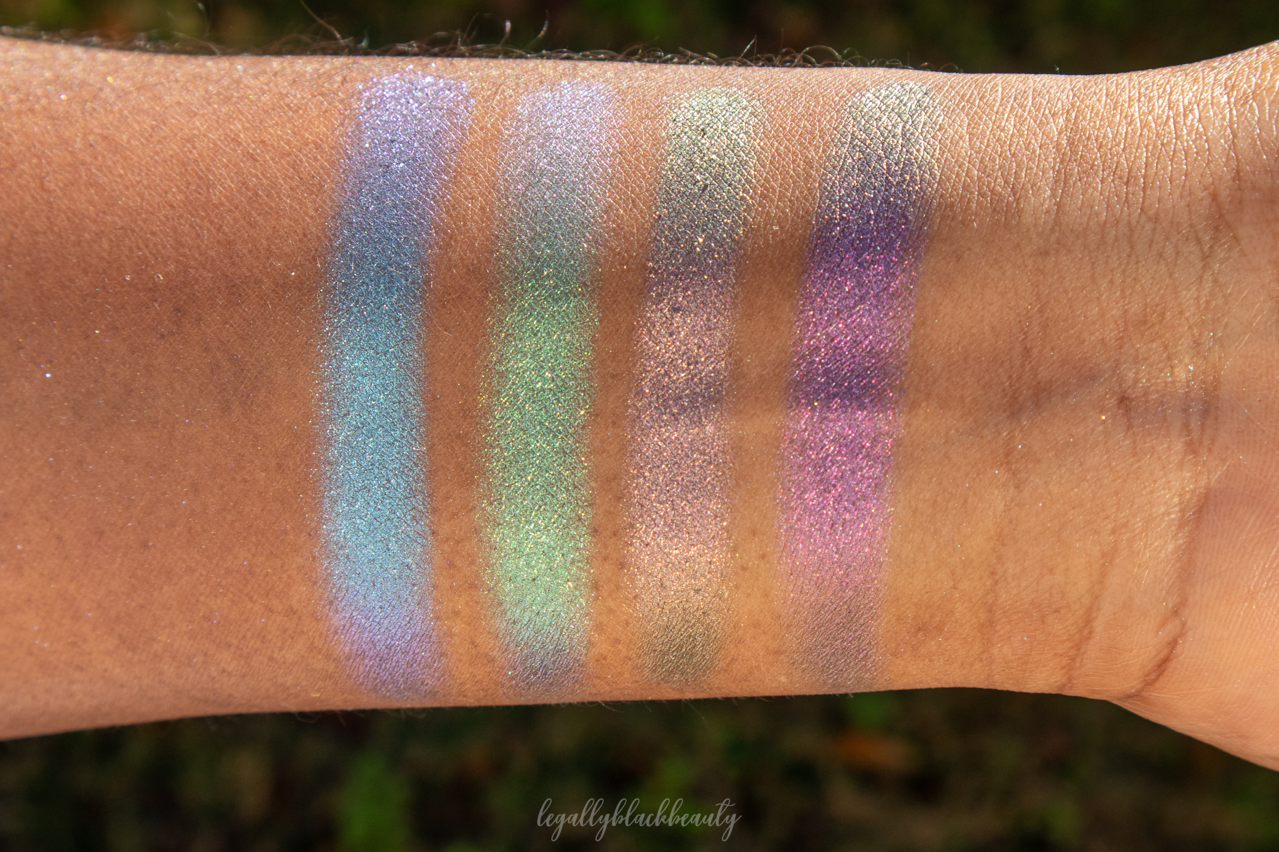
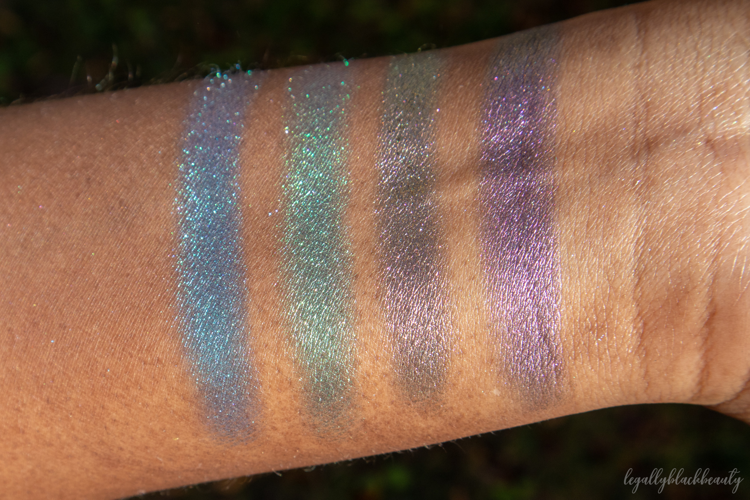
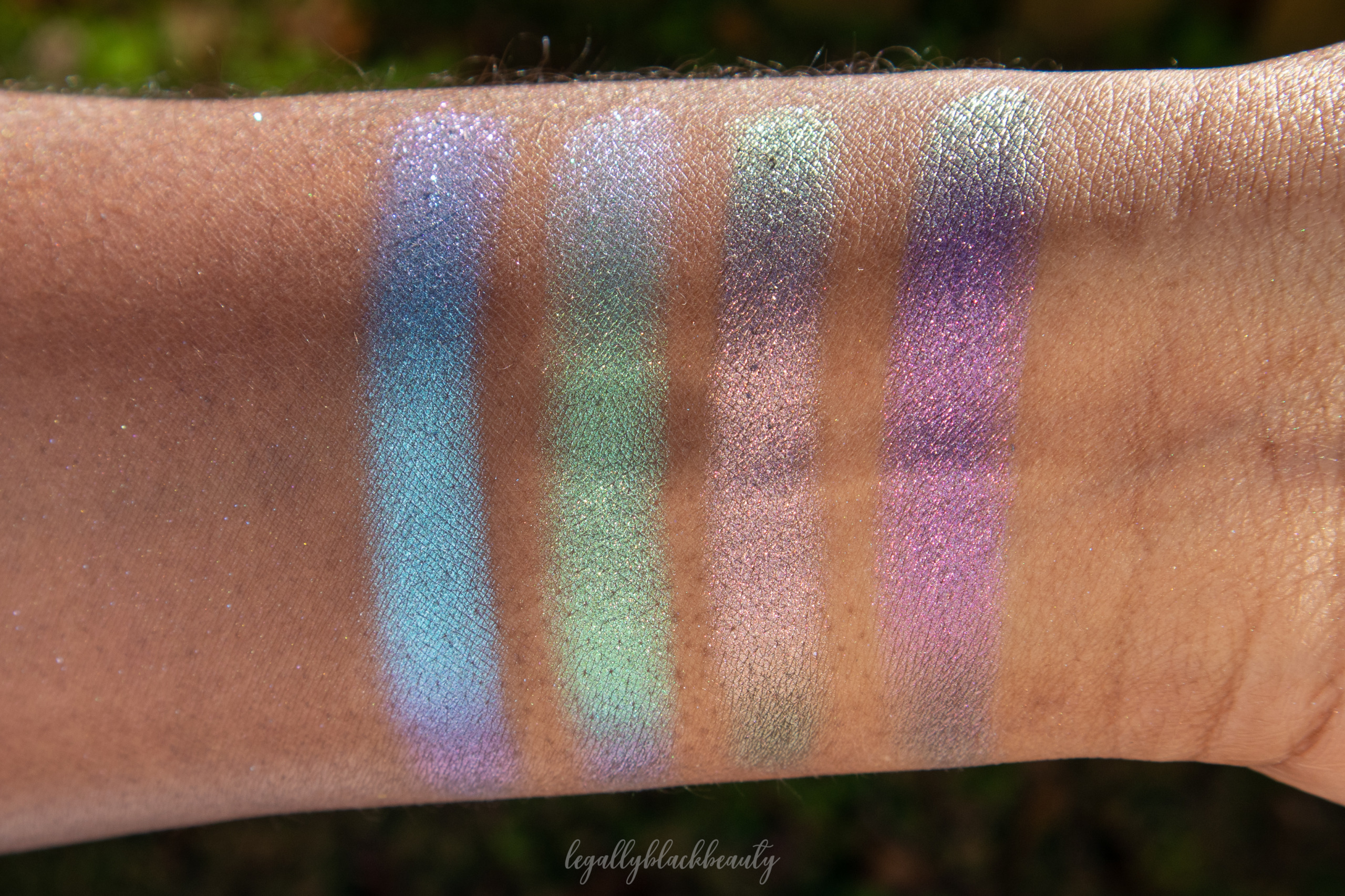
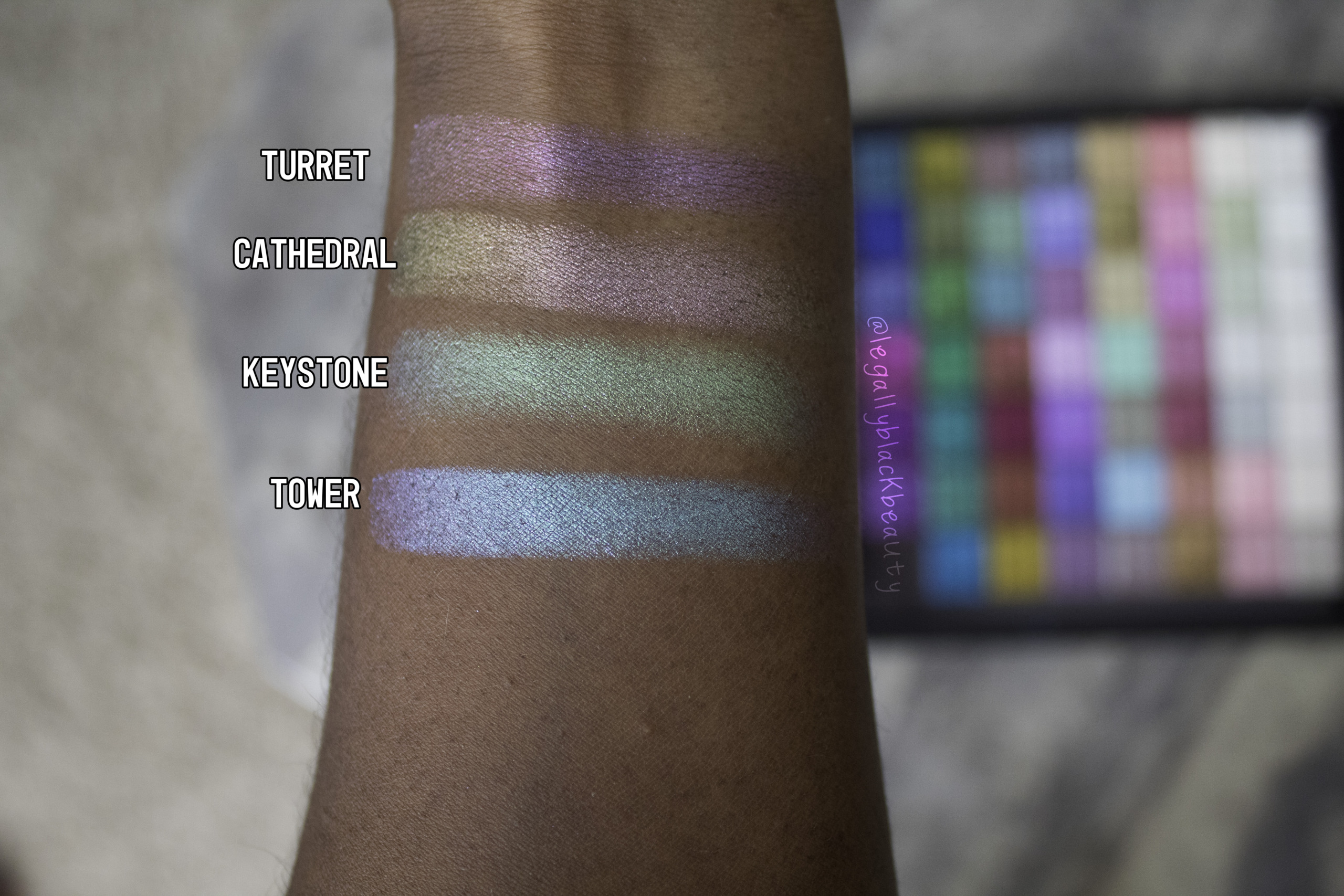
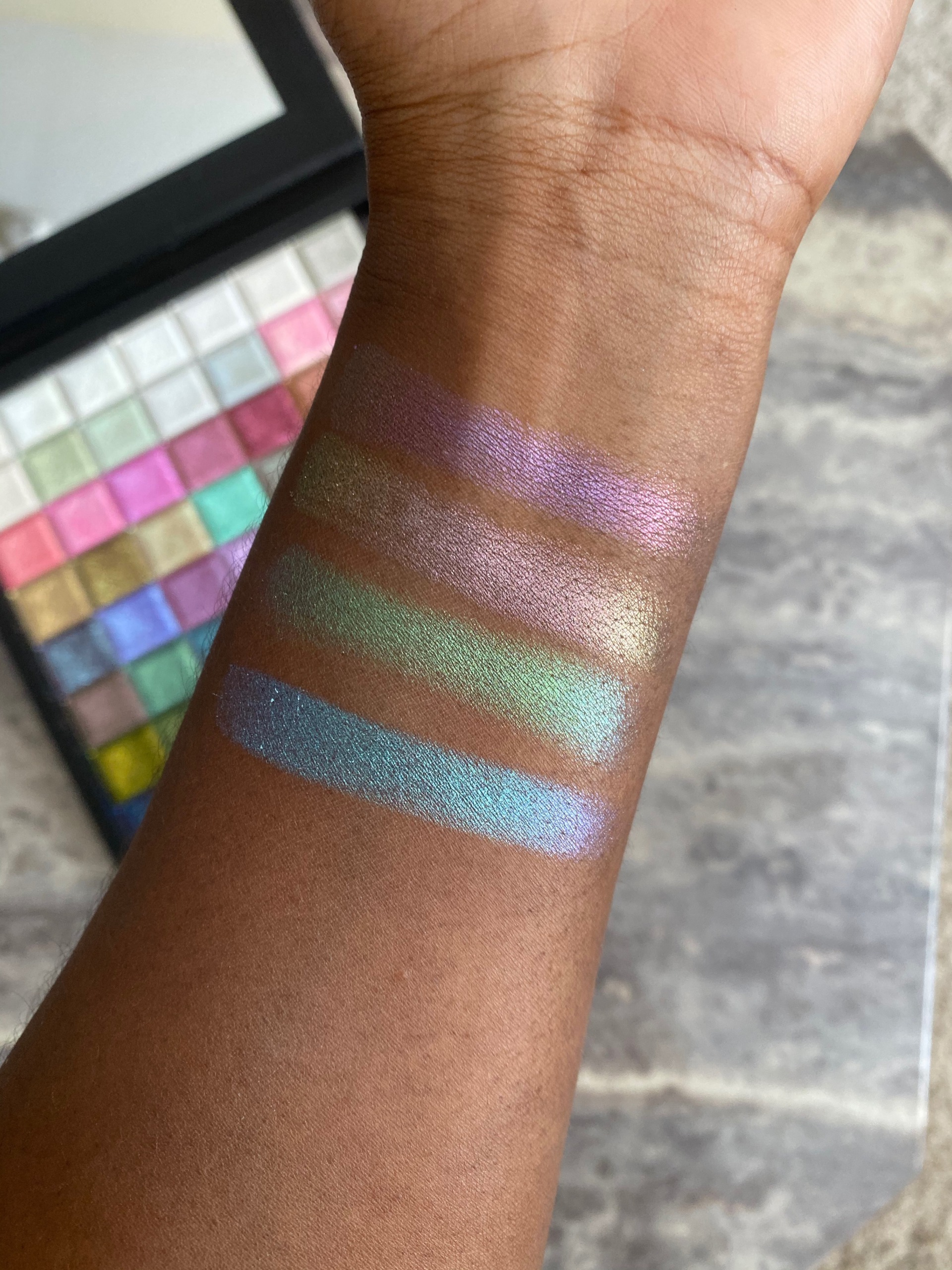
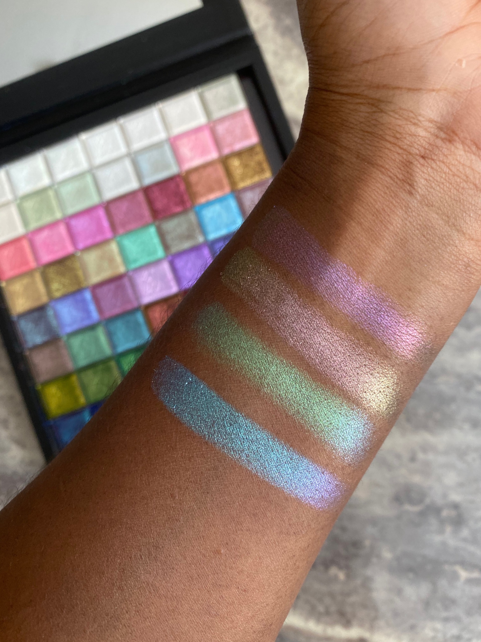
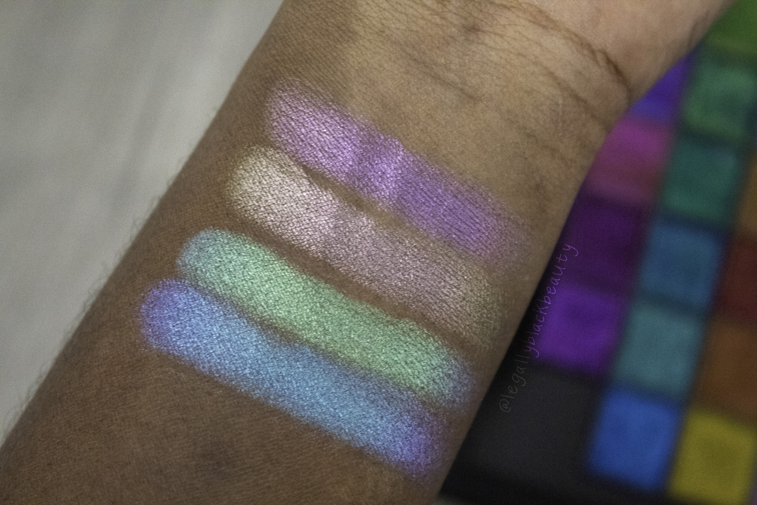
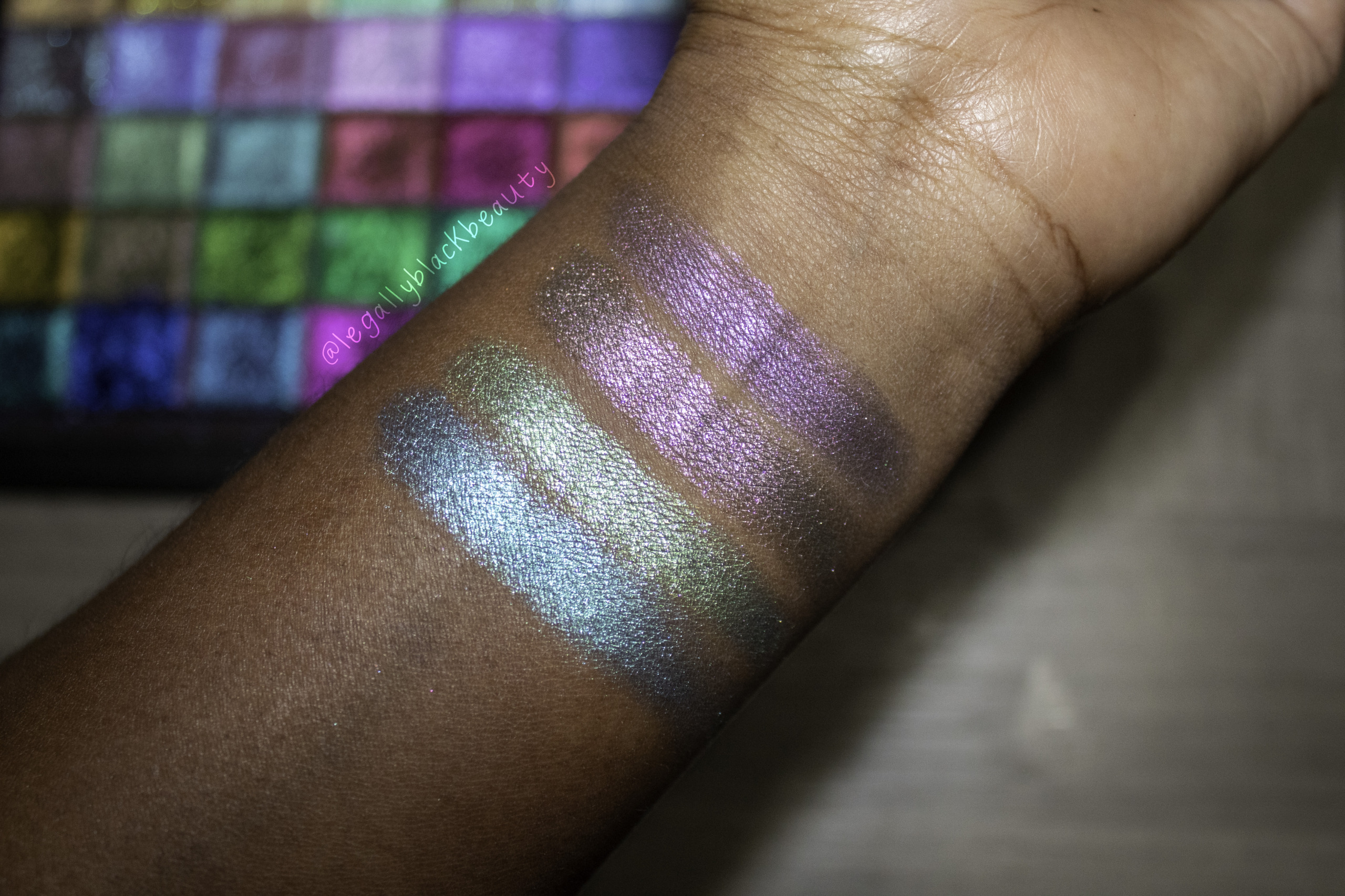
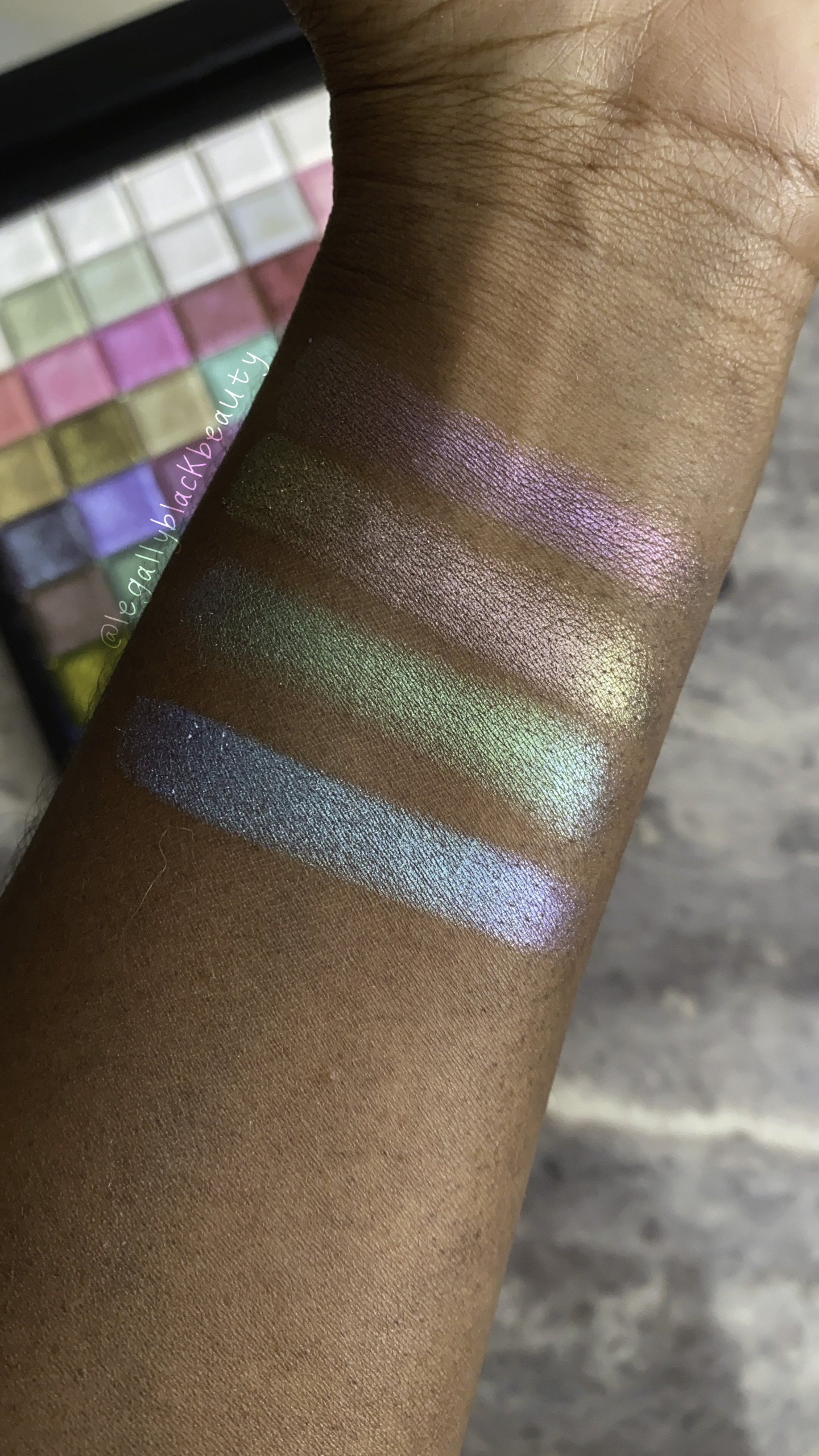
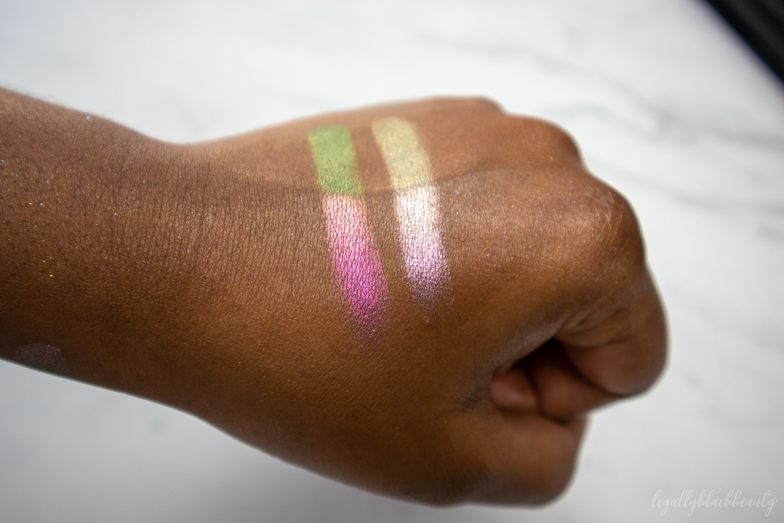
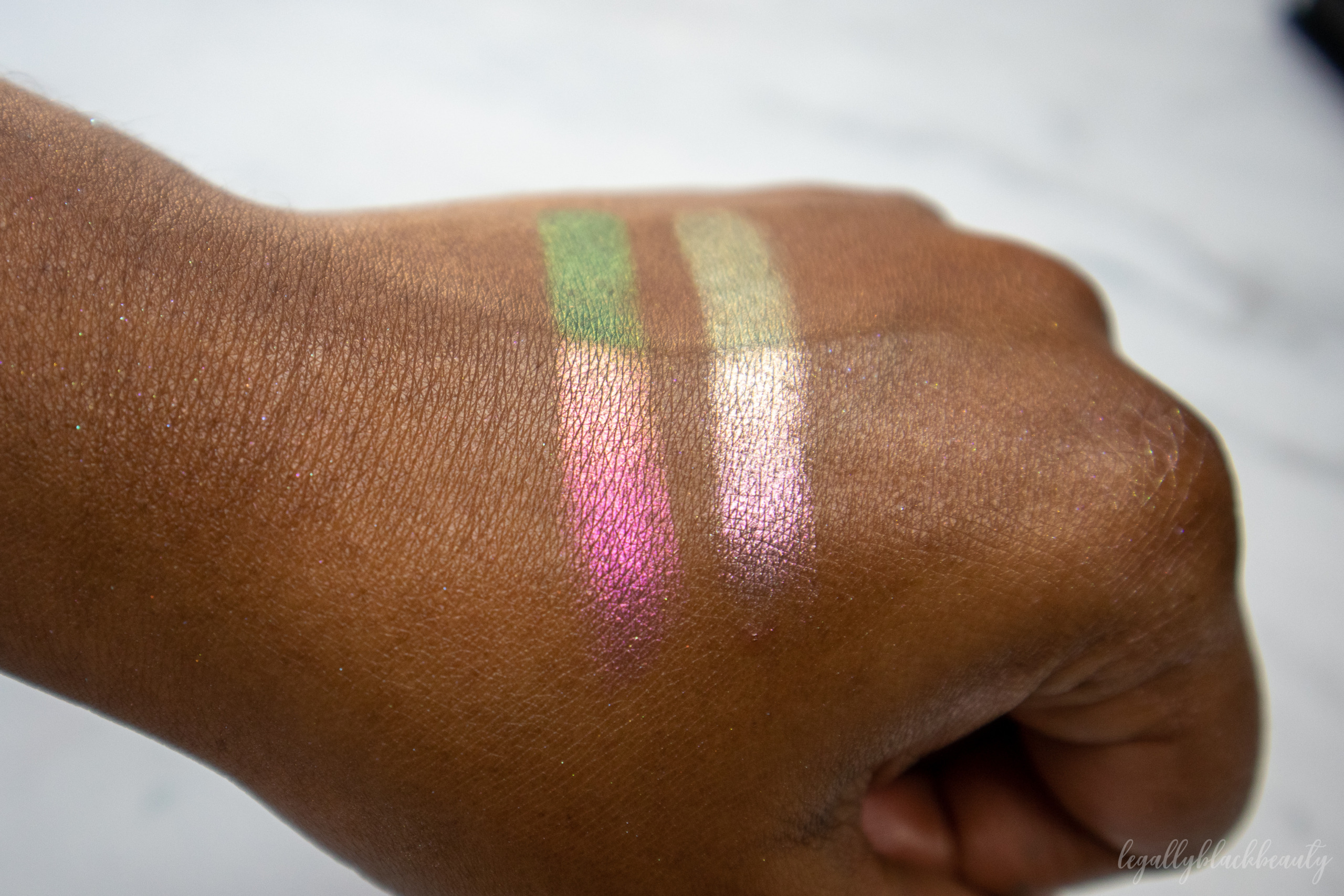
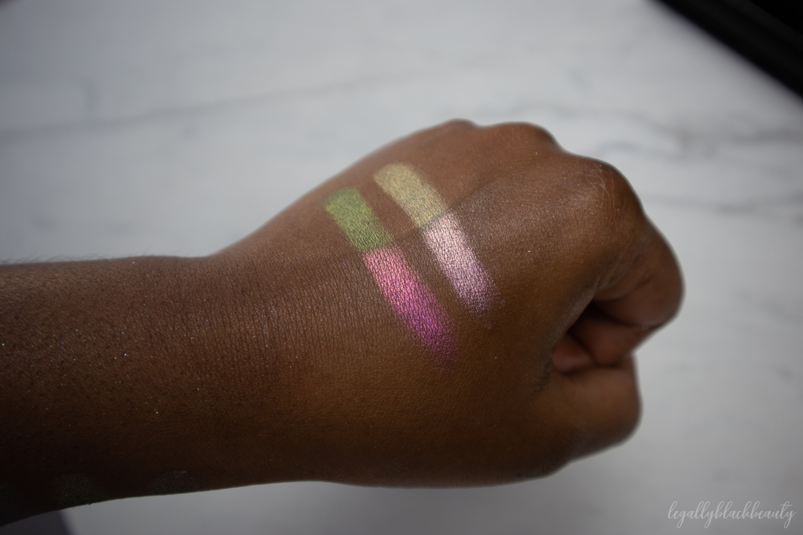
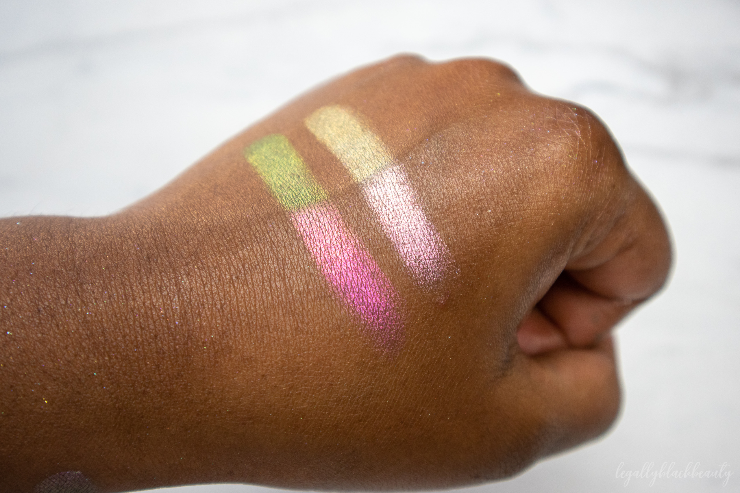
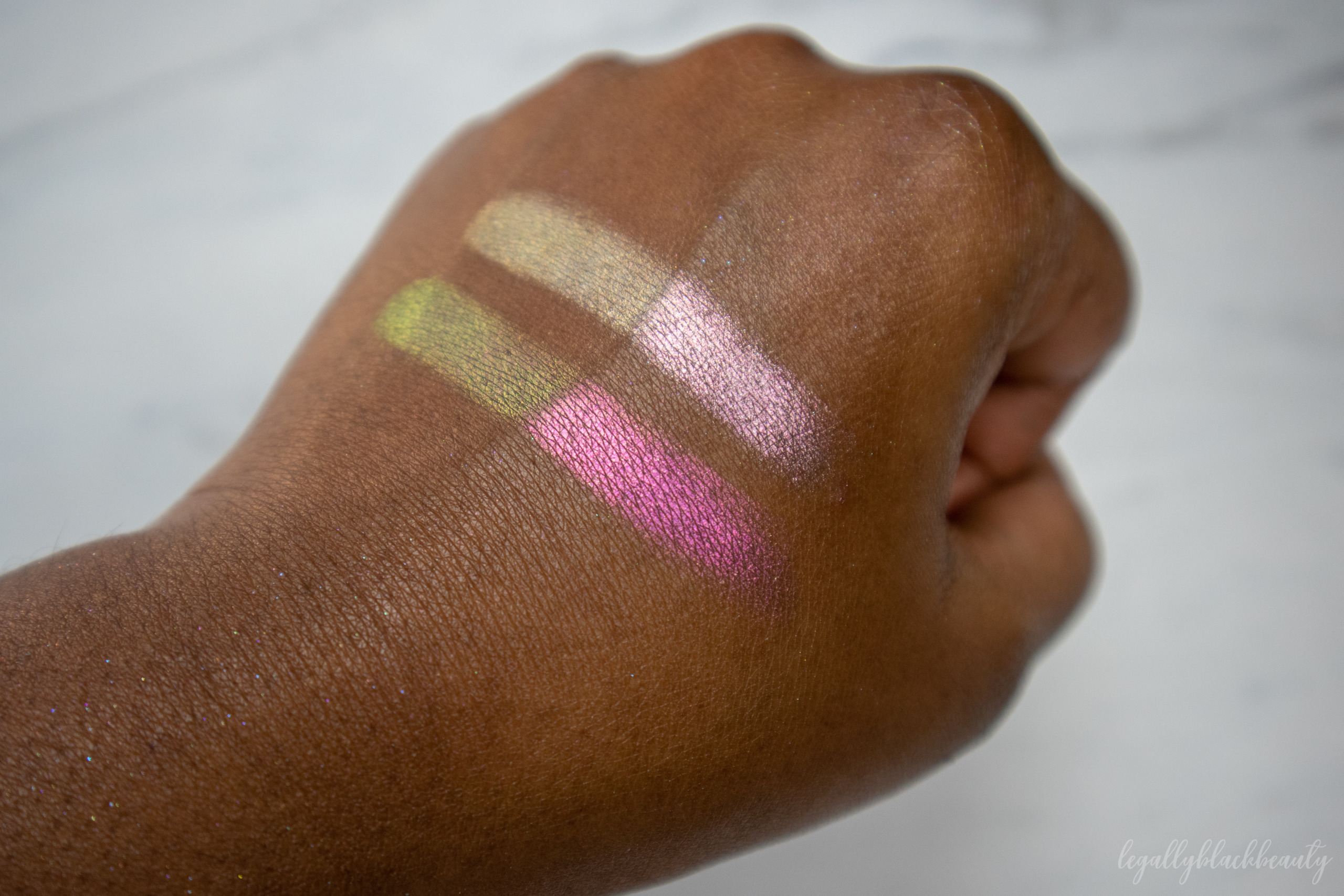
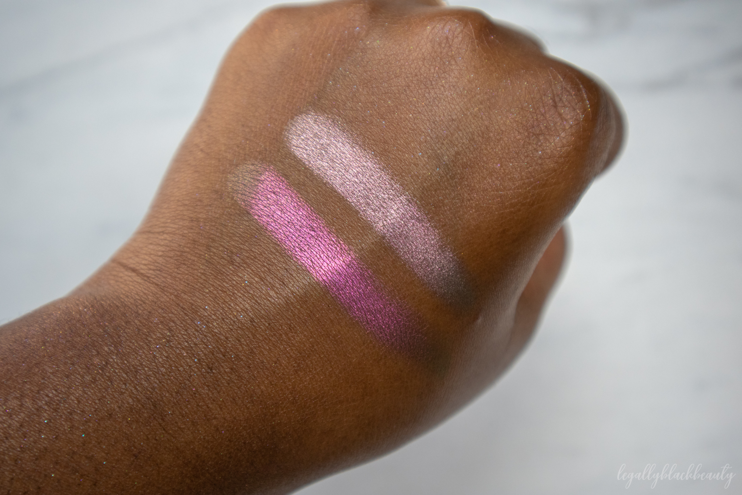
The Pastel Multichromes all consist of soft grey, grungy bases and bright, pearlized, luminous reflects. Clionadh considers them soft, pastel versions of the Jewelled Multichromes. All of the shadows can be used on the face, eyes, and lips. They can be purchased individually or in a bundle.
(swatched below from wrist to elbow)
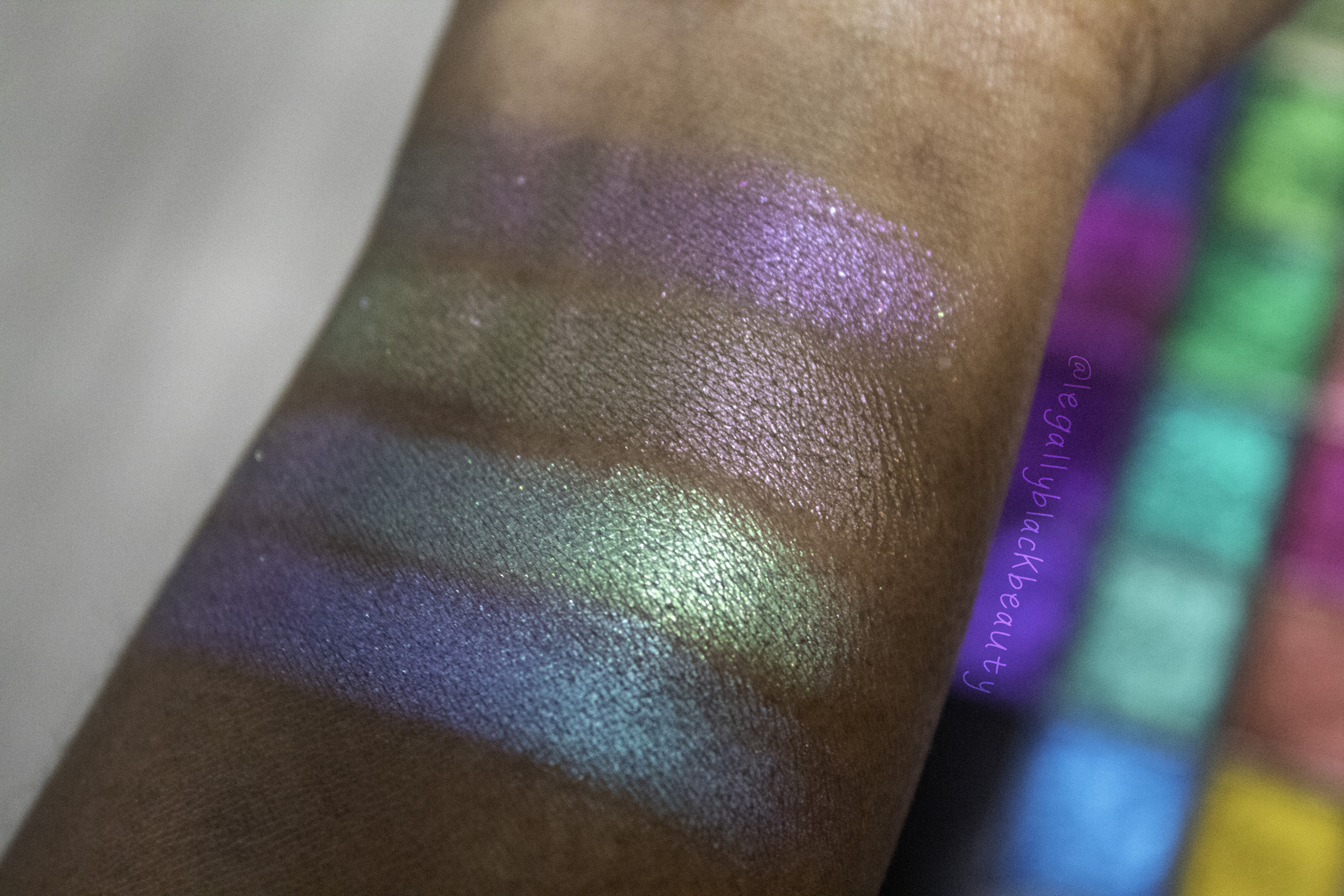
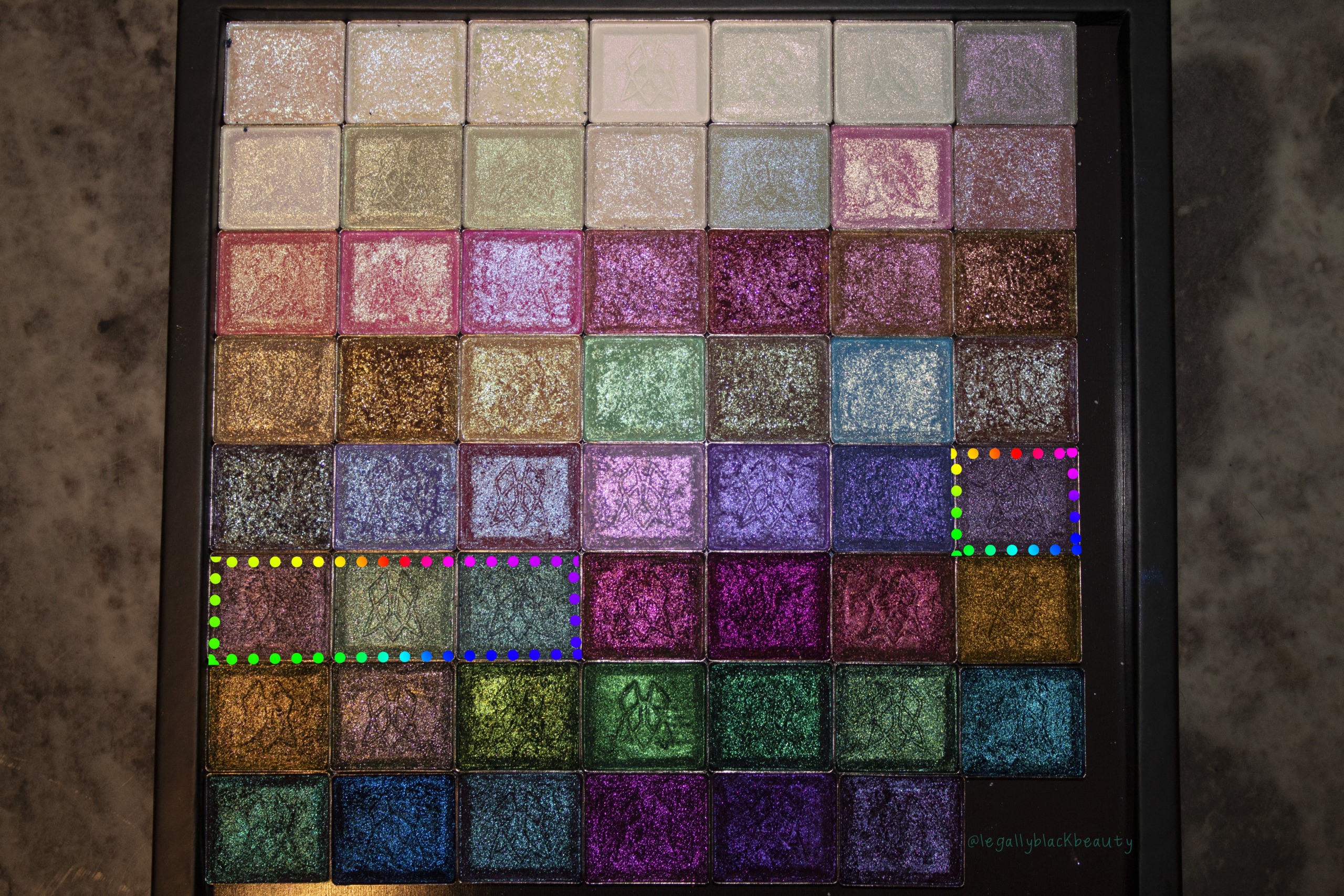
- Turret: Neutral grey base that shifts lilac-pink-orange-gold
- Cathedral: Grungy olive-grey base that shifts pink-peach-gold
- Keystone: Cool grey base that shifts green-blue-indigo
- Tower: Cool grey base that shifts blue-purple-pink