
- Purchased
- Gifted
- Affiliate Link(s)
Natasha Denona finally gave us some color! It’s not quite the amount (or, rather, the depth) of color many would have liked (more on that later). But it is, without question the most colorful palette Natasha Denona has released in a long time.
Not only did Natasha Denona bring us some color, but she also brought us a new word–triochrome. The word “triochrome” to describe a shadow with three shifts makes sense if you consider that we use the term “duochrome” to describe shadows with two shifts. Do I still wish she had opted for “trichrome” à la Pat McGrath instead? Of course.
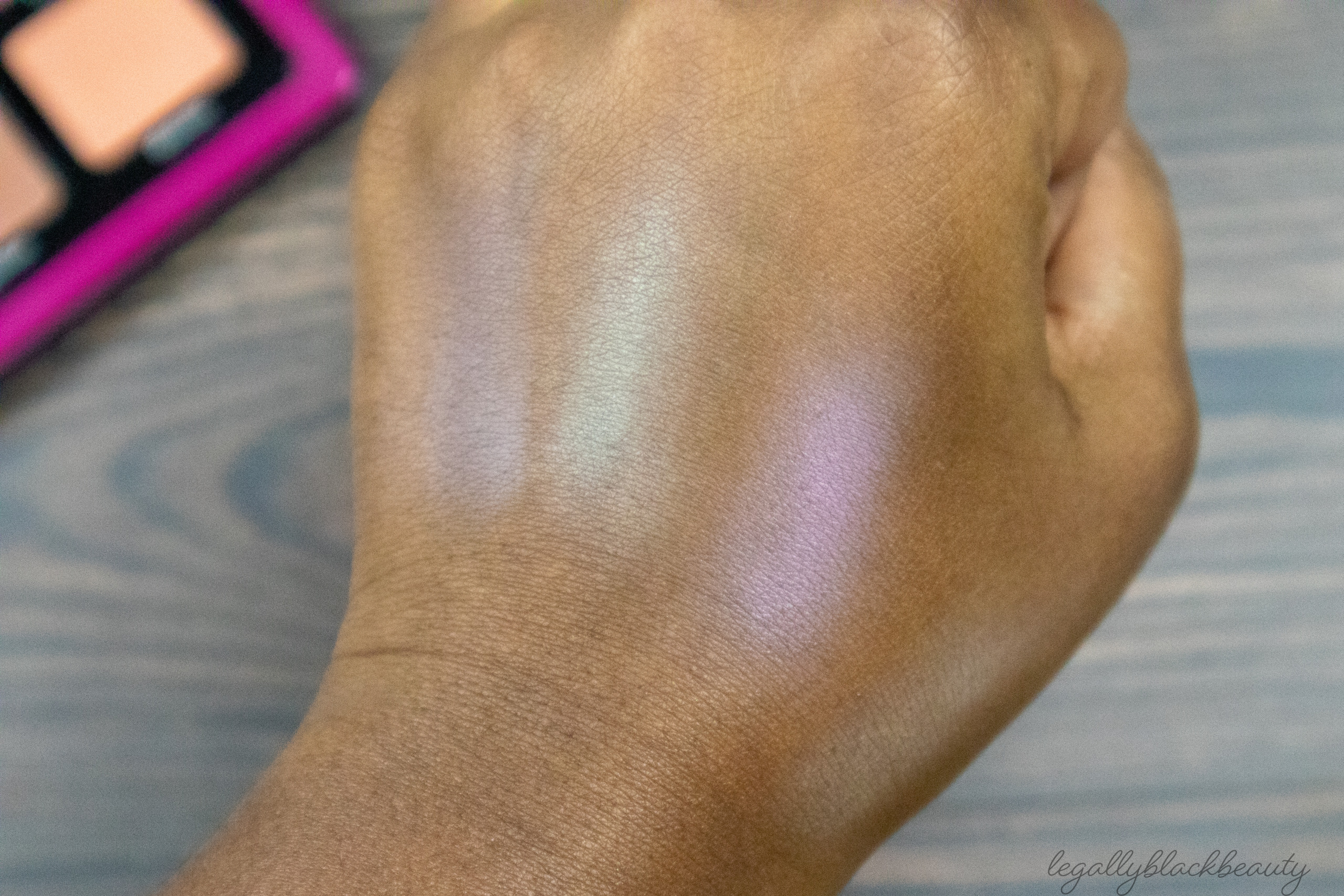
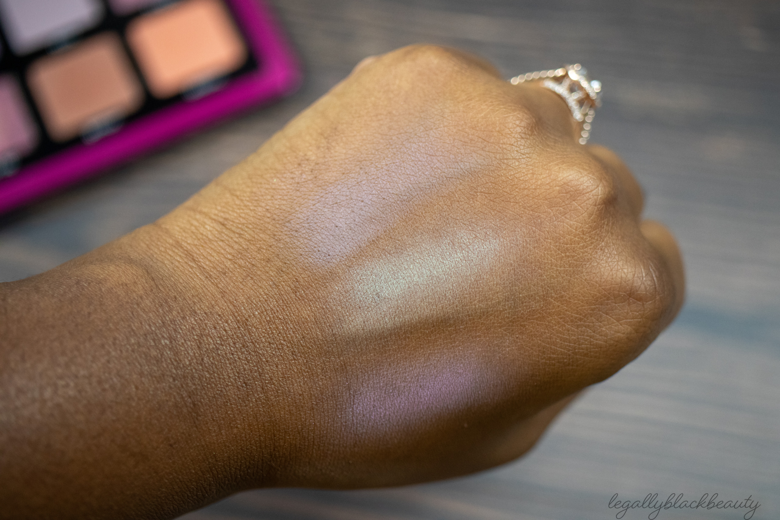
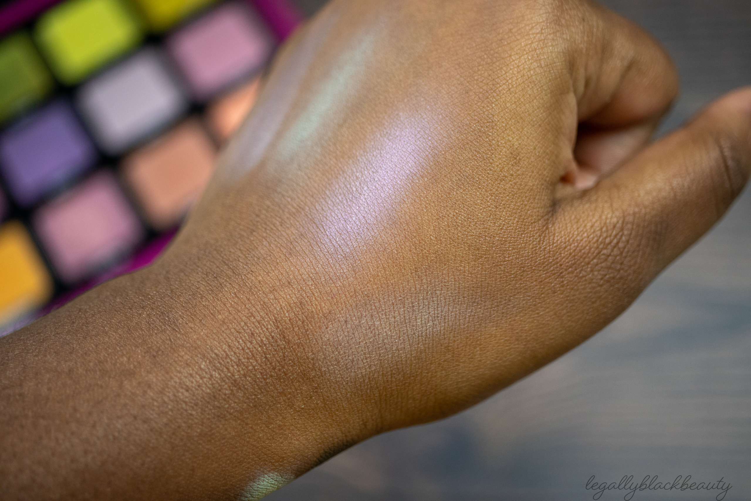
Like many recent Natasha Denona releases lately, this palette was met with a lot of umms, specifically from brown-skinned beauties wondering if some of the shadows might be a little ashy on our skin tones. As a result of my own questions, I decided to demo this product in a way I don’t normally demo products. In this post, you’ll, of course, find plenty of photos of my normal arm swatches. But I also singled out those shadows I found most concerning, swatching and blending them out on my hand to give you all a fuller picture of how they might work for you(sometimes shadows deepen as they blend). I also created two eye looks to get an understanding of how every shadow (yes, EVERY shadow) would look on dark skin. I placed two of the lightest mattes in two locations each to help gather my thoughts about them as blending versus lid shades (and I did this all at 11:30 pm so I forgot to put on mascara to cover up the fall out).
The three middle shadows in the bottom row were relegated to my lower lash line, so they’re not as easy to see in the eye looks. But, personally, those were the least concerning for me anyways.
My goal is not to get you all to buy something or to not buy something. Instead, my goal is to equip you with enough information for you to make an informed purchasing decision on your own. I’ll share my overall thoughts at the end, but I know this palette will not be everyone’s taste. I am aware that this palette is expensive, that some people want more depth, and that there are only three multichromes. And I can’t–and won’t–tell you how to feel about any of that. But I will, hopefully, give you a better understanding of how this palette might fit into your collection and how it might (or might not) satisfy your palette needs.
Enough about me. Let’s talk about Triochrome!
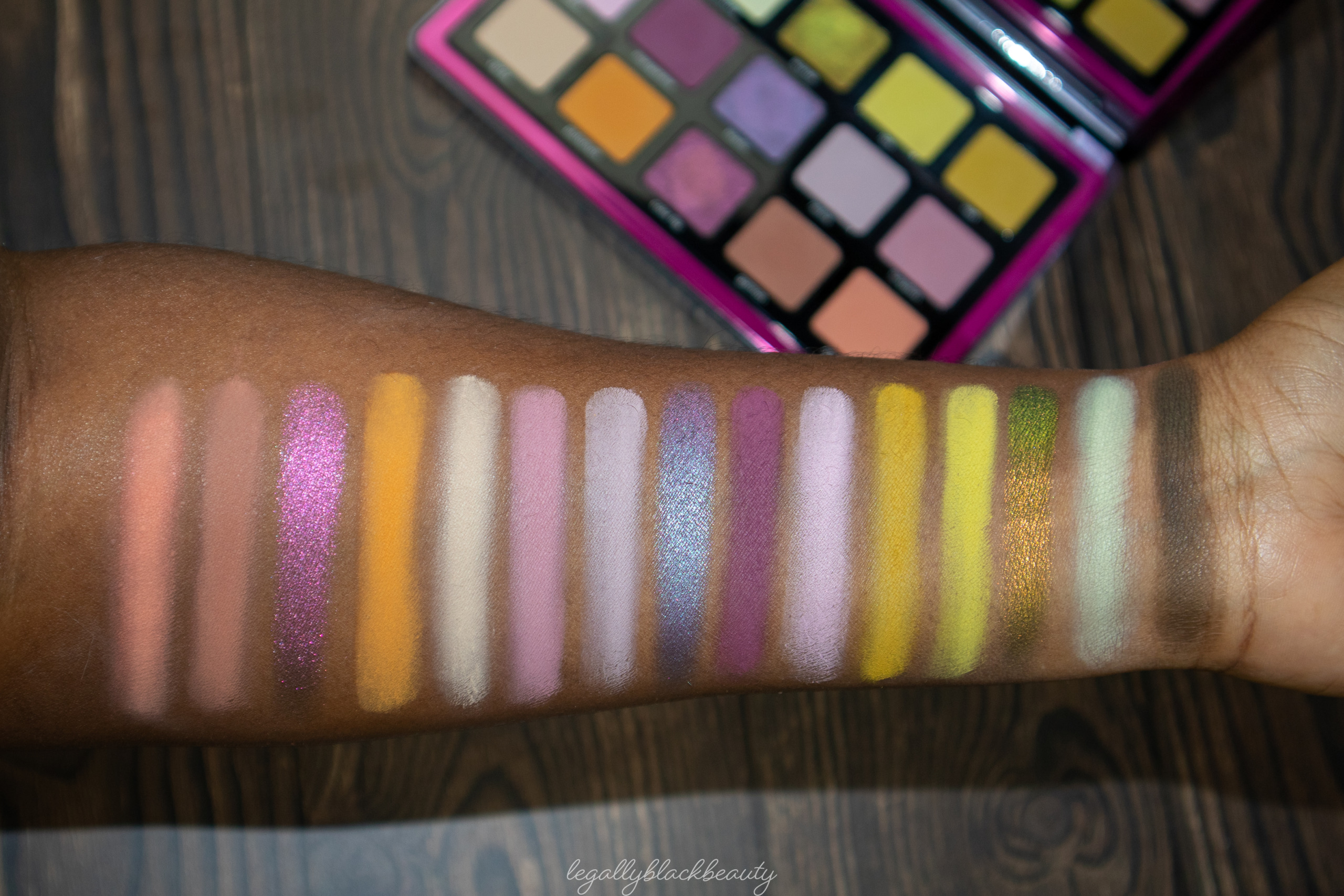
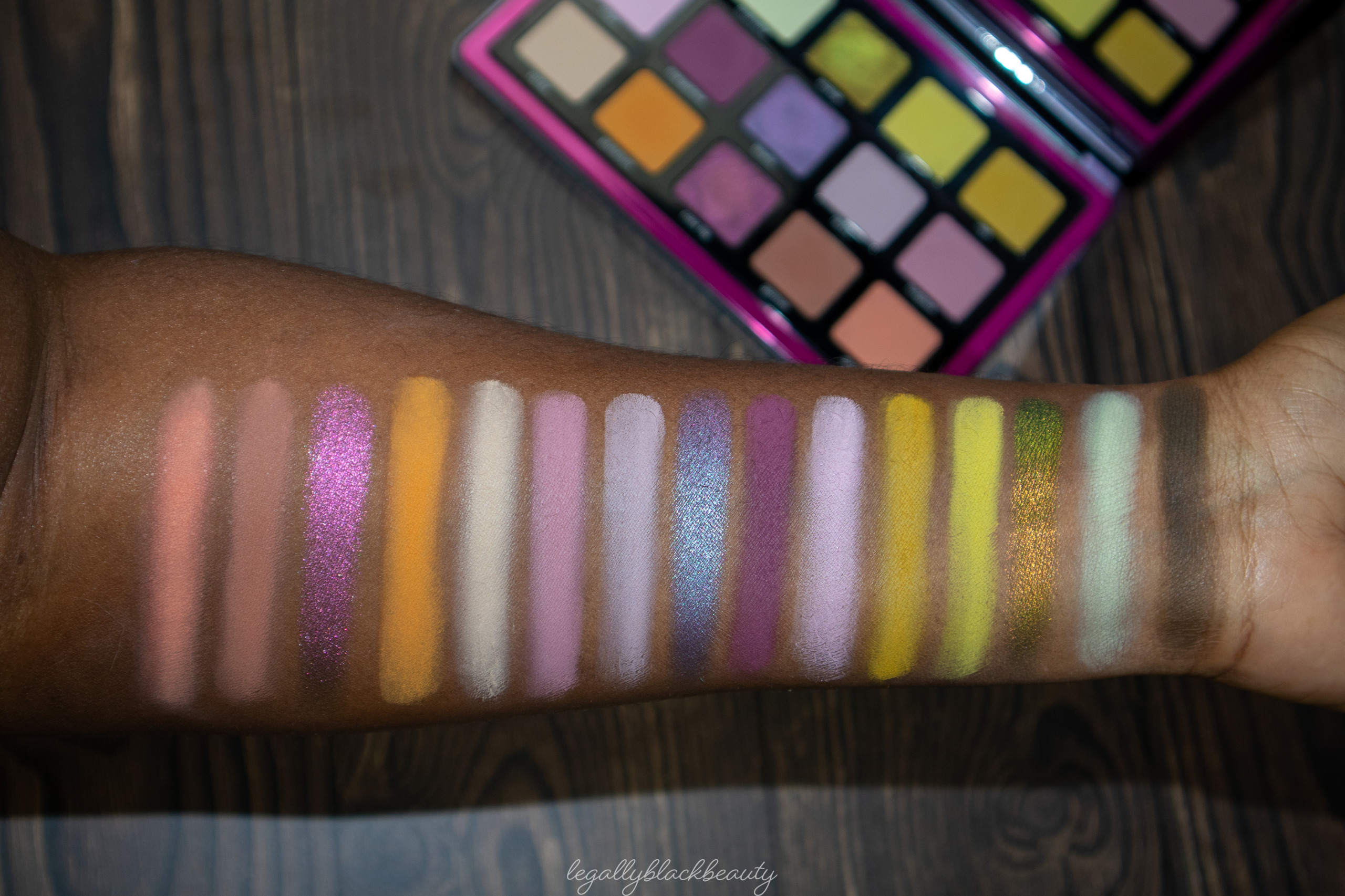
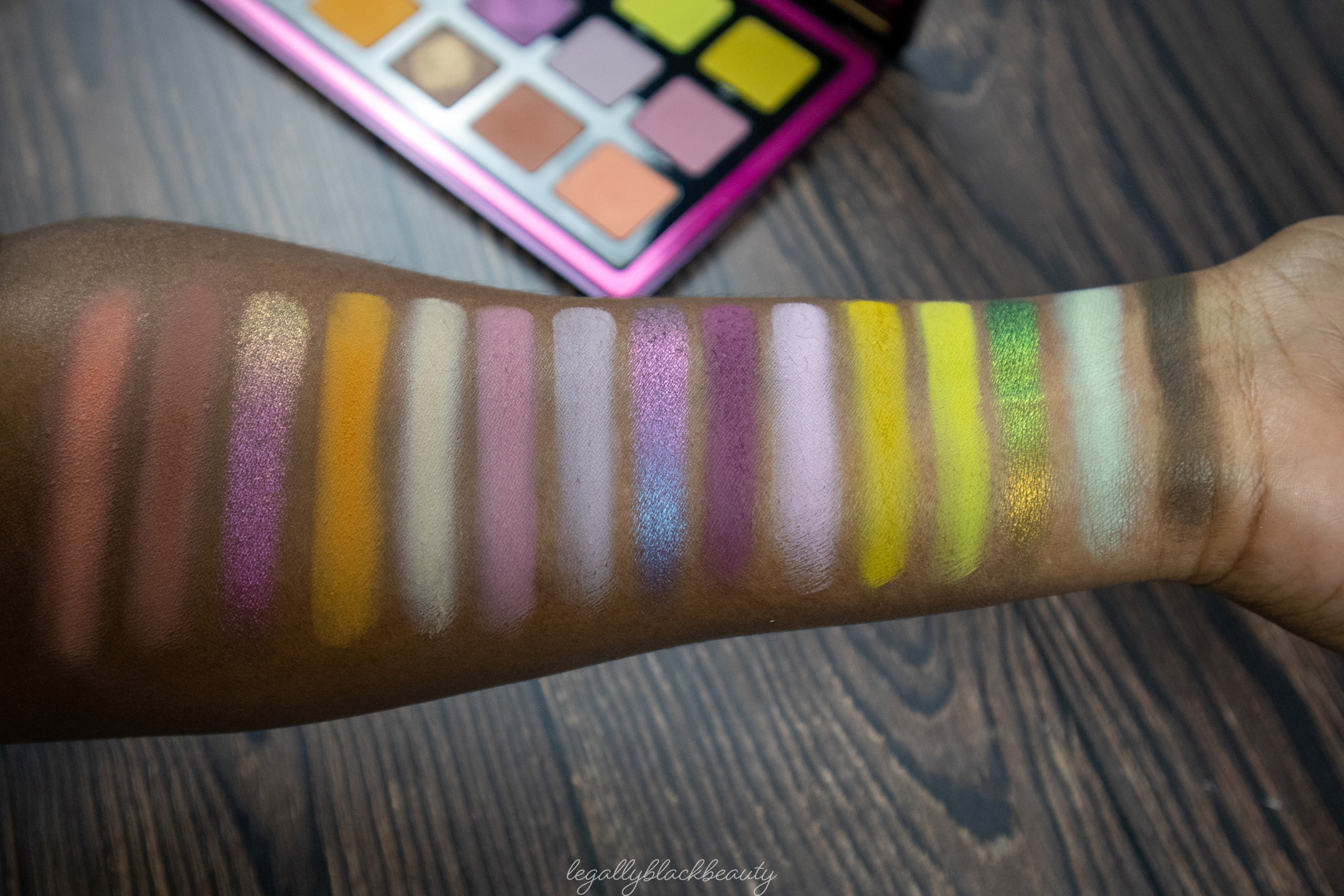
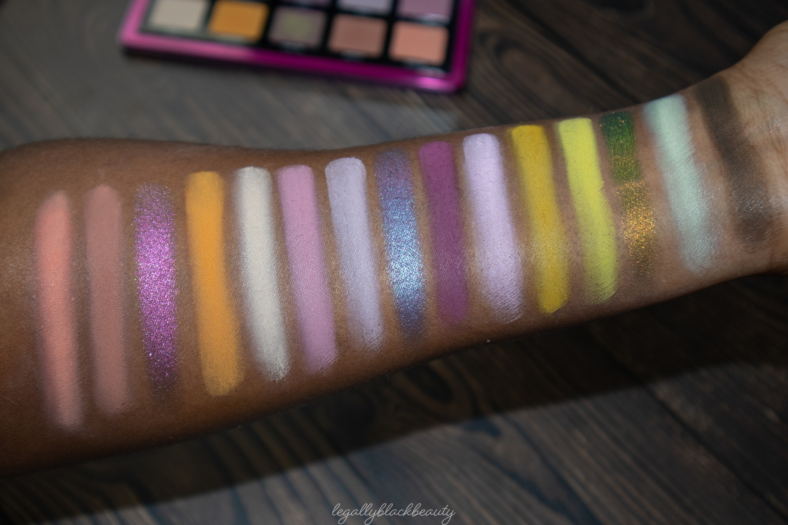
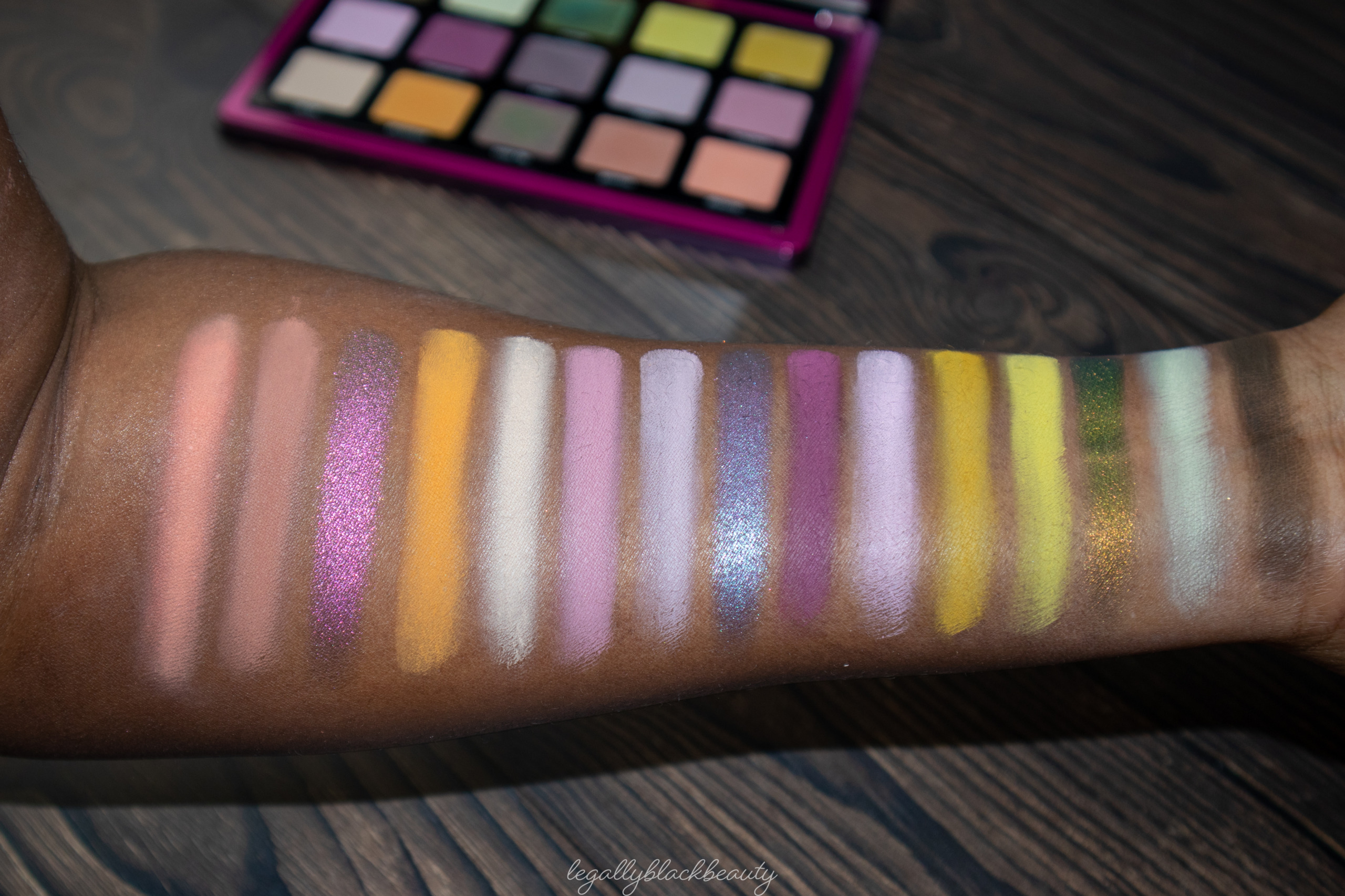
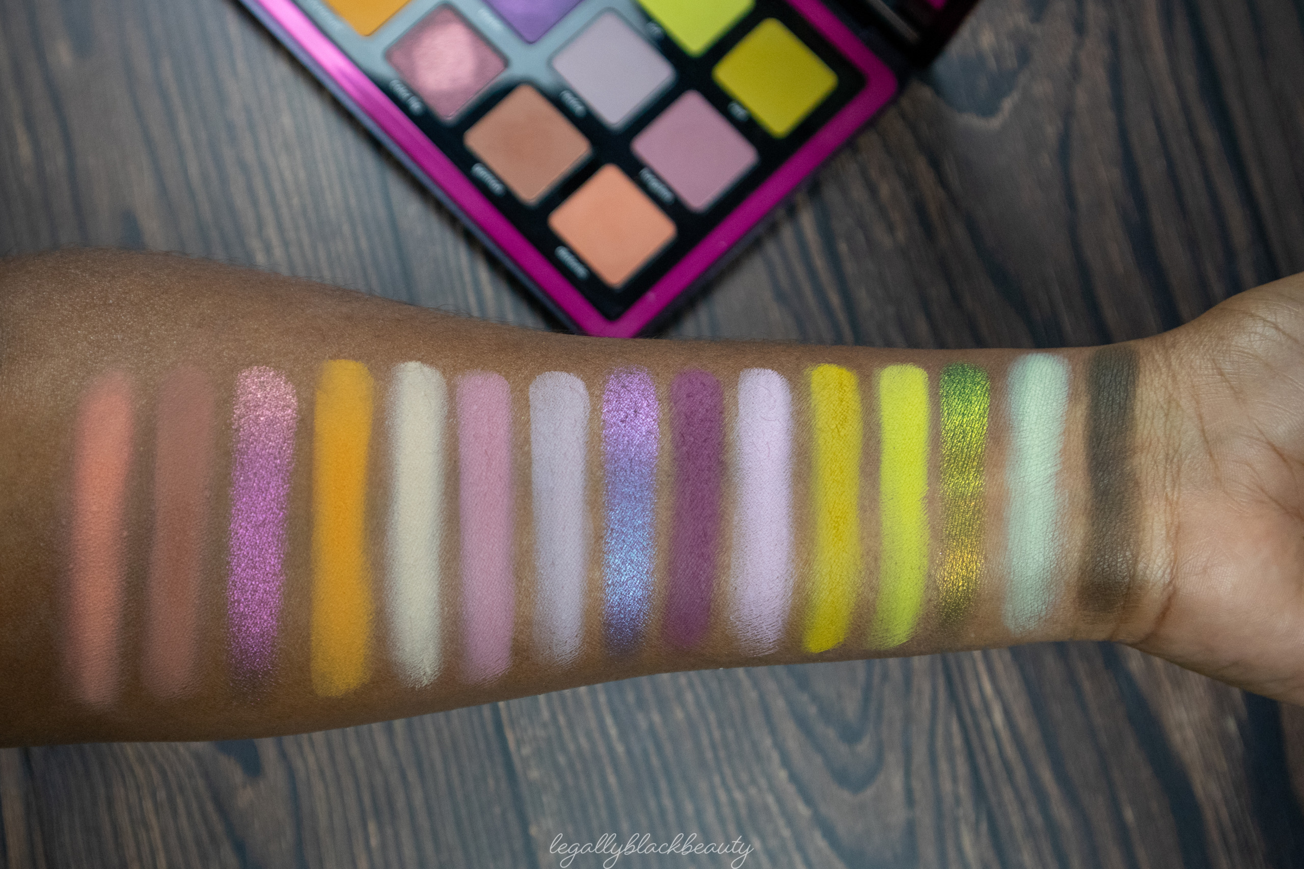
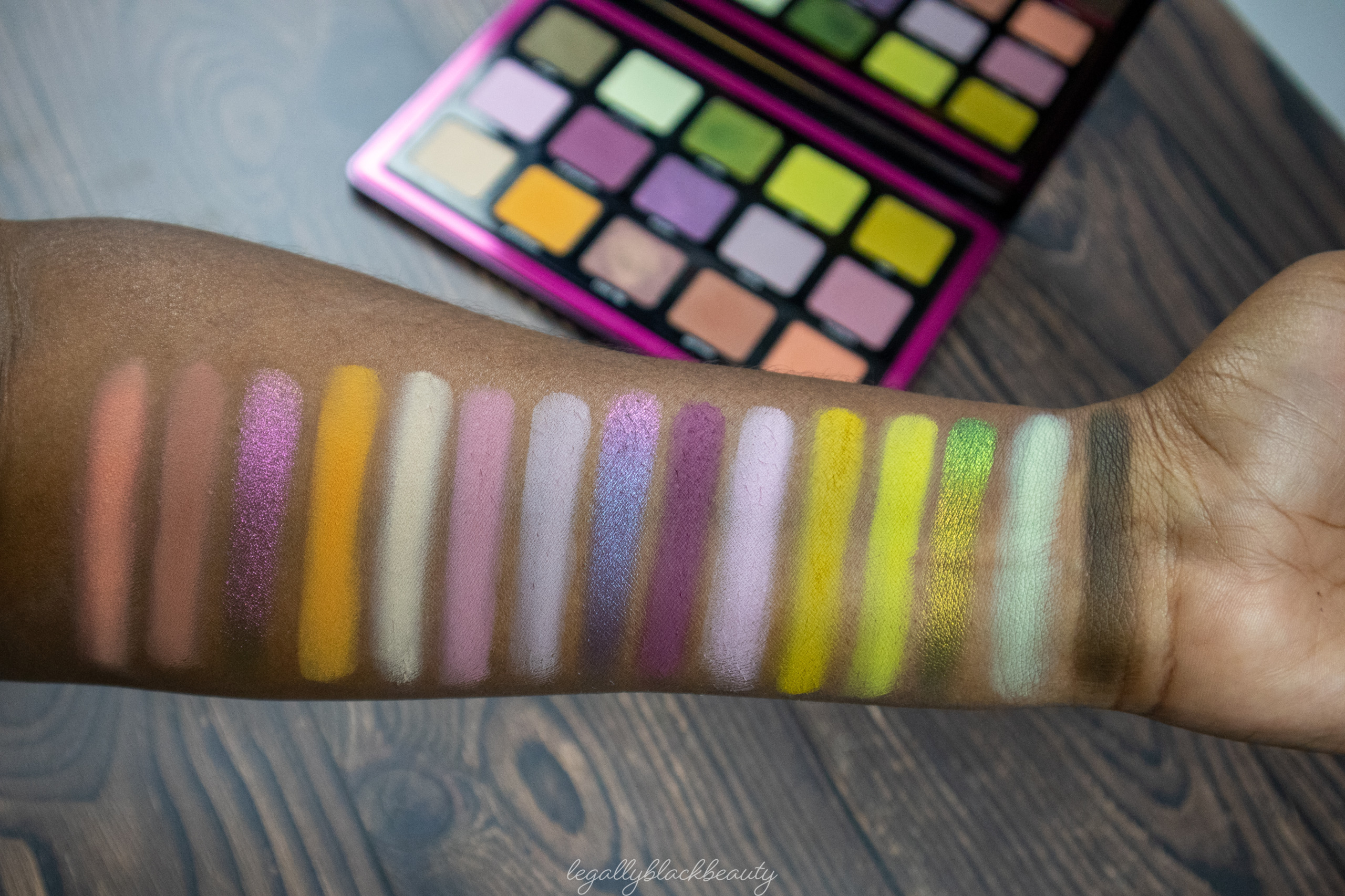
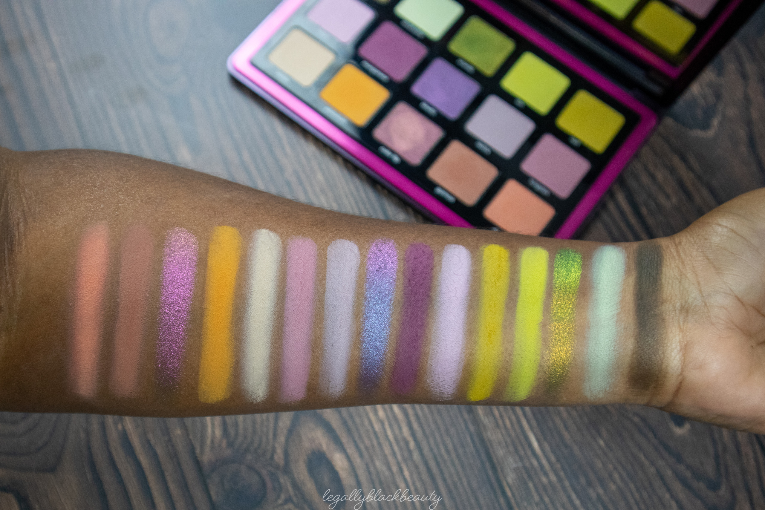
Triochrome is a 15-pan full-sized palette from Natasha Denona Beauty. It contains three color-shifting shadows and twelve mattes. The palette is named for the three multichromes, which are placed in the center column of the palette. It also has three rows of shadows of different tones, though all belonging to the same general color family. Even the multichromes all have a shift that places them within the color family of their respective rows.
It retails for 129 USD. It is Natasha Denona’s first palette of this size and price since Biba came out in the spring of 2019.
- Scrap: Cool dusty army green matte
- Andradite: Pastel mint matte
- Scarab: Poison green, warm gold, and blue shifting metallic
- Ion: Acid green matte
- Vert: Vibrant mustard matte
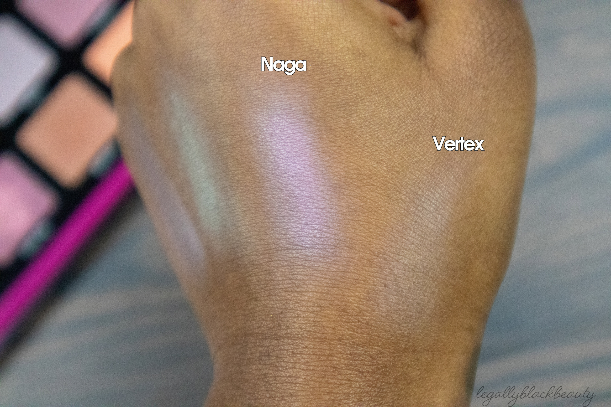
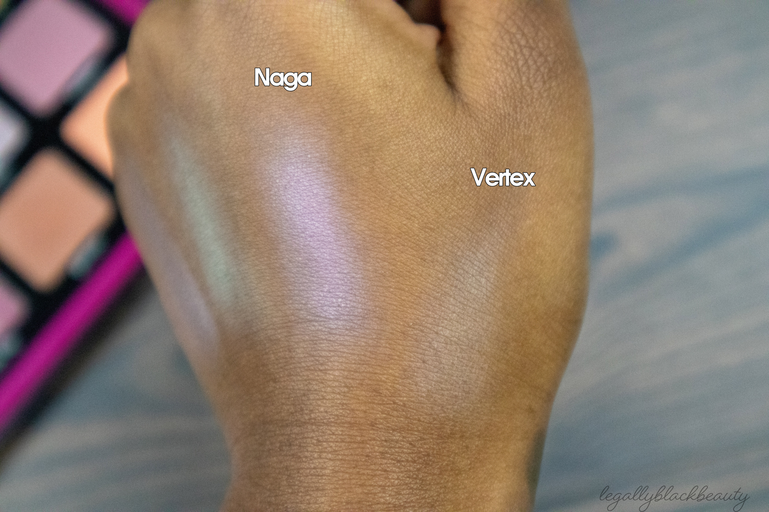
- Naga: Pastel lavender matte
- Manganese: Vibrant eggplant matte
- Kinetic: Purple, fuschia, and neutral silver shifting metallic
- Redox: Dusty lilac matte
- Tungsten: Toasted mauve matte
- Vertex: Cool ivory matte
- Plutonium: Burnt mandarine matte
- Color flip: Pink, beige**, and dusty green shifting metallic
- Garmon: Peachy taupe matte
- Diatonic: Vibrant light coral matte

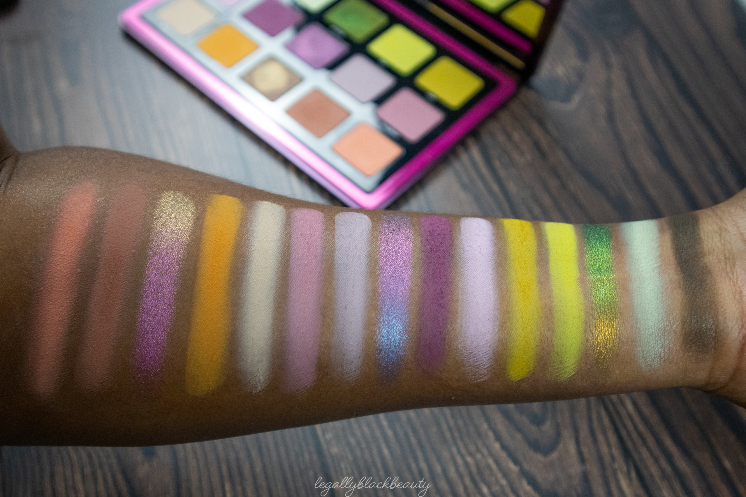
- Naga (above crease, closest to brow; inner lid)
- Manganese (outer corner)
- Kinetic (center lid)
- Redox (inner area above crease, underneath Naga )
- Tungsten (crease; outer area above crease)
- Vertex (inner corner)
- Plutonium (inner lower lash line)
- Color Flip (lower lash line)
- Garmon (outer lower lash line)
- Scrap (outer corner)
- Andradite (inner lid; above crease, closest to brow)
- Scarab (center lid)
- Ion (above crease, underneath Andradite)
- Vert (crease)
- Diatonic (inner corner)
- Plutonium (inner lower lash line)
- Color Flip (lower lash line)
- Garmon (outer lower lash line)
Triochrome performs as I expect Natasha Denona palettes to perform, for the most part. The mattes are the usual smooth powder formula, with no surprise cream-to-matte shadows thrown in the mix. The palette only has two deep mattes, which is particularly interesting considering that the palette is named for its three deep multichrome shimmers (note: their bases aren’t as deep as the bases of some indie multichromes, like Clionadh’s Jewelled Multichromes).
But, after further inspection of my own Natasha Denona collection, I realized this pattern follows one of the brand’s most common patterns. Another one of Natasha Denona’s full-sized 15-pan palettes, also lacks in depth. It has 1-2 mattes deeper than my skin tone–again, surprising given the depth of some of its shimmers. Likewise, Gold and Lila only have 2 deep mattes themselves. Out of two true mattes in Green-Brown, only one is (slightly) deeper than my skin tone. Moving to the smaller palettes, Bronze and Glam, both new releases, each have very few deep mattes as well. Bronze has one somewhat deep brown matte and one deep demi-matte; Glam has both a deep “lash line” shade and a deep “smoke” shade. Some of Natasha Denona’s most popular offerings, like Biba and Metropolis have an amount of depth atypical for the brand–which probably contributes to their popularity quite a bit.
What does all of this mean? Primarily, that I like to count sometimes. But also that Triochrome does not have an unusual ratio of light to deep mattes. Rather, it seems Natasha Denona has a somewhat formulaic approach to building many of their palettes. “One to two deep mattes is just enough.” Whether this approach is light-skin-centric or merely simplistic is up for debate. You can certainly create a variety of looks with only two deep mattes. You can also reach for shadows outside your palette. But, with Natasha Denona’s pattern, only having two deep mattes means you are more likely to end up with more light shades in a palette than you prefer, as well as shadows those with deep skin tones will find unflattering against their melinated skin.
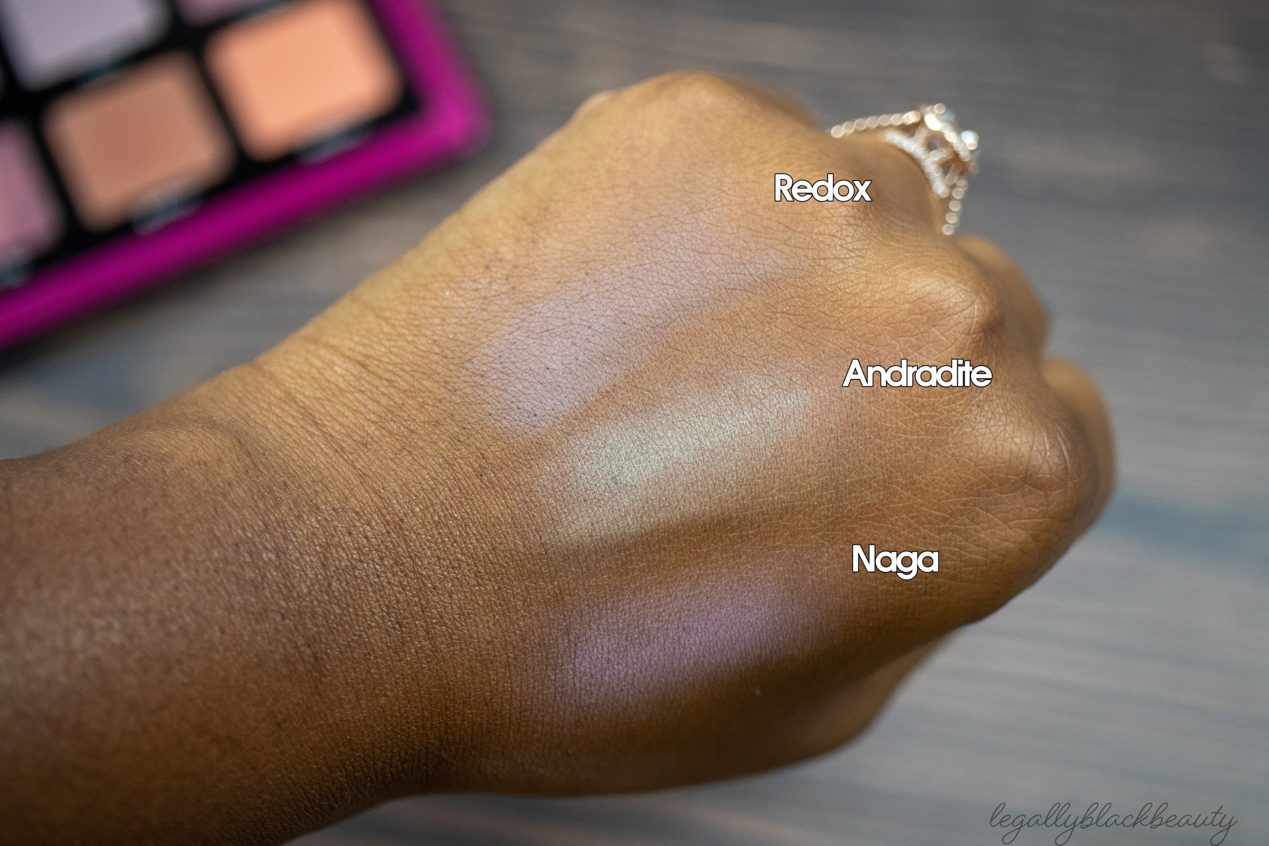
And that brings me to my next critique. Out of the twelve matte shadows in Triochrome, I find two are going to be of little use to me. Vertex is too light for my preference. I don’t see any way to not make it look ashy and chalky on my skin. In my opinion, Andradite looks terrible as a transition or blending shade for me. I am slightly more comfortable with it as a lid shade but, with multichromes competing for lid space, I don’t see myself using it that way often. I was concerned about Naga when I first saw it in its pan. I will have to be careful with it, but I can use it gently blend out the edges of a deeper shadow or on my lid for a pastel look. Redox borders on ashy because of how cool-toned it is, but it works for me as a person who doesn’t shy away from greyed colors.
The top row is one of my favorites. I think Ion, Vert, and Scrap are all stunning greens on my skin tone. And their unique undertones make them not-so-dupable within my collection. The remaining mattes–Plutonium, Garmon, and Diatonic–are nice, but less unique when compared to the brand’s own catalog (see Sunrise, Sunset, and Bronze, for example).
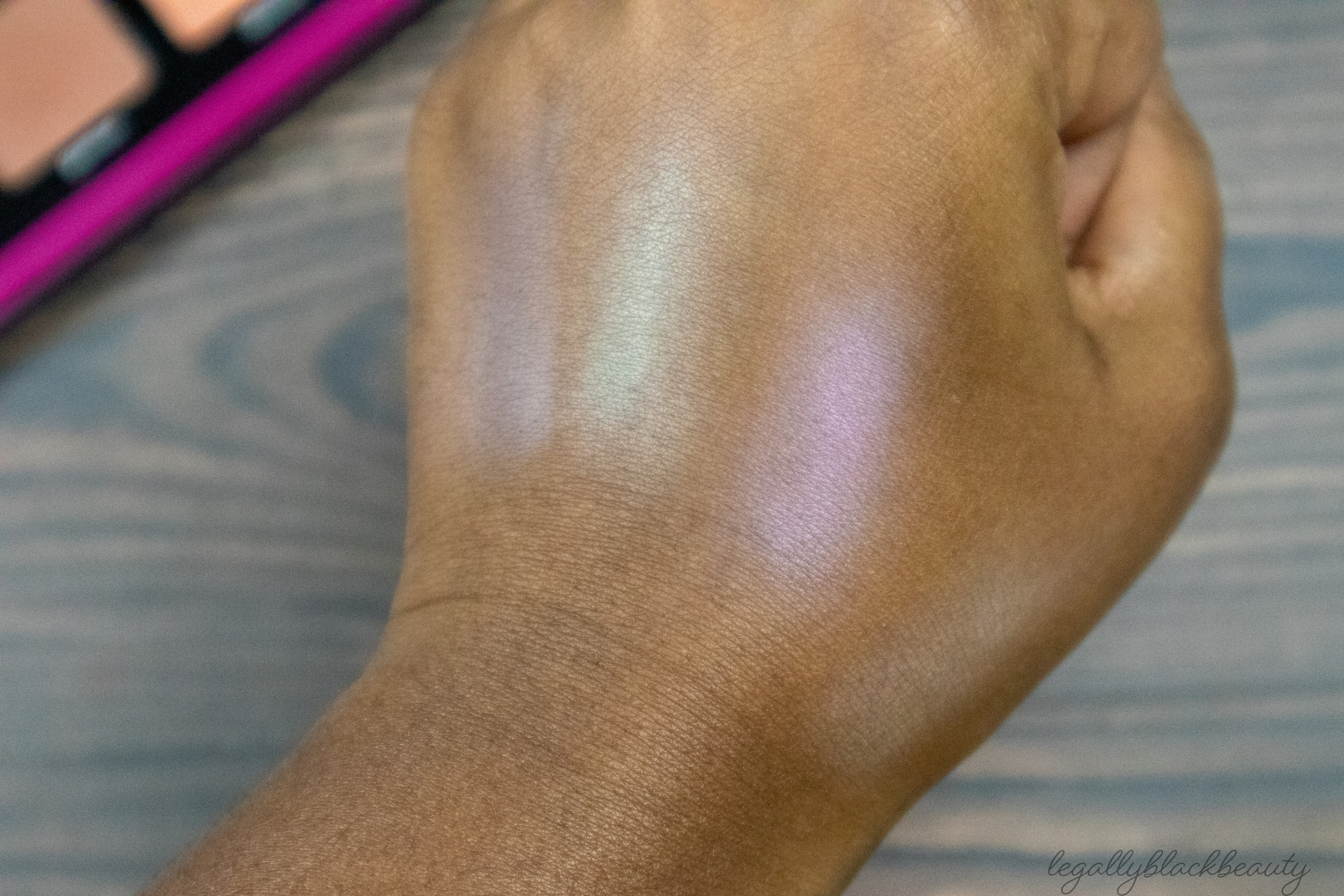
I also enjoy Scarab. The shifts are easy to catch, even if the particular shifts may appear a few times over in an indie lover’s collection. Kinetic is the weakest multichrome of the trio. The shifts are subtle on my lid, regardless of whether I apply it with my finger or with my brush. I could not intensify the shift by spraying my brush. As one final attempt, I was able to intensify it by using Fyrinnae’s Pixie Epoxy (the result is not shown in this post) . Color Flip is a beautiful, subtle multichrome with easily identifiable shifts. Color Flip’s swatch definitely matches up with Natasha Denona’s description of it as having a “nude” (read: beige) shift.
These multichromes are nowhere near as impactful, bright, and reflective as many indie options. But I don’t think Natasha Denona intended for these to compete with their bolder counterparts–and if they did intend so, they clearly missed the mark. I view these multichromes as more subtle, lending themselves to more professional and formal environments than the average indie multichrome. These more readily fit into the “work-appropriate multichrome” box than any multichrome I’ve encountered before.
Overall, I like the palette myself, but my metrics for judging a palette may be different from other people’s. I look at how easily I can come up with aesthetically-pleasing color combinations, how many ashy or unusable shadows there are compared to shadows I would find myself using often, and whether the shadows generally perform well. With my standards and preferences in mind, I know I will get a lot of use and joy out of Triochrome. But I know there are going to be dealbreakers for others. When deciding whether to bring Triochrome into your collection, consider your own preferences and needs for your palettes. Will this number of light mattes hinder your ability to fully enjoy the palette? Will you be embarrassed by how much your indie multichromes will outshine these? Do you not see yourself paying the price of this palette, with or without the 20-25% discount offered a few times a year?
I had a lot of thoughts about this palette and hope this review was helpful. Let me know your thoughts below!
After your post, I think I like it more than I initially did, and I may pick it up if it is ever offered at least 30% off or bundled up with another ND palette that I like but wouldn’t get for the full price (e.g. Biba, Bronze, Glam). I remember how desperately I wanted Metropolis for all its shortcomings, and ended up getting it during the Spring Rouge sale. Triochrome just does nor inspire the same feelings in me.
Thank you for including eye looks! Some of those mattes are gorgeous so I keep reconsidering this lol but I’m working on not being drawn in by 30% of a palette.
I also didn’t realize the lack of very deep mattes in so many of the ND palettes. I think I’ve only noticed it once before but some of their choices make more sense now.
I have to keep it real… this color story is so mehhh to me. I understand the vision, but I wish ND swapped out some of those shades. I’m thinking: andradite, naga, redox, vertex, garmon (all the pastel-ish shades). It’s like those pastel shades don’t mesh well with the rest. idk maybe I’m overthinking it… but I know you can relate (given the indigo debate lol)
Pastels with deep-ish multichromes is kind of a weird combination, right?