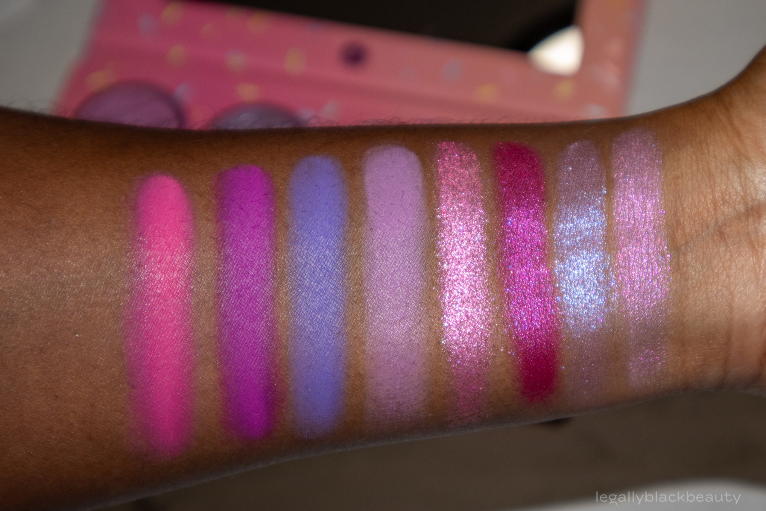
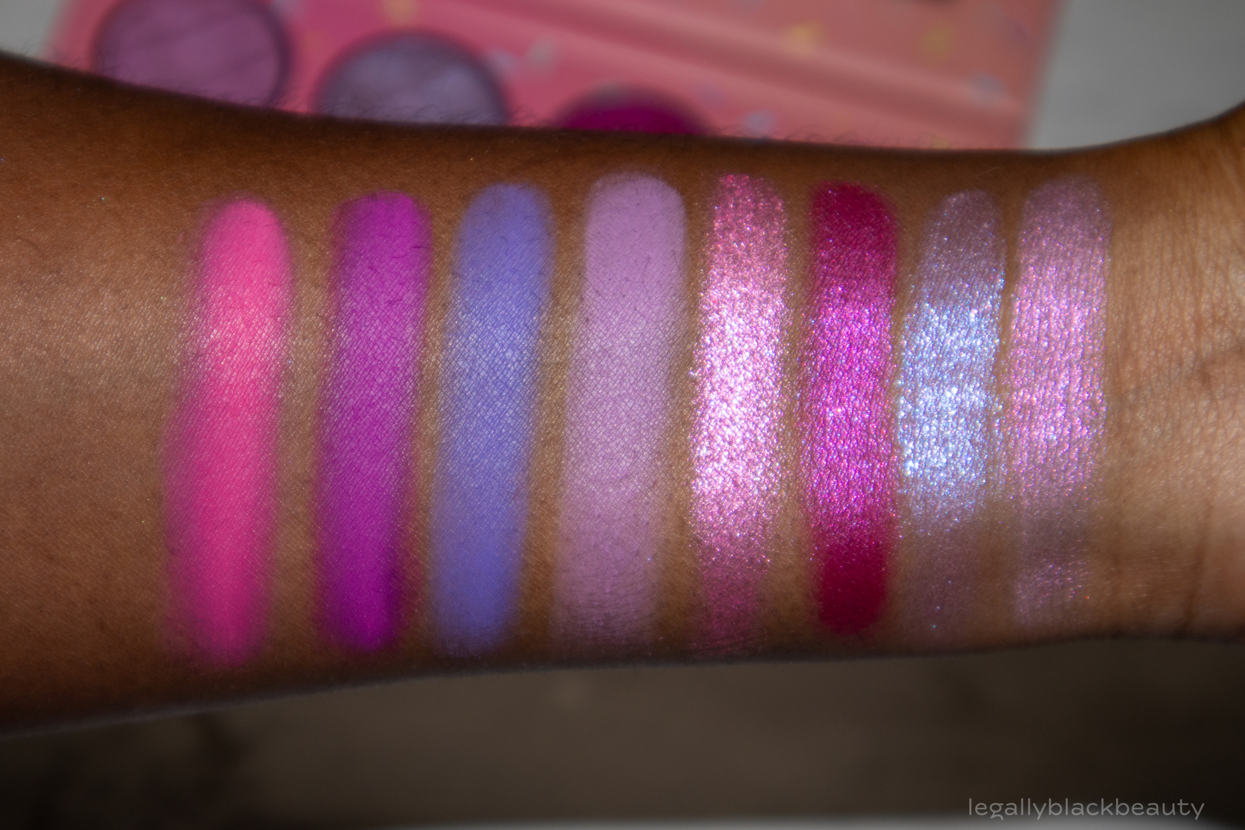
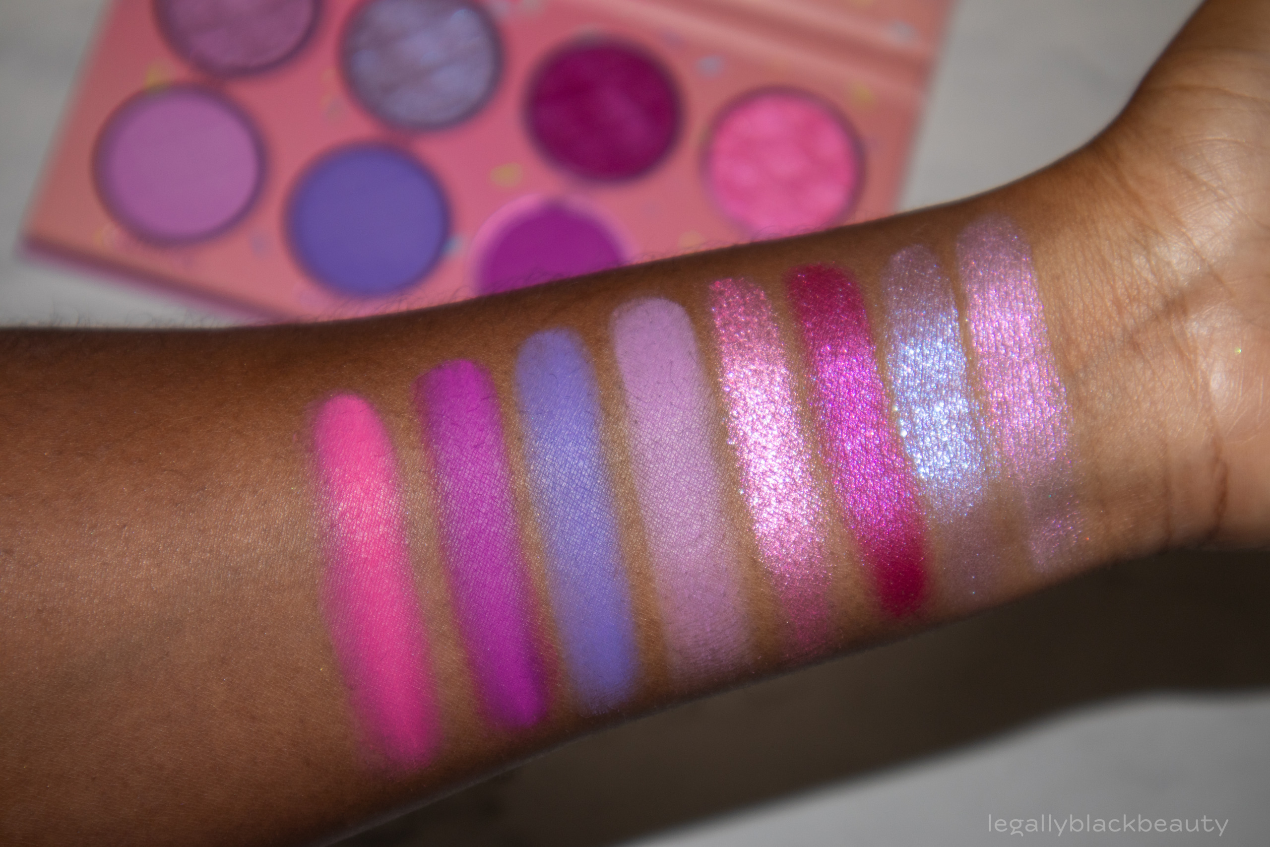
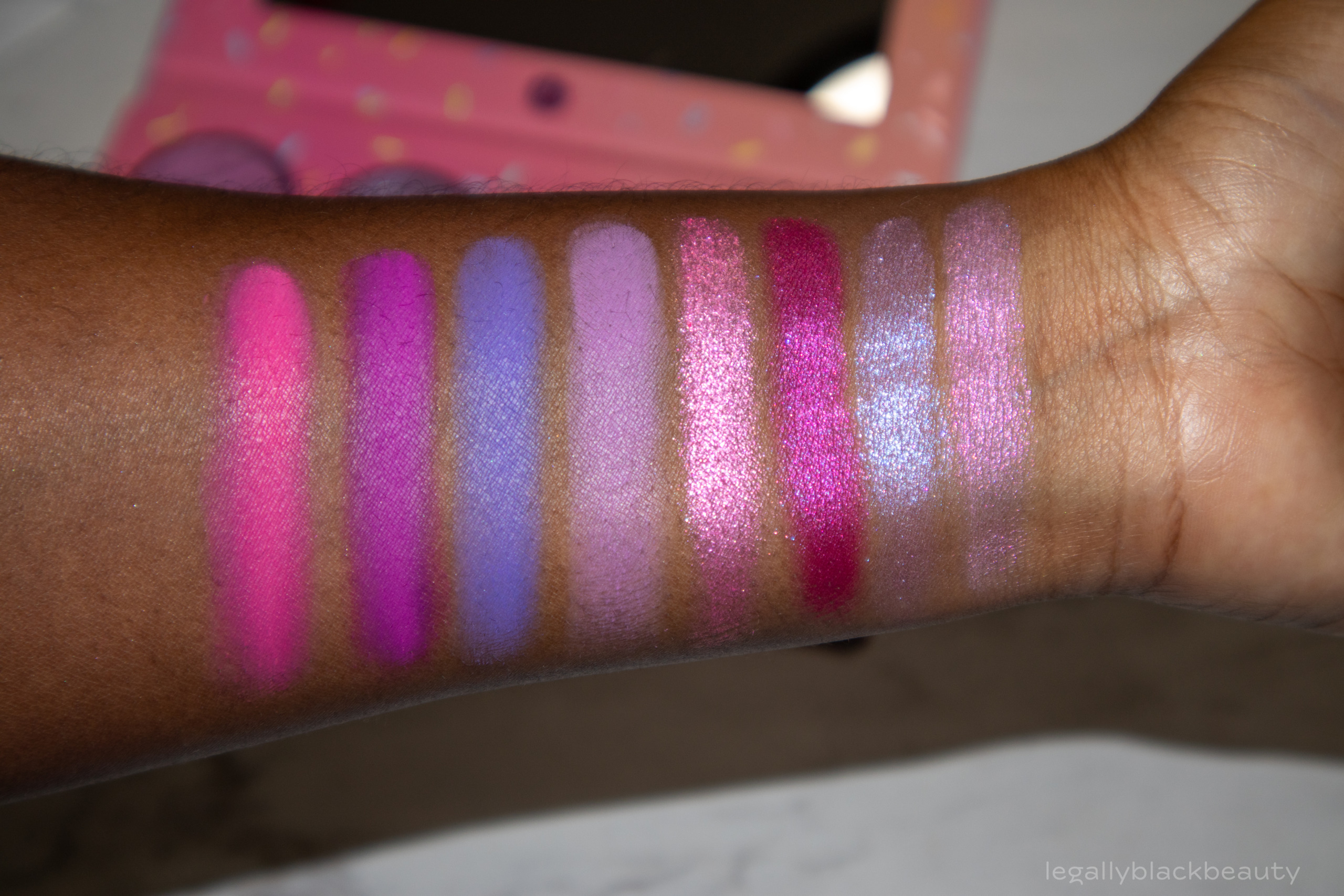
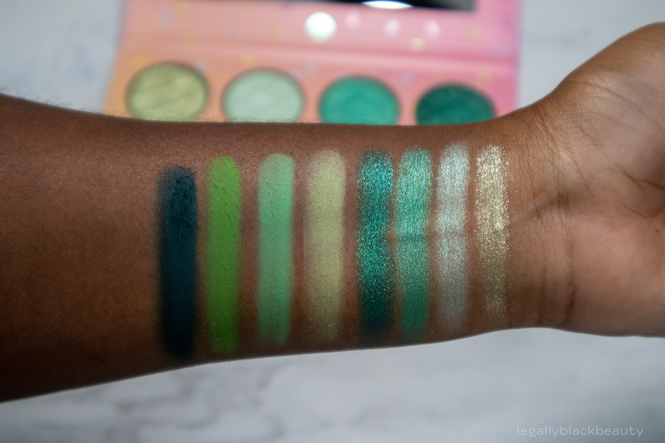
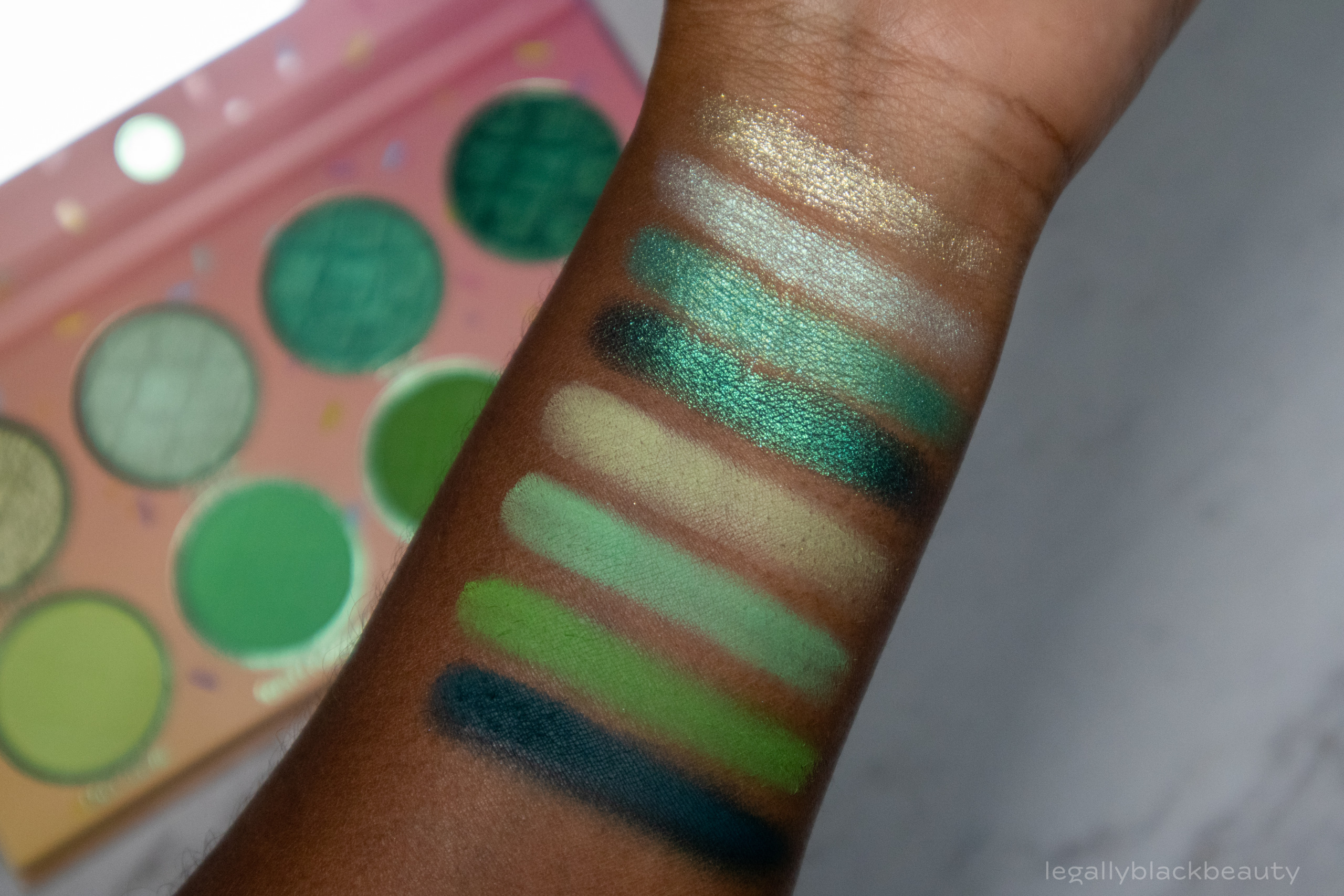
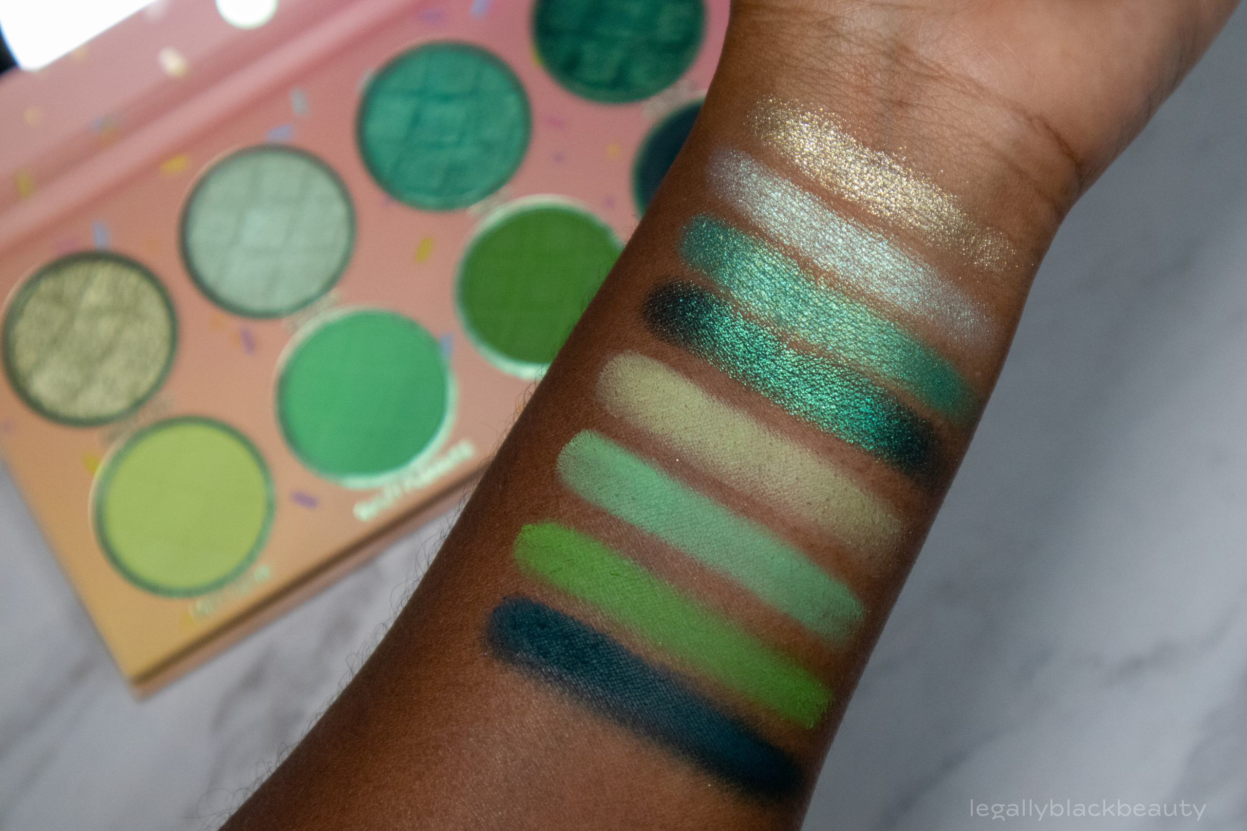
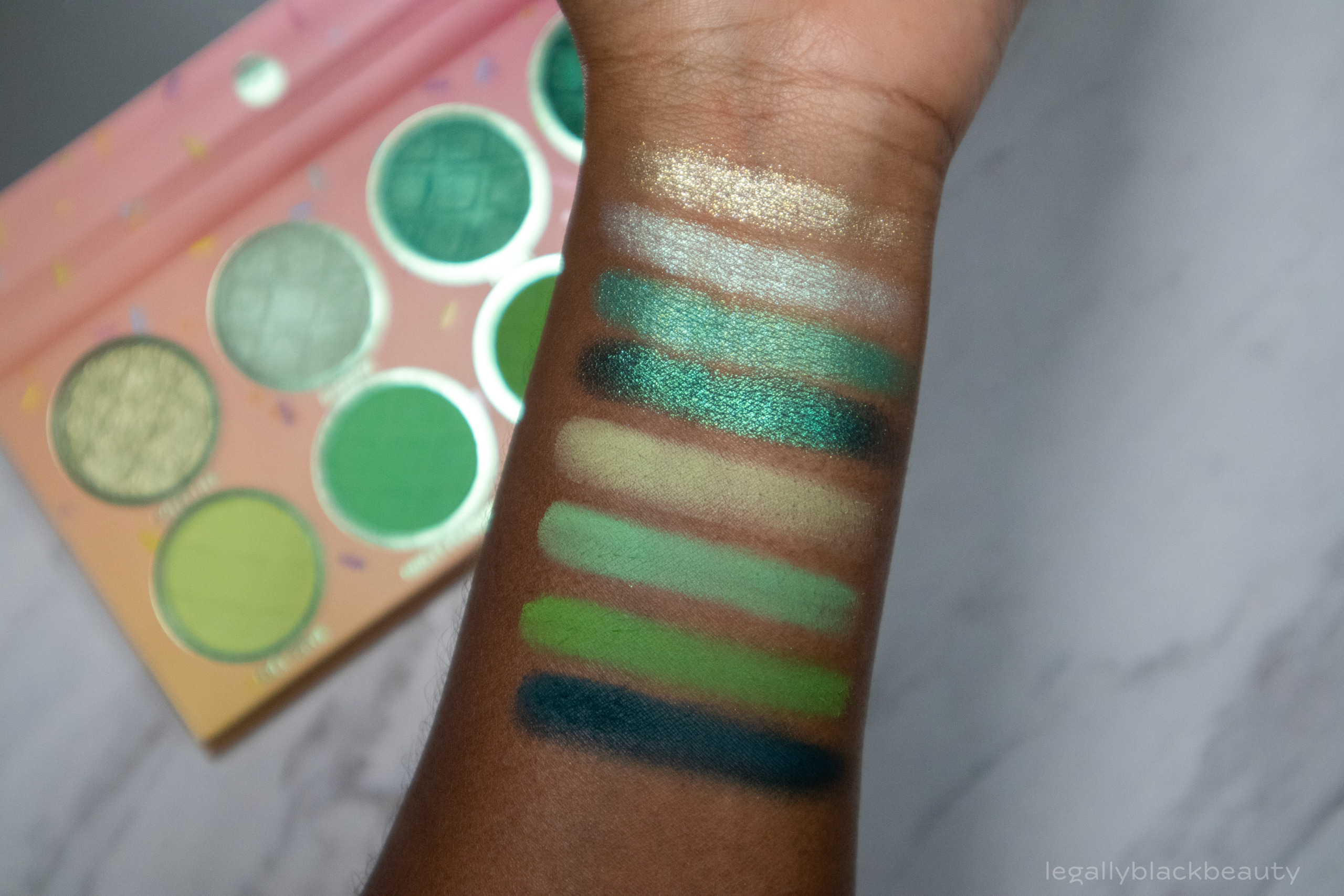
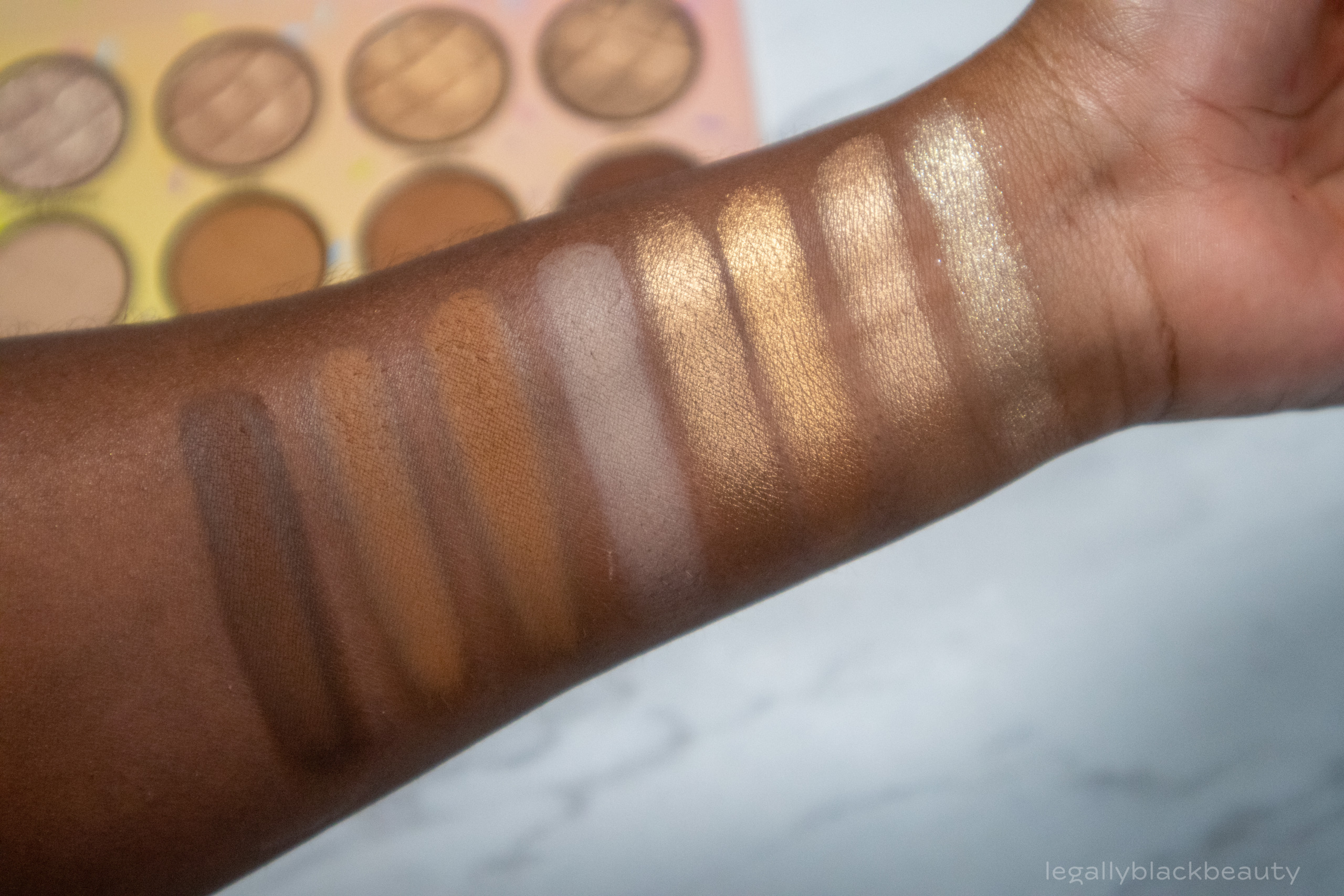
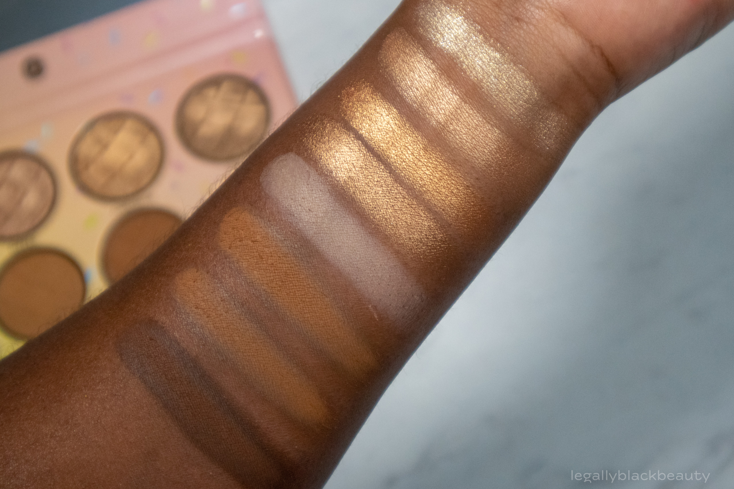
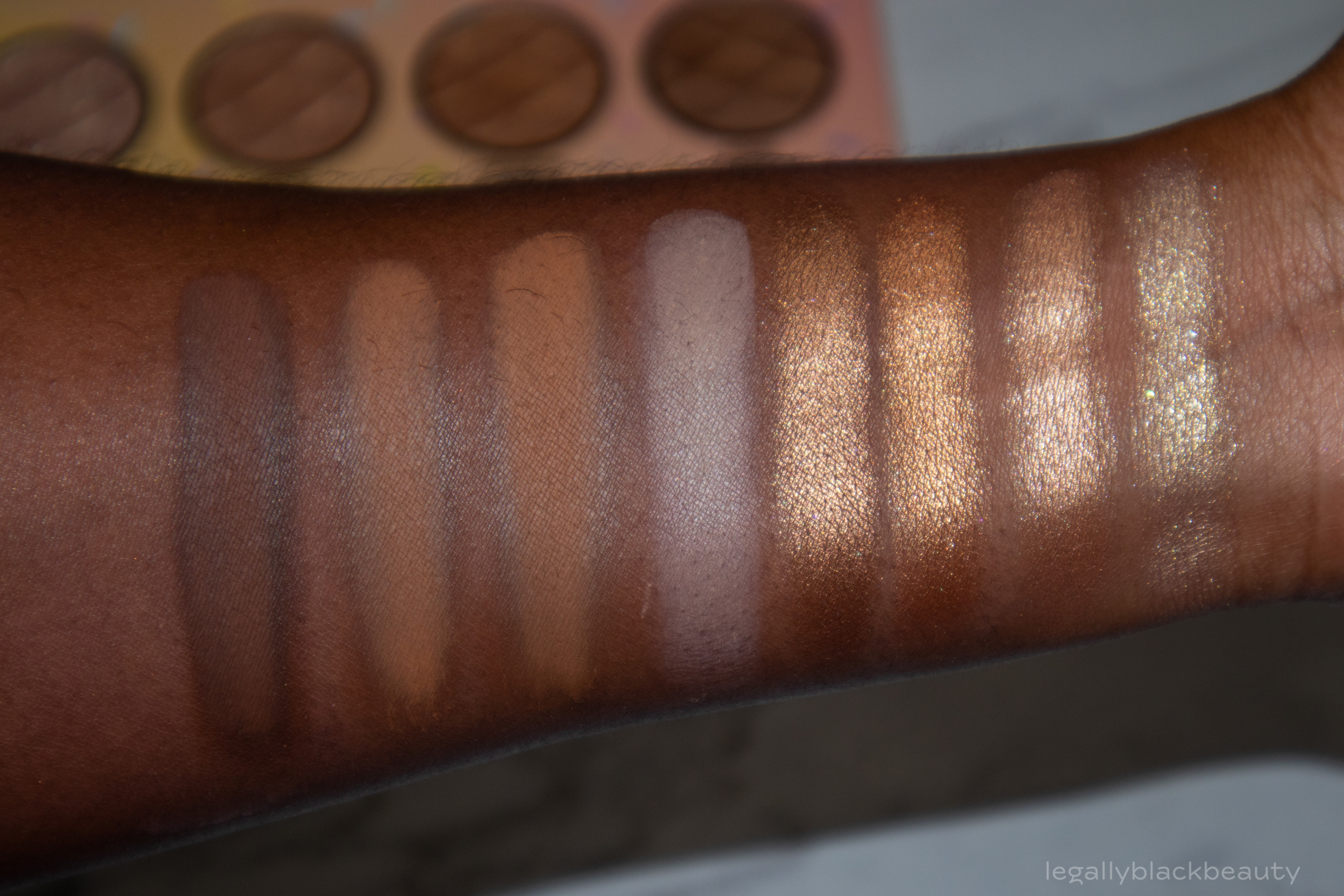
- Purchased
- Gifted
- Affiliate Link
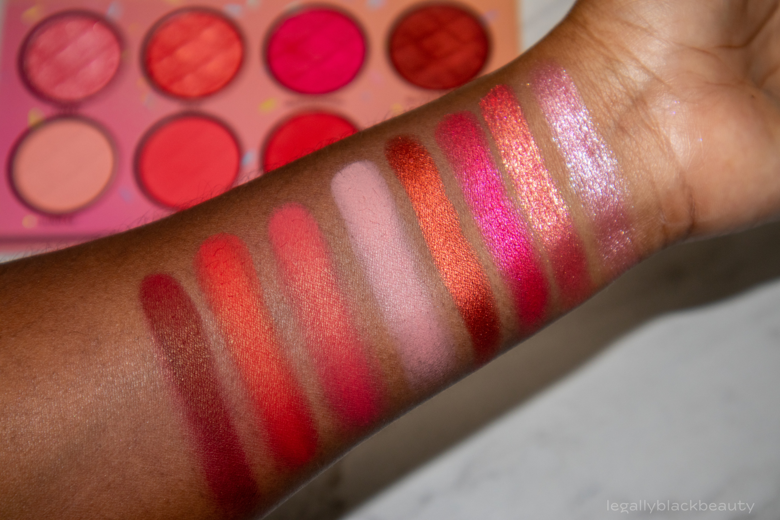
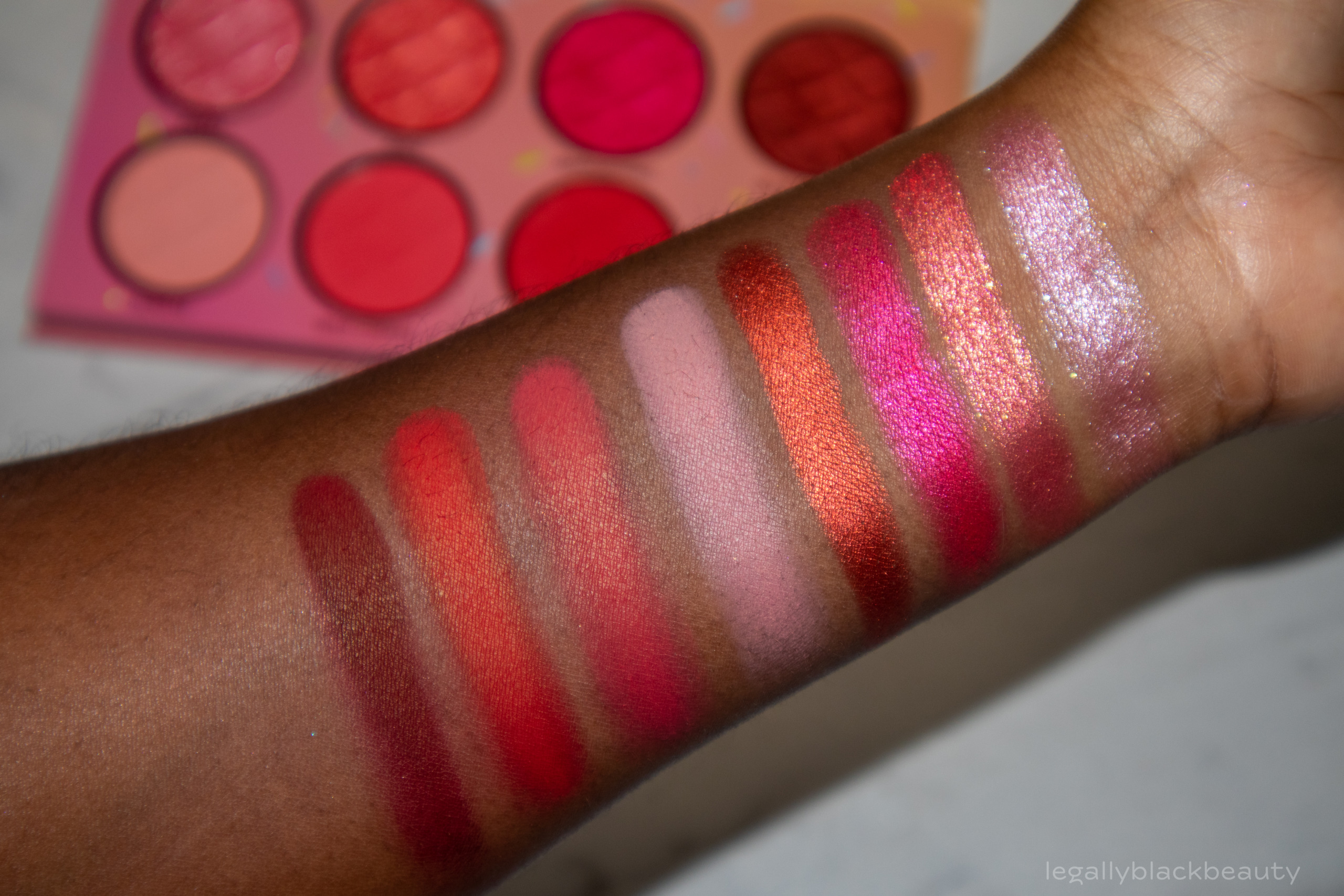
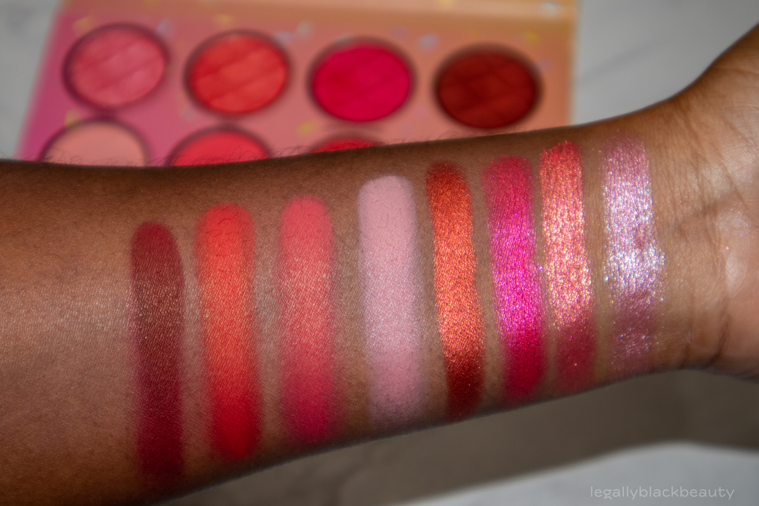
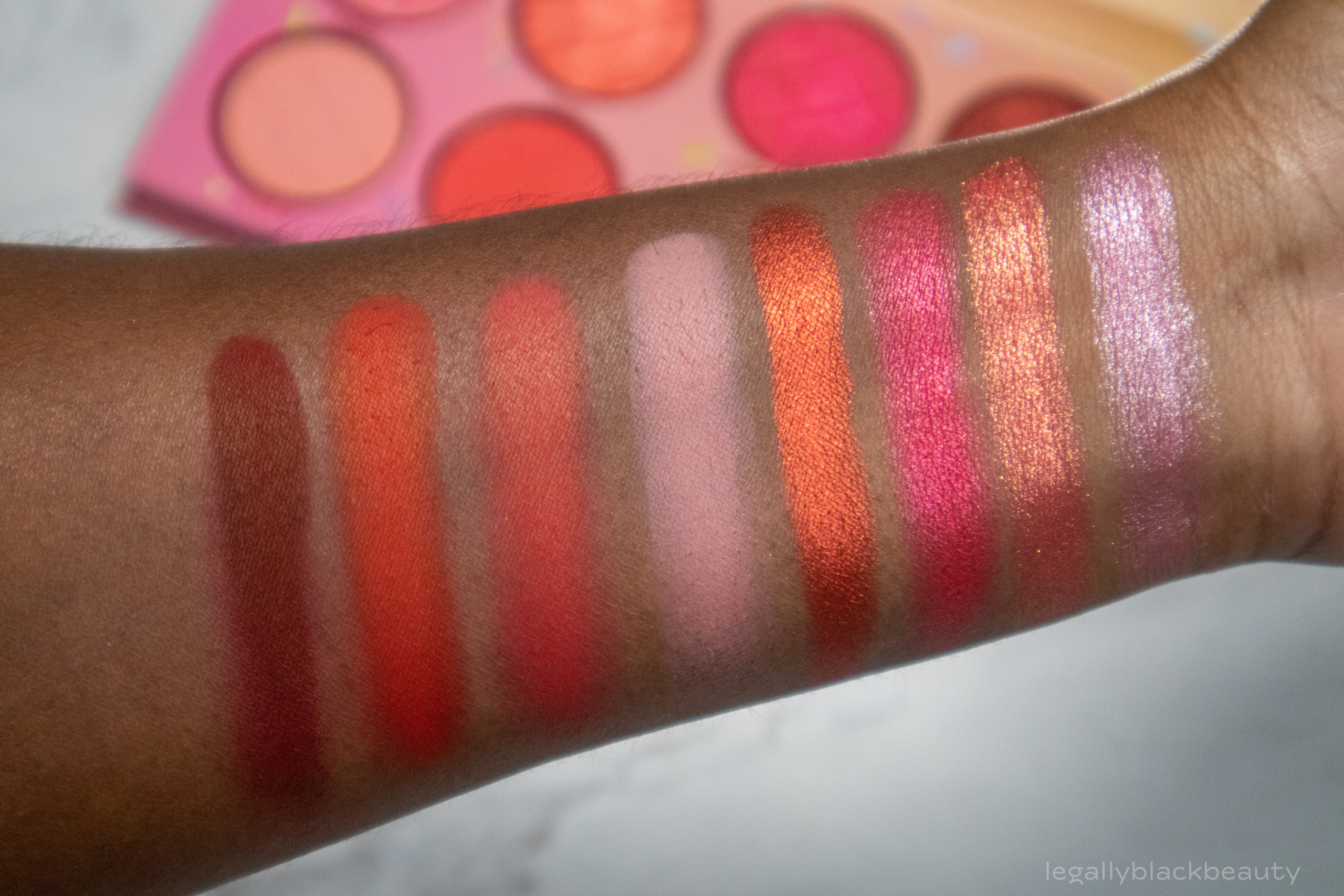
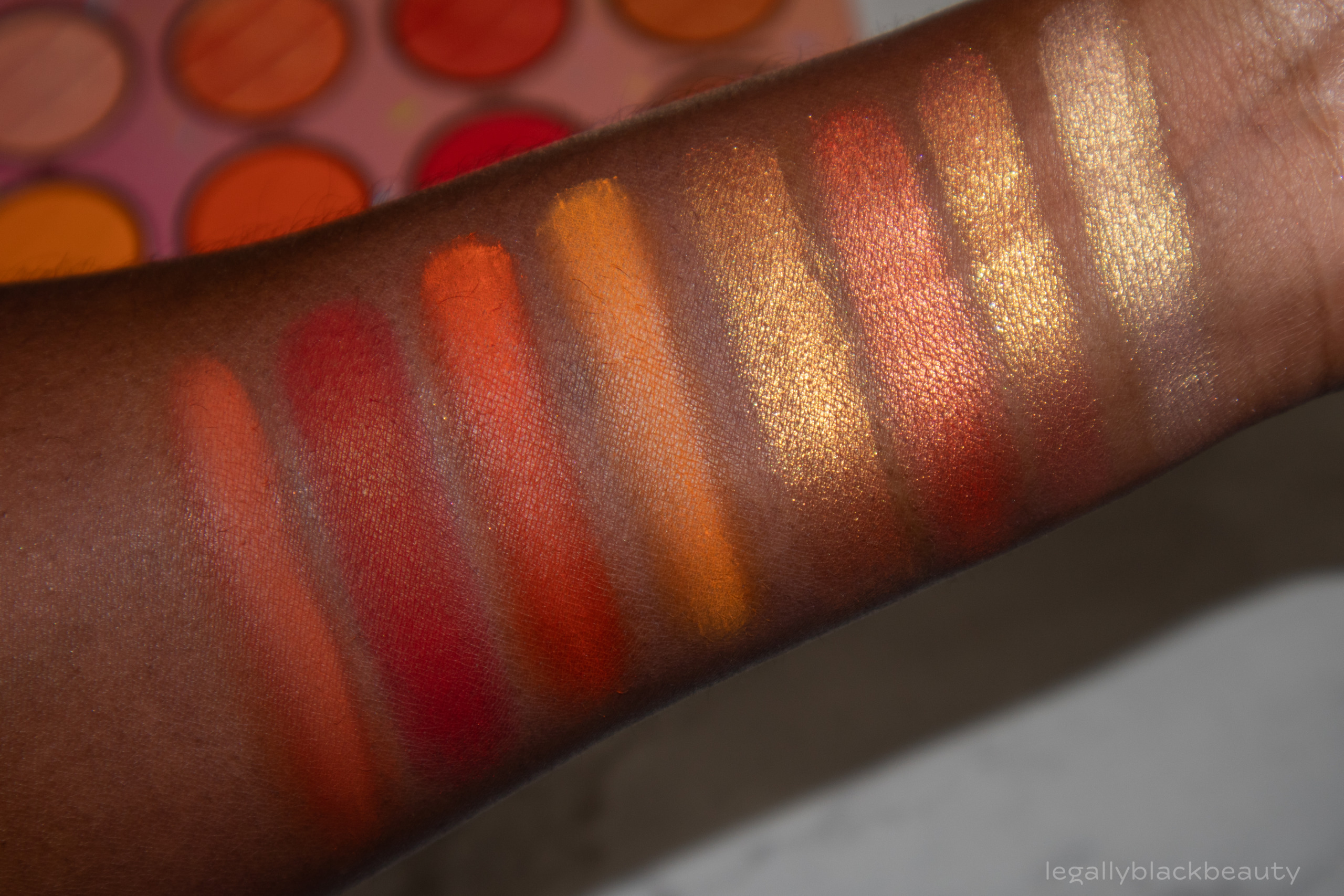
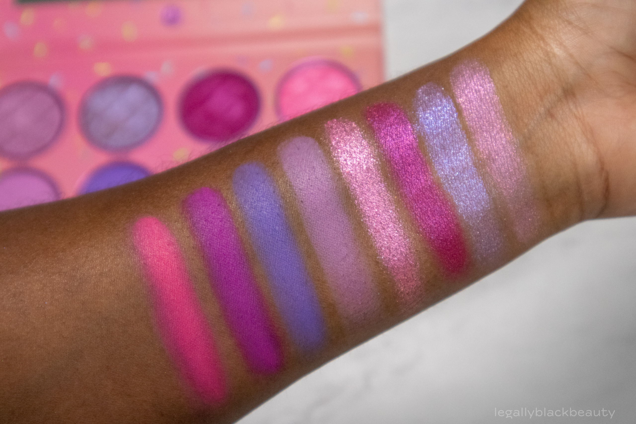
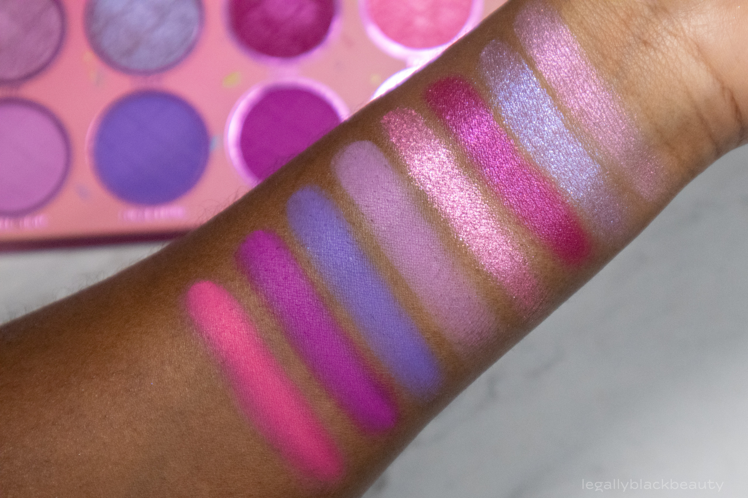
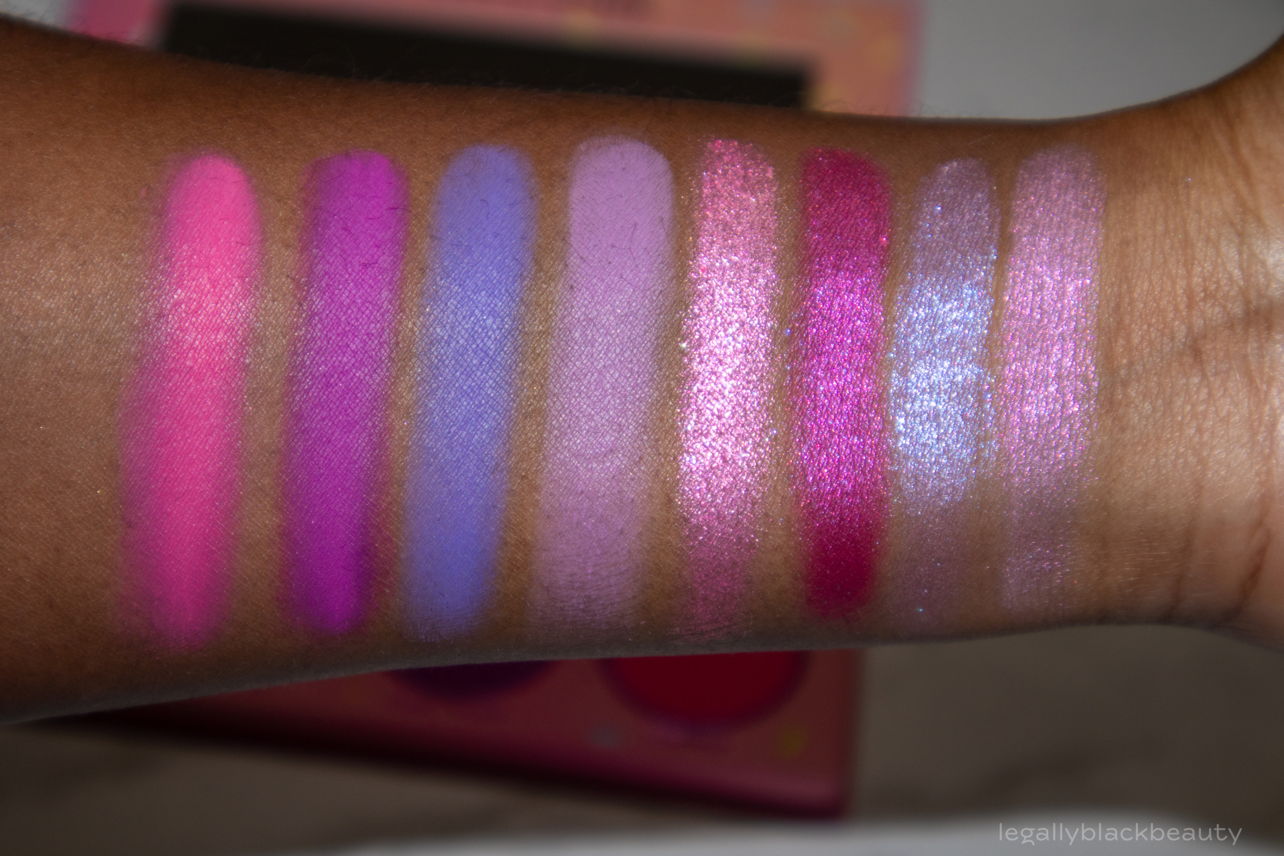
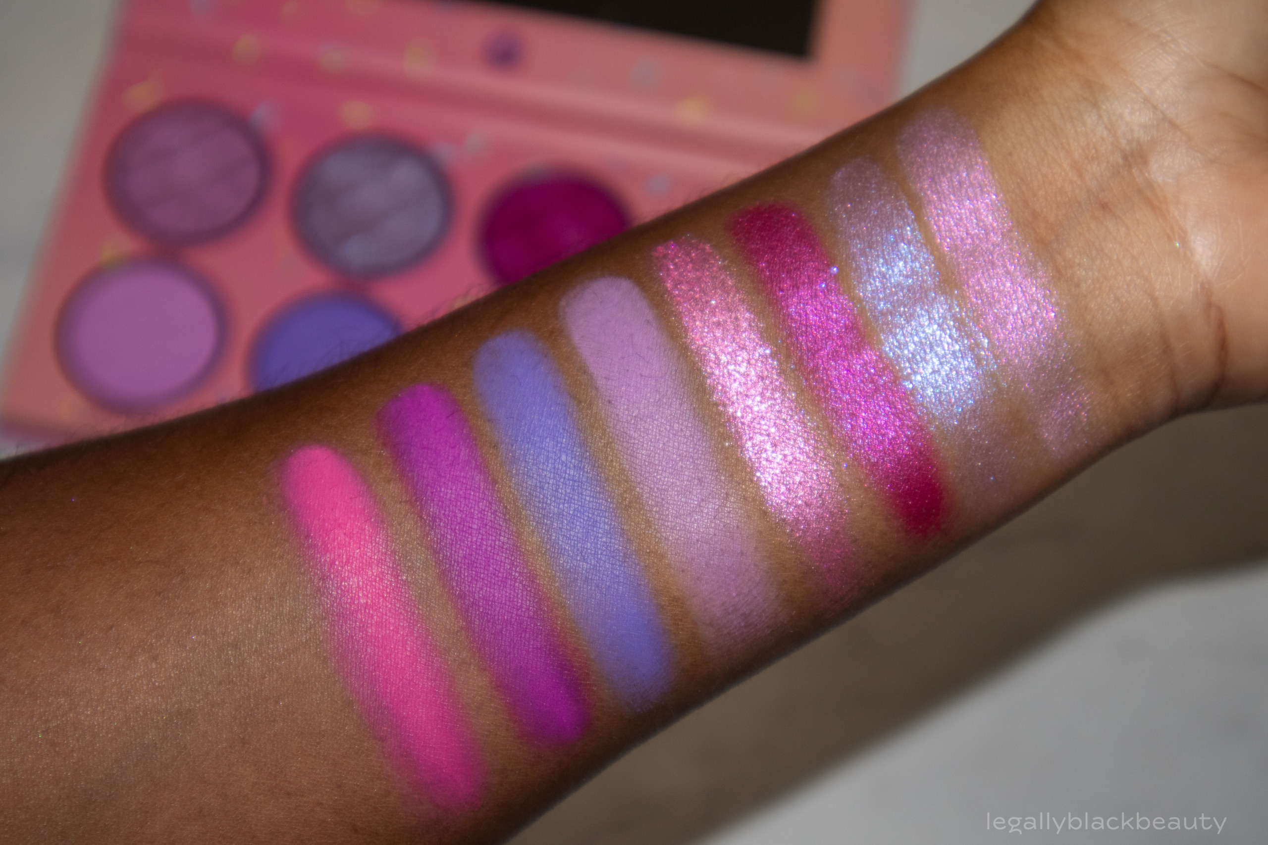
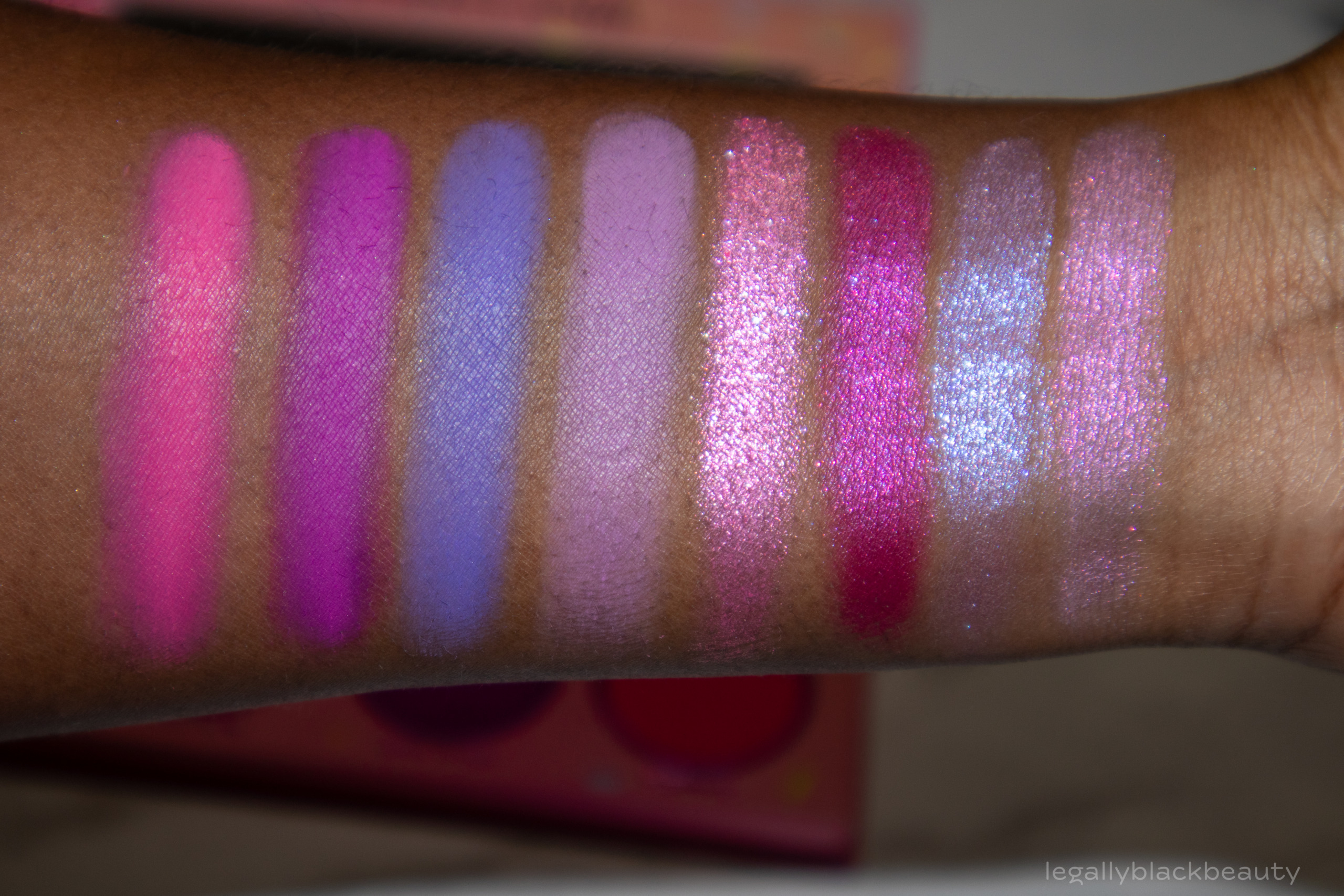
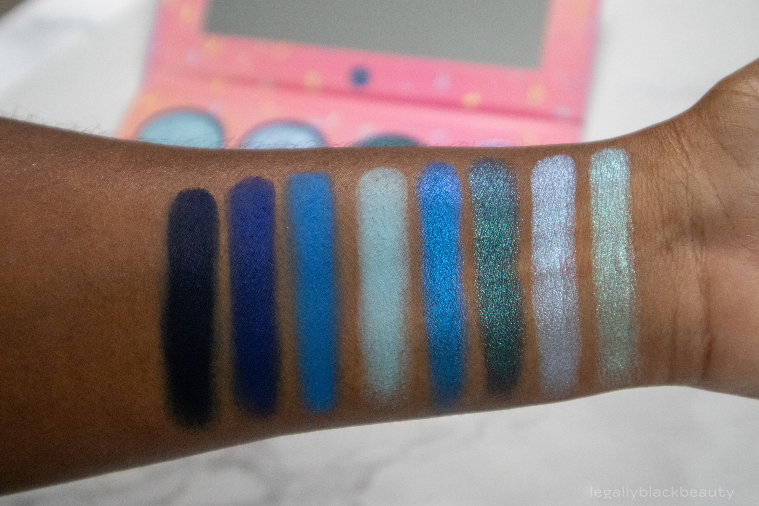
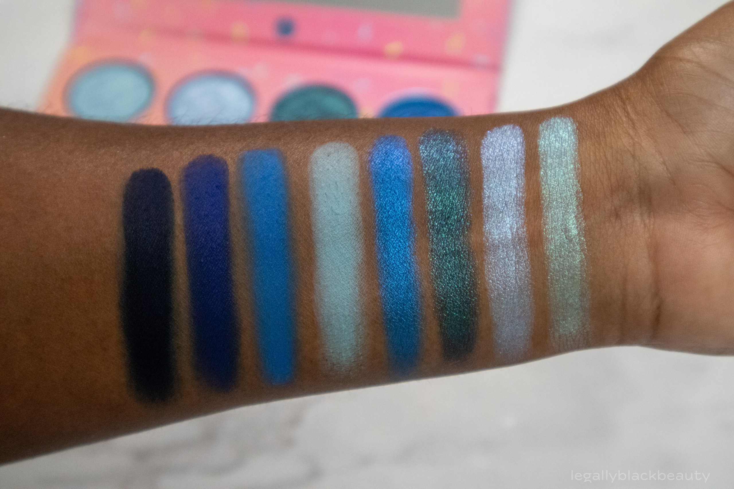
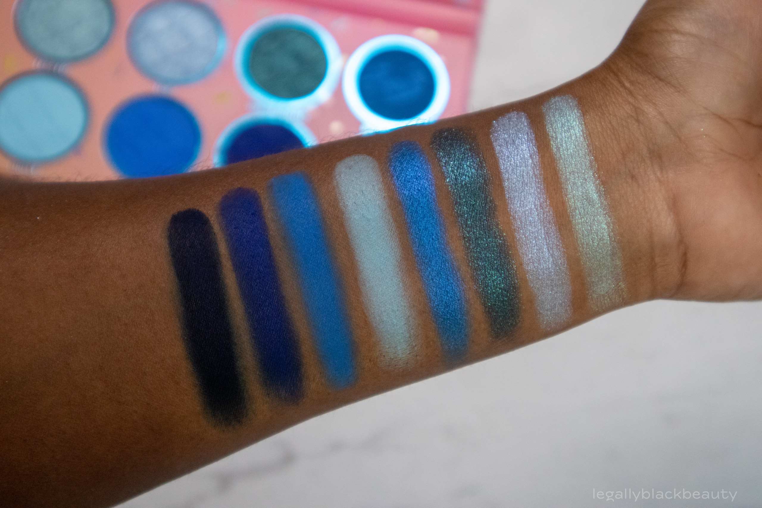
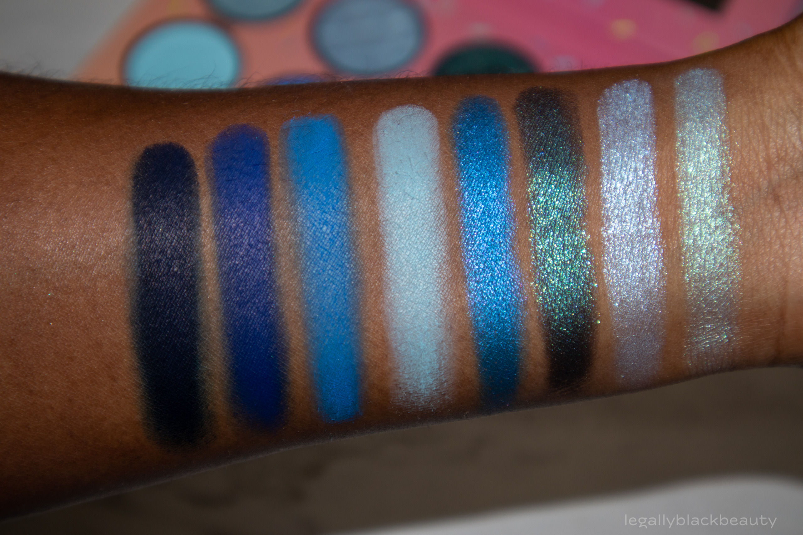
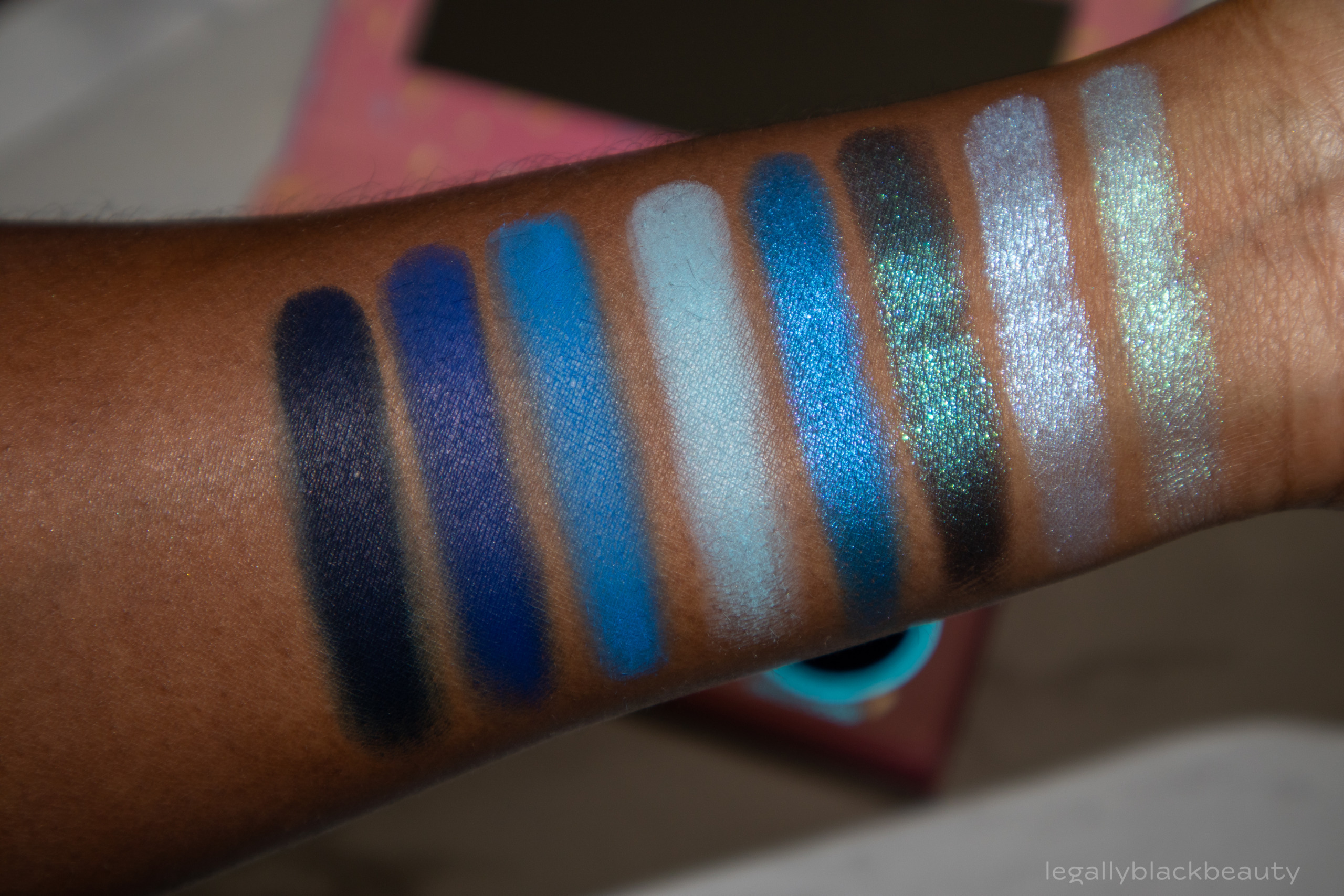
Happy Hump Day! Today, I’m bringing y’all swatches of the Club Nebula palette from Kaleidos Makeup. Kaleidos created the palette in collaboration with Angelica Nyqvist. This is the earliest I’ve ever reviewed a Kaleidos collection, but there’s a reason. The palette restocks today, February 17, 2021, at 11 pm PST. This is supposedly the last restock and the palette will only be available in limited quantities.
If you can’t get your hands on this palette, please don’t be too disappointed. I know Kaleidos typically means business when they discontinue a product, so the chances that this palette will come back are low. But you can always dupe out colors with other brands. If you feel pressure to support the creator, remember financial support is just one way to do so. If it’s not in your budget this month, you and everyone else will be fine without it. Supporting yourself is more important that supporting your favorite creators.
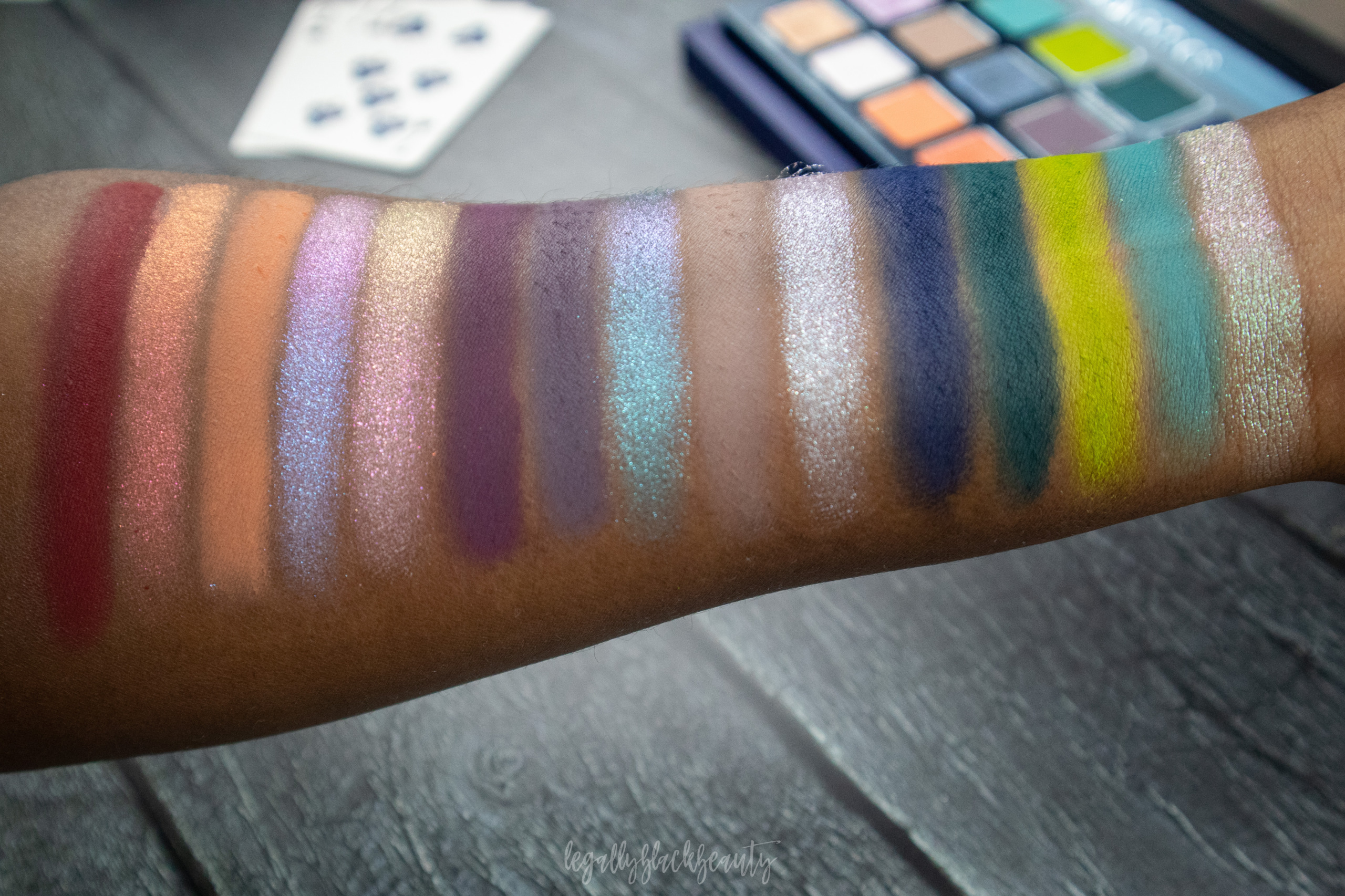
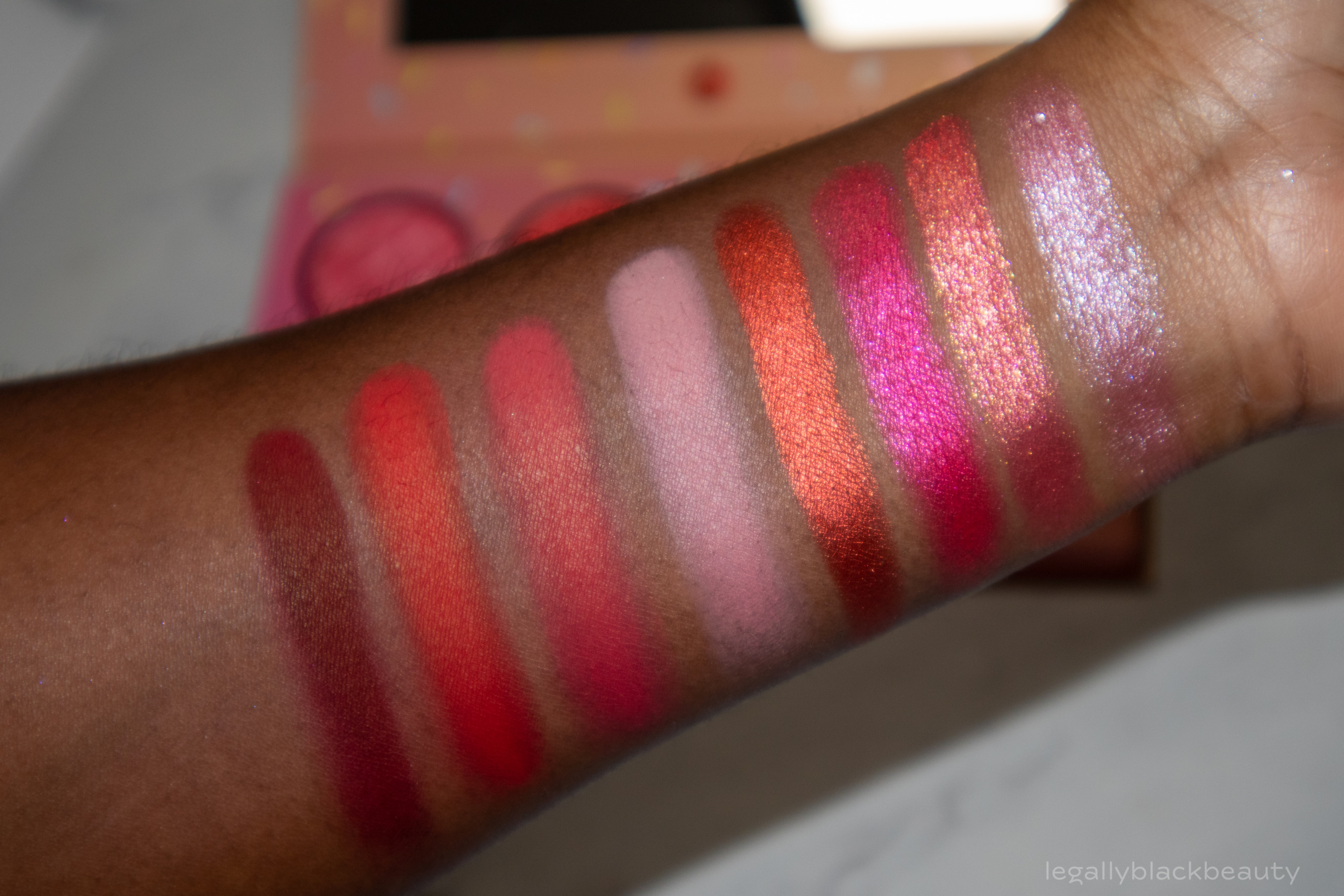
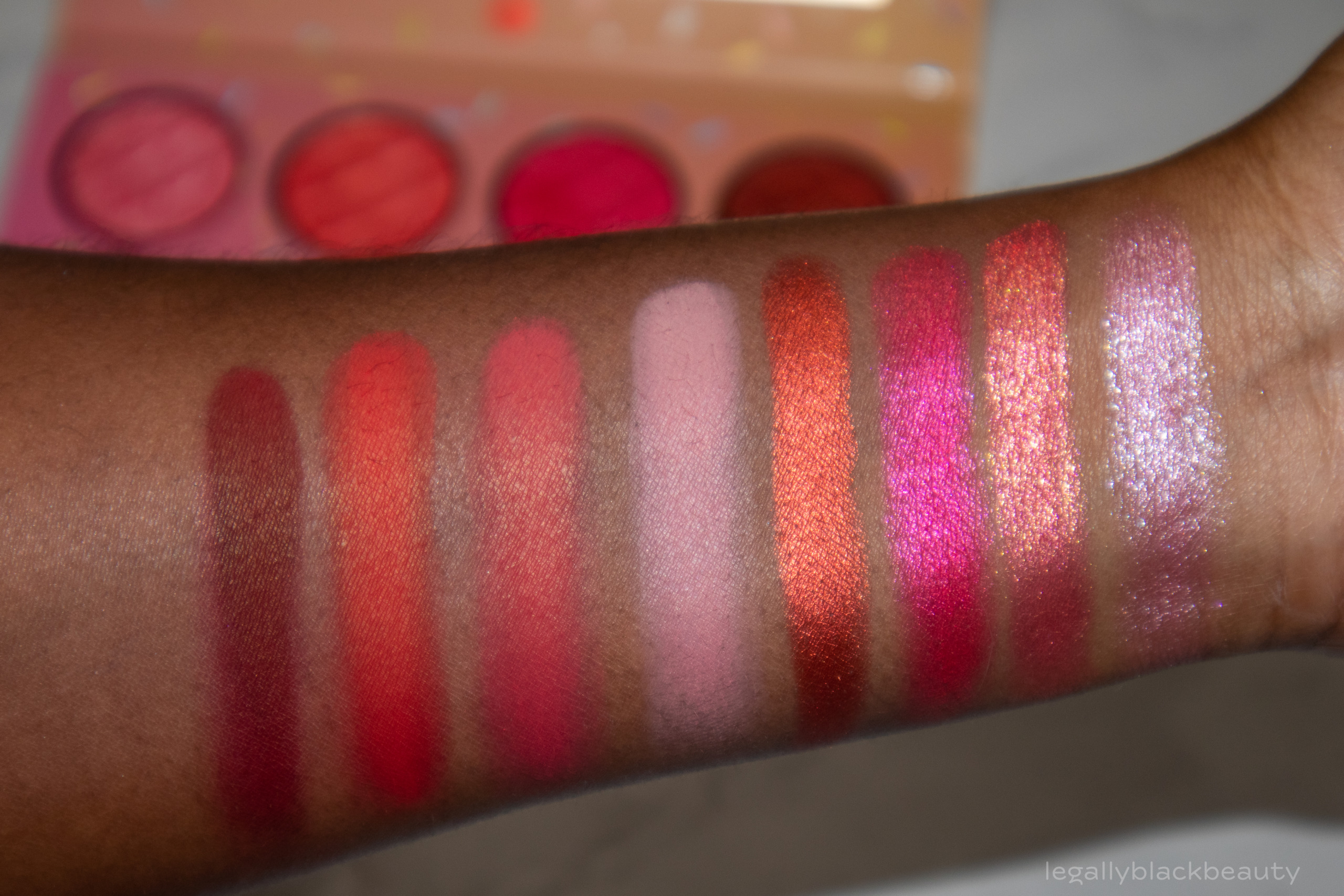
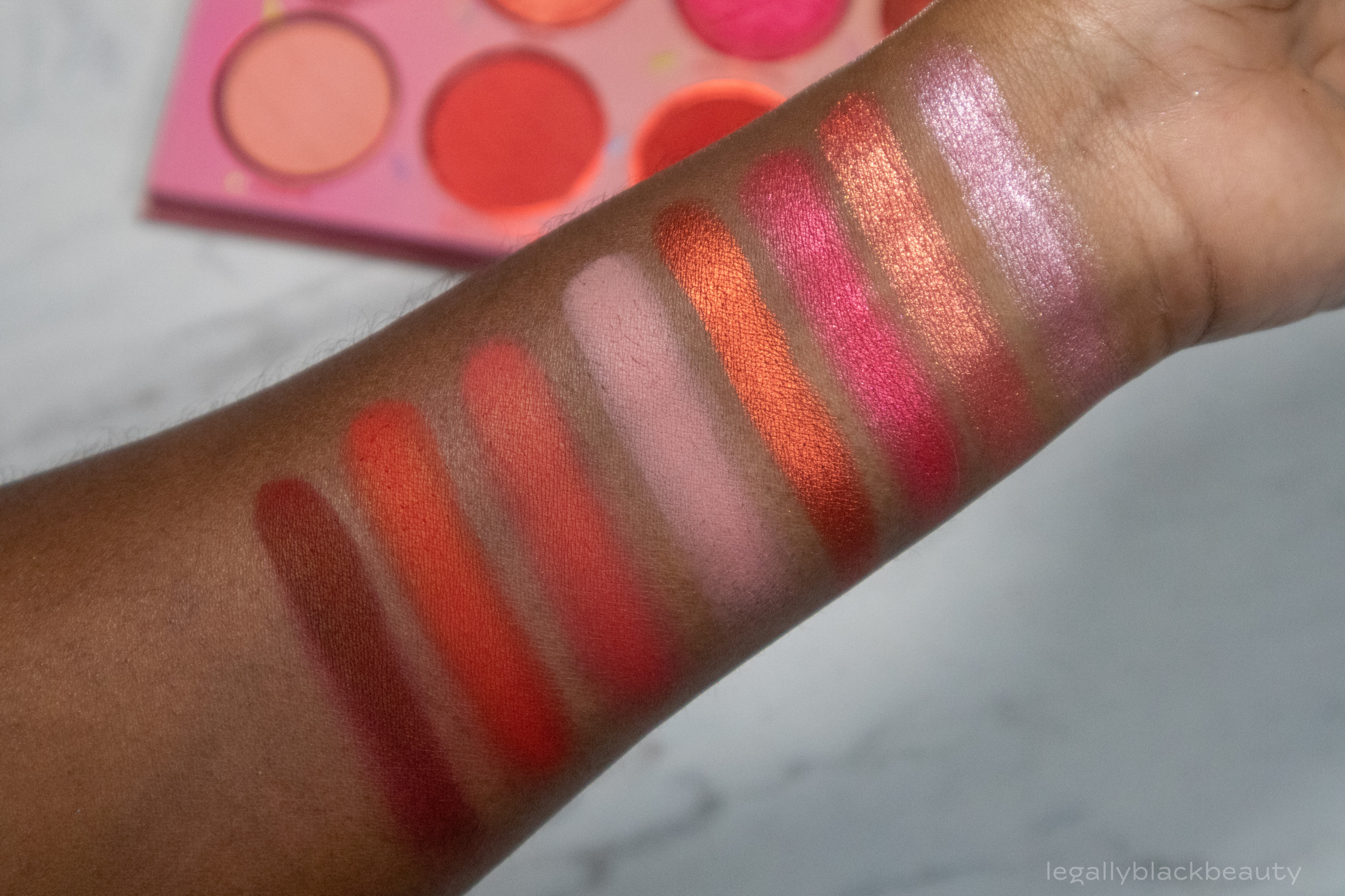
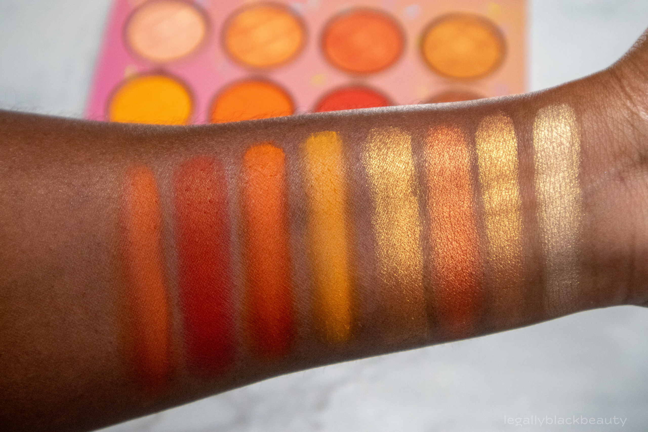
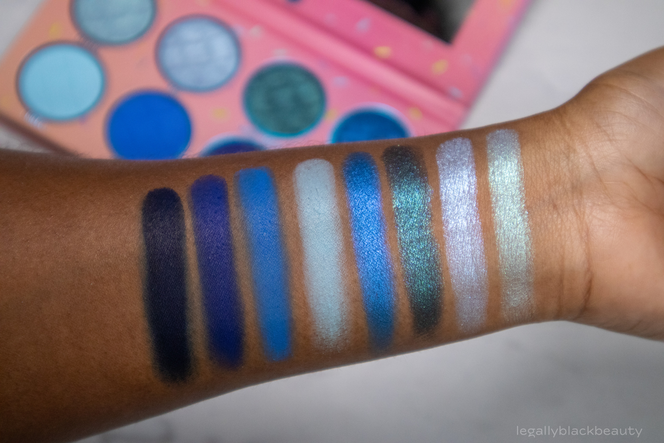
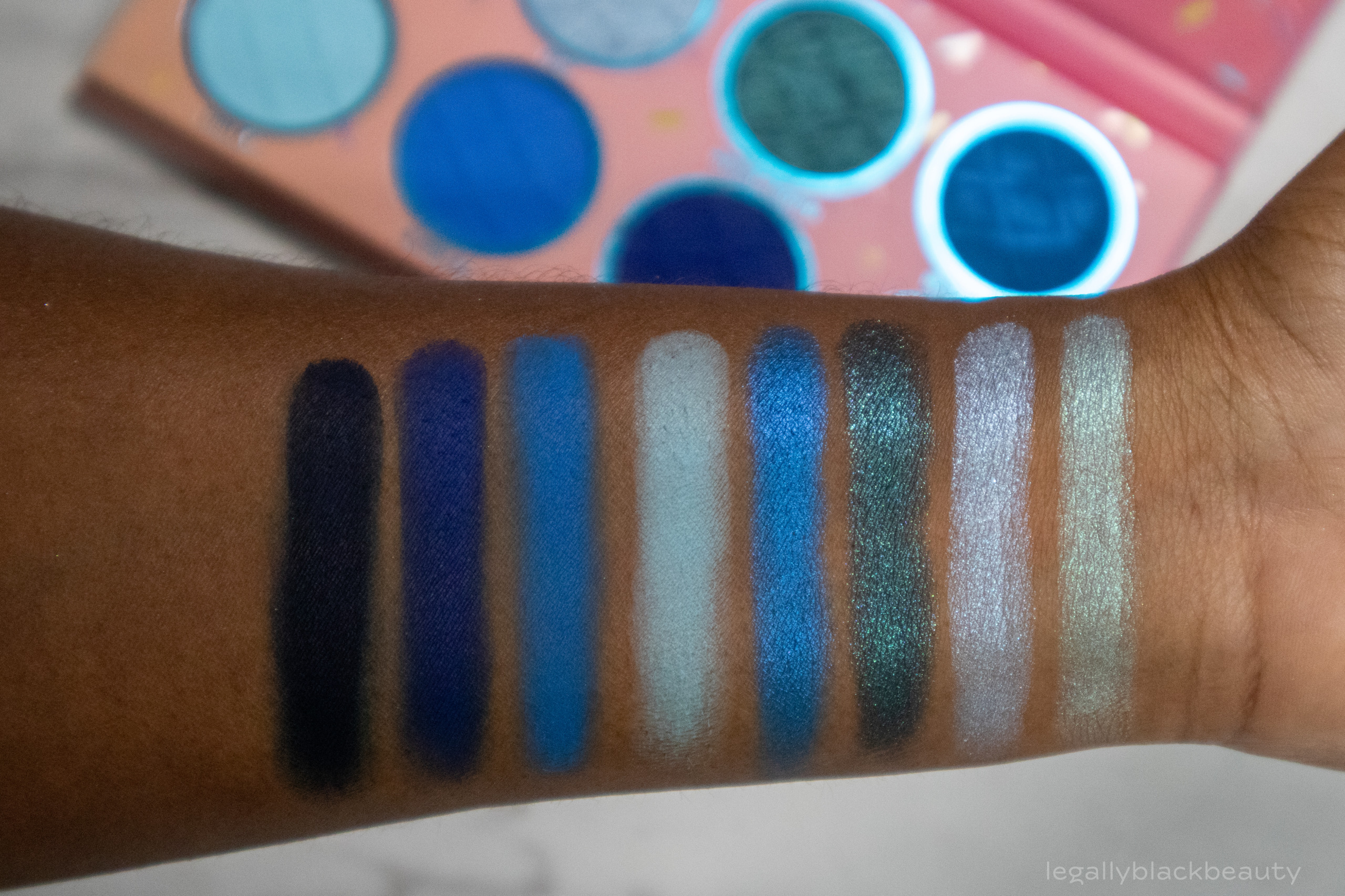
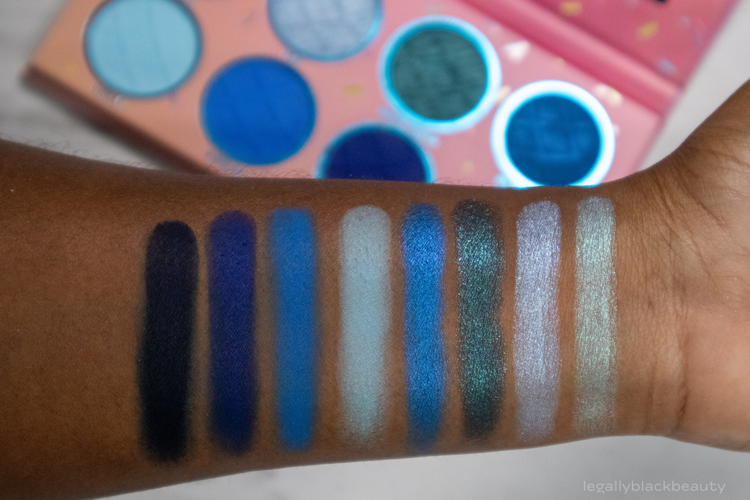
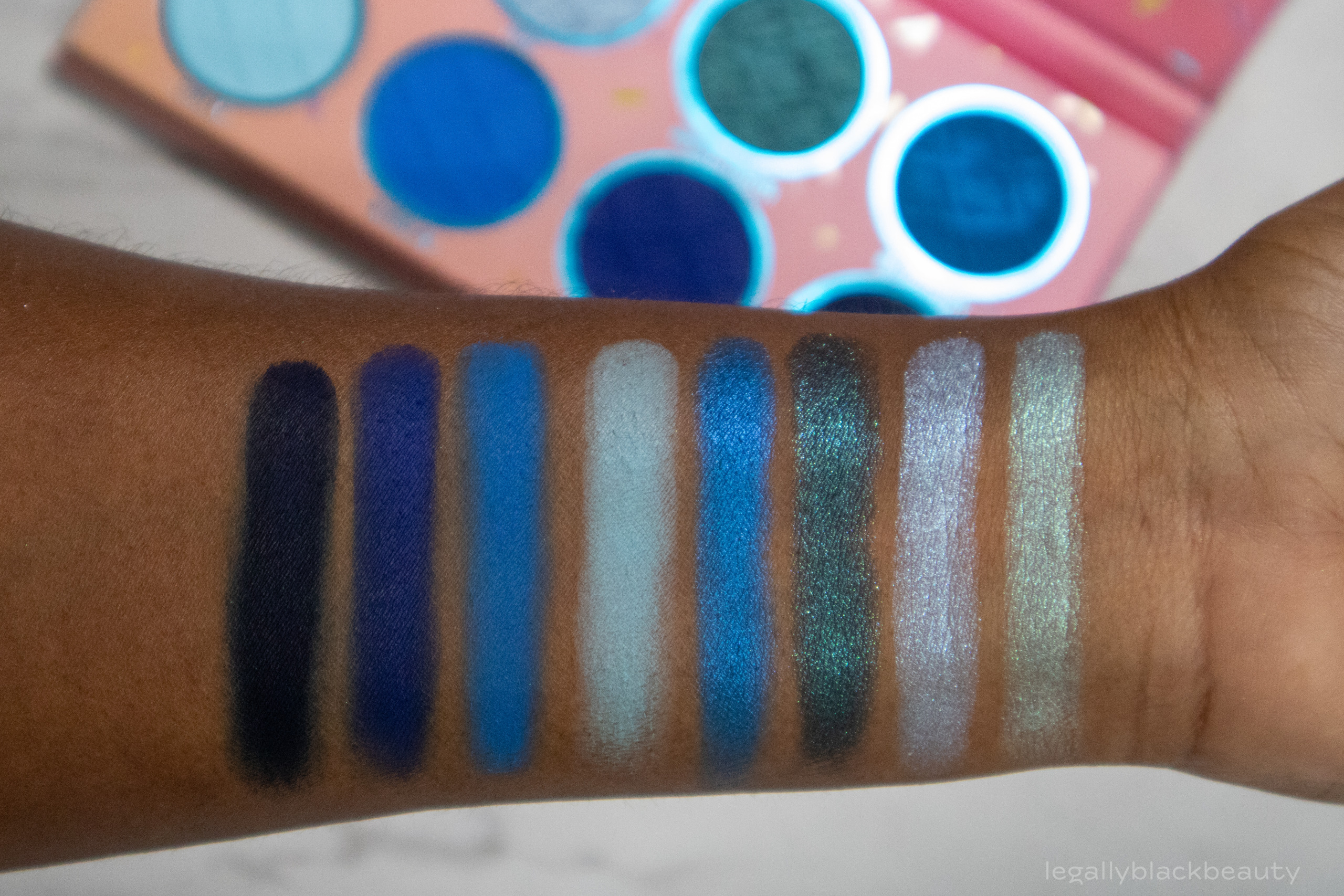
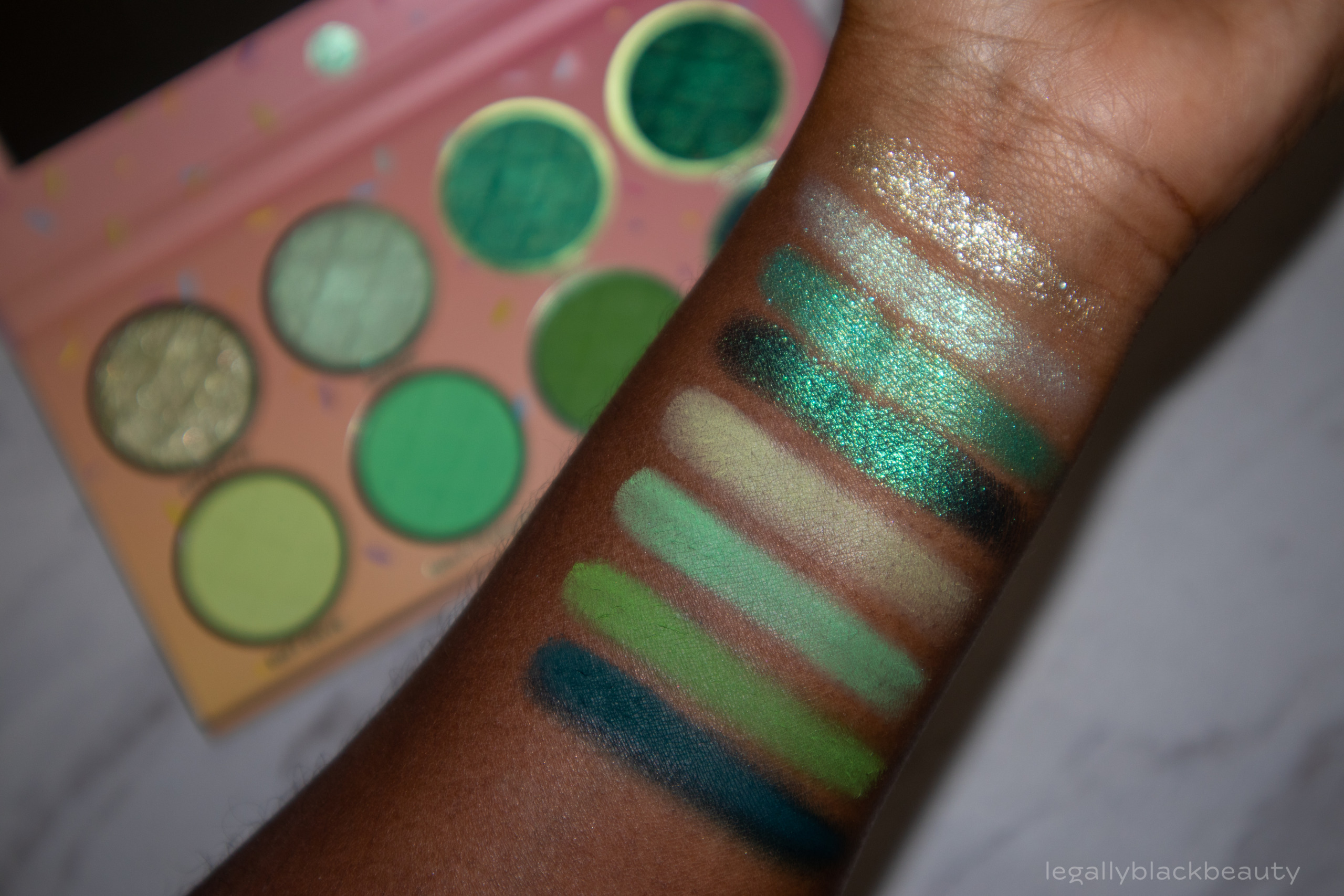
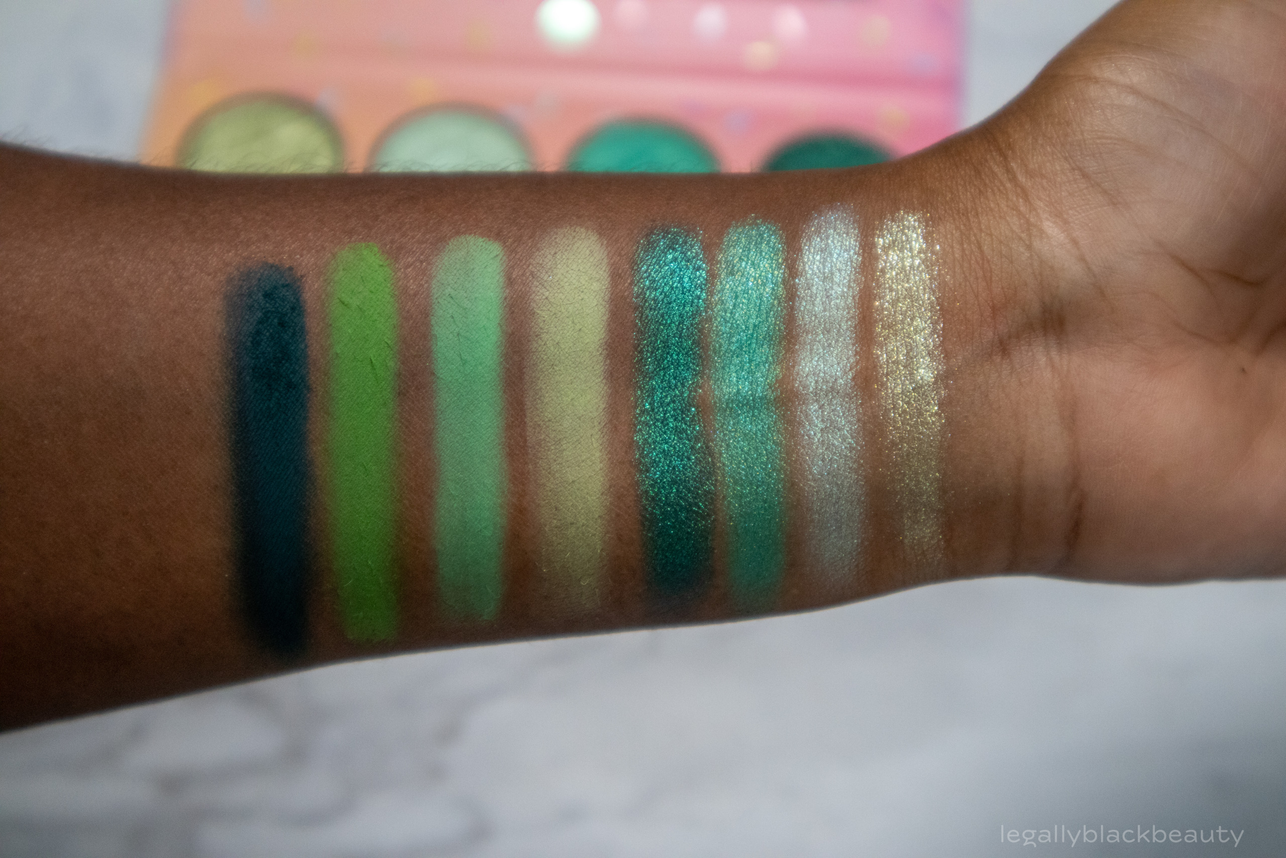
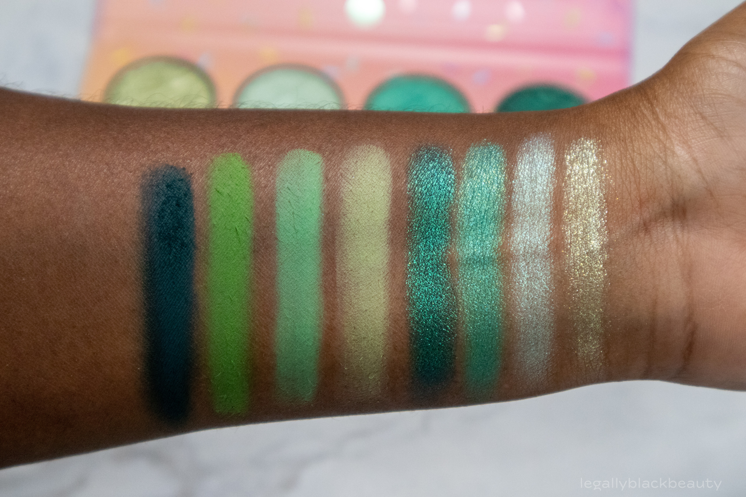
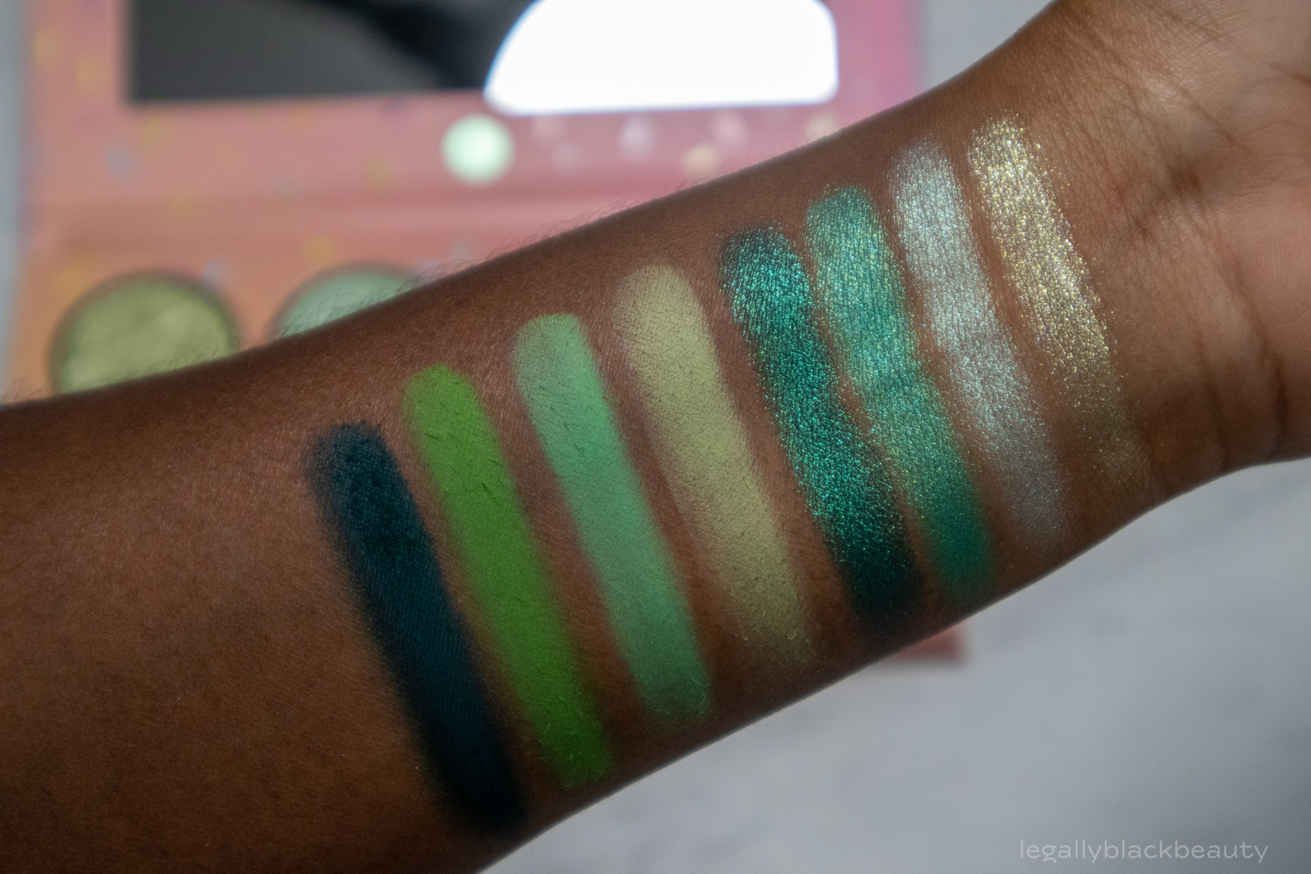
Bonus points if you catch the easter egg in the swatch photos. This post was supposed to go up a bit earlier so those were intended to be a helpful reminder of the restock date. And, also, I’m particularly drawn to the date because it’s my birthday. 🙂
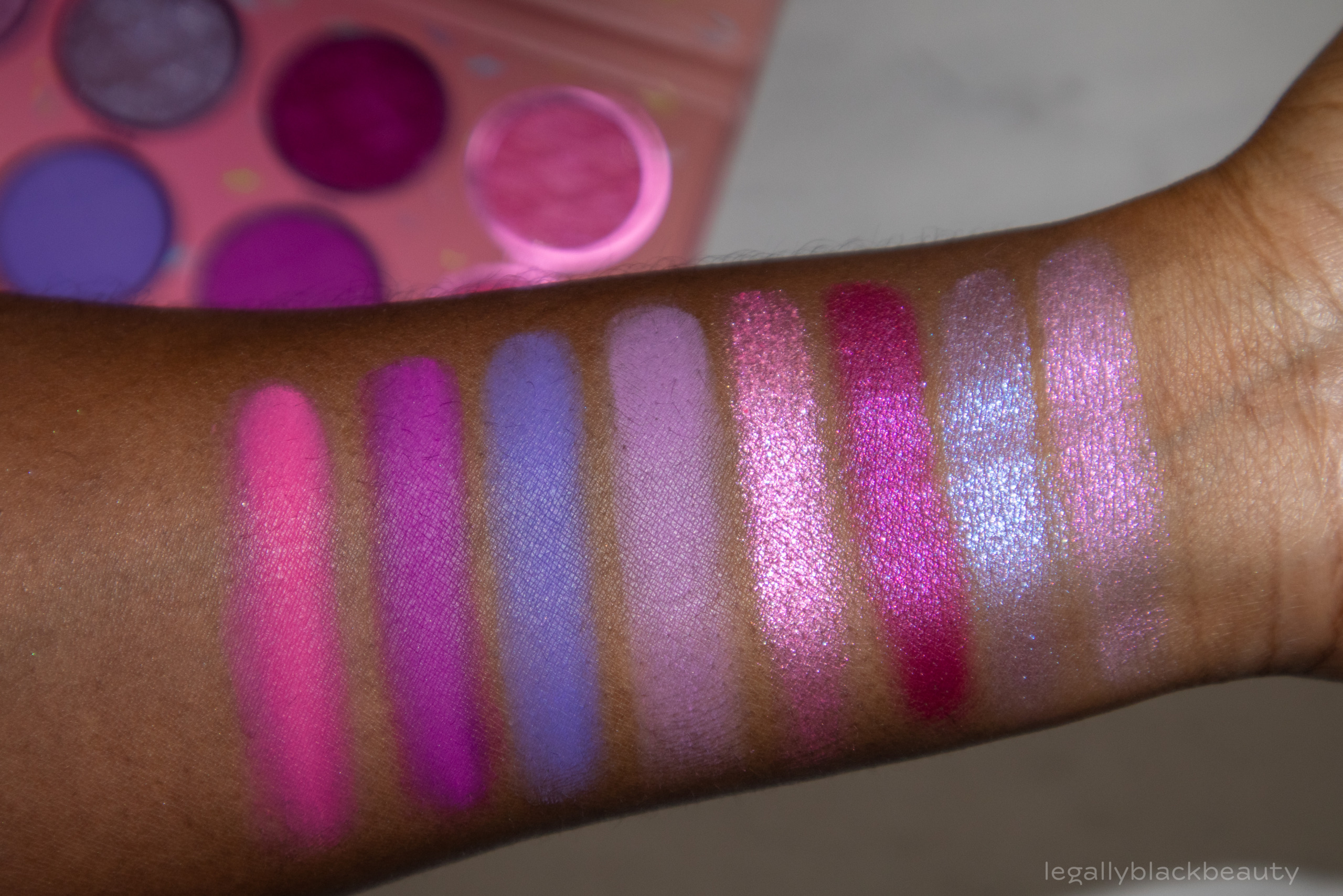
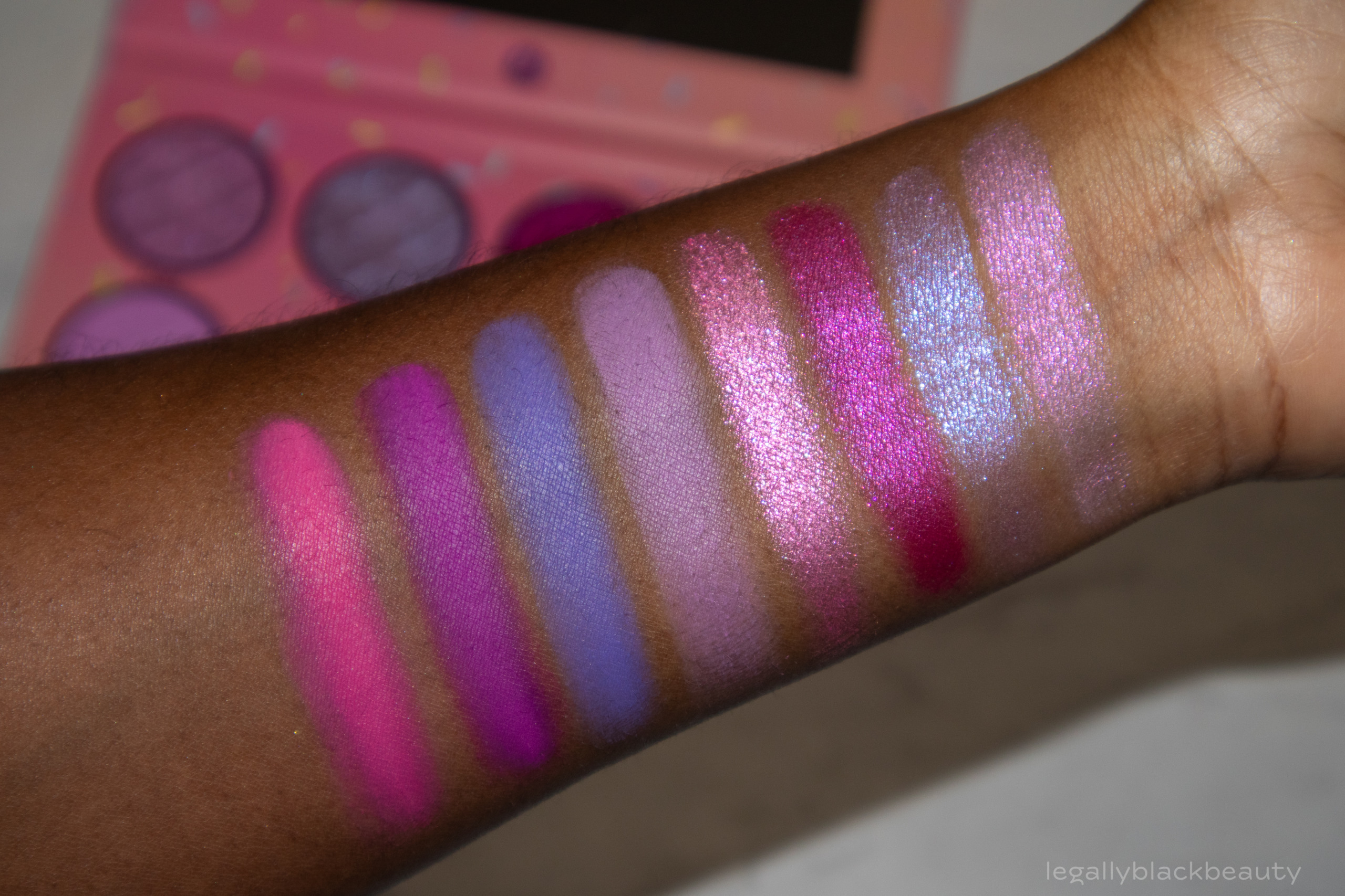
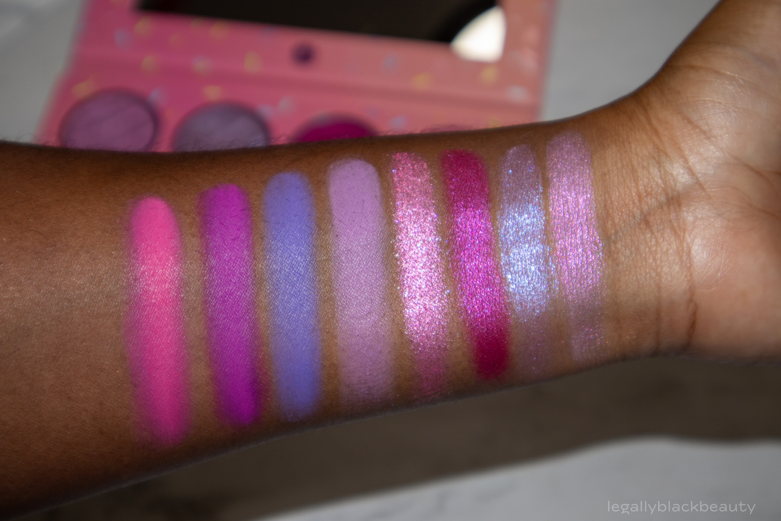
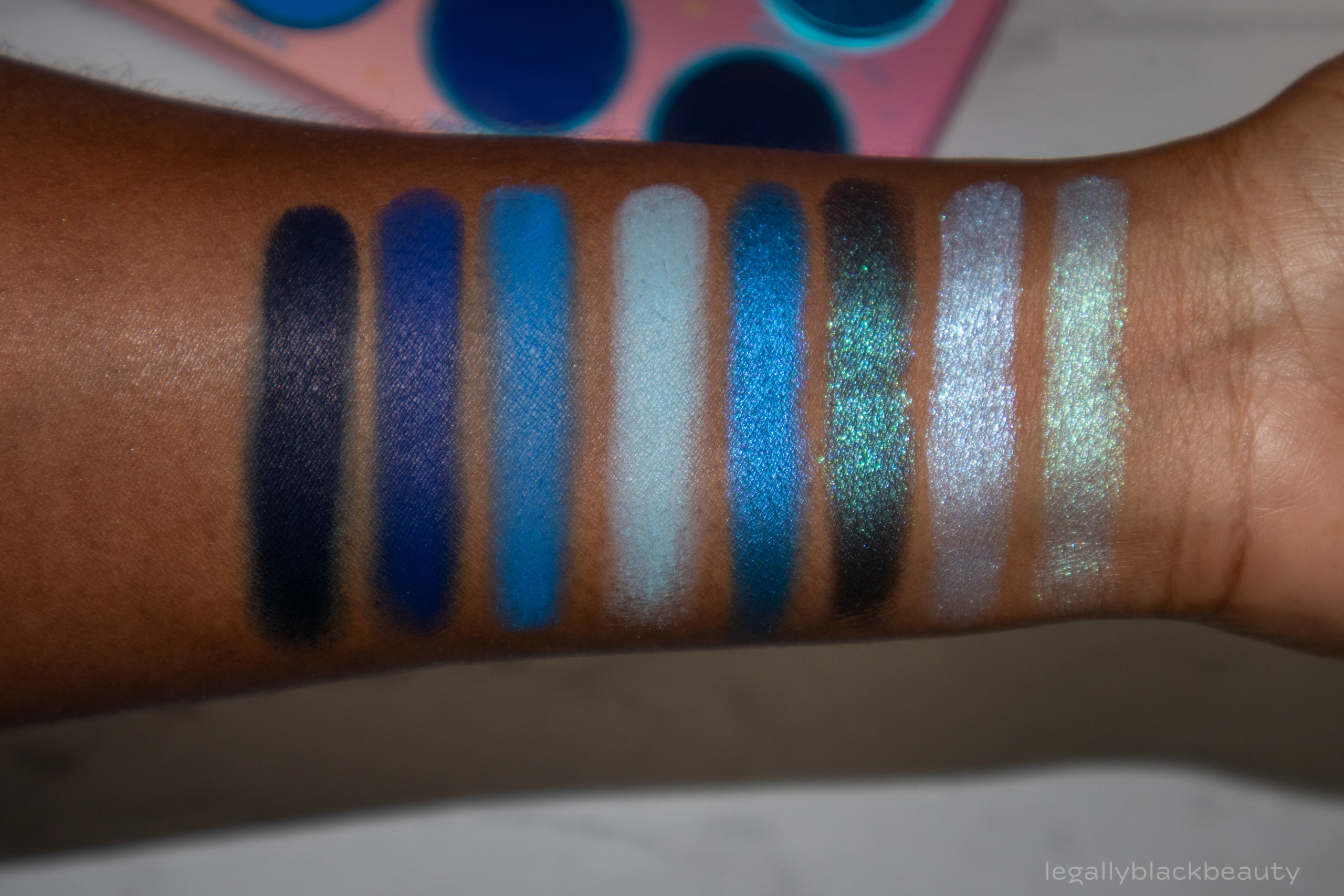
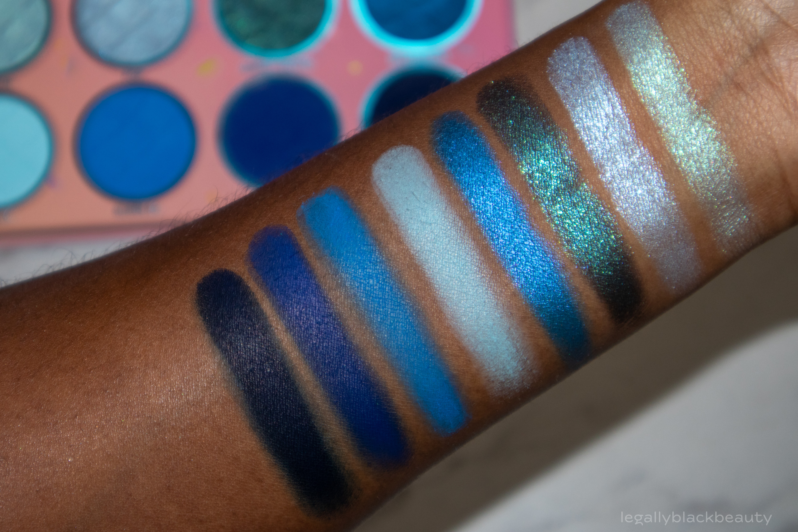
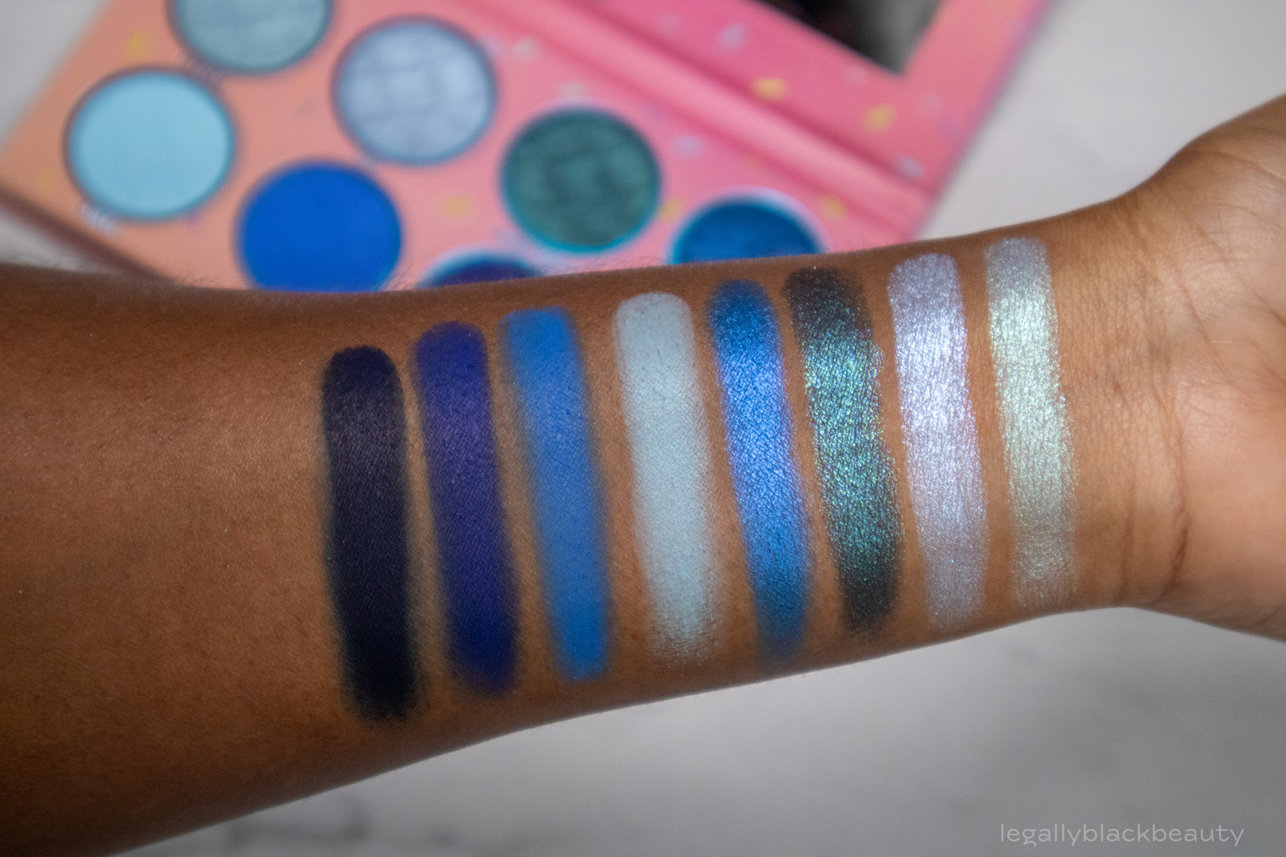
The Club Nebula palette is a 15-pan palette created in collaboration with Angelica Nyqvist. It contains an assortment of deep mattes and vibrant duochromes, with some pastel and neon hues thrown in the mix.
Every order of the palette comes with a custom shipper, with the size of the shipper depending on the size of the order.
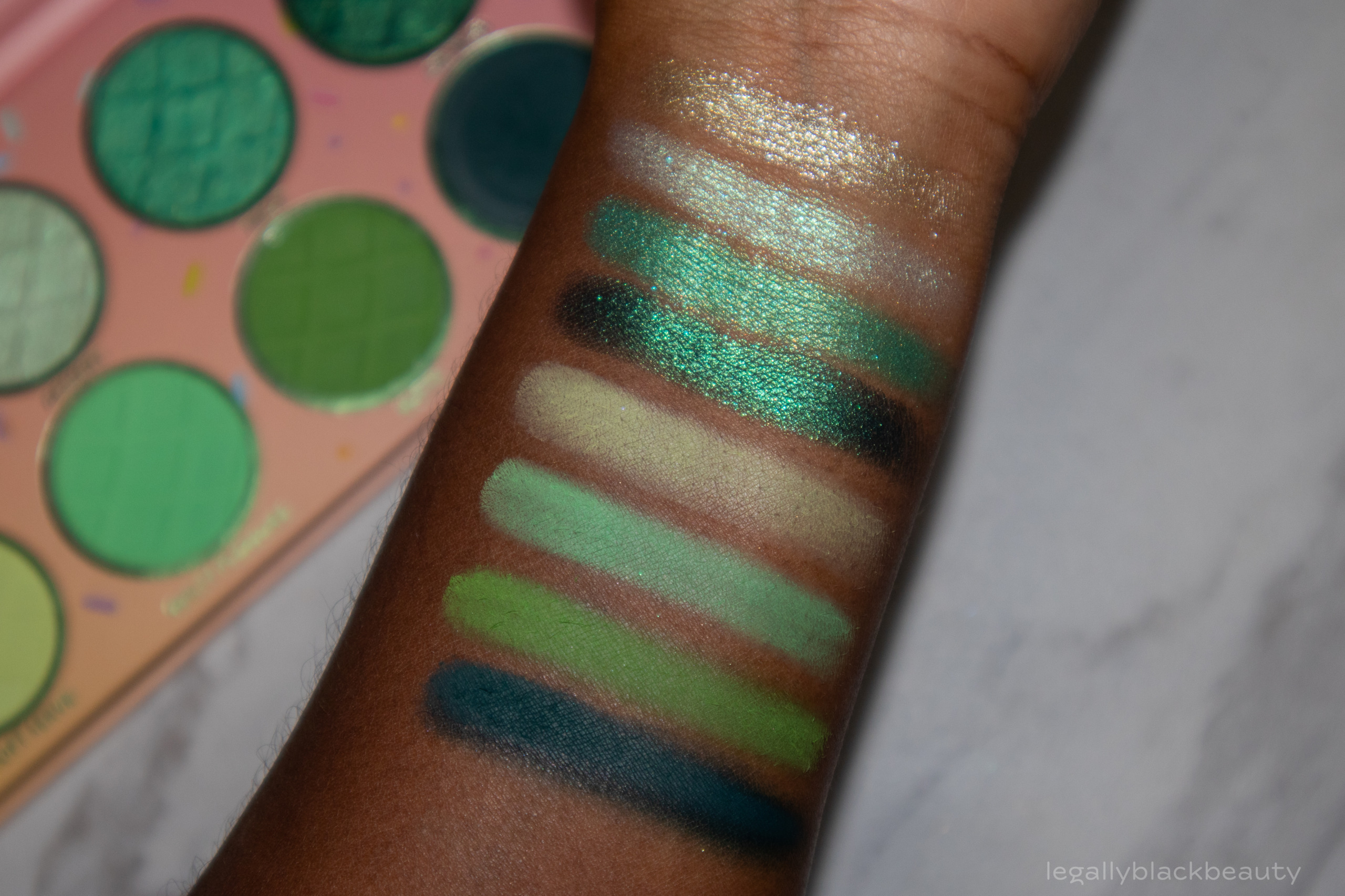
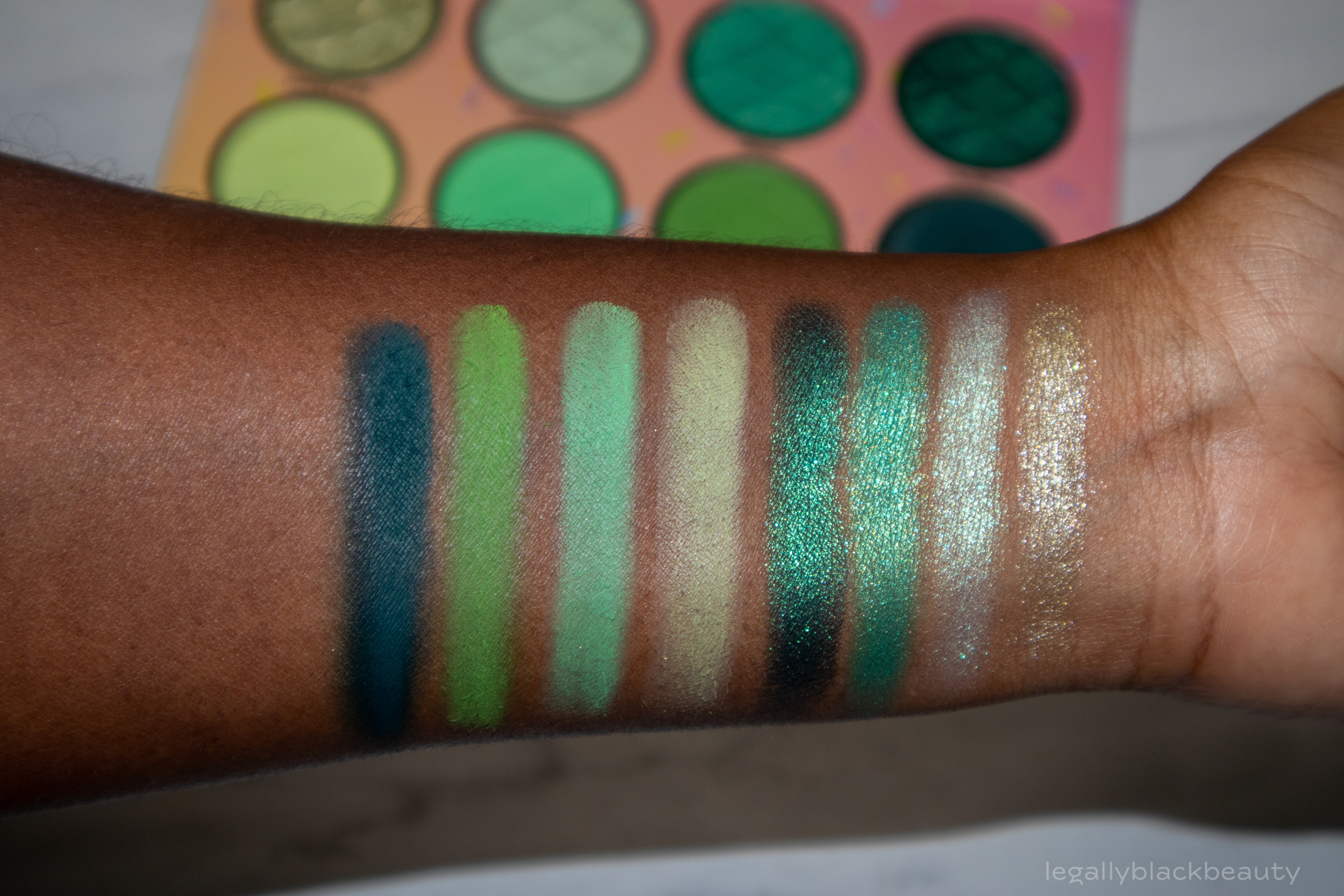
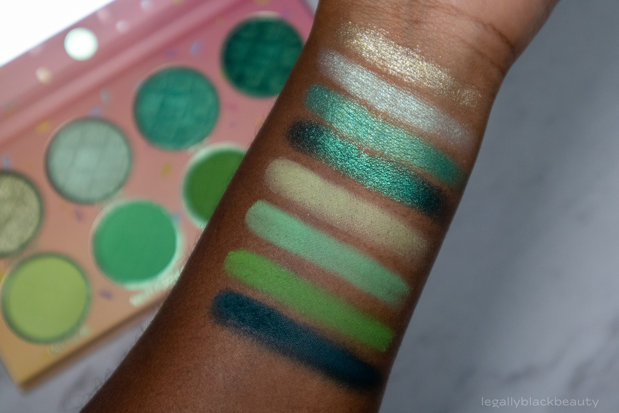
Like most of Kaleidos’ shimmers as of late, the shimmers in Club Nebula are thin and won’t show much base pigment. They are extremely sparkly and comprised of micro shimmers.
Gravity has some sheen to it and applies best over primer.
Astro and Celestial are described as multichromes. The shifts aren’t as strong as the shifts in more metallic multichrome formulas.
- Firefly: Fresh mint green sparkling duochrome with a frosty fuchsia shift
- 7 of 9: Satiny and buoyant Caribbean blue matte
- Gravity: Sumptuous sour apple and chartreuse green matte
- Queen of Blades: Regal, mysterious dark teal green matte
- Void: Infinitely deep navy-blue matte
- You’re My Only Hope: Luminous lavender sparkling duochrome adorned with white crystal shimmers and a pale blue shift
- Naaru: Taupe matte with a hint of plum
- Astro: Brilliant royal blue multichrome with a glimmer of warm violet and teal
- Rockhopper: Suave deep grey indigo matte
- Cylon: Debonair dark plum matte
- Celestial: Radiant hot pink multichrome with decadent fuchsia and golden shifts
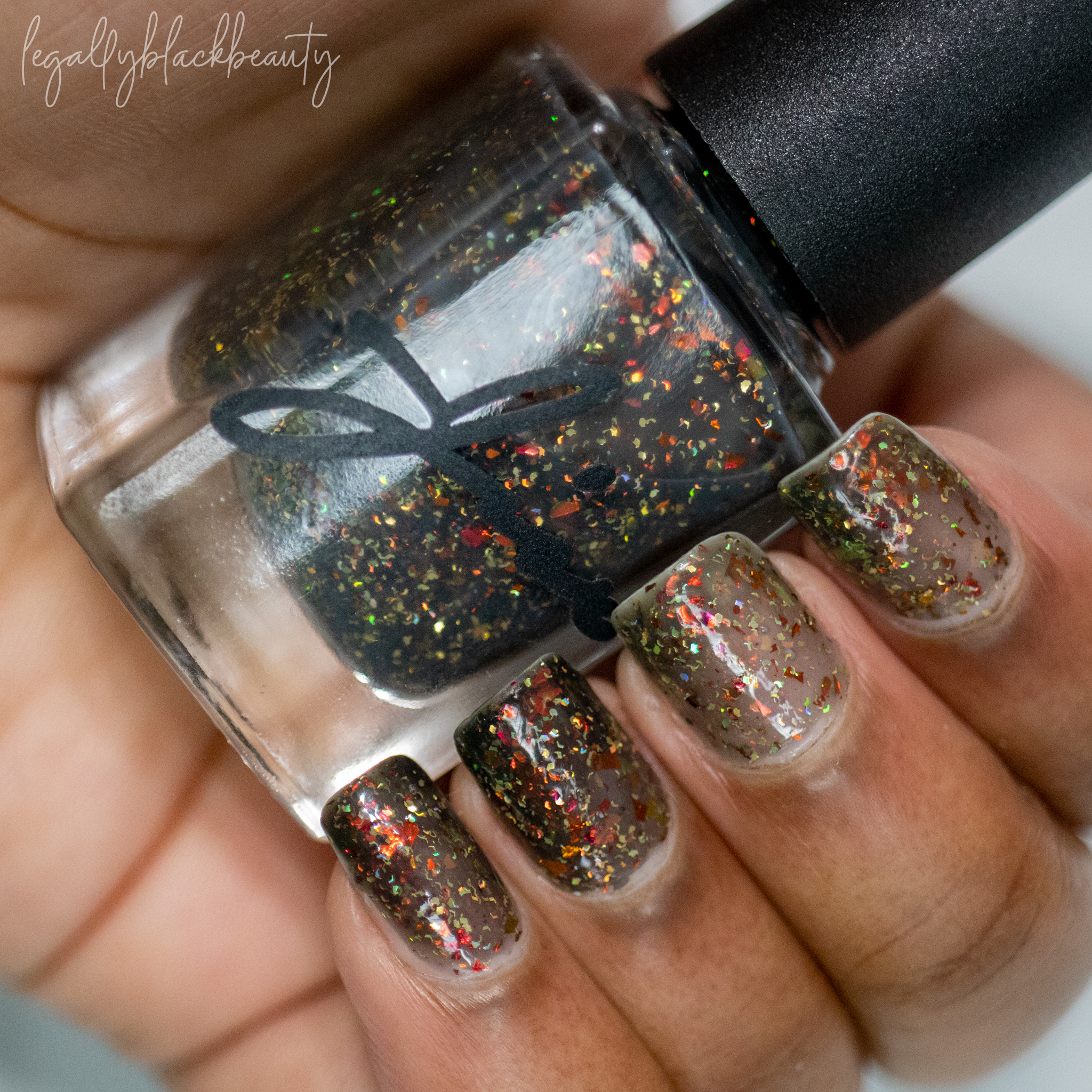
- Nova: Glistening amethyst blue sparkling duochrome topper with a warm violet shift
- Samus: Creamy peach orange matte
- Nebula: Rose-gold red sparkling duochrome with a molten copper shift
- Red Giant: Stately, deep brick red matte
I think Kaleidos and Angelica did a fantastic job creating this palette. The color story immediately spoke to me, which makes perfect sense given how much I love greens, blues, and purples.
I love the depth of this palette. Naaru is the only light matte, and one light matte in a palette is definitely a welcome change for me. While it looked decent swatched, it did have a light, almost white cast when applied to my eye. I don’t think it is too light to use, but it is a shadow I would use primarily to blend out other shadows.
Gravity stood out to me the most out of all of the mattes. It swatched as I would expect a neon matte to swatch, with slight separation of pigment/patchiness and trouble consistently adhering to skin after a certain amount of powder is used. It blends out well, although there can be a small yellow halo around the primary bright green pigment.
The other mattes are beautiful and rich. I noticed Queen of Blades looks best over primer. Without primer, it can easily venture into patchy territory. With primer, it is perfectly pigmented.
You’re My Only Hope is a beautiful lavender in the pan, but it reads as a silver or pale blue on my skin. I would have loved to get more of that purple to show up on my skin.
I was surprised that the two multichromes, Astro and Celestial, were labeled as such. They aren’t quite as shifty as some of the shadows labeled as duochromes, Nova in particular. All of the shifty shadows in Club Nebula are soft and light, which is interesting when you consider how deep the mattes go.
I’m not sure if the formulas in the palette are unique compared to other brands. Everything performs well, for the most part, but nothing stands out to me as exceptional. I know this statement stands in stark contrast with some of the earlier praises of Kaleidos (circa 2019), but a formula being good does not elevate a palette to must-have status for me. If you’re interested in the palette, consider whether the combination of the formulas and the colors intrigues you, as well as your motivations for buying it.
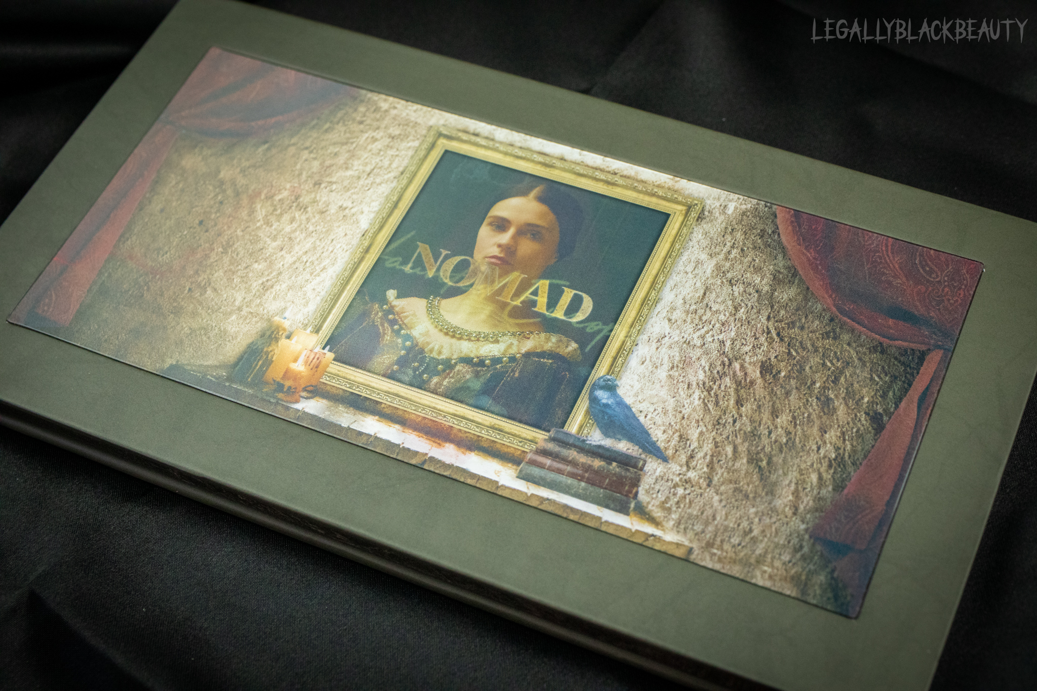
I don’t quite understand the theme of this palette, but I do appreciate the packaging and the beautiful deck of cards. As soon as this pandemic is over, I’m busting those out for some spades or King’s Cup. I love a good card game, don’t judge me.
